A Structured Approach to Data Analysis
Exploratory Data Analysis For Epidemiology
Learning objectives for this lesson:
- Construct a causal diagram before beginning data analysis
- Establish a system for managing data-collection sheets, files, and variables
- Apply best practices for data coding, entry, and verification
- Process outcome and predictor variables appropriately for analysis
- Evaluate unconditional associations between variables
- Set up a systematic approach for keeping track of analyses
This course was developed by Dr. Kiffer G. Card, Faculty of Health Sciences, Simon Fraser University based on Dohoo, I. R., Martin, S. W., & Stryhn, H. (2012). Methods in Epidemiologic Research. VER Inc.
Glossary: Key Terms, People & Concepts
📚 Reference page, available throughout the lesson
This glossary collects the key concepts, people, and ideas you will meet in this lesson. Use it as a reference while you work through the material, or as a review before assessments. Type in the search box to filter entries.
Introduction & Data Collection
Introduction and Overview
Earlier courses in this series covered how to read epidemiological evidence (230) and how to design and conduct epidemiologic studies (341). This course addresses the next link in the chain: how to analyse the data those studies produce. It uses R to apply the main statistical methods of modern public-health analysis, including linear, logistic, multinomial, ordinal, and count regression; mixed models for clustered and longitudinal data; and causal-inference tools for observational data. Each of these models is introduced in a later lesson, and none of them is needed to follow this lesson. Time-to-event (survival) models are beyond the scope of this course; HSCI 341 Lesson 8, Time-to-Event Data, introduces them. This first lesson sets the foundation: a disciplined workflow for taking raw data from collection through to analysis-ready files. The structured approach has become especially important since the wider scientific community recognised a replication crisis in published research (Ioannidis, 2005; Open Science Collaboration, 2015) and called for a manifesto of reproducible practice (Munafò et al., 2017). Across four content sections we walk through this in order: introduction and data collection (this section), data coding, entry, and file management (a later section), program files, editing, and verification (a later section), and data processing plus the first unconditional associations (a later section).
Two terms: replication and reproducibility
Replication means repeating a study with new participants and new data to see whether the original finding holds. Reproducibility means re-running the original analysis on the original data, with the original code, and obtaining the same numbers. The crisis was named for failed replications, which Ioannidis warned about in 2005 and which large projects documented in the 2010s. The habits taught in this lesson target reproducibility, because a result that cannot be reproduced from its own data and code cannot be checked, corrected, or built upon.
Learning Objectives
- Explain why a structured, iterative analytic workflow outperforms diving straight into modelling.
- Sketch a causal diagram that distinguishes outcomes, predictors, confounders, and intervening variables.
- Set up a storage and tracking system for original data-collection sheets.
- Recognise where this section sits in the larger pipeline that runs through later sections.
Why a Structured Approach?
When starting the analysis of a complex dataset, it is very helpful to have a structured approach in mind. For most people, there is a strong tendency to jump straight into the sophisticated analysis that will provide the ultimate answer. This rarely works out, because the results will be wrong when important preliminary steps were skipped.
Key Principle
Data analysis is an iterative process which often requires that you back up several steps as you gain more insight into your data, an idea Tukey developed when he distinguished exploratory from confirmatory work (Peng, 2011). A structured template, while not the only approach, will be applicable in most situations and will serve to guide your initial efforts; tidy-data conventions (Wickham, 2014) make each iteration cheaper.
Two terms in this box recur throughout the course. Exploratory analysis means getting to know the data by summarising and plotting it and looking for patterns, errors, and surprises; confirmatory analysis means formally testing a claim that was stated before the data were examined. Tidy data means a table in which each variable has its own column, each observation (for example, each participant) has its own row, and each cell holds a single value.
Start with a Causal Diagram
Before you start any work with your data, it is essential to construct a plausible causal diagram of the problem you are about to investigate. This will help identify:
- Which variables are important outcomes and predictors
- Which are potential confounders
- Which might be intervening variables between your main predictors and outcomes
Practical Tip
Keep this causal diagram in mind throughout the entire data-analysis process. With large datasets, it will not be possible to include all predictors as separate entities. This can be handled by including blocks of variables (e.g., demographic characteristics) in the diagram instead of listing each variable.
Quick refresher: DAGs from an earlier course
When we say “causal diagram” in 410, we mean a directed acyclic graph (DAG): nodes for variables, directed arrows for direct causal effects, no cycles. You met these in an earlier course, and the three structural pieces still do all the work:
- Fork (X ← C → Y): C is a confounder. Adjust for it.
- Chain (X → M → Y): M is a mediator. Do not adjust if you want the total effect.
- Collider (X → Z ← Y): Do not adjust, and watch for it in selection.
The DAG fixes your estimand (what causal quantity you are estimating) and your adjustment set (what goes on the right-hand side of the regression) before you fit anything. In 410 we use it as the bridge from a research question to a regression model.
What “adjusting for” a variable means in practice
To adjust for a variable (also called controlling for it or conditioning on it) means to compare exposed and unexposed people who have the same value of that variable, so that the variable cannot explain the difference between them. In practice an analyst adjusts in one of three ways. The most common is to add the variable to the right-hand side of a regression model, for example lm(outcome ~ exposure + age), which estimates the exposure effect among people of the same age. A second is to stratify, which means analysing each level of the variable separately (for example, women and men) and then combining the results. A third is to restrict the sample to one level of the variable, for example by studying only non-smokers or only hospital patients.
Restriction is the form that is easiest to overlook. A study that recruits only hospital patients has conditioned on hospital admission before any model is fitted, and if admission is a collider, that sampling decision alone can create a false association. The collider example later in this section shows the size of the distortion with simulated numbers.
Worked Example: From a research question to a DAG and an adjustment set
The smoking cohort used later in this section (cohort.csv) records whether each participant smokes and whether an event occurred during follow-up. Suppose the event is a cardiovascular (CVD) event, such as a heart attack or stroke. The six steps below turn that study into a causal diagram.
| Step | What the analyst does | Result for this example |
|---|---|---|
| 1. State the question | The question names the population, exposure, comparator, and outcome (PECO). | Among adults aged 20 to 79, does smoking, compared with not smoking, increase the risk of a CVD event during follow-up? |
| 2. Add common causes | The analyst lists variables that plausibly cause both the exposure and the outcome, using subject-matter knowledge and earlier studies. | Age and sex both influence whether a person smokes and their CVD risk, so each gets an arrow into smoking and an arrow into the CVD event. |
| 3. Add pathway variables | The analyst lists variables through which the exposure might act on the outcome. | Smoking raises blood pressure, and high blood pressure raises CVD risk, so blood pressure sits on a chain from smoking to the event. |
| 4. Add common effects | The analyst lists variables that both the exposure and the outcome cause, including any variable that determined who entered the data. | Smoking-related illness and CVD events both lead to hospital admission, so admission receives arrows from both and is a collider. |
| 5. Classify each variable | Each variable is labelled using the three structures: fork, chain, or collider. | Age and sex are confounders, blood pressure is a mediator, and hospital admission is a collider. |
| 6. Read off the adjustment set | The analyst chooses the estimand and lists the variables the model must include and exclude. | For the total effect of smoking, the model adjusts for age and sex, leaves blood pressure out, and does not restrict the sample to hospital patients. |
Narrated R walkthrough: Getting Started with R and RStudio
If you have not used R before, start with this walkthrough. It installs R and RStudio, shows how the RStudio window is laid out, introduces objects, functions and packages, loads the course survey data, and shows how to read a help page, with every line of code explained as it runs.
Open the Getting Started with R and RStudio walkthroughThe R boxes in this course assume a working installation of two free programs. R is the statistics language that does the calculations, and RStudio is the program in which R code is written and run. Both are available from the Posit download page; R is installed first and RStudio second.
- Create an RStudio project for the course by choosing File, then New Project, then New Directory, then New Project, and naming the folder (for example,
hsci410). A project is a folder that RStudio remembers; opening its.Rprojfile later reopens the same folder with the same settings, and file paths in the code are read relative to it. - Install the packages used in this lesson by typing the line below into the Console pane and pressing Enter. A package is a free add-on that supplies extra functions. Installation needs an internet connection, takes a few minutes, and is done once per computer.
- Load the packages at the top of each script with
library(). Loading has to be repeated in every new R session. - Open a new script with File, New File, R Script, and save it inside the project. Code typed into a script is saved with the project; code typed only into the Console is lost when RStudio closes.
# Run once per computer, in the Console
install.packages(c("tidyverse", "here", "mediation", "dagitty"))

# Run at the top of every script that uses them
library(tidyverse)   # data handling, graphics, reading and writing files
library(here)        # builds file paths from the project folder
Two ways of running code appear in every lesson. Running a line sends only the current line, or the highlighted lines, to the Console; in RStudio this is the Run button or Ctrl+Enter (Cmd+Return on a Mac). Sourcing a script runs the whole file from top to bottom; this is the Source button or Ctrl+Shift+S (Cmd+Shift+S on a Mac). Running line by line suits exploration, and sourcing confirms that the complete script works from a fresh start.
Any text after a # symbol on a line is a comment. R ignores comments, so they are used to explain what each step does and why. The code boxes in this course use comments in this way, and the answer-key scripts follow the same practice.
About tidyverse. The line library(tidyverse) loads several packages at once, including dplyr (data manipulation), readr (reading and writing files), tidyr (tidying data) and ggplot2 (graphics). If the tidyverse installation fails, the four packages can be installed separately with install.packages(c("dplyr", "readr", "tidyr", "ggplot2")) and loaded with four library() lines in place of library(tidyverse). Together they supply every tidyverse function used in this lesson.
dagitty
The dagitty package reads a DAG written as text and reports which variables must be adjusted for to estimate a chosen effect. The same tool is available as a free web page, dagitty.net, where the diagram is drawn with the mouse; the R version keeps the diagram in the script beside the analysis. The code below encodes the diagram from the worked example, with cvd standing for the CVD event and bp for blood pressure.
library(dagitty)

# Each "A -> B" is one arrow: A causes B
g <- dagitty("dag {
  age -> smoker ; age -> cvd
  sex -> smoker ; sex -> cvd
  smoker -> bp ; bp -> cvd
  smoker -> cvd
  smoker -> hospital ; cvd -> hospital
}")

# Variables to adjust for to estimate the TOTAL effect of smoking on cvd
adjustmentSets(g, exposure = "smoker", outcome = "cvd", effect = "total")

# Variables to adjust for to estimate the DIRECT effect (not through bp)
adjustmentSets(g, exposure = "smoker", outcome = "cvd", effect = "direct")Reading the output. The first line answers the first call (the total effect), and the second line answers the second call (the direct effect). Each is a sufficient adjustment set: if the DAG is correct, including these variables in the model removes confounding of that effect. For the total effect of smoking, the set is age and sex. Blood pressure is left out because it is a mediator, and hospital admission is left out because it is a collider. For the direct effect, blood pressure joins the set, because the direct effect is defined as the effect that remains when the mediator is held fixed. The answer is only as good as the arrows typed in: dagitty checks the logic of the diagram, and only subject-matter knowledge can check whether the diagram matches reality.
The simulation below creates a population of 10,000 people in which smoking and diabetes are unrelated by construction. Each condition raises the chance of a hospital admission, which makes admission a collider (smoking → admission ← diabetes). The code compares the percentage with diabetes among smokers and non-smokers, first in the whole population and then among hospital patients only. The function rbinom(n, 1, p) draws n values of 0 or 1 with probability p of a 1; table() counts each combination of values; prop.table(..., margin = 1) turns the counts into proportions within each row; and subset() keeps the rows that meet a condition.
set.seed(2026)
n        <- 10000
smoker   <- rbinom(n, 1, 0.30)   # 1 = smokes (30% of people)
diabetes <- rbinom(n, 1, 0.10)   # 1 = diabetes (10%), unrelated to smoking
# Each condition raises the chance of a hospital admission (the collider)
p_admit  <- 0.05 + 0.30 * smoker + 0.30 * diabetes
hospital <- rbinom(n, 1, p_admit)
pop      <- data.frame(smoker, diabetes, hospital)

# Whole population: % with diabetes among non-smokers (0) and smokers (1)
round(100 * prop.table(table(smoker = pop$smoker, diabetes = pop$diabetes),
margin = 1), 1)# Hospital patients only: this restriction conditions on the collider
inpatients <- subset(pop, hospital == 1)
nrow(inpatients)
round(100 * prop.table(table(smoker = inpatients$smoker,
diabetes = inpatients$diabetes), margin = 1), 1)Reading the output. Rows are smoking status (0 = does not smoke, 1 = smokes) and columns are diabetes status, so the right-hand column is the percentage with diabetes. In the whole population, about 10% of both groups have diabetes (10.0% and 9.8%), which matches the way the data were built. Among the 1,688 hospital patients, 44% of non-smokers and only 15% of smokers have diabetes, so smoking now appears to protect against diabetes. The association is produced entirely by the sampling: a non-smoker in hospital is likely to be there because of diabetes, whereas a smoker in hospital is often there because of smoking. A study that recruited only inpatients would report this false association even with flawless data entry and modelling.
From DAG to Regression: A Mediation Example
One of the clearest places to see this bridge is mediation. A DAG of the form X → M → Y with a residual direct path X → Y is the qualitative claim; the Baron & Kenny (1986) procedure introduced in 341 puts numbers on the direct and indirect components. Intuitively, the indirect effect is the part of education's benefit that appears only because more education tends to raise income, and higher income in turn improves health; the direct effect is whatever is left once that income pathway is set aside. Below we do that fitting in R, on simulated data so you can verify the answer against the truth.
A short primer on regression for the mediation example
Regression is taught properly in a later lesson, and three ideas are enough to follow this example. First, a regression model such as lm(health ~ education) fits the straight line that best describes how the outcome (health) changes as the predictor (education) increases. The model’s regression coefficient for education is the slope of that line: the average change in health for each one-unit increase in education. When a second predictor is added, as in lm(health ~ education + income), the coefficient for education becomes the average change in health per unit of education among people with the same income, which is what adjusting for income means.
Second, the data are simulated. The code invents 800 people and generates their education, income, and health from rules chosen in advance, so the true effects are known exactly: each unit of education raises income by 0.6 (the true path a), each unit of income raises health by 0.5 (the true path b), and each unit of education raises health directly by 0.3 (the true direct effect c′). The true total effect is therefore 0.3 + 0.6 × 0.5 = 0.60. Because the truth is known, the estimates can be checked against it, which is impossible with real data.
Third, the variables have no real-world units. Education is drawn with rnorm(), which produces values centred on 0 with a standard deviation of 1, so one unit of education is one standard deviation, and income and health are built from education on the same arbitrary scale. A coefficient of 0.30 therefore means that health rises by 0.30 of a unit for each one-unit (one standard deviation) increase in education, on a scale with no direct translation into years of schooling or dollars.
mediation package)
The DAG: education → income → health, with education → health directly. We will (i) run Baron & Kenny’s three regressions by hand, then (ii) replicate the result with the mediation package, which gives proper bootstrap confidence intervals for the indirect effect.
# install.packages(c("mediation", "dagitty"))
library(mediation)

# 1. Simulate data that match the DAG: education -> income -> health,
#    with a smaller direct path education -> health.
set.seed(410)
n         <- 800
education <- rnorm(n)
income    <- 0.6 * education + rnorm(n)              # path a
health    <- 0.3 * education + 0.5 * income + rnorm(n)  # direct + path b
dat       <- data.frame(education, income, health)

# 2. Baron & Kenny by hand --------------------------------------------------
#    Step 1: total effect c  (health on education)
coef(lm(health ~ education, data = dat))["education"]

#    Step 2: a (income on education)
fit_M  <- lm(income ~ education, data = dat)

#    Step 3: direct c' (education) and b (income), from health on both
fit_Y  <- lm(health ~ education + income, data = dat)
coef(fit_Y)                     # c' on education, b on income

# Indirect effect = a * b  (or equivalently c - c')
a <- coef(fit_M)["education"]
b <- coef(fit_Y)["income"]
a * b

# 3. Same answer, with bootstrap CIs, via the mediation package -------------
med <- mediate(fit_M, fit_Y,
                treat    = "education",
                mediator = "income",
                boot     = TRUE, sims = 1000)
summary(med)
What each line does.
| Code | What it does |
|---|---|
library(mediation) | This line loads the mediation package, which supplies the mediate() function used at the end. |
set.seed(410) | This line fixes R’s random-number generator, so the simulated data, and therefore every number in the output, are identical on every computer that runs the code. |
n <- 800 | This line stores the number of simulated people. The arrow <- assigns the value on its right to the name on its left. |
education <- rnorm(n) | This line draws 800 values from a normal (bell-shaped) distribution with mean 0 and standard deviation 1. |
income <- 0.6 * education + rnorm(n) | This line builds income so that each unit of education adds 0.6 (the true path a), plus random variation. |
health <- 0.3 * education + 0.5 * income + rnorm(n) | This line builds health from a direct education effect of 0.3 (the true c′) and an income effect of 0.5 (the true b), plus random variation. |
dat <- data.frame(...) | This line combines the three variables into one table with 800 rows and three columns. |
lm(health ~ education, data = dat) | This call fits a linear regression of health on education. The tilde ~ separates the outcome (left) from the predictors (right). |
coef(...)["education"] | This call extracts the fitted coefficients and keeps the one named education, which in the first model is the total effect c. |
fit_M <- lm(income ~ education, ...) | This line fits the mediator model; its education coefficient is a. |
fit_Y <- lm(health ~ education + income, ...) | This line fits the outcome model with both predictors; its education coefficient is c′ and its income coefficient is b. |
a * b | This line multiplies the two path coefficients to give the indirect effect. |
mediate(fit_M, fit_Y, treat, mediator, boot = TRUE, sims = 1000) | This call combines the two models to estimate the indirect, direct, and total effects. treat names the exposure, mediator names the mediator, and boot = TRUE with sims = 1000 requests 1,000 bootstrap resamples to build the confidence intervals. |
summary(med) | This call prints the table of estimates, confidence intervals, and p-values. |
Console output, with the four paths marked. The first three printed results come from the by-hand part of the code. The highlighted numbers are c (total effect, first result), c′ and b (the education and income coefficients in fit_Y), and a × b (the indirect effect, printed under the name education because a carries that label). The (Intercept) is the predicted health score when every predictor equals zero and is not needed here.
The value of a is computed by the code without being printed. Printing the coefficients of the mediator model shows it:
coef(fit_M) # the education coefficient is path a| Path | Where it comes from | Estimate | True value |
|---|---|---|---|
| c (total effect) | The education coefficient in lm(health ~ education). | 0.647 | 0.60 |
| a | The education coefficient in fit_M (income on education). | 0.663 | 0.60 |
| b | The income coefficient in fit_Y (health on education and income). | 0.448 | 0.50 |
| c′ (direct effect) | The education coefficient in fit_Y. | 0.351 | 0.30 |
| a × b (indirect effect) | The product of a and b; it also equals c − c′ = 0.6475 − 0.3506 = 0.2969. | 0.297 | 0.30 |
Reading the summary(med) table. Each row is one effect. ACME stands for average causal mediation effect, the indirect effect through income (a × b). ADE stands for average direct effect, the effect of education that does not pass through income (c′). Total Effect is c, and Prop. Mediated is the share of the total effect that travels through income: 0.297 ÷ 0.647 = 0.459. The Estimate column repeats the by-hand values, because the bootstrap adds uncertainty intervals without changing the estimates.
The 95% confidence interval. For the ACME, the interval runs from 0.243 to 0.350. A confidence interval shows how precisely an effect has been estimated: the values inside it are those most compatible with the data, and the method that produces it captures the true value in 95% of repeated samples. In this simulation the true indirect effect, 0.30, lies inside the interval. A narrow interval indicates a precise estimate, and an interval that includes 0 indicates that the data cannot rule out the absence of an indirect effect.
The p-value. The p-value answers the question of how often an estimate at least this far from zero would arise by chance if the true effect were zero. R prints < 2.2e-16 for any p-value below 0.00000000000000022. Here the p-value comes from the 1,000 bootstrap resamples, none of which fell on the other side of zero, so the package records it as zero. With 1,000 resamples the smallest p-value distinguishable from zero is 0.002, so the result is reported as p < 0.002. A p-value this small means the data are very hard to reconcile with an effect of zero. The stars repeat the same information using the thresholds listed on the Signif. codes line. The p-value carries no information about the size or importance of an effect; the estimate and its confidence interval carry that information.
A model reporting sentence. “In simulated data (n = 800), the estimated indirect effect of education on health through income was 0.30 units of the simulated health score per standard deviation of education (95% CI 0.24 to 0.35), the direct effect was 0.35 (95% CI 0.28 to 0.43), and the total effect was 0.65 (95% CI 0.58 to 0.72); income carried an estimated 46% of the total effect (95% CI 38% to 54%).”
Two cautions. (1) The estimate of the indirect effect is only as credible as the DAG. If an unmeasured variable confounds income and health, the indirect estimate is biased even though every regression runs cleanly. (2) Both the Baron & Kenny arithmetic and mediate() as called here assume that the effect of income on health is the same at every level of education, which is called the assumption of no exposure-mediator interaction. To relax it, the outcome model is fitted as lm(health ~ education + income + education:income, data = dat), where education:income is the interaction term; mediate() then reports separate indirect effects, labelled ACME (control) and ACME (treated), for education values of 0 and 1.
R Reflect on what you just ran
Use the questions below to interpret the output shown above, which matches what the code produces when it is run.
1. Compare the total effect c from lm(health ~ education) with the direct effect c' (the education coefficient in fit_Y). Which is larger, and what does the difference imply about the role of income?
set.seed(410), the total effect c from lm(health ~ education) is 0.647, while the direct effect c' from fit_Y is 0.351, so the total is larger. The difference (0.297) is the indirect effect operating through income; income carries a little under half (46%) of education's effect on health. This is the classical Baron & Kenny mediation signal: a substantial drop from c to c' when the mediator is added to the model.2. Multiply a * b by hand. How close is this product to the bootstrapped ACME from summary(med)? Does the 95% CI for ACME exclude zero?
fit_Y, the model of health on education and income); a×b = 0.297, close to the simulated truth of 0.6 × 0.5 = 0.30. The bootstrapped ACME from summary(med) is reported as 0.297 with 95% CI (0.243, 0.350), the same value as the product (the bootstrap only adds the interval), with the CI clearly excluding zero. The agreement validates that the by-hand and package estimates match; the CI confirms statistical significance.3. The output reports a Prop. Mediated of about 0.46. Translate that into a sentence about education, income, and health. What would change about your interpretation if the 95% CI for ACME crossed zero?
The structured approach starts with structured files. The convention below, with one RStudio project, one folder per stage, and one numbered script per task, scales from a homework assignment to a journal-ready paper. The steps are as follows.
- Open the RStudio project created in the setup box (File, Open Project), so that R works inside the project folder.
- Run the four
dir.create()lines below once, in the Console. They create the foldersdata/raw,data/processed,R, andoutput/figuresinside the project. - Download
cohort.csvfrom the link above and move it into the newdata/rawfolder. The file describes a small smoking cohort: 600 participants, 36 of whom have no recorded outcome because they were lost to follow-up. - Create a new script, save it as
R/01_load_clean.R, paste in the code fromlibrary(tidyverse)onward, and run it line by line. - Compare the console with the output shown below the code.
# Create directories from R (or by hand). Run once at project start.
dir.create("data/raw",        recursive = TRUE)
dir.create("data/processed",  recursive = TRUE)
dir.create("R");  dir.create("output/figures", recursive = TRUE)

# tidyverse: dplyr (manipulation), ggplot2 (graphics), readr (file IO),
# tidyr (reshape), stringr (text). Install once.
# install.packages(c("tidyverse", "here"))
library(tidyverse)
library(here)                                # builds file paths from the project folder

# A canonical pipeline: read -> clean -> save -> analyse
raw <- read_csv(here("data/raw/cohort.csv"))
clean <- raw |>
  filter(!is.na(outcome)) |>
  mutate(age_grp = cut(age, c(0, 30, 50, 70, Inf)),
         smoker  = factor(smoker, levels = c("No", "Yes")))
write_csv(clean, here("data/processed/cohort_clean.csv"))

# Sketch a DAG to anchor the analysis (see the earlier DAG course)
# library(dagitty)
# g <- dagitty("dag { smoker -> outcome ; age -> smoker ; age -> outcome }")Checking the data before and after cleaning. When read_csv() runs, it prints a short report of what it found. chr marks text (character) columns and dbl marks numeric columns (“double” is R’s name for a number that can have decimals). The message is informational, and adding show_col_types = FALSE to read_csv() switches it off.
Before any cleaning, glimpse() shows every variable on one line, with its type and its first few values:
glimpse(raw) # one line per variable: name, type, first valuesThe output can be read against a short codebook for the file:
| Variable | Type in R | Meaning and codes |
|---|---|---|
id | text (chr) | This is the participant identifier, running from C001 to C600. |
age | number (dbl) | This is age in years, from 20 to 79. |
sex | text (chr) | Sex is recorded as Female or Male. |
smoker | text, converted to a factor by the pipeline | Smoking status is recorded as No or Yes. |
followup_years | number (dbl) | This is the length of follow-up in years, from 1.0 to 10.0. |
outcome | number (dbl) | The value is 1 if the event occurred during follow-up and 0 if it did not; it is NA (a blank cell in the file) for participants lost to follow-up. |
Counting rows before and after the filter confirms what the pipeline did, and count() shows how many participants fall in each new age band:
nrow(raw)       # rows before filtering
nrow(clean)     # rows after dropping participants with no outcome
count(clean, age_grp) # participants in each age bandReading the output. The raw file has 600 rows and the cleaned file 564, so 36 participants were removed. In filter(!is.na(outcome)), is.na() asks whether each outcome is missing and ! means “not”, so the filter keeps the rows whose outcome is known. In the age bands, (30,50] means older than 30 and up to and including 50; a round bracket excludes the boundary and a square bracket includes it.
Dropping missing outcomes is a decision to record. Keeping only participants with a known outcome is a complete-case decision: the analysis will describe only the people who were followed to the end. If those lost to follow-up differ from the rest (for example, if sicker participants were more likely to drop out), the remaining 564 no longer represent the cohort, and the results may be biased. The decision therefore belongs in the file log, with the number of rows removed and the reason, as in the two lines below. The date in the log will be the date on which the code is run.
# Record the complete-case decision in the file log
cat(format(Sys.Date()), "cohort_clean.csv:", nrow(raw) - nrow(clean),
    "participants with no recorded outcome excluded;", nrow(clean), "remain\n",
    file = here("data/file_log.txt"), append = TRUE)
readLines(here("data/file_log.txt"))The pipe operator |> (or %>%) is the workhorse of the tidyverse: it chains verb -> verb -> verb so analysis reads top to bottom. Combined with here() for paths, your project is movable, shareable, and version-control-friendly out of the box.
R Reflect on what you just ran
Use the questions below to interpret the output shown above, which matches what the code produces when it is run.
1. After running dir.create() four times, what folder structure now exists in your project? Why is keeping data/raw/ separate from data/processed/ a defensible choice?
dir.create() calls create: data/raw/, data/processed/, R/, and output/figures/. Keeping data/raw/ separate from data/processed/ is defensible because raw data is the irreplaceable artefact, the source of truth that should never be modified. Processed data are derived from raw; if a cleaning bug is discovered, you can re-derive from raw, but if you overwrote the raw file, the bug is permanent. The separation enforces the rule "raw is read-only; processed is regenerable."2. Trace the pipeline raw |> filter(...) |> mutate(...). One brand-new column is added by mutate() and one existing column is re-encoded in place. Which is which?
clean: age_grp, a factor with age bands (0–30, 30–50, 50–70, 70+) built by cutting continuous age. The mutate() call also rewrites smoker, but that column already existed in raw; factor(smoker, levels = c("No", "Yes")) re-encodes it in place so the model's reference level is "No". So the pipeline adds one column (age_grp) and transforms one (smoker); filter() only drops rows and creates no columns.3. Why does the script use here("data/raw/cohort.csv") instead of an absolute path like "C:/Users/.../cohort.csv"? Give one practical scenario where this matters.
here() resolves paths relative to the project root, so the same script works on any machine, in any user account, in any operating system, as long as the project structure is unchanged. Absolute paths break instantly when the project is moved, shared with a collaborator on a different operating system, or run on another computer such as a university server. Concrete scenario: you send your code to a co-author for review. They unzip the project on their Mac at ~/projects/this_study/; your hardcoded C:/Users/.../ would fail immediately, while here("data/raw/cohort.csv") just works.Managing Data-Collection Sheets
It is important to establish a permanent storage system for all original data-collection sheets (survey forms, data-collection forms, etc.) that makes it easy to retrieve individual sheets if they are needed during the analysis.
Do not remove originals from your file. If you need a specific sheet for use at another location, make a photocopy. Never ship the original to another location without first making copies of all forms.
Set up a system for recording the insertion of data-collection sheets into the file so that you know how many remain to be collected before further work begins.
Once all forms have been collected, scan through all sheets for their completeness before doing anything else. If there are omissions, returning to the data source to complete the data will be more likely to succeed if done soon after collection rather than weeks or months later.
1. What should you construct before beginning any work with your data?
2. Why is data analysis described as an “iterative process”?
3. What should you do if you find omissions in data-collection sheets?
Reflection
Think of a research question you are interested in. A causal diagram shows the outcome, the main predictors (exposures) of interest, the confounders (variables that affect both a predictor and the outcome and are not on the causal pathway between them), and any intervening variables (variables that lie on the causal pathway from a predictor to the outcome). Sketch out (describe) such a diagram for your question. How does the diagram help you plan your analysis, for example in deciding which variables to adjust for and which to leave out?
Data Coding, Entry & File Management
Introduction and Overview
An earlier section set up the conceptual workflow and the discipline of starting from a causal diagram before you touch any data. This section turns to the practical side: how do you encode raw responses, enter them into a workable file, organise files across a project, and keep track of what every variable in your dataset means? These are unglamorous tasks, but they determine whether the analysis you eventually run is reproducible. Organising data so that each variable is a column and each observation a row (the tidy data convention) makes downstream analysis dramatically easier (Wickham, 2014).
Learning Objectives
- Apply coding conventions for missing values, numeric codes, and avoiding compound codes.
- Plan a data-entry workflow that minimises transcription error.
- Lay out a project folder structure that distinguishes raw, processed, and analysis files.
- Build and maintain a variable codebook that any collaborator could open and use.
Data Coding
Before entering data into a computer, careful coding is essential. Good coding practices prevent errors that can cascade throughout an entire analysis.
The rule about missing-value codes matters because software treats a code such as −999 as a real number until it is told otherwise. The five-person example below shows what happens to the mean age when one person’s unknown age is stored as −999. The function tibble() builds a small table, and c() combines values into a vector.
library(tidyverse)

# Five participants; the third did not report age, coded -999
ages <- tibble(id = 1:5, age = c(34, 51, -999, 47, 62))
mean(ages$age) # -999 is treated as a real ageR has averaged the code with the real ages: (34 + 51 − 999 + 47 + 62) ÷ 5 = −805 ÷ 5 = −161 years, an impossible value. A code of 999 would have produced an equally wrong mean of 238.6 years, and a code hidden among many real values distorts the mean by less, which makes it harder to notice. Converting the code to NA fixes the problem:
# Fix 1: convert the code to NA, R's missing-value code
ages_fixed <- ages |> mutate(age = na_if(age, -999))
ages_fixed$age
mean(ages_fixed$age)                 # NA: R will not average an unknown value
mean(ages_fixed$age, na.rm = TRUE) # drop the NA, then average the restna_if(age, -999) replaces every −999 in age with NA. A plain mean() then returns NA, because the average of a set that includes an unknown value is itself unknown; the argument na.rm = TRUE (“NA remove”) tells R to drop the missing value and average the rest: (34 + 51 + 47 + 62) ÷ 4 = 194 ÷ 4 = 48.5 years. The same conversion can be made when the file is first read, by listing every value that should count as missing:
# Fix 2: declare the code as missing when the file is read
demo_file <- tempfile(fileext = ".csv")   # a throwaway file for the demo
write_csv(ages, demo_file)
ages_read <- read_csv(demo_file, na = c("", "NA", "-999"),
                      show_col_types = FALSE)
ages_read$ageIn practice. For a real file, the second fix is written as read_csv("data/raw/file.csv", na = c("", "NA", "-999")). The empty string "" covers blank cells and "NA" covers cells that already contain the letters NA. Every missing-value code used in the study belongs in this list and in the codebook.
The rule to use numbers for every variable comes from software in which text values were awkward to analyse. In R, the usual practice is to keep the numeric codes in the raw file, documented in the codebook, and to convert each coded variable into a factor in the cleaning script. A factor is R’s type for a categorical variable: it stores the codes, attaches a text label to each one, and fixes the order of the categories, so that tables and models display Female and Male in place of 1 and 2. A raw file that already stores text, such as the Yes and No values in cohort.csv, is also acceptable provided every value is spelled consistently, and the same factor() step then fixes the order of the categories.
# The raw file stores sex as 1 = Female, 2 = Male (see the codebook)
codes <- tibble(id = 1:4, sex = c(1, 2, 2, 1))
codes <- codes |>
  mutate(sex_f = factor(sex, levels = c(1, 2), labels = c("Female", "Male")))
codes
table(codes$sex_f)Reading the code. In factor(sex, levels = c(1, 2), labels = c("Female", "Male")), levels lists the codes in the order wanted and labels gives the text for each code in the same order. In the printed table, <dbl> marks the original numeric column and <fct> marks the new factor. Keeping both columns side by side makes the conversion easy to check. The first level (here Female) becomes the reference category when the factor is used in a regression model.
Data Entry
Some important issues to consider when entering your data into a computer file:
Double-data entry, followed by comparison of the 2 files to detect any inconsistencies, is preferable to single-data entry. This dramatically reduces the error rate in your dataset.
Spreadsheets are a convenient tool for initial data entry, but they must be used with extreme caution. It is possible to sort individual columns, which could destroy your entire dataset with one inappropriate “sort” command. Custom data-entry software provides a greater margin of safety.
As soon as the data-entry process has been completed, save the original data files in a safe location. In large, expensive trials, keep a copy of all originals stored in another location. Convert your data to the format your statistical software uses as soon as possible.
Double data entry produces two files that should be identical, and the comparison step takes only a few lines of code. In the example below, two people entered the same five forms (sbp is systolic blood pressure in mmHg). The function anti_join(x, y, by = ...) returns the rows of x that have no exact match in y on the listed columns, so running it in both directions lists every record on which the two entries disagree.
# The same five forms, entered independently by two people
entry_a <- tibble(id = 1:5, age = c(34, 51, 29, 47, 62),
                  sbp = c(128, 141, 117, 135, 150))
entry_b <- tibble(id = 1:5, age = c(34, 15, 29, 47, 62),
                  sbp = c(128, 141, 117, 153, 150))

# Rows of entry_a with no exact match in entry_b, then the reverse
anti_join(entry_a, entry_b, by = c("id", "age", "sbp"))
anti_join(entry_b, entry_a, by = c("id", "age", "sbp"))Reading the output. Records 2 and 4 disagree. In record 2 the first person typed an age of 51 and the second typed 15, a pair of swapped digits; in record 4 the systolic pressure is 135 in one entry and 153 in the other. The analyst checks each disagreement against the original paper form and corrects the wrong entry. An error made identically by both people cannot be detected this way, so double entry reduces errors substantially without removing every one.
Keeping Track of Files
It is important to have a system for keeping track of all your files. Key recommendations:
- Assign a logical name with a 2-digit numerical suffix (e.g., brazil01). A 2-digit suffix allows you to have 99 versions that still sort correctly when listed alphabetically.
- When data manipulations are carried out, save the file with a new name (the next available number). Do not change data and then overwrite the file.
- Keep a simple log of files created with information about the contents (e.g., number of observations and variables).
bp01.csv (28/09): Original blood pressure study data as received; one record per participant (each participant was measured once). 1092 obs, 8 vars.
bp02.csv (30/09): 45 records with a missing age, systolic, or diastolic value dropped. 1047 obs, 8 vars.
bp03.csv (02/10): Derived variables age_ct, age_ctsq, age_c3, and htn added. 1047 obs, 12 vars.
Dates are written as day/month. The textbook version of this log used .dta files, the format of the Stata statistics package. This course stores every version as .csv (comma-separated values), a plain-text table that R, Stata, SPSS, and spreadsheet programs can all open.
The "save a new version, don't overwrite" rule is automatic if your transformations live in a script. The script, together with the log line it writes, becomes the file log. Download bp01.csv (the blood pressure study from the file log above: 1092 records, one per participant, 8 variables, 45 records incomplete) and save it as data/raw/bp01.csv in the project skeleton built earlier. For brevity, the script carries out the second and third steps of the log in one pass, so the file it saves as bp02.csv already contains the four derived variables (1047 observations and 12 variables); in a larger project each step would get its own numbered file, as in the log.
library(tidyverse)

# Read raw, never modify in place
bp_raw <- read_csv("data/raw/bp01.csv")

# Tidy: drop incomplete rows, build derived variables, lock factors
bp_clean <- bp_raw |>
  drop_na(systolic, diastolic, age) |>
  mutate(
    age_ct    = age - mean(age),                              # centred
    age_ctsq  = age_ct^2,                                       # quadratic term
    age_c3    = cut(age, c(0, 35, 55, Inf),
                    labels = c("young", "middle", "older")),
    htn       = factor(systolic >= 140 | diastolic >= 90,
                       levels = c(FALSE, TRUE),
                       labels = c("normotensive", "hypertensive"))
  )

# Persist as a new versioned file - and a small log line
write_csv(bp_clean, "data/processed/bp02.csv")
cat("bp02.csv", format(Sys.Date()), nrow(bp_clean), "obs",
    "\n", file = "data/file_log.txt", append = TRUE)

## At any time you can rebuild bp02 from bp01 by re-running this script.
What each function does.
| Code | What it does |
|---|---|
read_csv("data/raw/bp01.csv") | This call reads the raw file into R as a table (a tibble) called bp_raw; the file on disk is never changed. |
drop_na(systolic, diastolic, age) | This step removes every row in which any of the three named variables is missing (NA), which drops the 45 incomplete records. |
mutate(...) | This step creates new columns, or changes existing ones, from calculations on the existing columns. |
age - mean(age) | This calculation subtracts the mean age (48.05 years among the 1047 participants) from each person’s age, which centres age at zero. |
age_ct^2 | This calculation squares the centred age; the squared term lets a later model fit a curve. |
cut(age, c(0, 35, 55, Inf), labels = ...) | This call splits age into bands: above 0 and up to 35 (young), above 35 and up to 55 (middle), and above 55 (older). Inf stands for infinity, so the last band has no upper limit. |
systolic >= 140 | diastolic >= 90 | This comparison returns TRUE for each person whose systolic pressure is at least 140 mmHg or (the | symbol) whose diastolic pressure is at least 90 mmHg, and FALSE otherwise. |
factor(..., levels = c(FALSE, TRUE), labels = ...) | This call turns the TRUE/FALSE result into a factor with readable labels, so FALSE becomes normotensive and TRUE becomes hypertensive. |
write_csv(bp_clean, "data/processed/bp02.csv") | This call saves the cleaned table as a new file in the processed folder. |
cat(..., file = "data/file_log.txt", append = TRUE) | This call writes one line of text to the log file; append = TRUE adds the line at the end so that earlier entries are kept. |
format(Sys.Date()) | Sys.Date() returns today’s date and format() turns it into text such as 2026-10-01. |
nrow(bp_clean) | This call counts the rows (participants) in the cleaned table. |
What htn means. The variable htn (short for hypertension, or high blood pressure) classifies each participant as hypertensive if the systolic pressure is 140 mmHg or higher or the diastolic pressure is 90 mmHg or higher, and as normotensive (normal blood pressure) otherwise. Systolic pressure is the higher number in a reading such as 140/90 and diastolic the lower. The 140/90 threshold is a widely used clinical definition of hypertension; some guidelines use lower thresholds, which is one reason the activity below asks what happens when the cut-off moves. This simple definition ignores on_treatment, so a participant whose blood pressure is controlled by medication is classified as normotensive. A real analysis would decide how to classify treated participants and record that decision in the codebook.
Checking the result. The lines below confirm the row and column counts, show the derived variables for the first three participants, and produce the percentages quoted in the activity answers.
nrow(bp_raw)           # rows before cleaning
nrow(bp_clean)         # rows after drop_na()
ncol(bp_clean)         # 8 original variables + 4 derived
mean(bp_clean$age) # the value subtracted to make age_cthead(bp_clean[, c("id", "age", "age_ct", "age_ctsq", "age_c3")], 3)# Prevalence of hypertension under the 140/90 rule
count(bp_clean, htn) |> mutate(percent = round(100 * n / sum(n), 1))
# The same count with the systolic cut-off raised to 150
bp_clean |>
mutate(htn150 = systolic >= 150 | diastolic >= 90) |>
count(htn150) |>
mutate(percent = round(100 * n / sum(n), 1))Reading the output. The 45 incomplete records have gone (1092 to 1047 rows) and four variables have been added (12 columns). count() counts the rows in each category, and the added percent column divides each count by the total: 313 of 1047 participants (29.9%) are hypertensive under the 140/90 rule, and 251 (24.0%, printed as 24) under a 150/90 rule. Centring is easiest to see in the first rows. The mean age is 48.05 years, so participant BP0001, aged 49, has age_ct = 49 − 48.05 = 0.95, and BP0002, aged 43, has age_ct = 43 − 48.05 = −5.05. A centred value of 0 identifies a participant of exactly average age, so in a regression model that uses age_ct, the intercept is the predicted outcome for a participant of average age in this sample. The squared term grows quickly away from the mean: BP0003, aged 82, has age_ct = 33.95 and age_ctsq = 33.95 × 33.95 ≈ 1153.
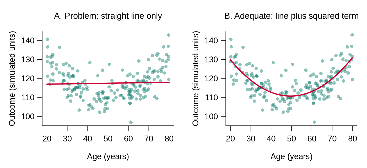
age_ctsq) lets the fitted line bend, so it follows the data. In bp01.csv the relationship between age and systolic pressure is close to a straight line, so the squared term adds little there; having it ready makes the check quick to run.SPSS is a statistics package that is often used through menus. A workflow built only by clicking through menus, in SPSS or any similar program, is difficult to re-derive unless the underlying commands are also saved (SPSS calls them syntax). A script can be re-run six months from now, by a colleague, on a different computer.
R Reflect on what you just ran
Use the questions below to interpret the output shown above, which matches what the code produces when it is run.
1. The mutate() call creates four new variables (age_ct, age_ctsq, age_c3, htn). For each, state in one phrase what kind of variable it is (continuous, categorical, derived) and why a future analyst would want it pre-built.
age_ct is a continuous variable (mean-centred age); centring is useful because the intercept of a regression model that uses it is the predicted outcome for a participant of average age (48 years in bp02). age_ctsq is a derived continuous variable (centred age squared) that allows the model to fit non-linear age effects without high collinearity with linear age. age_c3 is a categorical (factor) variable (three age groups), convenient for stratified summaries and clinical-grouping interpretation. htn is a derived categorical (binary) variable that allows easy contingency analyses and clinically intuitive subgroup reports. Pre-building these in the cleaning script means downstream analysis code references them by name instead of duplicating the recoding logic.2. The threshold for htn is systolic >= 140 | diastolic >= 90. If you raised the systolic cutoff to 150, would the prevalence of "hypertensive" go up or down? What does this tell you about the sensitivity of categorical recodes to threshold choice?
bp02 the 140/90 rule classifies 29.9% of the 1047 participants as hypertensive, and the 150/90 rule 24.0%, so a 10 mmHg shift moves the prevalence by about 6 percentage points. The reproducibility lesson: any categorical cut-point should be defended by reference to clinical guidelines (or explicit alternative cut-points checked in sensitivity analyses), and the analysis script should expose the threshold as a named constant rather than buried in a formula.3. The script writes bp02.csv rather than overwriting bp01.csv. Describe one error this rule would prevent that a point-and-click workflow which saves changes over the working file would not.
bp02.csv instead of overwriting bp01.csv preserves an audit trail of derivations. Point-and-click workflows in menu-driven packages such as SPSS make it easy to save changes over the working dataset unless the commands (syntax) are saved as well, so a bug discovered three steps later cannot be undone, because the original derived state is gone. With versioned outputs, the analyst can re-run from any intermediate point, compare one version with another, and verify the consequence of a single cleaning decision. Concrete bug-prevention: a labelling error in bp02 (e.g., reversed levels) is recoverable because bp01 remains intact to be re-derived.Keeping Track of Variables
Even a relatively focused study can give rise to a large number of variables once transformed and recoded variables have been created. Recommendations include:
Use short but informative names and have all related variables start with the same name. Long names can be shortened by removing vowels (e.g., wtr_cstrn for “water cistern”). If your statistics program is case sensitive, use ONLY lower-case letters. At some point, prepare a master list of all variables.
| Variable | Description |
|---|---|
age | Original data (in years) |
age_ct | Age after centring by subtraction of the mean |
age_ctsq | Quadratic term (age_ct squared) |
age_c2 | Age categorised into 2 categories (young vs old) |
age_c3 | Age categorised into 3 categories |
A Complete Codebook for the Blood Pressure Study
A codebook (also called a data dictionary) lists every variable with its meaning, type, units, allowed values, and number of missing values, so that a collaborator can use the file without asking the original analyst. The table below is the codebook for bp01.csv, extended with the four variables derived in the cleaning script. The ranges and missing counts come from the verification checks in the next section.
| Variable | Description | Type and units | Values or range | Missing |
|---|---|---|---|---|
id | Participant identifier | text | BP0001 to BP1092, one per participant | 0 |
age | Age | number, years | 18 to 85 | 11 |
sex | Sex | text (factor in analysis) | Female, Male | 0 |
smoker | Smoking status | text (factor in analysis) | No, Yes | 0 |
bmi | Body mass index | number, kg/m² | 16.0 to 41.2 | 0 |
systolic | Systolic blood pressure | number, mmHg | 85 to 186 | 18 |
diastolic | Diastolic blood pressure | number, mmHg | 42 to 119 | 19 |
on_treatment | Takes blood-pressure medication | text (factor in analysis) | No, Yes | 0 |
age_ct | Age minus the mean age of 48.05 (derived) | number, years | −30.05 to 36.95 | 0 |
age_ctsq | age_ct squared (derived) | number | 0 to about 1365 | 0 |
age_c3 | Age band (derived) | factor | young (18 to 35), middle (36 to 55), older (56 to 85) | 0 |
htn | Hypertension by the 140/90 rule (derived) | factor | normotensive, hypertensive | 0 |
The missing counts refer to bp01.csv; in the cleaned file every variable is complete because the 45 incomplete records were removed. A codebook is updated each time a variable is added or redefined, and saving it as a .csv file beside the data (as shown in the next section) keeps the two together.
1. Why should you never use compound codes?
2. What is the advantage of double-data entry?
3. When data manipulations are carried out, what should you do with the file?
Reflection
Describe a file-naming and version-control system you would use for a dataset in your own research area. How would you organise the variable names for a study with demographic, clinical, and outcome variables?
YYYYMMDD_studyname_dataset_version.ext (e.g., 20260516_smoking_cohort_clean_v03.csv). Numbered file versions with a one-line log entry for each, plus weekly copies to a second location such as university cloud storage. Scripts can also be tracked with Git, a version-control program that records every saved change, although numbered files and a log achieve the same goal at this stage. Variable naming: lower-case words joined by underscores throughout; demographic prefix dem_ (e.g., dem_age, dem_sex, dem_education); clinical prefix cli_ (cli_bp_systolic, cli_hba1c); outcome prefix out_ (out_mi_5y, out_cvd_death). Avoid spaces and special characters; version suffix for revised derived variables (out_mi_5y_v2); a codebook (a table saved as .csv beside the data) accompanies the dataset documenting type, valid range, missing-data codes, and derivation logic. This is the difference between a dataset a stranger can reproduce in 6 months and one only the original analyst can navigate.Program Files, Data Editing & Verification
Introduction and Overview
An earlier section organised your files and variables. This section turns to the analyses themselves: working in program mode rather than interactively (so the work is reproducible), editing data systematically rather than ad hoc, and verifying that the dataset behaves as expected before you draw any inferences from it. The discipline you build here is what separates a defensible analysis from a fragile one, and it has been argued that reproducibility is now the minimum standard for evaluating computational research (Peng, 2011).
Learning Objectives
- Contrast interactive and program-mode workflows and justify why programs are required for reproducible work.
- Edit data through scripted, documented steps rather than ad hoc fixes to the raw file.
- Run systematic verification checks on ranges, types, and internal consistency.
- Decide when verification is sufficient to move on to substantive analysis.
Program Mode vs. Interactive Processing
Statistical programs can be used in an interactive mode (selecting items from menus or typing in a command) or in program mode (compiling a series of commands into a program and then running it).
Interactive mode is very useful for exploring your data and trying out analyses. However, it should not be used for any of the “real” processing and/or analysis because it is very difficult to keep a clear record of steps taken. Consequently, it is difficult or impossible to reconstruct the analyses you have completed.
Program mode is the recommended approach. You compile the commands into a program and then run it. These program files can be saved and used to reconstruct any analyses you have carried out. Key tips: name files logically, structure the program to be easy to follow, use sequential indents, and document the file thoroughly with comments.
In RStudio, interactive mode corresponds to typing commands directly into the Console pane, or to clicking through menus such as Import Dataset, and program mode corresponds to writing the commands in a script file (.R) and running it. A practical habit combines the two: commands are tried out in the Console, and each command that is kept is copied into the script with a comment, so that the script alone can recreate every result. In R, a comment is any text that follows a # symbol on a line, and R ignores it when the code runs.
Critical Rule
Do all of the analyses in your statistical program. Don’t start doing basic statistics in a spreadsheet. You are going to need the statistical program eventually, and it will be much easier to keep track of all your analyses if they are all done there.
Data Editing
Before beginning any analyses, spend time editing your data. The most important components are:
Data Verification
Before you start any analyses, you must verify that your data are correct. This can be combined with data processing and involves going through all of your variables, one-by-one.
- Determine the number of valid observations and the number of missing values
- Check the maximum and minimum values (or the 5 smallest and 5 largest) to make sure they are reasonable; if they are not, find the error, correct it, and repeat the process
- Prepare a histogram of the data to get an idea of the distribution and see if it looks reasonable
- Determine the number of valid observations and the number of missing values
- Obtain a frequency distribution to see if the counts in each category look reasonable (and to make sure there are no unexpected categories)
bp01.csv in R
The verification steps listed above translate into a handful of R functions. The code below runs them on the raw blood pressure file from the previous section, one check at a time, and the output under each piece of code is what it produces. The table after the code explains how to read each check and what a problem would look like.
library(tidyverse)
bp_raw <- read_csv("data/raw/bp01.csv", show_col_types = FALSE)

# 1. Range, quartiles, mean and number missing for each continuous variable
summary(bp_raw[, c("age", "bmi", "systolic", "diastolic")])# 2. Number of missing values (NA) in every variable
colSums(is.na(bp_raw))# 3. The five smallest and five largest values
head(sort(bp_raw$systolic), 5)
tail(sort(bp_raw$systolic), 5)
head(sort(bp_raw$age), 5)
tail(sort(bp_raw$age), 5)# 4. Histogram: does the shape look reasonable?
hist(bp_raw$systolic, breaks = 30, xlab = "Systolic BP (mmHg)", main = "")The histogram appears in the Plots pane; panel A of the figure below shows it.
# 5. Frequency table for each categorical variable, showing NA if any
table(bp_raw$sex, useNA = "ifany")
table(bp_raw$smoker, useNA = "ifany")
table(bp_raw$on_treatment, useNA = "ifany")# 6. Consistency check: diastolic pressure should never exceed systolic
bp_raw |> filter(diastolic > systolic)
# 7. Every identifier should appear exactly once (compare with nrow)
n_distinct(bp_raw$id)How to read each check.
| Check | What the output shows for bp01.csv | What would signal a problem |
|---|---|---|
1. summary() | Min. and Max. are the smallest and largest values; 1st Qu., Median, and 3rd Qu. split the data into quarters; and NA's counts missing values. Ages run from 18 to 85, BMI from 16.0 to 41.2, systolic pressure from 85 to 186 mmHg, and diastolic pressure from 42 to 119 mmHg, all of which are possible in adults. | A minimum or maximum that cannot be true, such as an age of 999 or a blood pressure of 0, or a mean far from the median, would call for a closer look. |
2. colSums(is.na()) | is.na() marks each missing value as TRUE and colSums() counts the TRUE values in each column: 11 ages, 18 systolic values, and 19 diastolic values are missing, and the other variables are complete. | Missing counts that differ from the study records, or missing values in a variable that should be complete, would need explaining. |
3. head(sort()), tail(sort()) | sort() puts the values in order, head(..., 5) shows the first five, and tail(..., 5) the last five. The lowest systolic value (85 mmHg) and the highest age (85 years) fill all five places shown. A count with sum(bp_raw$systolic == 85, na.rm = TRUE) finds 15 participants at 85 mmHg, and the same count for age finds 6 participants aged 85. | An impossible value would be an error. A pile-up of identical values at the edge, as here, can also mean that values beyond a limit were recorded as the limit, which the study protocol should confirm. |
4. hist() | The histogram of systolic pressure is a single hump centred near 128 mmHg. The small bars above 180 mmHg hold three high but possible readings (181, 186, and 186 mmHg). | An isolated bar far from the rest, or a shape that contradicts what is known about the variable, would need investigation. |
5. table(..., useNA = "ifany") | Each category is listed with its count. The argument useNA = "ifany" adds an NA column only when values are missing, and none are missing here. | An unexpected category, such as a misspelling, or more missing values than expected would need correcting. |
6. filter(diastolic > systolic) | filter() keeps the rows that meet the condition. The result has 0 rows, so no participant has a diastolic reading above the systolic reading. | Any returned row identifies a record to check against the original form. |
7. n_distinct(id) | n_distinct() counts the different values. There are 1092 identifiers for 1092 rows, which confirms one row per participant. | Fewer identifiers than rows would mean duplicated records or repeated measurements that the codebook should explain. |
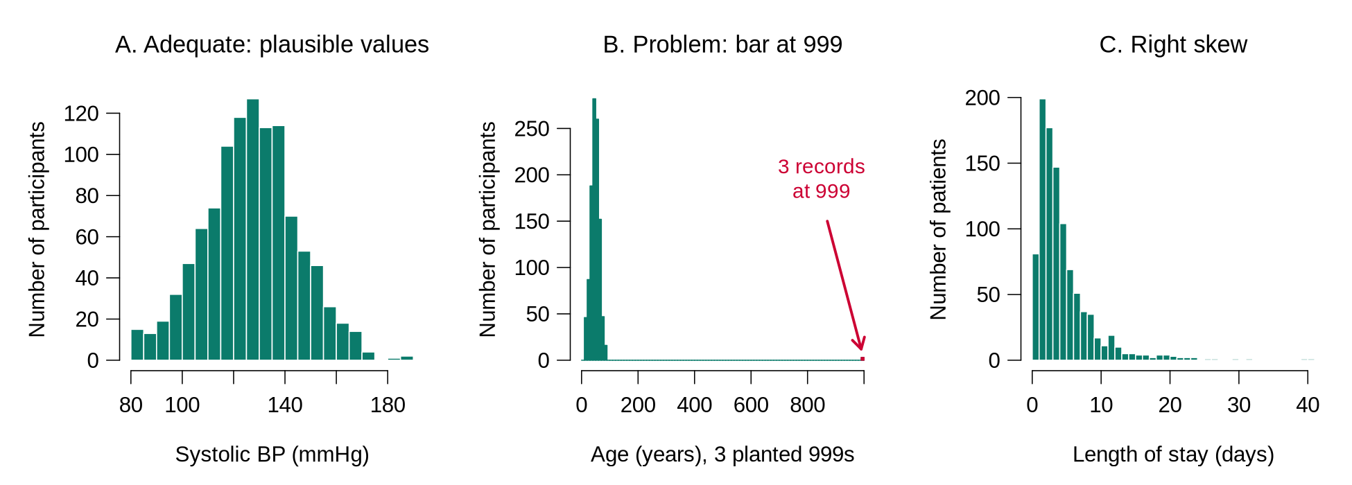
hist() produces. A. Systolic blood pressure in bp01.csv: a single hump of plausible values. B. A copy of bp01.csv in which three missing ages were stored as 999 (planted for illustration): the real ages are squeezed against the left edge, and an isolated bar appears at 999 (highlighted in red here). C. Simulated hospital length of stay: most values are small and a long tail stretches to the right. A skewed shape like C can be correct for the variable; it still matters for later choices, such as the log transformation discussed in the next section.The raw file passes every check above, so the example below plants three typical errors on a copy of the data, leaving the raw file untouched, and shows how the same checks reveal them and how the cleaning script fixes them.
bp_bad <- bp_raw                       # a copy; bp_raw is untouched
bp_bad$age[c(5, 120, 640)] <- 999      # planted: unknown age typed as 999
bp_bad$sex[c(10, 302)] <- "F"          # planted: abbreviation
bp_bad$sex[450] <- "male"              # planted: lower-case spelling

summary(bp_bad$age)
tail(sort(bp_bad$age), 5)
table(bp_bad$sex, useNA = "ifany")The maximum age of 999 and a mean of 50.69 (up from 48.05) reveal the planted code, and the frequency table shows four categories where the codebook allows two. Both problems are fixed in the cleaning script:
# The fix belongs in the cleaning script, never in the raw file
bp_fixed <- bp_bad |>
  mutate(age = na_if(age, 999),
         sex = case_when(sex %in% c("Female", "F") ~ "Female",
                         sex %in% c("Male", "male") ~ "Male"))
summary(bp_fixed$age)
table(bp_fixed$sex, useNA = "ifany")Reading the fix. na_if(age, 999) turns the code into NA. case_when() checks each condition in turn: %in% asks whether the value is one of the listed spellings, and the value after ~ is assigned when it is. Any value that matches no condition becomes NA, so a spelling that the analyst did not anticipate appears as missing in the next frequency table and is never silently relabelled. The fixed counts, 554 women and 538 men, match the raw file. After the fix, age has 14 missing values (11 original and 3 converted); where possible, the three ages are looked up on the original forms and entered through the script.
Variable labels can be stored in R in several ways. The simplest, and the one that works with every package, is a codebook table saved beside the data. The function tribble() builds a small table row by row: the first line names the columns, each name starting with ~, and every following line describes one variable. Category labels are attached separately with factor(), as shown in an earlier section.
codebook <- tribble(
  ~variable,      ~label,                             ~units_or_codes,
  "id",           "Participant identifier",           "BP0001 to BP1092",
  "age",          "Age",                              "years",
  "sex",          "Sex",                              "Female, Male",
  "smoker",       "Smoking status",                   "No, Yes",
  "bmi",          "Body mass index",                  "kg/m2",
  "systolic",     "Systolic blood pressure",          "mmHg",
  "diastolic",    "Diastolic blood pressure",         "mmHg",
  "on_treatment", "Takes blood-pressure medication",  "No, Yes"
)
codebook
write_csv(codebook, "data/codebook_bp01.csv") # saved beside the dataSaving the codebook as a .csv file in the data folder keeps it with the data, and any collaborator can open it in R or in a spreadsheet. When a variable is added or redefined in the cleaning script, the codebook is updated in the same session.
Verification checklist: when to move on
Verification can be considered complete when every statement below is true, and each fix has been made in the cleaning script and recorded in the log.
- Every variable in the file appears in the codebook, with its meaning, type, units, and allowed values.
- The number of rows matches the number of participants (or records) expected from the study records, and every identifier is unique.
- For each continuous variable, the number of missing values is known, and the smallest and largest values are possible.
- Each continuous variable’s histogram shows no isolated bar at a code such as 999 and no shape that contradicts what is known about the variable.
- For each categorical variable, the frequency table shows only the categories listed in the codebook.
- Every missing-value code has been converted to NA.
- Cross-variable checks, such as a search for diastolic readings above the systolic reading or for pregnancies recorded among male participants, return no rows, or every returned row has been checked against the original form.
- The cleaning script runs from top to bottom on the raw file and reproduces the cleaned file exactly.
1. Why should program mode be preferred over interactive mode for “real” data analysis?
2. When verifying continuous variables, what should you examine first?
3. What is the purpose of attaching labels to categorical variable values?
Reflection
Imagine you receive a dataset where a colleague entered data interactively in a spreadsheet with no documentation. What steps would you take to clean, verify, and prepare the data for analysis? What problems might you encounter?
Data Processing & Unconditional Associations
Introduction and Overview
Earlier sections produced a verified, well-documented dataset. This section finally takes the step every student is impatient to make: the actual analysis. We start with how to process outcome and predictor variables for analysis, handle multilevel data structure, and run the “unconditional associations” (single-predictor descriptions) that are the necessary first look at any dataset before you touch a multivariable model.
Learning Objectives
- Process outcome variables to fit the planned analysis (categorical, continuous, count, or rate).
- Process predictor variables, including categorisation, scaling, and recoding decisions.
- Recognise multilevel structure in your dataset and the implications for later modelling.
- Run and interpret unconditional (single-predictor) associations as the first analytic step.
- Keep an analytic log that allows you to reconstruct every decision you made.
Processing the Outcome Variable(s)
While verifying data, you can also start processing your outcome variable(s). Review the stated goals of the study to determine the format(s) which best suits the goal(s). Consider the following based on outcome type:
Is the distribution of outcomes across categories acceptable? For example, if you planned a multinomial regression with a 3-category outcome, but very few observations fall in one of the categories, you might want to recode it to a 2-category variable.
Does the variable have the characteristics necessary for the planned analysis? If linear regression is planned, is the distribution approximately normal? If not, explore transformations. Note: It is the normality of the residuals which is ultimately important, but if the original variable is far from normal and there are no strong predictors, the residuals are unlikely to be normal.
If Poisson regression is planned, are the mean and variance of the distribution approximately equal? The Poisson model assumes they are; when the variance runs well above the mean (a pattern called overdispersion), the fitted standard errors come out too small and the p-values look stronger than the data warrant. If that happens, consider negative binomial regression or alternative analytic approaches.
What proportion of the observations are censored? You might also want to generate a simple graph of the empirical hazard function to get an idea what shape it has.
Outcome Types at a Glance
The table below gathers the outcome types from the slide and the accordion above, with an example of each, the model usually used, the check to make now, and where the model is taught. The checks in the fourth column belong to this lesson.
| Outcome type | Example | Usual model | What to check now | Where it is taught |
|---|---|---|---|---|
| Binary (two categories) | Hypertensive or normotensive (htn) | Logistic regression | Both categories should contain a reasonable number of people, because a rare category gives unstable estimates. | It is taught in a later lesson, Linear and Logistic Regression. |
| Categorical with three or more categories | Smoking status recorded as never, former, or current | Multinomial regression (unordered) or ordinal regression (ordered) | The count in each category should be checked, and categories that hold only a handful of people can be combined. | It is taught in a later lesson, Generalized Linear Models. |
| Continuous | Systolic blood pressure in mmHg | Linear regression | A histogram should show no strong skew; if it does, a transformation such as the logarithm can be tried, and the residuals are checked after the model is fitted. | It is taught in a later lesson, Linear and Logistic Regression. |
| Count or rate | Number of clinic visits in a year | Poisson regression, or negative binomial regression when the variance is much larger than the mean | The mean and the variance of the counts should be compared, and the check is repeated after the model is fitted, because the Poisson assumption applies to people who share the same values of the predictors. | It is taught in a later lesson, Generalized Linear Models. |
| Time to event | Years from enrolment to a cardiovascular event | Survival models, such as the Cox model | The proportion of censored observations should be counted, and the event rate over time can be plotted. | These models are beyond the scope of this course; HSCI 341 Lesson 8, Time-to-Event Data, introduces them. |
Four terms in this section need plain definitions.
| Term | Plain-language meaning |
|---|---|
| Censoring | In time-to-event data, a record is censored when follow-up ends before the event has happened, for example because the study closed or the person moved away. The analyst knows only that the event time is later than the last contact, and survival methods use that partial information. |
| Variance | Variance measures spread. It is the average of the squared distances between each value and the mean (R divides by n − 1), and its square root is the standard deviation. |
| Residual | A residual is the difference between a person’s observed value and the value the model predicts for that person (observed minus predicted). Linear regression assumes that the residuals are roughly bell-shaped around zero. |
| Overdispersion | A count outcome is overdispersed when its variance is clearly larger than its mean. The Poisson model assumes the two are about equal, so overdispersion makes its standard errors too small and its p-values too optimistic. |
The check for a Poisson model is to compare the mean of the counts with their variance. The invented example below records clinic visits in one year for ten patients at each of two clinics; var() computes the variance.
# Clinic visits in one year for ten patients at each of two clinics
visits_a <- c(0, 2, 4, 3, 2, 6, 1, 3, 2, 3)
visits_b <- c(0, 1, 1, 0, 9, 2, 0, 12, 1, 0)
mean(visits_a)
var(visits_a)
mean(visits_b)
var(visits_b)Reading the output. Both clinics average 2.6 visits per patient. For clinic A, the squared distances from 2.6 are 6.76, 0.36, 1.96, 0.16, 0.36, 11.56, 2.56, 0.16, 0.36, and 0.16; they sum to 24.4, and 24.4 ÷ 9 = 2.71, because var() divides by n − 1 = 9. A variance this close to the mean is what a Poisson model expects. In clinic B, most patients have no visits or one visit and two have 9 and 12, so the variance (18.27) is about seven times the mean. That pattern is overdispersion, and a negative binomial model would be the safer starting point for these counts.
Residuals and Transformations
A residual is easiest to understand in a picture. Panel A of the figure below fits a straight line for systolic pressure against age in the cleaned blood pressure data and draws, for 25 randomly chosen participants, the vertical distance between each observed value and the line. Panel B collects the residuals of all 1047 participants in a histogram; a roughly bell-shaped histogram centred on zero is what linear regression assumes. Residuals are checked after a model is fitted, which a later lesson covers in detail. At the processing stage the analyst looks at the outcome itself, because a strongly skewed outcome rarely produces bell-shaped residuals.
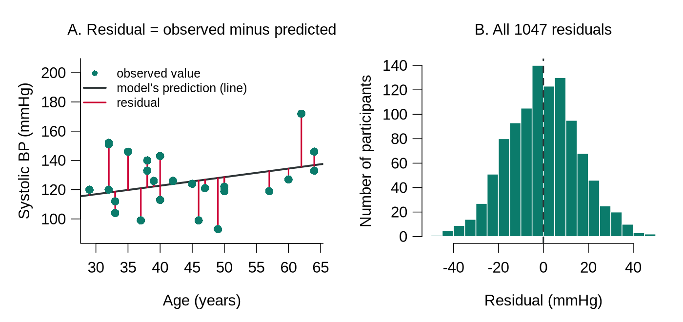
bp01.csv after cleaning). A. Each red segment is one participant’s residual, the observed value minus the value on the fitted line; points above the line have positive residuals. B. Histogram of all 1047 residuals, centred on zero (dashed line) and roughly bell-shaped, which is the pattern linear regression assumes.When an outcome has a long right tail, taking the natural logarithm of each value, log() in R, often makes the distribution close to symmetric, because the logarithm shrinks large values much more than small ones. The simulated example below uses hospital length of stay in days. The function rlnorm() draws right-skewed values for the simulation, and round(..., 1) keeps one decimal place.
# Simulated hospital length of stay (days) for 1000 patients
set.seed(4104)
los <- round(rlnorm(1000, meanlog = 1.2, sdlog = 0.8), 1)
summary(los)        # mean well above median: a sign of right skew
summary(log(los))   # after the log transformation
hist(los, breaks = 40)          # before: long right tail
hist(log(los), breaks = 30)     # after: roughly symmetric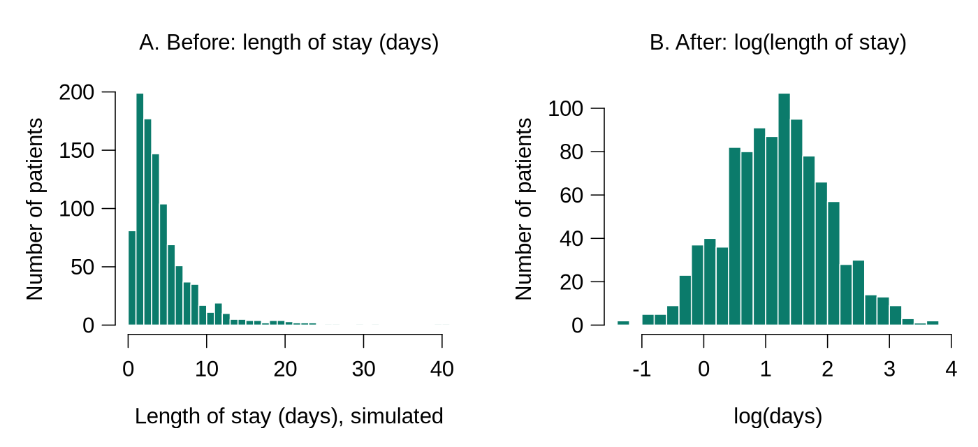
log(): the tail is pulled in and the shape is roughly symmetric.Reading the output. Before the transformation the mean (4.57 days) is well above the median (3.40 days), because the few very long stays pull the mean upwards; this gap is a quick numerical sign of right skew. After the transformation the mean (1.19) and median (1.22) are close, matching the symmetric histogram. In a real analysis the new variable is created in the cleaning script, for example mutate(log_los = log(los)), and the transformation is recorded in the codebook. The logarithm is defined only for values above zero, so an outcome that contains zeros needs adjustment first; the next lesson returns to transformations.
Processing Predictor Variables
It is important to go through all predictor variables to determine how they will be handled:
- Missing values: Are there many? If so, you might need to abandon plans to use that predictor, or conduct 2 analyses (one on the subset where the predictor is present and one on the full dataset ignoring the predictor). A third option, multiple imputation, fills each missing value several times with plausible values predicted from the other variables and combines the results; the next lesson introduces it. Whichever option is chosen is recorded in the analysis log with its reason.
- Distribution: For continuous variables, is there a reasonable representation over the whole range of values? If not, it might be necessary to categorise the variable.
- Categorical variables: Are all categories reasonably well represented? If not, you might have to combine categories.
The first question about any predictor is how much of it is missing. The two lines below give the count and the percentage of missing values for every variable in the raw blood pressure file. colMeans(is.na()) gives the proportion missing, because R counts each TRUE as 1 and each FALSE as 0.
colSums(is.na(bp_raw))                    # number missing per variable
round(100 * colMeans(is.na(bp_raw)), 1) # percentage missing per variableThe decision that follows belongs in the analysis log in plain words. An entry for this file might read as follows.
The analyst types the log entry by hand, using the counts from the output above; 45 of 1092 participants is 4.1%.
The cross-tabulation below splits the cleaned blood pressure data into ten-year age bands and counts normotensive and hypertensive participants in each. The breaks c(17, 29, 39, ...) work because ages are whole numbers, so the band above 17 and up to 29 holds ages 18 to 29.
# bp_clean comes from the recoding pipeline in the section on data coding
bp_dec <- bp_clean |>
  mutate(age_dec = cut(age, c(17, 29, 39, 49, 59, 69, 79, Inf),
                       labels = c("18-29", "30-39", "40-49", "50-59",
                                  "60-69", "70-79", "80+")))
table(bp_dec$age_dec, bp_dec$htn)# Merge the two oldest bands into 70+
bp_dec <- bp_dec |>
mutate(age_dec6 = cut(age, c(17, 29, 39, 49, 59, 69, Inf),
labels = c("18-29", "30-39", "40-49", "50-59",
"60-69", "70+")))
table(bp_dec$age_dec6, bp_dec$htn)Reading the output. Before merging, the 80+ band holds only 17 participants, and only 3 of them are normotensive. A logistic model that compares each band with a reference band would estimate the 80+ effect from those 3 people, which gives a very wide confidence interval: with 50–59 as the reference band, the odds of hypertension in the 80+ band are estimated at about 11 times the odds in the reference band, with a 95% confidence interval from about 3 to more than 38. A band with no normotensive participants at all would prevent the model from converging (the fitting procedure cannot settle on an answer). Merging 70–79 and 80+ into 70+ gives 24 normotensive and 49 hypertensive participants, enough for a stable estimate. The 18–29 band has only 4 hypertensive participants and might likewise be merged with 30–39. Each merge is a judgement made before the outcome model is fitted, and it is recorded in the log.
Multilevel Data
If your data are multilevel (e.g., blood pressure measurements within individuals within centres), evaluate the hierarchical structure:
Key Questions for Multilevel Data
What is the average (and range) number of observations at one level in each higher-level unit? Are individuals uniquely identified within a hierarchical level? It is often useful to create one unique identifier for each observation in the dataset.
Why this matters: observations from the same person, or the same centre, resemble one another more than observations drawn at random, so a model that ignores the clustering behaves as if it holds more independent information than it really does. The result is standard errors that are too small and confidence intervals that are too narrow. Mixed models, which arrive later in the course, are built for exactly this structure.
Multilevel data are usually stored in long format, with one row per measurement and columns that identify the person and the centre. The small table below, typed into R for illustration with tribble(), holds ten blood pressure measurements on five people in two centres.
# Long format: one row per measurement (illustrative data typed into R)
bp_long <- tribble(
  ~centre, ~person, ~visit, ~sbp,
  "A",     "A01",   1,      132,
  "A",     "A01",   2,      128,
  "A",     "A02",   1,      141,
  "A",     "A02",   2,      139,
  "A",     "A02",   3,      137,
  "B",     "B01",   1,      118,
  "B",     "B01",   2,      121,
  "B",     "B02",   1,      150,
  "B",     "B03",   1,      126,
  "B",     "B03",   2,      124
)
Three counts characterise the hierarchy. count(bp_long, centre, person) counts the rows for each combination of centre and person, which is the number of measurements per person; distinct() keeps one row per person, so counting those rows by centre gives the number of people per centre; and n_distinct() counts the different person identifiers.
count(bp_long, centre, person)                        # measurements per person
bp_long |> distinct(centre, person) |> count(centre)  # people per centre
n_distinct(bp_long$person) # people overallReading the output. People have between one and three measurements, centre A has two people and centre B three, and there are five people in total. Here every person identifier begins with the centre letter, so each person is uniquely identified across centres. If two centres had both numbered their patients 01, 02, 03, the analyst would build a unique identifier first, for example with mutate(uid = paste(centre, person)), so that no merging step could confuse two people.
Unconditional Associations
Before proceeding with any multivariable analyses, it is important to evaluate unconditional associations within the data, that is, the crude one-predictor-at-a-time relationships examined with nothing else held constant. These serve as the foundation for building more complex models.
| Variable Types | Analytical Approach |
|---|---|
| Two continuous variables | Correlation coefficient, scatterplot, simple linear regression |
| One continuous + one categorical | One-way ANOVA, simple linear or logistic regression |
| Two categorical variables | Cross-tabulation and χ² test |
In the middle row of the table, the choice depends on which variable is the outcome. When the continuous variable is the outcome, as when systolic pressure is compared across smoking groups, one-way ANOVA or a simple linear regression compares the group means, and the two methods give the same overall p-value for any number of groups. When the categorical variable is the outcome and has two categories, as when hypertension is related to age, simple logistic regression is used; it is taught in a later lesson. The worked examples below run one example of each row on the cleaned blood pressure data (bp_clean from the recoding pipeline in the section on data coding; in a new R session, that script is run first).
The correlation coefficient r summarises how closely two continuous variables follow a straight line. cor() computes it, and cor.test() adds a 95% confidence interval and a p-value.
cor(bp_clean$age, bp_clean$systolic)        # correlation coefficient r
cor.test(bp_clean$age, bp_clean$systolic) # adds a 95% CI and a p-valueThe scatterplot shows the shape of the relationship, and a simple linear regression puts a number on the slope. confint() gives 95% confidence intervals for the coefficients.
plot(systolic ~ age, data = bp_clean)         # scatterplot
fit1 <- lm(systolic ~ age, data = bp_clean)   # simple linear regression
coef(fit1)
confint(fit1) # 95% CIs for the coefficientsReading the output. The correlation is r = 0.48: systolic pressure tends to be higher in older participants, with considerable scatter. As a rough guide, values of |r| below about 0.3 are described as weak, values from about 0.3 to 0.7 as moderate, and values above about 0.7 as strong; the labels are conventions, and the scatterplot should always be inspected as well. In the cor.test() output, the 95% confidence interval for r runs from 0.43 to 0.52, and the p-value (< 2.2e-16) means that a correlation this large would almost never arise by chance if age and systolic pressure were unrelated; t and df are the test statistic and its degrees of freedom. The regression slope for age is 0.585: on average, systolic pressure is 0.59 mmHg higher for each additional year of age (95% CI 0.52 to 0.65). The intercept, 99.4 mmHg, is the predicted value at age 0, which lies far outside the data and has no practical meaning; centred age would give an intercept for a participant of average age.
A model reporting sentence. “Systolic blood pressure was moderately correlated with age (r = 0.48, 95% CI 0.43 to 0.52); in a simple linear regression, each additional year of age was associated with a 0.59 mmHg higher systolic pressure (95% CI 0.52 to 0.65), before adjustment for other variables.”
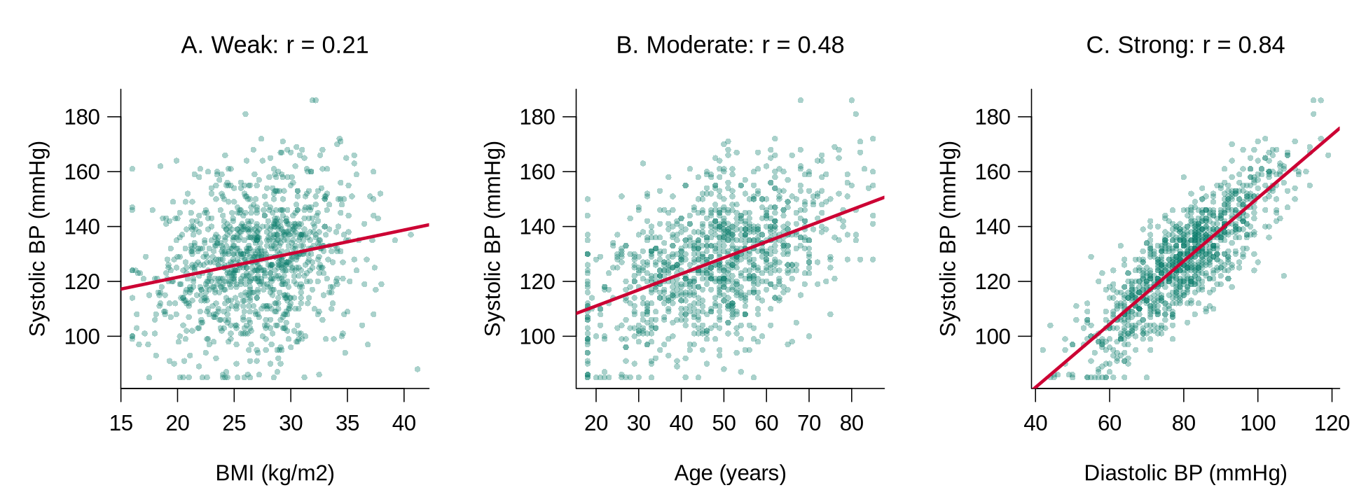
For two groups, the group means and a simple linear regression answer the question together. tapply(x, group, mean) applies mean() to x separately within each group.
table(bp_clean$smoker)                             # group sizes
tapply(bp_clean$systolic, bp_clean$smoker, mean)   # mean systolic by group
fit2 <- lm(systolic ~ smoker, data = bp_clean)
coef(fit2)
confint(fit2)For three or more groups, one-way ANOVA tests whether the group means differ. The example uses the three age bands created earlier.
# Three or more groups: one-way ANOVA across the age bands
tapply(bp_clean$systolic, bp_clean$age_c3, mean)
summary(aov(systolic ~ age_c3, data = bp_clean))Reading the output. Mean systolic pressure is 126.3 mmHg among the 811 non-smokers and 131.5 mmHg among the 236 smokers. In the regression, the intercept (126.3) is the mean for the reference group, non-smokers, because No is the first level of smoker, and the coefficient smokerYes (5.15) is the difference between the two group means, with a 95% CI of 2.57 to 7.73 mmHg that excludes zero. In the ANOVA table, Df gives the degrees of freedom (number of groups minus 1, and number of people minus number of groups), Sum Sq and Mean Sq measure the variation between and within the groups, F value is the ratio of between-group to within-group variation, and Pr(>F) is the p-value. An F of 111.4 with p < 2e-16 indicates that mean systolic pressure differs across the age bands; ANOVA does not identify which bands differ, so the group means (115.6, 126.8, and 136.8 mmHg) are reported alongside it.
A model reporting sentence. “Mean systolic pressure was 131.5 mmHg among smokers and 126.3 mmHg among non-smokers, an unadjusted difference of 5.1 mmHg (95% CI 2.6 to 7.7). Mean systolic pressure also differed across age bands (one-way ANOVA, F = 111.4 on 2 and 1044 degrees of freedom, p < 0.001), rising from 115.6 mmHg in participants aged 35 or younger to 136.8 mmHg in those older than 55.”
A cross-tabulation counts the participants in every combination of two categorical variables, and row percentages make the groups comparable. prop.table(tab, margin = 1) divides each count by its row total.
tab <- table(smoker = bp_clean$smoker, htn = bp_clean$htn)
tab                                            # counts
round(100 * prop.table(tab, margin = 1), 1) # row percentagesThe chi-squared test asks whether the pattern of counts differs from what would be expected if the two variables were unrelated. The expected counts are worth printing, because the test is unreliable when any expected count is small.
chisq.test(tab)                                # chi-squared test
chisq.test(tab)$expected # expected counts if unrelatedReading the output. Hypertension is more common among smokers (35.2%, 83 of 236) than among non-smokers (28.4%, 230 of 811). The chi-squared statistic is 3.73 on 1 degree of freedom with p = 0.054. R applies a small correction (Yates’ continuity correction) automatically for a table with two rows and two columns. A p-value of 0.054 indicates weak evidence against no association: the data are somewhat unusual under no association, and a difference at least this large would arise in about 5 of every 100 samples of this size if there were no association. The crude difference will also change once age, a likely confounder, is taken into account. All expected counts are far above 5, so the test is appropriate here; when any expected count falls below 5, Fisher’s exact test, fisher.test(tab), is used instead.
A model reporting sentence. “Hypertension was more common among smokers (35.2%) than among non-smokers (28.4%), although the evidence for an unadjusted association was weak (chi-squared test, p = 0.054).”
When evaluating unconditional associations, pay attention to:
- Associations between predictors and outcome: Determine if there is any association at all; determine the functional form (is it linear?); get a simple picture of the strength and direction.
- Associations between pairs of predictors: Look for potential collinearity problems (highly correlated predictors).
- Confounding variables: Evaluate associations between the confounders identified in the causal diagram and the key predictors of interest and the outcome. These associations show how strongly each confounder could distort the crude comparison; the decision to adjust for a confounder rests on the diagram.
A correlation matrix shows the correlation between every pair of continuous variables at once. cor() applied to several columns returns the matrix, and round(..., 2) keeps two decimal places.
round(cor(bp_clean[, c("age", "bmi", "systolic", "diastolic")]), 2)Reading the output. Each cell is the correlation between the row variable and the column variable, and the diagonal is always 1. A common rule of thumb flags pairs with |r| above about 0.8 as possible collinearity problems. Systolic and diastolic pressure (r = 0.84) cross that line, which is expected because both measure blood pressure; a model would normally include one of them, or a combined measure, as a predictor. The correlation matrix helps detect collinearity, whereas the choice of confounders to include in a model comes from the causal diagram.
What to do next. The unconditional analyses feed directly into the plan for the multivariable model.
| Finding | What to do next |
|---|---|
| A confounder from the DAG shows little crude association with the outcome. | The confounder stays in the planned model, because the decision to adjust rests on the causal diagram. |
| A scatterplot shows a curve. | The analyst plans a squared term (such as age_ctsq) or a categorised version (such as age_c3) for that predictor. |
| Two predictors have |r| above about 0.8. | The analyst treats them as candidates for collinearity and keeps the one that best matches the research question, or combines them. |
| A cross-tabulation has an expected count below 5. | The analyst uses Fisher’s exact test or combines sparse categories before modelling. |
| An association is far stronger or weaker than subject-matter knowledge suggests. | The analyst rechecks the coding and verification of both variables before interpreting it. |
Keeping Track of Your Analyses
Before starting the more substantial analysis, set up a system for keeping track of your results:
1. Why should you evaluate unconditional associations before multivariable analyses?
2. If a continuous outcome variable is far from normally distributed, what should you do?
3. What is the appropriate analytical approach for evaluating the association between two categorical variables?
Reflection
Consider a dataset with 15 predictor variables and one continuous outcome. Unconditional analyses examine each predictor on its own (its distribution, missing values, and its association with the outcome one predictor at a time) before any multivariable model is fitted, so that data problems and effect sizes are visible before adjustment hides them. Describe the sequence of unconditional analyses you would carry out before fitting any multivariable models. How would you handle a predictor that has 30% missing values?
A Structured Approach to Data Analysis: Final Assessment
Bringing It All Together
This lesson laid out a structured workflow for taking a dataset from collection to first analysis. The first section insisted that you start with a causal diagram and a clear separation of outcomes, predictors, confounders, and intervening variables, before you touch the data. The section on coding, entry, and file management turned that intent into discipline at the level of files: thoughtful coding, a project folder you could hand to a collaborator, and a codebook that captures every variable. The section on program files and verification made the workflow reproducible by moving you out of point-and-click interactive mode into program-mode scripts, with systematic editing and verification. The section on data processing closed the loop by processing outcomes and predictors, surfacing multilevel structure, and producing the unconditional associations that should always precede a multivariable model.
The thread running through all four sections is that an analysis is only as trustworthy as the steps that came before it. Every later lesson in this course, including linear regression, model building, logistic regression, count data, and mixed models, assumes you arrive at the modelling step with a clean, documented, and well-understood dataset. The structured approach is what makes the rest of the course possible. It also positions you to interpret p-values, confidence intervals, and effect sizes responsibly when you eventually report them (Wasserstein & Lazar, 2016; Greenland et al., 2016), and to avoid the analytic flexibility that drives false-positive results (Simmons, Nelson, & Simonsohn, 2011). A first plain-language reading of a p-value and a confidence interval accompanies the mediation example in the first section, and the worked examples of unconditional associations apply both; later lessons return to them with every model. The historical roots of exploratory data analysis trace to John Tukey.
Key Takeaways from this lesson
- Always start with a causal diagram: it forces you to declare your outcome, predictors, confounders, and intervening variables before the data can mislead you.
- Data analysis is iterative; expect to back up several steps as you learn more about your data.
- Coding and file-management decisions made in the first hour shape every analysis you run afterward; treat them as part of the analysis, not pre-work.
- Use program mode, not interactive clicks: a script you can re-run is the only honest record of what you did.
- Verify the dataset (ranges, types, consistency) before you trust any descriptive or inferential output.
- Run unconditional associations first; they reveal data problems and effect sizes that a multivariable model will hide.
Reflection
This lesson set out a structured approach to data analysis in four steps: (1) start with a causal diagram that separates outcomes, predictors, confounders, and intervening variables before touching the data; (2) plan data coding, file management, and a codebook so that the project could be handed to a collaborator; (3) work in program mode with scripts rather than interactive point-and-click processing, and edit and verify the data systematically; and (4) process the outcome and predictor variables, identify any multilevel structure, and examine unconditional associations before fitting a multivariable model. Which of these steps do you consider the most important, and why? How would you apply the structured approach to a dataset you are currently working with or plan to work with in the future?
adjustmentSets(), and write the analysis plan down, with a date, before modelling begins. Verification and the unconditional analyses then proceed as described in this lesson; they examine the outcome’s distribution and the crude associations, and any change they prompt to the plan, such as a transformation or a merged category, is recorded in the log with its reason. Writing the plan down in advance, which some studies do formally by registering it publicly (pre-registration), is what separates confirmatory from exploratory analysis. Both are valuable, and labelling each clearly is what makes a causal claim defensible.Final Knowledge Assessment
1. What is the first step recommended before beginning any data analysis?
2. Why should you avoid starting analyses in a spreadsheet?
3. What coding value should NOT be assigned to missing data?
4. Why is a 2-digit numerical suffix recommended for file names?
5. What is the danger of using the “sort” command in a spreadsheet for data entry?
6. What is the primary purpose of evaluating unconditional associations between pairs of predictors?
7. When processing a categorical outcome with 3 categories, when might you recode it to 2 categories?
8. What approach should be used to document what a program file does?
9. For verifying a continuous variable, what visual tool is recommended?
10. What is the appropriate analysis for the association between one continuous and one categorical variable?
11. If a predictor variable has many missing values, what options are available?
12. What should you do with log files from your analyses?
13. Why is interactive mode still useful despite its limitations?
14. When you evaluate the confounders identified in the causal diagram, which ones can distort the crude comparison the most?
15. What does the chapter suggest you should do if a count/rate outcome’s mean and variance are not approximately equal?
✦ Before submitting: pass every section knowledge check (100%) and complete every reflection.