Data Cleaning &
Descriptive Analyses
Exploratory Data Analysis For Epidemiology
Learning objectives for this lesson:
- Identify common types of data errors and their sources in the data pipeline
- Distinguish between missing data mechanisms (MCAR, MAR, MNAR) and their analytic implications
- Apply systematic data cleaning strategies including range checks, outlier detection, and consistency verification
- Select and implement appropriate methods for handling missing data
- Calculate and interpret measures of central tendency, spread, and shape
- Construct and interpret descriptive summaries appropriate for epidemiologic research
- Assess distributional assumptions and select appropriate visualization techniques
This course was developed by Dr. Kiffer G. Card, Faculty of Health Sciences, Simon Fraser University based on Dohoo, I. R., Martin, S. W., & Stryhn, H. (2012). Methods in Epidemiologic Research. VER Inc.
Glossary: Key Terms, People & Concepts
📚 Reference page, available throughout the lesson
This glossary collects the key concepts, people, and ideas you will meet in this lesson. Use it as a reference while you work through the material, or as a review before assessments. Type in the search box to filter entries.
Data Quality & Types of Errors
Introduction and Overview
An earlier lesson set up the structured workflow that takes raw data from collection to analysis-ready files. This lesson zooms into two specific phases of that pipeline that deserve their own treatment: cleaning the data (detecting errors, handling missing values, deciding how to deal with outliers) and producing descriptive analyses (the numerical summaries and visualisations that every analysis report eventually needs). The three content sections walk through this in order: data quality and types of error (this section), the cleaning workflow itself (a later section), and descriptive statistics and Table 1 (a later section).
Learning Objectives
- Trace where errors enter the collection → entry → storage → analysis pipeline.
- Distinguish between common error types (random vs. systematic, structural vs. value-level).
- Classify missing-data mechanisms (MCAR, MAR, MNAR) and explain why the distinction matters.
- Describe variable types in epidemiologic data and the operations each type supports.
The Data Pipeline
Before any statistical analysis can begin, data must travel through a pipeline: collection → entry → storage → analysis. Errors can be introduced at every stage, and understanding where problems arise is the first step toward ensuring high-quality data for epidemiologic research.
Key Principle
The quality of your analysis can never exceed the quality of your data. Careful attention to data quality at each stage of the pipeline is a prerequisite for valid epidemiologic inference. Data quality has several dimensions. Wang and Strong (1996) asked data users what quality meant to them and found many dimensions beyond accuracy. Four of them matter at every cleaning step and appear in the walkthrough above: accuracy (the values are correct), completeness (the values are present), timeliness (the values are current enough for the question) and consistency (the values are recorded in the same format and agree with each other). A fifth, relevance, asks whether the data suit the research question at all.
At the collection stage, errors may arise from poorly worded survey items, interviewer bias, instrument malfunction, or participant misunderstanding. During data entry, transcription mistakes and coding errors are common. Storage introduces risks of data corruption, version control problems, and format incompatibilities. Finally, at the analysis stage, incorrect variable coding, inappropriate transformations, and software errors can compromise results.
Types of Data Errors
Errors in epidemiologic datasets take many forms. Van den Broeck, Argeseanu Cunningham, Eeckels, & Herbst (2005) describe data cleaning as a three-stage process, screening, diagnosing, and editing, that should be planned into study design rather than improvised after collection. Click each card below to learn about common error types.
Screening means looking systematically for values that seem odd, such as an age of 220 or an empty cell where an answer was expected. Diagnosing means deciding what each odd value is: an error, a true but unusual value, or a missing-data code. Editing means acting on the diagnosis by correcting the value from the source document, setting it to missing, or leaving it unchanged, and recording the decision. Planning these steps before data collection allows the study team to build some of the checks into the data-entry system itself.
Two Further Ways to Classify Errors
The five error types above describe what an error looks like in the file. Two further distinctions describe how an error behaves, and both affect what the analyst can do about it.
Random versus systematic error. A random error is unpredictable in direction: a reader misjudges a blood pressure gauge by a few mmHg, sometimes upward and sometimes downward. Random errors add noise, which widens the spread of the data and makes estimates less precise. Their effect on a mean tends to cancel out, but random error in an exposure weakens estimated associations toward no effect, and random error in a measurement compared with a cut-off, such as 140 mmHg, changes the proportion above that cut-off. A systematic error pushes values in the same direction every time, as with a miscalibrated scale that adds 2 kg to every weight. Systematic errors do not cancel out, so they produce bias, meaning an estimate that is consistently too high or too low. Range checks catch some random errors, such as an impossible value, whereas a systematic error usually leaves values that look plausible and can be found only by comparison with an outside source, such as a recalibrated instrument.
Structural versus value-level error. A structural error affects the layout of the file: a variable stored as text when it should be a number, two variables merged into one column, a record that appears twice, or a missing-data code such as -9 mixed in with real values. A value-level error affects a single cell, such as one blood pressure entered as 1,200. Structural problems are usually fixed first, because value-level checks such as range checks give misleading answers when a column has the wrong type or contains codes.
Missing Data
Missing data are ubiquitous in epidemiologic research. The mechanism by which data become missing has profound implications for the validity of subsequent analyses. Rubin (1976) identified three missing data mechanisms:
Important Warning
The missing data mechanism is an assumption that cannot be verified from the observed data alone. You should always conduct sensitivity analyses to assess how your results might change under different assumptions about the missing data mechanism.
Data Dictionaries and Codebooks
A data dictionary (or codebook) is a structured document that describes every variable in a dataset: its name, label, type, valid range, coding scheme, and source. Maintaining a comprehensive data dictionary is essential for:
- Ensuring consistency across data entry operators
- Facilitating communication among research team members
- Supporting reproducibility when analyses are revisited months or years later
- Identifying and resolving coding discrepancies
Variable Types in Epidemiologic Data
Correctly classifying variables is fundamental to choosing appropriate cleaning strategies and analytic methods.
The Course Dataset and Its Codebook
The R activities in this lesson use phaa_survey.csv, a simulated cross-sectional survey of 800 adults that later lessons also use. The table below is a codebook excerpt for the variables this lesson works with most. A hard limit marks values that cannot be correct for this survey; values beyond it are treated as errors. A soft limit marks values that are possible but unusual; values between a soft and a hard limit are flagged for investigation, checked against the source where possible, and kept unless they are shown to be wrong. The limits are the rules applied in this lesson.
| Variable | Type and units | Valid values (hard limits) | Soft limits (flag and check) | Missing code |
|---|---|---|---|---|
id | Text identifier | P0001 to P0800, each appearing once | None | Never missing |
age | Continuous; whole years | 18 to 100 (only adults were eligible) | Above 90 | Blank cell |
systolic_bp | Continuous; mmHg, whole numbers | 80 to 220 | Below 90 or above 180 | Blank cell |
bmi | Continuous; kg/m², one decimal | 13 to 60 | Below 16 or above 50 | Blank cell |
smoker | Binary; text | "Yes" (current smoker) or "No" | None | Blank cell |
dep1 to dep7 | Ordinal questionnaire items | 1 (Never) to 5 (Always); a higher value means a more frequent depressive symptom | None | Blank cell |
income | Ordered categories; text | "<25k", "25-50k", "50-75k", "75-100k", ">100k" | None | Blank cell |
In this file a missing value is an empty cell, which R reads as NA (not available). Many real files instead store codes such as -9 (refused) or 999 (not asked); the codebook is where such codes are declared, and the next section shows how to convert them before any analysis. A full codebook would also record each variable's source, such as the questionnaire item or the measurement protocol; in this simulated file every variable comes from a single survey record per participant.
Getting Ready to Run R
Setup Before the First R Box
Each R box in this lesson can be run in RStudio or any R console. Three preparations are needed once, before the first box.
- Download
phaa_survey.csv(the link appears in each R box) and save it in a folder for this course. R looks for files in its working directory, the folder it is currently pointed at. In RStudio the menu Session > Set Working Directory > Choose Directory points R at the folder, andgetwd()prints the folder R is using. Ifread.csv()reports that it cannot open the file, the file is not in the working directory. - Install the two add-on packages used in this lesson by running
install.packages("psych")andinstall.packages("mice")once. A package is a bundle of extra functions; installing copies it to the computer, andlibrary(psych)loads it at the start of each new R session. - Open a new R script (File > New File > R Script), copy the code from each box into it in the order the boxes appear, and save the script in the same folder. The order matters, because later boxes use objects created by earlier ones.
A line of code runs when the cursor is on it and Ctrl+Enter (Cmd+Return on a Mac) is pressed, and the result appears in the Console pane. Selecting several lines and pressing the same keys runs them together, and the Source button runs the whole script from top to bottom. Running one line at a time allows each result to be compared with the annotated output on this page.
The code shown on this page is the starter code for every activity and can be copied directly. The answer-key script linked in each activity box contains the same code together with worked answers, and it becomes available after the responses to that box are saved.
Narrated R walkthrough: Data Cleaning and Descriptive Statistics in R
This walkthrough applies the steps of this lesson to the Canadian Social Connection Survey, one line at a time. It keeps the rows and columns an analysis needs, explores each variable before changing it, recodes and checks every recode, and then describes the data with summary statistics, plots, stratified tables and a Table 1.
Open the Data Cleaning and Descriptive Statistics in R walkthroughReading R Code: A Short Primer
R code is a sequence of instructions. Most lines either create an object (a named result stored in memory) or ask R to display something. The symbols in the table below appear throughout this lesson.
| Symbol or term | Example | What it means |
|---|---|---|
<- | x <- c(4, 7, 9) | The arrow stores the result on its right under the name on its left. The example creates an object called x that holds three numbers. |
c() | c("age", "bmi") | The function c() combines values into a vector, an ordered list of values of the same type. |
| Functions and arguments | mean(x, na.rm = TRUE) | A function is a named command followed by parentheses. The values inside the parentheses are its arguments, and name = value sets an option. |
$ | phaa$age | The dollar sign picks one column out of a data frame (R's name for a table of rows and columns). phaa$age is the age column of the data frame phaa. |
[ ] | phaa$age[3]phaa[1:5, c("id", "age")] | Square brackets select elements. For a single column, [3] picks the third value. For a data frame, the part before the comma picks rows and the part after the comma picks columns, so the second example shows the ID and age of the first five people. |
== < > <= >= != | phaa$age < 18 | Comparisons return TRUE or FALSE for each value. A double equals sign tests whether two values are equal, and != tests whether they differ. |
| and & | phaa$age < 18 | phaa$age > 100 | The vertical bar means "or" and the ampersand means "and". The example is TRUE for any age below 18 or above 100. |
! | !is.na(phaa$bmi) | The exclamation mark turns TRUE into FALSE and FALSE into TRUE, so the example is TRUE wherever BMI is present. |
NA | phaa$bmi[phaa$bmi > 60] <- NA | NA is R's code for a missing value. The example replaces every BMI above 60 with a missing value. |
na.rm = TRUE | mean(phaa$age, na.rm = TRUE) | Most summary functions return NA when any value is missing. The argument na.rm = TRUE (remove NAs) tells the function to leave missing values out. |
~ | boxplot(systolic_bp ~ smoker, data = phaa) | The tilde reads as "by" or "depending on". The example draws systolic blood pressure separately for each smoking group. |
# | # a note for readers | Everything after # on a line is a comment for human readers, and R ignores it. |
library() | library(psych) | The function loads an installed package so that its functions can be used in the current session. |
A First Look at the Raw File
Screening starts by reading the file and comparing what arrived with the codebook. Four commands do most of this work: dim() reports the number of rows and columns, str() (structure) lists each variable with its type and first few values, summary() gives the minimum, quartiles, mean and maximum of numeric variables, and colSums(is.na()) counts the missing values in each column (is.na() marks each missing cell as TRUE and colSums() adds up the TRUEs in each column).
# Read the raw file. Blank cells and the text "NA" become missing values (NA).
phaa <- read.csv("phaa_survey.csv", stringsAsFactors = FALSE,
                 na.strings = c("", "NA"))

dim(phaa)                 # number of rows (people) and columns (variables)
str(phaa)                 # each variable's type and its first few values
summary(phaa[, c("age", "systolic_bp", "bmi", "dep1")])
table(phaa$smoker, useNA = "ifany")   # counts for a text (character) variable
colSums(is.na(phaa)) # how many values are missing in each column| Output | What it shows | What to do with it |
|---|---|---|
dim(): 800 27 | The file has 800 rows, one per participant, and 27 columns, one per variable. | The counts match the codebook. A different count would suggest an incomplete download or a different version of the file. |
str(): chr, int, num | The label chr means text (character), int means whole numbers and num means numbers that can have decimals. | Every variable has the type the codebook leads one to expect. A numeric variable listed as chr would signal text, such as "unknown", hiding in the column. |
summary(): Min. and Max. | Age runs from -3 to 220, systolic BP from 60 to 300 and BMI up to 95. The middle of each distribution (quartiles and median) looks ordinary. | These five values break the hard limits in the codebook. The next section diagnoses them and sets them to missing. |
table() | Smoking status takes only the two codes in the codebook, "No" (664) and "Yes" (136), with no missing values. | No recoding is needed. Variants such as "yes" or "Y" would appear here as extra categories. |
colSums(is.na()) | Five variables have missing values: income (35), physical activity (28), social support (20), and the items dep4 (15) and anx2 (15). | These counts are the starting point for the missing-data decisions in the next section. |
1. A researcher discovers that a participant’s recorded date of diagnosis is earlier than their date of birth. What type of error is this?
2. Under which missing data mechanism can complete-case analysis still produce unbiased estimates?
3. Which of the following is NOT a primary purpose of a data dictionary?
● Complete the knowledge check to continue.
Data Cleaning Strategies
Introduction and Overview
An earlier section named the kinds of errors that can enter a dataset. This section provides the cleaning workflow that addresses them: systematic verification, outlier identification, missing-data handling, transformations, recoding, and string cleaning. Each step has its own techniques and its own decisions to document.
Learning Objectives
- Run range, type, and consistency checks as a first systematic verification pass.
- Identify outliers and decide whether to keep, transform, or exclude them, with reasons recorded.
- Choose an appropriate missing-data strategy (complete-case, single imputation, multiple imputation) given the plausible mechanism and the amount missing.
- Apply transformations and derive new variables without losing the audit trail back to the raw data.
- Document every cleaning decision so that another analyst could reproduce your final dataset.
Systematic Verification
Data cleaning should follow a systematic, documented process. The goal is not to “fix” data arbitrarily but to identify and resolve genuine errors while preserving the integrity of valid observations.
Range checks verify that values fall within predefined valid or plausible bounds. For example, gestational age should be between approximately 20 and 44 weeks; human body temperature typically ranges from 35°C to 42°C.
Define both hard limits (biologically impossible values that should be flagged as errors) and soft limits (unusual but possible values that should be reviewed).
The two kinds of limit lead to different actions. A value beyond a hard limit is an error: it is corrected from the source document if possible and otherwise set to missing. A value between a soft limit and a hard limit is flagged for investigation: the analyst lists it, checks it against the source where possible, and keeps it unless it is shown to be wrong. The codebook excerpt in the previous section gives both kinds of limit for the course data.
Consistency checks examine whether values across multiple fields are logically compatible. Examples include verifying that discharge dates occur after admission dates, that a participant’s age is consistent with their reported date of birth, and that skip patterns in questionnaires are respected.
These checks often require domain knowledge about the relationships between variables.
Cross-validation involves comparing data from multiple sources to verify accuracy. For example, comparing self-reported medication use with pharmacy dispensing records, or verifying diagnoses against medical chart reviews.
When discrepancies arise, establishing a hierarchy of data source reliability is essential for deciding which value to retain.
Identifying Outliers
Outliers are observations that lie far from the bulk of the data. They may represent genuine extreme values, data errors, or observations from a different population. The visual tools used to spot them, including box plots, stem-and-leaf displays, and the broader practice of looking at data before modelling, trace back to Tukey (1977). Several methods are used to identify them:
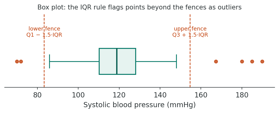
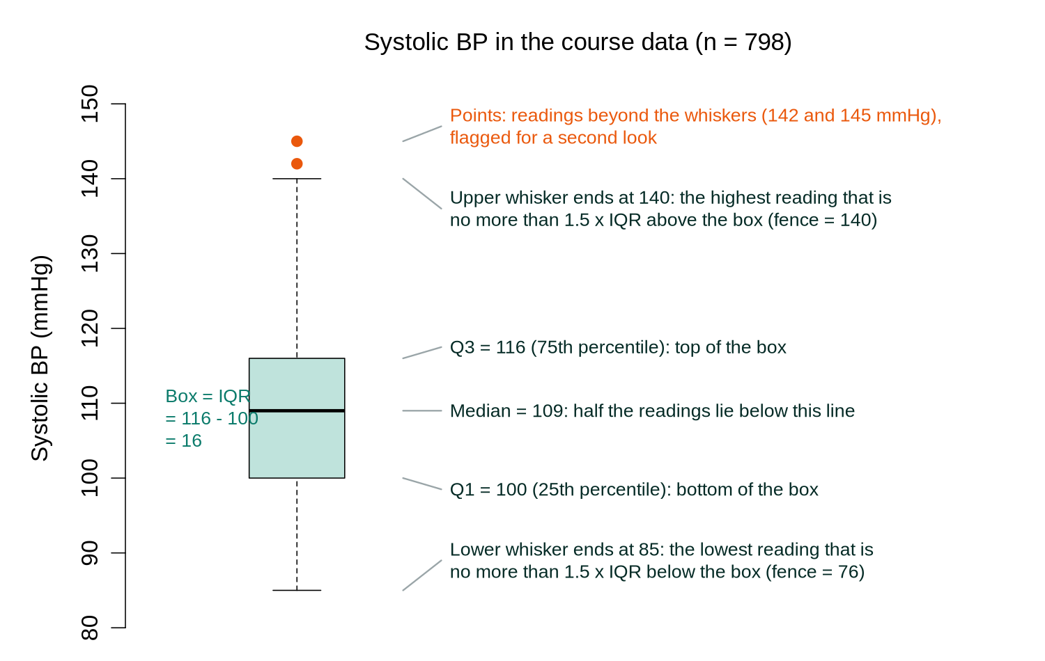
The interquartile range (IQR) method defines outliers as values falling below Q1 − 1.5×IQR or above Q3 + 1.5×IQR, where Q1 and Q3 are the 25th and 75th percentiles, respectively.
This method is robust to extreme values because it is based on percentiles rather than the mean and standard deviation. Values beyond 3×IQR from the quartiles are sometimes termed “extreme outliers.”
Worked Example: IQR Fences for Eleven Readings
Eleven systolic blood pressure readings (mmHg), sorted from lowest to highest, are 96, 102, 106, 110, 112, 115, 118, 121, 125, 131 and 184.
| Step | Calculation | Result |
|---|---|---|
| Median: the middle (6th) value | 96, 102, 106, 110, 112, 115, 118, 121, 125, 131, 184 | 115 |
| Q1: halfway between the 3rd and 4th values | (106 + 110) / 2 | 108 |
| Q3: halfway between the 8th and 9th values | (121 + 125) / 2 | 123 |
| IQR | 123 − 108 | 15 |
| Lower fence | 108 − 1.5 × 15 = 108 − 22.5 | 85.5 |
| Upper fence | 123 + 1.5 × 15 = 123 + 22.5 | 145.5 |
| Values outside the fences | 184 is above 145.5 | 184 is flagged |
The reading of 184 mmHg is flagged for investigation. It also lies beyond Q3 + 3 × IQR = 168, so some texts would call it an extreme outlier. A systolic pressure of 184 mmHg is high but physiologically possible, so the next step is to check the source record, and the value is kept if it is confirmed. Textbooks differ slightly in how they place Q1 and Q3 for some sample sizes; for these eleven values the method above gives the same quartiles as R's quantile() and boxplot() functions, as the R box later in this section shows.
The z-score method standardizes each observation as z = (x − mean) / SD. Values with |z| > 3 are commonly flagged as potential outliers.
This approach assumes an approximately normal distribution and can be misleading for heavily skewed data because the mean and SD are themselves influenced by outliers (the masking effect).
Worked Example: A z-Score
The standard deviation (SD) measures the typical distance of values from their mean; a later section explains how it is calculated. Suppose systolic blood pressure in a population has a mean of 120 mmHg and an SD of 15 mmHg. A reading of 180 mmHg has z = (180 − 120) / 15 = 60 / 15 = 4, so it lies four SDs above the mean. The absolute value |z|, the size of z ignoring its sign, is 4, which is above the usual cut-off of 3, so the reading is flagged. A reading of 135 mmHg has z = (135 − 120) / 15 = 1, one SD above the mean, which is ordinary. In a bell-shaped (normal) distribution about 99.7% of values lie within three SDs of the mean, which is why |z| > 3 is the conventional flag. In R, scale() converts every value of a variable to its z-score in one step.
Visual inspection using boxplots, histograms, and scatterplots is often the most informative first step in outlier detection.
- Boxplots display the median, IQR, and individual outliers beyond the whiskers
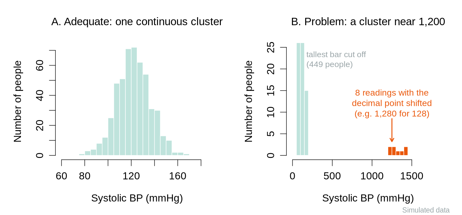
- Histograms reveal gaps in the distribution that may indicate erroneous values
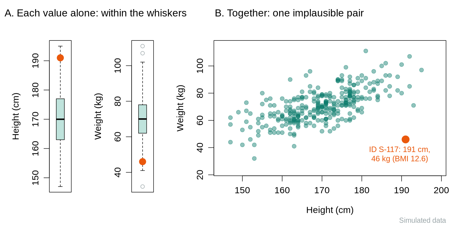
- Scatterplots can reveal bivariate outliers that appear normal when each variable is examined individually
Visual methods should complement, not replace, quantitative rules. Always investigate outliers before deciding to exclude them.
Practical Tip
Never delete an outlier simply because it is extreme. Investigate whether it represents a data error, a genuinely unusual observation, or a member of a different subpopulation. Document every decision to retain or remove an outlier in your audit trail.
What the Visual Checks Reveal
Two kinds of problem are easier to see in a plot than in a table of numbers. A histogram (a bar chart of how many values fall in each range) shows gaps and separate clusters. When a decimal point is shifted during data entry, the shifted values form a small cluster at ten times the typical value, far from the main distribution, as in panel B below.
A scatter plot shows each person as a point with two measurements. A bivariate outlier is a combination of values that is implausible even though each value is ordinary on its own. In the simulated example below, a height of 191 cm and a weight of 46 kg each lie inside the boxplot whiskers, but together they imply a BMI of 12.6, which would be life-threatening. Only the scatter plot reveals the problem.
Outlier Rules in R
The code below repeats the eleven-reading example, then applies the IQR rule and z-scores to BMI in the raw course file, and finally counts the values that fall in the soft-limit zones from the codebook. It continues from the first-look box in the previous section, so phaa still holds the raw data. quantile(x, probs = c(0.25, 0.75)) returns Q1 and Q3, IQR() returns their difference, boxplot.stats(x)$out lists the values beyond the fences that a boxplot would draw as points, and which() returns the row numbers where a condition is TRUE, so that the IDs can be listed.
# Worked example: the eleven readings from the text
x <- c(96, 102, 106, 110, 112, 115, 118, 121, 125, 131, 184)
quantile(x, probs = c(0.25, 0.75))     # Q1 and Q3
IQR(x)                                  # Q3 minus Q1
boxplot.stats(x)$out                    # values beyond the fences

# The same steps on BMI in the course file (before any cleaning)
q     <- quantile(phaa$bmi, probs = c(0.25, 0.75), na.rm = TRUE)
iqr   <- IQR(phaa$bmi, na.rm = TRUE)
lower <- q[1] - 1.5 * iqr
upper <- q[2] + 1.5 * iqr
c(lower, upper)
flag <- which(phaa$bmi < lower | phaa$bmi > upper)
length(flag)                            # how many rows are flagged
phaa[flag, c("id", "bmi")]              # who they are, and their values

# z-scores: scale() computes (x - mean) / SD for every value
z <- as.numeric(scale(phaa$bmi))
phaa$id[which(abs(z) > 3)]              # IDs with |z| greater than 3
round(z[which(phaa$bmi == 31.6)], 2)   # z for the BMI of 31.6

# Masking: repeat without the impossible BMI of 95
bmi_ok <- phaa$bmi[phaa$bmi < 60]
round(c(mean = mean(phaa$bmi), sd = sd(phaa$bmi)), 2)
round(c(mean = mean(bmi_ok), sd = sd(bmi_ok)), 2)
round((31.6 - mean(bmi_ok)) / sd(bmi_ok), 2)

# Soft limits: count values that deserve a second look (nothing is changed)
sum(phaa$systolic_bp < 90 | phaa$systolic_bp > 180)
sum(phaa$bmi < 16 | phaa$bmi > 50)| Output | What it shows |
|---|---|
| Eleven readings | R reproduces the hand calculation: Q1 = 108, Q3 = 123, IQR = 15, and only 184 lies beyond the fences. |
| BMI fences 11.45 and 30.25 | Five BMI values are flagged. One (95.0, ID P0078) is impossible; the other four (30.3 to 31.6) are ordinary values for adults with obesity. The IQR rule finds what is unusual in this sample, and it cannot tell an error from a real value, so the four plausible values are kept and the 95.0 is handled by the hard limit in the activity below. |
| z-scores | Only P0078 has |z| > 3. The BMI of 31.6 has z = 2.58 because the single value of 95 pulls the mean up and inflates the SD from 3.24 to 4.17. With the impossible value removed, the same reading has z = 3.34, and the readings of 30.6 and 30.8 also exceed 3 (z = 3.03 and 3.09). One extreme error hid three unusual values from the z rule, which is called masking. |
| Soft-limit counts | 48 systolic readings lie below 90 or above 180 mmHg. Two of them (60 and 300) are beyond the hard limits; the other 46 lie between 85 and 89 mmHg, which is low but possible, so they are flagged and kept. Likewise 67 BMI values lie below 16 or above 50; one is the impossible 95, and the other 66 lie between 15.0 and 15.9 and are kept. |
These lines only display results and leave phaa unchanged; the activity box below reads the raw file again and makes the replacements.
Range Checks in Practice
The activity below applies the hard limits from the codebook to the course file. It is the editing stage of the screening, diagnosing and editing sequence: the values were screened in the first-look box, diagnosed as impossible in the outlier box, and are now replaced, with each change listed first.
This block uses the course dataset phaa_survey.csv, the simulated survey of 800 adults introduced in the previous section; later lessons use the same participants. It reads the raw file again, so it can be run on its own. Step 3a prints how many values break each hard limit from the codebook and lists their IDs before step 3b replaces them, which leaves a record of exactly what changed. Values in the soft-limit zones (counted in the previous box) are left as they are. All the code needed is shown here; the answer-key script linked above contains the same code with worked answers and becomes available after the responses are saved.
# 1. Read the raw file. Treat blank cells as missing (na.strings).
phaa <- read.csv(file = "phaa_survey.csv",
                 stringsAsFactors = FALSE,
                 na.strings = c("", "NA"))
summary(phaa$age)                 # before the conversion in step 2

# 2. Make sure age and bmi are numeric (in a real export they often arrive
#    as character because a cell holds text such as "unknown"; here every
#    cell is a number, so no NAs are created at this step).
phaa$age <- as.numeric(phaa$age)
phaa$bmi <- as.numeric(phaa$bmi)
summary(phaa$age)                 # after the conversion

# 3a. Count and list the rows that break each hard limit BEFORE changing them
sum(phaa$age < 18 | phaa$age > 100, na.rm = TRUE)
phaa$id[which(phaa$age < 18 | phaa$age > 100)]
sum(phaa$systolic_bp < 80 | phaa$systolic_bp > 220, na.rm = TRUE)
phaa$id[which(phaa$systolic_bp < 80 | phaa$systolic_bp > 220)]
sum(phaa$bmi < 13 | phaa$bmi > 60, na.rm = TRUE)
phaa$id[which(phaa$bmi < 13 | phaa$bmi > 60)]

# 3b. Range checks: replace the impossible values with NA
phaa$age[phaa$age < 18 | phaa$age > 100] <- NA
phaa$systolic_bp[phaa$systolic_bp < 80 | phaa$systolic_bp > 220] <- NA
phaa$bmi[phaa$bmi < 13 | phaa$bmi > 60] <- NA
summary(phaa$age)                 # after the range check

# 4. Put the education levels in order (lowest to highest) so that
#    comparisons such as <= are meaningful
phaa$education <- factor(phaa$education,
  levels = c("Less than high school", "High school", "Some college",
             "Bachelor's", "Graduate degree"),
  ordered = TRUE)
levels(phaa$education)
Why never overwrite the raw file? Range-check rules will change as you learn more about the data. Keeping phaa_survey.csv untouched lets you replay the cleaning from a known starting state.
R Reflect on what you just ran
Use the questions below to interpret the output you produced. Look at your console / plot before answering.
1. Look at summary(phaa$age) before and after the line phaa$age <- as.numeric(phaa$age). How many NAs appear, and what does that count tell you about the raw data quality?
read.csv() already stores age as integer and summary() reports the quartiles before and after as.numeric() with 0 NAs both times; the conversion changes nothing here. The NAs appear at step 3, where the 18 to 100 range check turns those two impossible ages into NA (summary(phaa$age) then shows 2 NAs). Had the raw file contained text such as "unknown" or "30s", the column would have arrived as character and as.numeric() would have produced one NA per unparseable cell (with a warning). Either way the NA count is a direct measure of data-quality flaws in the raw entry: each NA is a value the original data collection accepted but that cannot be analysed quantitatively.2. After the range-check on systolic_bp, how many rows were set to NA? Why is replacing impossible values with NA preferable to deleting those rows entirely?
3. After making education an ordered factor, what does levels(phaa$education) show? Why does the ordering matter for any analysis that asks "as education goes up, does X change?"
levels(phaa$education) shows the five levels in the specified order: "Less than high school" < "High school" < "Some college" < "Bachelor's" < "Graduate degree". Ordering matters because an ordered factor lets R interpret "higher education" as a meaningful direction in regression and tests, so linear contrasts become interpretable, and later analyses that look for a trend across education levels treat the categories in the right order. Without the ordering R defaults to alphabetical, which makes "Bachelor's" < "Graduate degree" < "High school" < "Less than high school" < "Some college", which is nonsensical for inferential purposes.Handling Missing Data
The choice of method for handling missing data depends on the assumed missing data mechanism and the proportion of missingness. Practical guidance on implementing multiple imputation via chained equations, including how to specify the imputation model, how many imputations to draw, and how to diagnose problems, is given by White, Royston, & Wood (2011).
Five Terms Used in This Section
Complete-case analysis (also called listwise deletion) analyses only the rows that have no missing value on any variable used in the analysis.
Bias is a systematic difference between an estimate and the true value, so that repeating the study many times would give answers that are too high, or too low, on average.
Precision describes how much an estimate would vary from sample to sample; a precise estimate changes little when the study is repeated.
The standard error (SE) measures that sample-to-sample variation. For a mean it equals the standard deviation divided by the square root of the number of observations, so it shrinks as the sample grows.
A confidence interval (CI) is a range around an estimate, roughly the estimate plus or minus two standard errors for a 95% interval, that shows the values compatible with the data.
Missing data can damage both properties. Losing rows lowers precision (larger standard errors and wider confidence intervals), and missingness that is related to the values being studied, either directly (MNAR) or through observed variables linked to them (MAR), can bias a complete-case analysis.
Excludes any observation with one or more missing values. Simple to implement, but can dramatically reduce sample size and introduces bias unless data are MCAR. In multivariable models with many variables, even low rates of missingness on individual variables can lead to large cumulative losses.
Uses all available data for each analysis. For example, when computing a correlation matrix, each pair of variables uses all cases with non-missing values for that pair. This preserves more data than listwise deletion, but can produce inconsistent results. For example, correlations computed on different subsets of people can form a set that could not all have come from one group of people (technically, a correlation matrix that is not positive semi-definite), which some later methods cannot use.
Mean imputation replaces missing values with the variable mean. While simple, it underestimates variance and distorts relationships between variables. Median imputation is more robust for skewed distributions. Mode imputation is used for categorical variables.
All single imputation methods treat the imputed value as if it were known with certainty, leading to underestimated standard errors and overly narrow confidence intervals.
Multiple imputation creates several (typically 5–20) plausible imputed datasets, analyzes each separately, and pools the results using Rubin’s rules. This approach correctly accounts for the uncertainty due to missing data and produces valid inference under the MAR assumption.
Rubin’s rules average the estimates from the completed datasets and combine two sources of variation in the standard error: the ordinary variation within each dataset and the variation between datasets, which reflects how uncertain the imputed values are.
Multiple imputation is widely used for handling missing data in epidemiologic research when the proportion of missingness is non-trivial. It needs care: the imputation model should include the outcome and the variables that predict missingness (Sterne et al., 2009).
Missing Data in R: How Much, and Who Is Missing?
The lines below continue from the activity above, so phaa now holds the data after the range checks. complete.cases() returns TRUE for each row with no missing value, na.omit() returns a copy of the data with every incomplete row removed, and tapply(y, group, mean) calculates the mean of y separately for each value of group.
# How much is missing, and where? (after the range checks above)
n_miss <- colSums(is.na(phaa))
n_miss[n_miss > 0]                       # only the columns with gaps
round(100 * n_miss[n_miss > 0] / nrow(phaa), 1)   # the same, as percentages
sum(complete.cases(phaa))                # rows with no gap in any column
nrow(na.omit(phaa))                      # na.omit() keeps only those rows

# Do people with and without a recorded income differ on what was observed?
inc_miss <- is.na(phaa$income)           # TRUE = income missing
table(inc_miss)
round(tapply(phaa$age, inc_miss, mean, na.rm = TRUE), 1)
round(tapply(phaa$systolic_bp, inc_miss, mean, na.rm = TRUE), 1)
round(prop.table(table(inc_miss, phaa$smoker), margin = 1) * 100, 1)| Output | What it shows |
|---|---|
| Missing values by column | Eight columns now have gaps: the five from the raw file plus age, BMI and systolic BP, which gained NAs from the range checks. The largest share is income, at 4.4%. |
complete.cases() and na.omit() | Only 687 of 800 rows (85.9%) are complete. No variable is missing more than 4.4% of its values, yet a complete-case analysis that used every column would lose 113 people (14%), because the gaps fall on different people. An analysis that uses only a few variables loses far fewer, so na.omit() should be applied only to the columns an analysis needs, for example na.omit(phaa[, c("age", "systolic_bp")]). |
| Comparison by income missingness | The 35 people without an income value are a little younger (42.6 versus 45.3 years), have slightly lower systolic BP (105.3 versus 108.4 mmHg) and smoke less often (8.6% versus 17.4%, which is 3 of the 35 people). Differences like these, if real, would argue against MCAR and suggest that missingness depends on observed variables (MAR). |
Because the course file is simulated, its true mechanism is known: the income values were deleted completely at random. The differences in the comparison therefore arose by chance in a group of only 35 people. Comparisons of this kind can suggest a mechanism, and small groups can produce sizeable differences by chance alone, so they cannot establish one.
Reasoning About the Mechanism
The observed data can show that missingness is related to observed variables, which is evidence against MCAR. They cannot show whether missingness depends on the missing values themselves, because those values were never recorded. Whether MNAR is plausible is therefore judged from subject knowledge. Income is the standard example: refusal to answer income questions is often reported to be more common among people with high incomes, so an analyst should treat MNAR as a real possibility for income even when a comparison like the one above looks reassuring. By contrast, a blood pressure reading lost because a machine failed at random times is a case where MCAR is plausible.
Because the mechanism cannot be confirmed from the data, it is stated as an assumption in the methods section of a report. An example sentence is: "Income was missing for 35 of 800 participants (4.4%). We assumed that income was missing at random given age, gender, education and region, and handled it with multiple imputation; a sensitivity analysis that assumed non-responders had higher incomes than similar responders gave similar results." The sentence reports the amount missing, the assumed mechanism, the method used, and how the conclusion was checked.
What Little’s MCAR Test Can and Cannot Show
Little’s test (Little, 1988) compares the means of the observed variables across groups of people with different patterns of missing values. A small p-value (a result that would be unlikely if the data were MCAR) is evidence that the data are not MCAR. A large p-value is weak reassurance: the test has little power (ability to detect a departure from MCAR) when few values are missing, and because it uses only observed values it cannot detect MNAR at all. The test is available in add-on R packages (for example as mcar_test() in the naniar package) and is not needed in this course; the group comparison above examines the same question in a form that is easier to read.
Worked Example: Missing High Earners Bias the Mean
Ten people have annual incomes (in thousands of dollars) of 22, 28, 31, 35, 40, 46, 52, 60, 85 and 120. Their total is 519, so the true mean is 519 / 10 = 51.9.
| Scenario | Calculation from the eight observed values | Mean | Error |
|---|---|---|---|
| Two people chosen at random (31 and 52) do not answer | (519 − 31 − 52) / 8 = 436 / 8 | 54.5 | +2.6 |
| The two highest earners (85 and 120) do not answer | (519 − 85 − 120) / 8 = 314 / 8 | 39.25 | −12.65 |
When the missing people are chosen at random (MCAR), the error can go in either direction and averages out to zero over many repetitions; the only cost is a smaller sample. When the highest values are the ones that go missing (MNAR), every complete-case mean is pulled downward, and collecting more data of the same kind does not remove the error. The simulation below repeats the comparison with 10,000 simulated incomes.
The code simulates 10,000 incomes with a long right tail. set.seed() fixes the random numbers so that the results repeat exactly, rlnorm() draws right-skewed values, and runif(10000) < 0.30 is TRUE for a random 30% of people.
set.seed(410)
income <- round(rlnorm(10000, meanlog = log(55), sdlog = 0.6))  # simulated, $1000s
mean(income)                            # the true mean in this population

# MCAR: everyone has the same 30% chance of leaving the question blank
inc_mcar <- income
inc_mcar[runif(10000) < 0.30] <- NA
mean(inc_mcar, na.rm = TRUE)

# MNAR: the top quarter of earners leave it blank far more often
p_miss <- ifelse(income > quantile(income, 0.75), 0.70, 0.15)
inc_mnar <- income
inc_mnar[runif(10000) < p_miss] <- NA
mean(inc_mnar, na.rm = TRUE)

# Standard error of a mean = SD / square root of n (smaller = more precise)
sd(income) / sqrt(10000)
sd(inc_mcar, na.rm = TRUE) / sqrt(sum(!is.na(inc_mcar)))The true mean is 65.9. With MCAR missingness the complete-case mean, 65.3, is close to the truth, and the standard error rises from 0.437 to 0.509 because fewer values remain: no bias, lower precision. With MNAR missingness the complete-case mean is 54.4, about 11.5 thousand dollars too low, and no method that uses only the observed incomes can recover the missing information without further assumptions.
How Much Missing Data Is Too Much?
No single threshold applies to every study. As a rough guide, many applied texts suggest that when fewer than about 5% of the rows needed for an analysis have missing values and MCAR is plausible, complete-case analysis is unlikely to change the conclusions much. When more is missing, when missingness is related to observed variables, or when MNAR is plausible, multiple imputation under a stated MAR assumption, together with a sensitivity analysis, is the safer choice. The proportion that matters is the share of rows lost from the specific analysis, which can be much larger than the share missing on any one variable, as the 687 complete rows above show.
This guide also explains where complete-case analysis fits in this lesson. It is defensible when little is missing and MCAR is plausible, which is the situation in the scale activity in the next section, where na.omit() drops the 15 people (about 2%) who skipped one depression item before a factor analysis. It becomes hard to defend when many rows are lost or when the people with missing values differ from the rest.
Missing-Data Codes Such as -9 and 999
Many data systems cannot leave a cell empty, so they store a code such as -9 (refused) or 999 (not asked) instead. R treats these codes as real numbers. A single age of 999 among the 800 ages in the course file would raise the mean by about 1.2 years, and in a small sample, as in the example below, one code can move a mean by decades. The codebook lists the codes for each variable, and the analyst converts them to NA before any summary is calculated. The course file uses empty cells only, so the example below uses a short made-up vector. The operator %in% asks, for each value on its left, whether it appears in the list on its right.
age_raw <- c(34, -9, 51, 999, 47)    # -9 = refused, 999 = not asked
mean(age_raw)                        # wrong: the codes are averaged as if they were ages
age_raw[age_raw %in% c(-9, 999)] <- NA
age_raw
mean(age_raw, na.rm = TRUE)          # na.rm = TRUE leaves the NAs out
# The codes can also be converted while reading a file:
# mydata <- read.csv("mydata.csv", na.strings = c("", "NA", "-9", "999"))The first mean, 224.4, is meaningless because the codes were averaged as if they were ages; after the conversion the mean of the three real ages is 44. The na.strings argument converts codes while the file is read, but it applies to every column, so it is safe only when the code cannot be a real value in any column. A value of 999 could be a real number of minutes of activity per week, for example. Converting codes column by column with %in%, guided by the codebook, avoids that problem.
The mice package (multivariate imputation by chained equations) fills each missing value with a draw from a model built from the other variables, repeats this to create several completed datasets, analyses each dataset, and pools the results with Rubin’s rules. The minimal example below imputes the 28 missing physical-activity values using age, gender, smoking status, BMI and social support, and estimates the mean weekly activity. It continues from the boxes above, so phaa holds the cleaned data.
library(mice)
mi_vars <- phaa[, c("age", "gender", "smoker", "bmi", "phys_act_min",
                    "social_support_score")]
mi_vars$gender <- factor(mi_vars$gender)
mi_vars$smoker <- factor(mi_vars$smoker)
imp <- mice(mi_vars, m = 5, seed = 2026, printFlag = FALSE)  # 5 completed datasets
fit <- with(imp, lm(phys_act_min ~ 1))   # lm(y ~ 1) estimates the mean of y
summary(pool(fit), conf.int = TRUE)      # pooled with Rubin's rules

# Complete-case estimate and its standard error, for comparison
mean(phaa$phys_act_min, na.rm = TRUE)
sd(phaa$phys_act_min, na.rm = TRUE) / sqrt(sum(!is.na(phaa$phys_act_min)))| Code or output | What it means |
|---|---|
mice(mi_vars, m = 5, seed = 2026, printFlag = FALSE) | The function creates five completed datasets; seed makes the random draws repeatable and printFlag = FALSE hides the progress messages. When the package loads, R prints messages about functions it masks, which can be ignored. |
with(imp, lm(phys_act_min ~ 1)) | The same analysis is run on each completed dataset. lm(y ~ 1) is a regression with no predictors, whose single coefficient (the intercept) is the mean of y; the next lesson introduces regression fully. |
estimate, std.error, 2.5 % and 97.5 % | The pooled mean is 175.7 minutes per week with a standard error of 2.94 and a 95% confidence interval from 170.0 to 181.5. These are the numbers to report. |
| Complete-case mean and standard error | The complete-case mean is 176.1 (SE 2.96). The two answers agree closely, as expected, because the values in this simulated file were removed completely at random. With MAR missingness in real data the two can differ noticeably, and the imputed estimate is the one that corrects the bias when the MAR assumption holds. |
Data Transformations
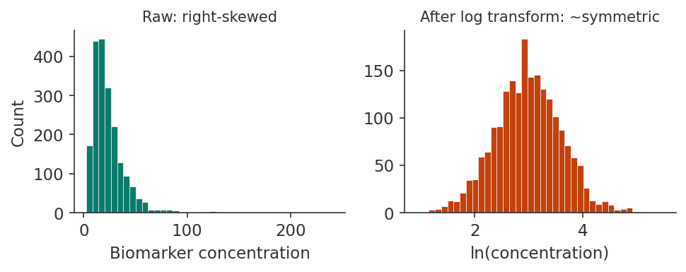
When continuous variables are heavily skewed, transformations can make the distribution more symmetric, stabilize variance, and improve the validity of parametric methods.
Parametric methods, such as the t-test and linear regression, assume that the data (or the errors of a model) follow a particular distribution, usually the bell-shaped normal distribution, which is fully described by its mean and standard deviation. When that assumption is badly wrong, their standard errors and confidence intervals can be misleading. Rank-based (non-parametric) methods, described in a later section, make fewer assumptions.
| Transformation | Formula | When to Use |
|---|---|---|
| Log (natural) | ln(x) or ln(x + 1) | Right-skewed data, multiplicative relationships (e.g., biomarker concentrations, income) |
| Square root | √x | Count data, moderately right-skewed distributions |
| Inverse (reciprocal) | 1/x | Strongly right-skewed data; commonly used for rates and times |
The log of zero does not exist (R returns -Inf, minus infinity), so a variable that contains zeros, such as the number of clinic visits, cannot be logged directly. The usual remedy is to add 1 to every value first, ln(x + 1), which turns 0 into ln(1) = 0 and keeps all values in the same order. The constant 1 is a convention; when most values are small, the choice of constant affects the results, and the report should state it. R has a dedicated function, log1p(), for ln(x + 1), and expm1() reverses it.
The reciprocal, 1/x, reverses the order of values: the largest value becomes the smallest. Analysts often use −1/x instead, so that larger original values still have larger transformed values and the direction of any association stays easy to read.
Worked Example: Back-Transforming a Log Mean
Nine C-reactive protein (CRP) values, a blood marker of inflammation, are 0.4, 0.8, 1.1, 1.5, 2.3, 3.0, 4.8, 9.5 and 21.0 mg/L. Their arithmetic mean is 4.93 mg/L, pulled upward by the single value of 21.0, and their median is 2.3 mg/L. The mean of the natural logs is 0.906. Back-transforming with the exponential function gives exp(0.906) = 2.48 mg/L. This back-transformed value is the geometric mean, a typical value on the original scale that is much less affected by the long right tail. A report would give the geometric mean of 2.48 mg/L, because the log-scale figure of 0.906 has no direct meaning for most readers. The same logic applies to regression coefficients for a log-transformed outcome, which a later lesson back-transforms into percentage differences.
crp <- c(0.4, 0.8, 1.1, 1.5, 2.3, 3.0, 4.8, 9.5, 21.0)  # a right-skewed biomarker (mg/L)
mean(crp)                  # arithmetic mean, pulled up by the 21.0
median(crp)
log_crp <- log(crp)        # natural log of each value
round(log_crp, 2)
mean(log_crp)              # the mean on the log scale
exp(mean(log_crp))         # back-transformed: the geometric mean, in mg/L

visits <- c(0, 0, 1, 2, 5, 12)
log(visits)                # log(0) is -Inf, which cannot be analysed
log1p(visits)              # log1p(x) = log(x + 1), and log1p(0) = 0
expm1(log1p(visits))       # expm1() undoes log1p()

1 / c(2, 5, 10)            # the reciprocal reverses the order
-1 / c(2, 5, 10) # a minus sign restores itlog() is the natural log, exp() reverses it, log1p() and expm1() are the matching pair for ln(x + 1), and the last two lines show that the reciprocal reverses the order of 2, 5 and 10 while −1/x restores it.
Remember
When you transform a variable, all subsequent interpretations must account for the transformation. For example, a regression coefficient from a log-transformed outcome represents a multiplicative (rather than additive) change. Always back-transform results for reporting.
Recoding and Derived Variables
Recoding involves creating new variables from existing ones. Common examples include collapsing categories (e.g., combining “current smoker” and “former smoker” into “ever smoker”), categorizing continuous variables into clinically meaningful groups (e.g., BMI categories), and computing derived variables such as person-years of follow-up or age at onset.
In R, ifelse(condition, value_if_true, value_if_false) creates a new variable from a condition, and cut() turns a continuous variable into bands. In cut(), the breaks argument gives the cut-points, right = FALSE places each cut-point in the band above it (so a BMI of exactly 25.0 falls in the band 25 to 29.9), and labels names the bands. A cross-tabulation of the old and new variables, as in the box below, is the standard check that a recode did what was intended.
String Cleaning and Standardization
Free-text fields often contain inconsistencies: “Vancouver,” “vancouver,” “VANCOUVER,” and “Vancoouver” may all refer to the same city. Standardization strategies include converting to consistent case, trimming whitespace, applying regular expressions for pattern matching, and using lookup tables or fuzzy matching algorithms.
A regular expression is a short pattern that describes text. The pattern ^vanc means "text that starts with vanc" (the symbol ^ marks the start), and [0-9]+ means "one or more digits". The function grepl() asks whether a pattern occurs in each value, and gsub() replaces it. A lookup table is a two-column list that maps every known variant to its standard spelling. Fuzzy matching finds strings that differ by only a letter or two, which helps when the variants cannot all be listed in advance; its suggested matches should be checked by a person. The function duplicated() returns TRUE for the second and later copies of a value, so sum(duplicated(phaa$id)) counts repeated IDs.
city <- c("Vancouver", "vancouver ", "VANCOUVER", "Vancoouver", " Burnaby")
city <- trimws(tolower(city))    # remove stray spaces, then make lower case
city
city[grepl("^vanc", city)] <- "vancouver"   # regular expression: starts with "vanc"
table(city)

# Recoding with ifelse() and cut()
smoker01 <- ifelse(phaa$smoker == "Yes", 1, 0)   # 1 = smoker, 0 = non-smoker
table(phaa$smoker, smoker01)
bmi_group <- cut(phaa$bmi, breaks = c(0, 18.5, 25, 30, Inf), right = FALSE,
                 labels = c("Under 18.5", "18.5 to 24.9", "25 to 29.9", "30 or more"))
table(bmi_group, useNA = "ifany")

# Duplicates: is any ID present more than once?
sum(duplicated(phaa$id))| Output | What it shows |
|---|---|
trimws(tolower(city)) | Making the text lower case and removing stray spaces merges three of the four spellings of Vancouver. The misspelling "vancoouver" remains. |
grepl("^vanc", city) | The pattern catches the misspelling, and the table now shows four values of "vancouver" and one of "burnaby". A pattern this broad would also catch any other place name starting with "vanc", so the table should be checked after every replacement. |
table(phaa$smoker, smoker01) | All 664 "No" values became 0 and all 136 "Yes" values became 1, so the recode worked. |
table(bmi_group, useNA = "ifany") | The bands hold 199, 521, 75 and 4 people, and one person has no band because that BMI was set to missing by the range check. useNA = "ifany" makes the missing value visible in the table. |
sum(duplicated(phaa$id)) | The result is 0, so no ID appears twice. Records entered twice under different IDs can be found with sum(duplicated(phaa[, names(phaa) != "id"])), which compares whole rows after setting the ID column aside and flags a record only when every other value matches. |
These examples store their results in separate objects (city, smoker01, bmi_group) instead of adding columns to phaa, so the cleaned file saved at the end of the lesson keeps the same columns as the course version used in later lessons.
Documenting the Cleaning Process
Every data cleaning decision should be recorded in an audit trail. This includes what was changed, why, by whom, and when. Reproducibility requires that another analyst could replicate the cleaning process from the original raw data using your documentation, an expectation echoed in the Statistical Methods in Psychology Journals guidelines (Wilkinson & the Task Force on Statistical Inference, 1999).
In practice the audit trail has two parts. The cleaning script records every change as code, with a comment giving the reason, and it is always run from the untouched raw file. A cleaning log, a small table with one row per changed value, records the date, the analyst, the ID, the variable, the old and new values and the reason, in a form that a reviewer can read without running any code. The cleaned data are then saved under a new file name so that the raw file is never overwritten; in this lesson that happens in the last line of the scale activity in the next section, which writes phaa_survey_clean.csv.
# ---------------------------------------------------------------
# clean_phaa.R   Cleaning script for phaa_survey.csv
# Raw file: phaa_survey.csv (never edited)
# Output:   phaa_survey_clean.csv (written at the end of the script)
# ---------------------------------------------------------------
cleaning_log <- data.frame(
  date     = "2026-09-30",
  analyst  = "AB",
  id       = c("P0033", "P0612", "P0017", "P0245", "P0078"),
  variable = c("age", "age", "systolic_bp", "systolic_bp", "bmi"),
  old      = c(-3, 220, 300, 60, 95),
  new      = NA,
  reason   = c("below 18: impossible", "above 100: impossible",
               "above 220: implausible", "below 80: implausible",
               "above 60: implausible")
)
cleaning_log
write.csv(cleaning_log, "cleaning_log.csv", row.names = FALSE)Each row of the log matches one value changed in the activity above. Saving the log with write.csv() creates cleaning_log.csv in the working directory, where it sits beside the raw file, the script and, later, the cleaned file.
A cohort study of cardiovascular disease collected blood pressure measurements on 2,400 participants. During cleaning, 15 systolic values exceeded 300 mmHg. The analyst traced 12 of these to a decimal-point shift (e.g., 1,200 instead of 120.0) and corrected them using the original paper forms. Three could not be verified and were set to missing with a note: “Original form illegible; value implausible.” All decisions were logged in a cleaning script with date stamps.
Reflection
Think about a dataset you have worked with (or imagine a large epidemiologic study). What data cleaning challenges would you expect, and how would you prioritize your cleaning steps? What would your audit trail include?
1. What is the primary disadvantage of mean imputation for handling missing data?
2. Which outlier detection method is most robust for skewed distributions?
3. A log transformation is most appropriate for which type of distribution?
● Complete the reflection and knowledge check to continue.
Descriptive Analyses
Introduction and Overview
Earlier sections produced a clean, well-documented dataset. This section turns that dataset into the descriptive summaries that any analysis report opens with: means and medians, spreads and shapes, and frequency distributions, “Table 1” characteristics by exposure group, and the visualisations that go with them. Doing this carefully is what lets readers understand what your data look like before they trust your inferential models.
Learning Objectives
- Choose the appropriate measure of central tendency, spread, and shape for each variable type and distribution.
- Build frequency distributions and cross-tabulations to summarise categorical data.
- Select visualisations that match the variable type and the question you are asking.
- Construct a publication-ready “Table 1” of participant characteristics, including stratified comparisons.
- Assess normality and decide when a transformation or non-parametric approach is warranted.
Measures of Central Tendency
Measures of central tendency summarize the “typical” value in a distribution. The choice depends on the variable type and distributional shape.
The arithmetic mean (x̄) is the sum of all values divided by the number of observations. It uses all data points and is the basis of many parametric statistical methods. Parametric methods are those that assume the data follow a particular distribution, usually the bell-shaped normal distribution, which is fully described by its mean and standard deviation.
When to use: Symmetric or approximately normal distributions. Avoid for heavily skewed data or when outliers are present, as the mean is pulled toward extreme values.
The median is the middle value when observations are ordered from smallest to largest. For an even number of observations, it is the average of the two middle values.
When to use: Skewed distributions, ordinal data, or when outliers are present. The median is robust to extreme values; unlike the mean, adding or removing an outlier has minimal effect on the median.
The mode is the most frequently occurring value. A distribution may be unimodal, bimodal, or multimodal.
When to use: Categorical (nominal) data, where neither the mean nor the median is meaningful. It is also useful for identifying common response values in continuous data (e.g., digit preference).
Worked Example: An Extreme Income Moves the Mean
Five people earn 30, 35, 40, 45 and 50 thousand dollars a year. The mean is (30 + 35 + 40 + 45 + 50) / 5 = 200 / 5 = 40, and the median, the middle value, is also 40. A sixth person who earns 500 thousand dollars joins the group. The mean becomes 700 / 6 = 116.7, far above what five of the six people earn, while the median moves only to 42.5, halfway between 40 and 45, the two middle values of the six. The median still describes a typical member of the group, whereas the mean now lies far from five of the six incomes. This is why skewed variables such as income are summarised with the median.
Measures of Spread
Spread (or dispersion) describes how much variability exists in the data around the central value.
| Measure | Formula / Definition | Properties |
|---|---|---|
| Range | Maximum − Minimum | Sensitive to outliers; uses only 2 data points |
| Variance (s²) | Σ(xi − x̄)² / (n − 1) | Average squared deviation; units are squared |
| Standard Deviation (s) | √s² | Same units as original variable; most commonly reported |
| IQR | Q3 − Q1 | Robust to outliers; covers middle 50% of data |
The variance divides by n − 1 instead of n. The deviations are measured from the sample mean, which sits in the middle of the sample by construction, so they are slightly smaller on average than deviations from the true population mean would be. Dividing by n − 1, a slightly smaller number, corrects for this. The standard deviation is the square root of the variance, which brings the value back from squared units (squared mmHg, for instance) to the original units so that it can be reported beside the mean.
Worked Example: A Standard Deviation Step by Step
Five systolic readings are 110, 116, 120, 124 and 130 mmHg. Their mean is 600 / 5 = 120 mmHg.
| Value x | Deviation x − 120 | Squared deviation |
|---|---|---|
| 110 | −10 | 100 |
| 116 | −4 | 16 |
| 120 | 0 | 0 |
| 124 | 4 | 16 |
| 130 | 10 | 100 |
| Sum | 0 | 232 |
The deviations always sum to zero, which is why they are squared before being averaged. The variance is 232 / (5 − 1) = 58 squared mmHg, and the standard deviation is √58 = 7.62 mmHg: a typical reading lies about 7.6 mmHg from the mean. The R box below repeats both worked examples.
income5 <- c(30, 35, 40, 45, 50)        # five incomes, $1000s per year
mean(income5)
median(income5)
income6 <- c(income5, 500)              # add one very high earner
mean(income6)
median(income6)

# Standard deviation, step by step
sbp <- c(110, 116, 120, 124, 130)
dev <- sbp - mean(sbp)                  # distance of each value from the mean
dev
dev^2                                   # squared distances
sum(dev^2) / (length(sbp) - 1)          # the variance
sqrt(sum(dev^2) / (length(sbp) - 1))    # the standard deviation
sd(sbp) # R's built-in function gives the sameReporting Convention
For normally distributed variables, report mean ± SD. For skewed distributions, report median (IQR) or median (Q1, Q3). This convention is standard in epidemiologic publications and should be followed in “Table 1”.
Measures of Shape
Beyond central tendency and spread, the shape of a distribution provides critical information for choosing analytical methods.
Skewness measures the asymmetry of a distribution. A skewness of 0 indicates perfect symmetry.
- Positive (right) skew: Long right tail; mean > median. Common in variables like income, hospital length of stay, and biomarker concentrations.
- Negative (left) skew: Long left tail; mean < median. Less common but seen in variables like age at death in developed countries.
As a rule of thumb, |skewness| > 1 indicates substantial skew, though this depends on sample size.
Kurtosis describes the “tailedness” of a distribution relative to a normal distribution (which has a kurtosis of 3, or excess kurtosis of 0).
- Leptokurtic (excess kurtosis > 0): Heavier tails and a sharper peak; more extreme values than expected under normality.
- Platykurtic (excess kurtosis < 0): Lighter tails and a flatter peak; fewer extreme values than expected.
High kurtosis can indicate the presence of outliers or a mixture of subpopulations.
The describe() function in the psych package, used below, reports excess kurtosis. A value near 0 therefore means tails like those of a normal distribution, a positive value means heavier tails, and a negative value means lighter tails.
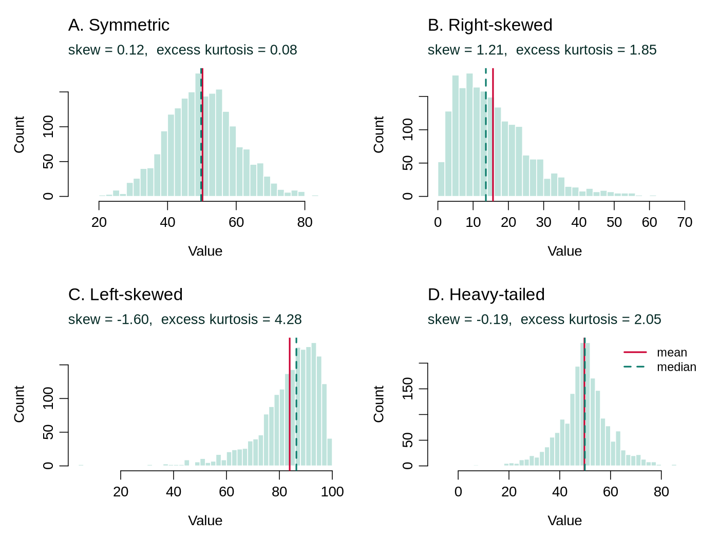
psych::describe() uses. The solid red line is the mean and the dashed line the median: they coincide for symmetric shapes, and the mean is pulled toward the long tail for skewed ones. Panel D has almost no skew but positive excess kurtosis, because both tails are longer than a normal curve would produce.Reading summary() and describe() Output
Two functions produce most numerical summaries in this course. Base R's summary() gives the minimum, first quartile, median, mean, third quartile and maximum, plus a count of missing values when there are any. The describe() function from the psych package gives a longer row for each variable, including the standard deviation, skew and excess kurtosis. The box below applies both to three variables that the activity below does not use.
summary(phaa$diastolic_bp)
library(psych)
describe(phaa[, c("diastolic_bp", "discrimination_score", "social_support_score")])| Column | What it means |
|---|---|
Min., 1st Qu., Median, Mean, 3rd Qu., Max. | For diastolic BP the middle half of readings lies between 64 and 76 mmHg (IQR = 12), and the mean (70.15) and median (70) almost coincide, a sign of a symmetric distribution. A seventh column, NA's, appears when values are missing. |
n | The number of non-missing values. Social support has 780, so 20 values are missing. |
mean, sd, median | The centre and spread that are reported in a results table. |
trimmed, mad | trimmed is the mean after dropping the lowest and highest 10% of values, and mad (median absolute deviation) is the median distance of the values from their median, multiplied by 1.4826 so that it equals the SD for normally distributed data. When they are close to the mean and SD, extreme values have little influence. |
skew, kurtosis | Skewness and excess kurtosis. All three variables have skew between −0.04 and 0.13 and kurtosis between −0.44 and 0.05, so none is noticeably skewed or heavy-tailed. |
se | The standard error of the mean, the SD divided by the square root of n. It describes the precision of the mean; the SD is the measure of spread between people. |
What to report: because the three variables are close to symmetric, each is summarised as mean (SD): diastolic BP 70.2 (9.1) mmHg, discrimination score 7.0 (4.0) and social support score 25.9 (6.0) with 20 values missing. If |skew| were above about 1, or the histogram showed a long tail, the median and IQR from summary() would be reported instead.
Frequency Distributions and Cross-Tabulations
For categorical variables, frequency distributions display the count and percentage of observations in each category. Cross-tabulations (contingency tables) display the joint distribution of two categorical variables and are the basis for computing measures of association such as odds ratios and risk ratios. Some readers will have calculated odds ratios in an earlier course; the worked example after the table builds them from the start.
| Cases (n) | Controls (n) | Total | |
|---|---|---|---|
| Exposed | 45 | 30 | 75 |
| Unexposed | 15 | 60 | 75 |
| Total | 60 | 90 | 150 |
From this 2×2 table, the odds ratio = (45 × 60) / (30 × 15) = 2,700 / 450 = 6.0, suggesting a strong association between exposure and disease.
Worked Example: From Counts to Odds to an Odds Ratio
The odds of a characteristic compare the number of people who have it with the number who do not: odds = number with / number without. For example, 3 people with for every 1 without gives odds of 3, which corresponds to a probability of 3 / 4 = 0.75.
In the outbreak table above the four cells are labelled a = 45 (exposed cases), b = 30 (exposed controls), c = 15 (unexposed cases) and d = 60 (unexposed controls).
| Group | Exposed | Unexposed | Odds of exposure |
|---|---|---|---|
| Cases | a = 45 | c = 15 | 45 / 15 = 3.0 |
| Controls | b = 30 | d = 60 | 30 / 60 = 0.5 |
Among cases, 3 people were exposed for every 1 who was not; among controls, 1 person was exposed for every 2 who were not. The odds ratio divides one odds by the other: OR = 3.0 / 0.5 = 6.0. Rearranging gives the cross-product formula, OR = (a × d) / (b × c) = (45 × 60) / (30 × 15) = 6.0.
An odds ratio of 1 means the odds are the same in both groups, so there is no association. A value above 1 means the exposure is more common (in odds terms) among cases, and a value below 1 means it is less common. An OR of 6 is a strong association. A descriptive odds ratio makes no allowance for chance or for other differences between the groups; later lessons add confidence intervals and adjust for other variables.
matrix() builds a table from four counts, filling the first column and then the second; dimnames labels the rows and columns. For the course data, table() builds the same kind of table from two variables, and tab["Yes", "No"] picks the cell in the row labelled "Yes" and the column labelled "No".
# The outbreak table from the text
outbreak <- matrix(c(45, 15, 30, 60), nrow = 2,
                   dimnames = list(Exposure = c("Exposed", "Unexposed"),
                                   Group    = c("Case", "Control")))
outbreak
odds_cases    <- outbreak["Exposed", "Case"] / outbreak["Unexposed", "Case"]
odds_controls <- outbreak["Exposed", "Control"] / outbreak["Unexposed", "Control"]
odds_cases
odds_controls
odds_cases / odds_controls              # the odds ratio

# The same steps with the course data: hypertension by smoking status
tab <- table(Smoker = phaa$smoker, Hypertension = phaa$hypertension)
tab
odds_smokers     <- tab["Yes", "Yes"] / tab["Yes", "No"]
odds_non_smokers <- tab["No", "Yes"] / tab["No", "No"]
round(c(smokers = odds_smokers, non_smokers = odds_non_smokers,
OR = odds_smokers / odds_non_smokers), 3)The outbreak calculation reproduces the odds of 3 and 0.5 and the odds ratio of 6. In the course data, 8 of 136 smokers and 15 of 664 non-smokers have hypertension, giving odds of 0.062 and 0.023 and an odds ratio of 2.70: the odds of hypertension are about 2.7 times as high among smokers. With only 23 people with hypertension this estimate is imprecise; the logistic regression in the next lesson adds a confidence interval and adjusts for age and other variables.
Visualization Techniques
Appropriate visualization depends on the variable type and the question being asked. Exploratory data analysis emphasises looking at data first so structure, gaps, and anomalies are visible before any model is fit.
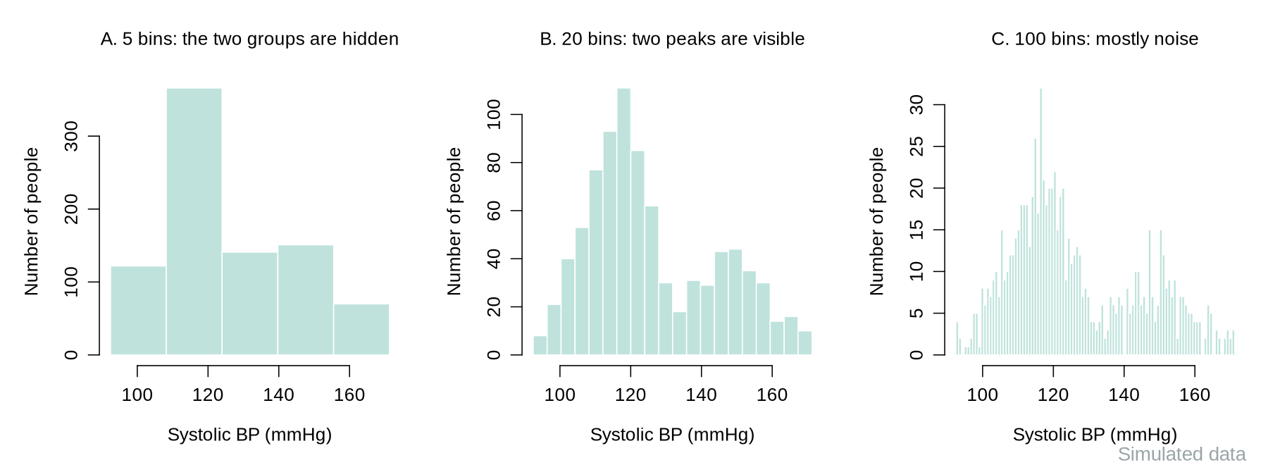
Histograms display the distribution of a continuous variable by dividing values into bins and counting observations per bin. They reveal distributional shape, modality, gaps, and potential outliers. The choice of bin width affects interpretation: too few bins obscure patterns, too many create noise.
The figure below shows the same 850 simulated readings, drawn from two groups with different average blood pressures, using 5, 20 and 100 bins. In R the number of bins is suggested with the breaks argument, for example hist(phaa$systolic_bp, breaks = 20); R treats the number as a suggestion and chooses round cut-points near it.
Boxplots display the median, the IQR (the box), whiskers that extend to the most extreme observation lying within 1.5×IQR of the box, and individual points beyond the whiskers. They are ideal for comparing distributions across groups (e.g., blood pressure by treatment arm) and for quickly identifying asymmetry and outliers.
Bar charts display frequencies or proportions for categorical variables. Use them for comparing counts across groups. Avoid using bar charts for continuous data (use histograms instead) and avoid 3D bar charts, which distort proportions.
Scatter plots display the relationship between two continuous variables and can reveal linear or nonlinear associations, clusters, and outliers. Line graphs are appropriate for displaying trends over time (e.g., incidence rates by year). Both are essential in epidemiologic exploratory analysis.
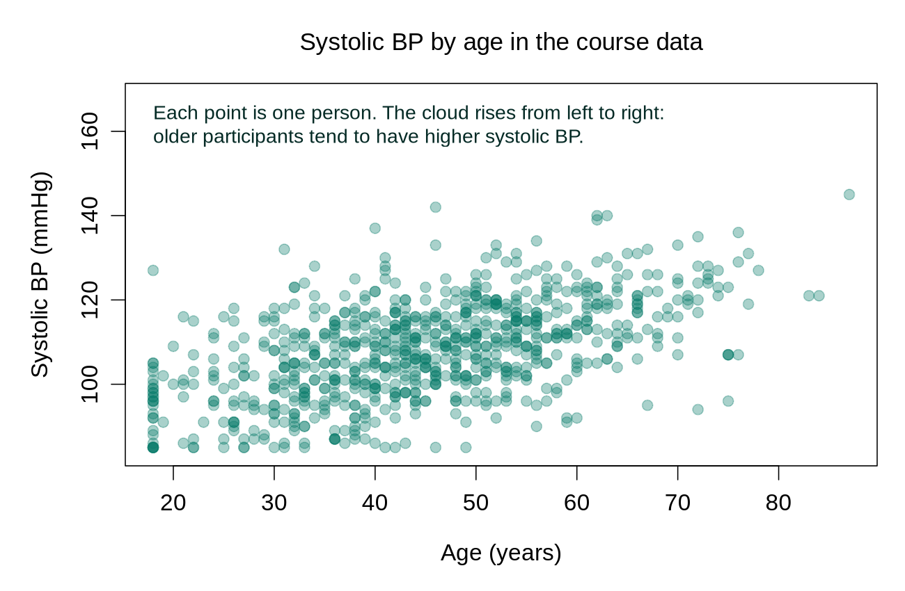
This block continues from the cleaning activity in the previous section, so phaa must already hold the cleaned data. It calculates descriptive statistics and draws four standard plots: a histogram, a boxplot by smoking status, a bar chart and a scatter plot. Base R is enough; psych::describe() (the describe() function from the psych package) is convenient for many variables at once. The stratified Table 1 is built in its own box under the next heading.
# Categorical descriptives ---------------------------------------------------
table(phaa$gender)                            # frequencies
prop.table(table(phaa$gender))                # proportions
round(prop.table(table(phaa$gender)) * 100, 1)  # %

# Cross-tab: gender by smoker, row percentages
round(prop.table(table(phaa$gender, phaa$smoker), margin = 1) * 100, 1)

# Numeric descriptives --------------------------------------------------------
summary(phaa$age)
sd(phaa$age, na.rm = TRUE)
IQR(phaa$age, na.rm = TRUE)

# psych::describe() summarises many variables at once
library(psych)
describe(phaa[, c("age", "bmi", "systolic_bp", "phys_act_min")])

# Plots: histogram, boxplot stratified by exposure, bar chart, scatter plot ---
hist(phaa$systolic_bp, main = "Systolic BP", xlab = "mmHg")

boxplot(systolic_bp ~ smoker, data = phaa,
        main = "Systolic BP by smoking status", ylab = "mmHg")

barplot(table(phaa$gender), main = "Gender distribution")

plot(phaa$age, phaa$systolic_bp, main = "Systolic BP by age",
     xlab = "Age (years)", ylab = "Systolic BP (mmHg)")
Tip: always plot before you fit a regression. A boxplot of systolic_bp by smoker tells you in a second whether the comparison you are about to do in a later lesson will be driven by a few extreme values or by a real shift in the centre of the distribution.
R Reflect on what you just ran
Use the questions below to interpret the output you produced. Look at your console / plot before answering.
1. From round(prop.table(table(phaa$gender, phaa$smoker), margin = 1) * 100, 1), which gender category has the highest percentage of current smokers? What is the magnitude of the gender gap in smoking?
2. From describe(phaa[, c("age", "bmi", "systolic_bp", "phys_act_min")]), which variable has the largest skew? Which is most clearly approximately normal? How would you justify reporting median (IQR) vs mean (SD) for each in a Table 1?
describe() from psych returns skew values for each variable. In this dataset all four are close to symmetric: BMI has the largest skew (0.17), with physical-activity minutes just behind (0.16) and age at 0.12, while systolic BP (skew 0.05, kurtosis -0.31) is the most clearly normal. For Table 1: report mean (SD) for all four here, because none has the long tail that pulls a mean away from the median (mean and median agree within 1 unit for each). Reserve median (IQR) for variables whose skew is well above 1 or whose histogram shows a long right tail (real physical-activity or income data often look like that), because the median is less pulled by extremes.3. Look at the boxplot(systolic_bp ~ smoker). Does the median for smokers appear higher, lower, or similar to non-smokers? Are there any visible outliers, and would you expect them to bias a t-test of the difference in means?
Descriptive Statistics for Epidemiologic Data: “Table 1”
In epidemiologic publications, “Table 1” typically presents the baseline characteristics of the study population, often stratified by exposure or outcome status. How baseline characteristics and group comparisons are reported has been the subject of methodological scrutiny. Pocock, Assmann, Enos, & Kasten (2002) reviewed published trial reports and catalogued common problems with baseline comparisons, subgroup analyses and covariate adjustment. A well-constructed Table 1 includes:
- Demographics (age, sex, ethnicity) with appropriate summary statistics
- Key clinical or exposure variables
- Missing data counts for each variable
- A comparison column between groups, preferably standardised differences (explained below)
| Characteristic | Exposed (n=200) | Unexposed (n=300) | p-value |
|---|---|---|---|
| Age, mean ± SD | 52.3 ± 11.4 | 49.8 ± 12.1 | 0.02 |
| Female, n (%) | 110 (55.0%) | 162 (54.0%) | 0.82 |
| BMI, median (IQR) | 27.1 (24.0–31.5) | 25.8 (23.2–29.4) | 0.004 |
| Current smoker, n (%) | 48 (24.0%) | 51 (17.0%) | 0.05 |
| Diabetes, n (%) | 34 (17.0%) | 30 (10.0%) | 0.02 |
Note how continuous variables with normal distributions use mean ± SD, while skewed variables (BMI) use median (IQR). Categorical variables are presented as n (%).
In this hypothetical study BMI was right-skewed, so its median (IQR) was reported. In the course data BMI is close to symmetric (skew 0.17 in the descriptive activity above), so the course-data table below reports it as mean (SD). The choice follows the distribution of each variable in the data at hand. The example also follows a layout common in published papers, with a p-value column and without an overall column or counts of missing values; the course-data table below shows the layout this lesson recommends.
Null Hypotheses, p-Values and Standardised Differences
A null hypothesis is the starting assumption of no difference: here, that exposed and unexposed people have the same average age in the population the sample came from. A p-value is the probability of seeing a difference at least as large as the one observed if the null hypothesis were true. A small p-value (conventionally below 0.05) means the observed difference would be surprising if there were truly no difference between the groups.
A standardised difference (also called the standardised mean difference, SMD) expresses the gap between two groups in standard-deviation units. For a continuous variable it is the difference in means divided by the square root of the average of the two groups' variances; for a proportion, the difference in proportions is divided by a standard deviation calculated from the two proportions. An SMD of 0.5 means the groups differ by half a standard deviation. Values below about 0.1 are commonly read as a negligible imbalance, although this cut-off is a convention.
Recommendation for this course. Table 1 describes the sample, so this course follows the STROBE reporting guideline for observational studies, which advises that significance tests be avoided in descriptive tables (Vandenbroucke et al., 2007). A p-value in Table 1 depends heavily on sample size and describes chance variation; whether an imbalance is large enough to matter as a confounder (a variable that can distort the association between exposure and outcome, defined more fully under the next heading) is a separate question, which the standardised difference addresses more directly. Where a comparison column is wanted, report the standardised difference. When a journal requires p-values, they should be read as descriptions of chance variation.
Base R can build Table 1 with three small helper functions. function(v) { ... } defines a reusable recipe, tapply(v, grp, f) applies the recipe f separately to each smoking group, and sprintf() formats numbers as text: %.1f means one decimal place, %d a whole number and %% a percent sign. The comparison phaa$education >= "Bachelor's" works because education was made an ordered factor in the cleaning activity; it is TRUE for a bachelor's or graduate degree.
# Three small helper functions. function(v) { ... } defines a reusable recipe
# that is applied to the whole sample and then to each smoking group.
grp <- phaa$smoker                       # the grouping variable ("No", "Yes")

mean_sd <- function(v) {                 # "mean (SD)" and the standardised difference
  f <- function(x) sprintf("%.1f (%.1f)", mean(x, na.rm = TRUE), sd(x, na.rm = TRUE))
  m <- tapply(v, grp, mean, na.rm = TRUE)
  s <- tapply(v, grp, sd, na.rm = TRUE)
  d <- (m["Yes"] - m["No"]) / sqrt((s["Yes"]^2 + s["No"]^2) / 2)
  c(Overall = f(v), tapply(v, grp, f), SMD = sprintf("%.2f", d))
}
n_pct <- function(v, level) {            # "n (%)" and the standardised difference
  f <- function(x) sprintf("%d (%.1f%%)", sum(x == level, na.rm = TRUE),
                           100 * mean(x == level, na.rm = TRUE))
  p <- tapply(v == level, grp, mean, na.rm = TRUE)
  d <- (p["Yes"] - p["No"]) / sqrt((p["Yes"] * (1 - p["Yes"]) + p["No"] * (1 - p["No"])) / 2)
  c(Overall = f(v), tapply(v, grp, f), SMD = sprintf("%.2f", d))
}
n_miss <- function(v) {                  # number of missing values
  c(Overall = sum(is.na(v)), tapply(is.na(v), grp, sum), SMD = "")
}

table1 <- rbind(
  "N"                     = c(Overall = length(grp), table(grp), SMD = ""),
  "Age, mean (SD)"        = mean_sd(phaa$age),
  "  Age missing, n"      = n_miss(phaa$age),
  "Woman, n (%)"          = n_pct(phaa$gender, "Woman"),
  "Degree, n (%)"         = n_pct(phaa$education >= "Bachelor's", TRUE),
  "BMI, mean (SD)"        = mean_sd(phaa$bmi),
  "SBP, mean (SD)"        = mean_sd(phaa$systolic_bp),
  "Activity, mean (SD)"   = mean_sd(phaa$phys_act_min),
  "  Activity missing, n" = n_miss(phaa$phys_act_min),
  "Income missing, n (%)" = n_pct(is.na(phaa$income), TRUE)
)
noquote(table1)The output has one column for the whole sample, one for non-smokers ("No"), one for smokers ("Yes") and the standardised difference (smokers minus non-smokers). Smokers and non-smokers have nearly the same age (SMD 0.02), proportion of women (0.06), education (−0.09) and physical activity (0.00). Smokers have a lower mean BMI (19.5 versus 21.0 kg/m², SMD −0.50) and a higher mean systolic BP (113.5 versus 107.2 mmHg, SMD 0.56). BMI differs between the groups, but smoking can itself lower body weight, so BMI may be a mediator, a variable on the causal path from smoking to blood pressure. In the simulated course data BMI was generated to depend on smoking status. Adjusting for a mediator removes part of the effect being estimated, so whether BMI enters a model is decided from subject knowledge about causal order, which the regression lessons will need to consider. The missing-value rows show that missing activity data are spread across both groups (20 and 8).
Turning the R output into a report table involves relabelling the columns (with group sizes in the headers), writing units and full names into the row labels, removing the percent signs that the row label already states, and adding a footnote that defines abbreviations. The numbers themselves are copied unchanged.
| Characteristic | Overall (n = 800) | Non-smokers (n = 664) | Smokers (n = 136) | Std. diff. |
|---|---|---|---|---|
| Age (years), mean (SD) | 45.1 (13.6) | 45.1 (13.4) | 45.3 (14.9) | 0.02 |
| Missing, n | 2 | 1 | 1 | |
| Women, n (%) | 414 (51.7) | 340 (51.2) | 74 (54.4) | 0.06 |
| Bachelor's degree or higher, n (%) | 360 (45.0) | 304 (45.8) | 56 (41.2) | −0.09 |
| BMI (kg/m²), mean (SD) | 20.8 (3.2) | 21.0 (3.2) | 19.5 (2.9) | −0.50 |
| Systolic BP (mmHg), mean (SD) | 108.2 (11.3) | 107.2 (11.0) | 113.5 (11.6) | 0.56 |
| Physical activity (min/week), mean (SD) | 176.1 (82.4) | 176.0 (83.4) | 176.1 (77.1) | 0.00 |
| Missing, n | 28 | 20 | 8 | |
| Income not reported, n (%) | 35 (4.4) | 32 (4.8) | 3 (2.2) | −0.14 |
Table note for a report: "Std. diff.: standardised difference, smokers minus non-smokers. SD: standard deviation. BMI: body mass index. One BMI value and two systolic BP values were set to missing by range checks."
Stratified Descriptive Analyses
Stratifying descriptive statistics by key exposure or covariate groups allows you to assess the distribution of potential confounders across exposure categories. This is a critical step before proceeding to multivariable modelling, as it helps identify imbalances that may require adjustment.
A confounder is a third variable that is related to both the exposure and the outcome and can therefore make the two appear more, or less, strongly associated than they truly are. Age is a common example, because it is linked to many exposures and to blood pressure. A large standardised difference in Table 1 marks a variable that differs between the exposure groups; whether it also affects the outcome is judged from subject knowledge and the later regression models. A variable that is itself affected by the exposure is a mediator and does not meet the definition of a confounder.
Building Scales: Internal Consistency and Factor Analysis
Many public-health surveys ask several items that together measure a latent construct (e.g., depression, anxiety, social support). Two questions need to be answered before you can use these items as a single scale variable in a regression: (1) internal consistency (do the items hang together?), assessed with Cronbach’s α; and (2) dimensionality (how many underlying factors do the items measure?), assessed with exploratory factor analysis (EFA). Once both checks pass, the items can be summed (or averaged) into a derived scale variable that you carry forward into later lessons.
Each depression item asks how often a symptom occurred, on a five-point response scale from 1 (Never) to 5 (Always), so a higher number always means more symptoms. Some questionnaires also include reverse-coded items, worded in the opposite direction (for example, "I felt hopeful about the future"), where a high answer means fewer symptoms. Such items must be flipped before alpha is calculated or a score is built; on a 1 to 5 scale the flipped value is 6 minus the original, so 5 becomes 1 and 1 becomes 5. The alpha() function prints a warning when an item correlates negatively with the rest of the scale, which is the usual sign of an item that has not been reversed. None of the course items is reverse-coded.
Cronbach's alpha can be understood as a measure of how well the items agree. If people who score high on one item tend to score high on the others, the items share a common source, the construct, and alpha is high. Alpha rises when the items are more strongly correlated with each other and when there are more of them. Under the assumptions behind it, an alpha of 0.90 indicates that about 90% of the variation in total scores reflects what the items have in common and about 10% reflects item-specific noise. Values of about 0.70 or higher are conventionally acceptable and 0.80 or higher good; values above about 0.95 can mean that some items are near-duplicates.
Two terms from factor analysis appear in the output. An eigenvalue measures how much of the shared variation among the items one factor accounts for; a large first eigenvalue followed by small ones suggests a single underlying factor. Parallel analysis compares each eigenvalue from the real data with the eigenvalue that random data of the same size would produce, and keeps factors, counting from the first, for as long as the real eigenvalue is larger. A factor loading is the correlation between an item and a factor; loadings of 0.40 or higher are conventionally treated as meaningful, and this lesson uses that threshold throughout.
The course dataset contains seven depression items (dep1 … dep7) and five anxiety items (anx1 … anx5). Below we (1) confirm internal consistency, (2) decide on the number of factors, and (3) build the derived scale scores we use for the rest of the course.
# 1. Internal consistency for each candidate scale ----------------------------
library(psych)
dep_items <- phaa[, c("dep1","dep2","dep3","dep4","dep5","dep6","dep7")]
anx_items <- phaa[, c("anx1","anx2","anx3","anx4","anx5")]

alpha(dep_items)             # raw_alpha >= 0.70 is acceptable, >= 0.80 is good
alpha(anx_items)
dep_alpha <- alpha(dep_items)            # store the result to read it at 3 decimals
round(dep_alpha$total$raw_alpha, 3)
round(dep_alpha$alpha.drop[, "raw_alpha", drop = FALSE], 3)  # alpha if an item is dropped

# 2. How many underlying factors? ------------------------------------------
fa.parallel(dep_items, fa = "fa")   # parallel analysis for factors

# 3. Inspect a one-factor solution for the depression items ----------------
factanal(x = na.omit(dep_items), factors = 1)
# na.omit(): factanal() needs complete rows and dep4 has 15 NAs, so these 15
# people are left out of this check (a complete-case analysis).
# With a single factor there is nothing to rotate, so no rotation is requested.
# Loadings >= 0.40 contribute meaningfully to the factor.

# 4. Two-factor solution combining dep + anx items -------------------------
combined <- na.omit(cbind(dep_items, anx_items))
factanal(x = combined, factors = 2, rotation = "varimax")
# dep1-7 should load on one factor; anx1-5 on the other.

# 5. Build derived scale variables for use in later lessons ------------------
# Score = mean of the answered items x number of items, calculated only when
# at most one item is missing (otherwise NA). A missing item is never
# counted as 0, which would understate the person's score.
n_dep <- rowSums(!is.na(dep_items))     # items answered by each person
n_anx <- rowSums(!is.na(anx_items))
phaa$dep_score <- ifelse(n_dep >= 6, rowMeans(dep_items, na.rm = TRUE) * 7, NA)
phaa$anx_score <- ifelse(n_anx >= 4, rowMeans(anx_items, na.rm = TRUE) * 5, NA)
summary(phaa$dep_score)

# 6. Save the cleaned, scale-augmented file under a new name -----------------
write.csv(phaa, "phaa_survey_clean.csv", row.names = FALSE)| Output | What it shows and what to report |
|---|---|
raw_alpha | Cronbach's alpha, printed to two decimals as 0.9. The line round(dep_alpha$total$raw_alpha, 3) gives 0.904, which is the value to report (α = 0.904). |
std.alpha, average_r | Alpha calculated from standardised items (similar here because all items share the same response scale), and the average correlation between pairs of items (0.57). |
| 95% confidence boundaries | The range of alpha values compatible with the data, 0.89 to 0.91. |
| Reliability if an item is dropped | Each row gives alpha with that item removed. A value above the overall 0.904 would mean the scale is better without the item. Every value here is lower (0.886 to 0.896 at three decimals), so every item contributes; dep7 contributes least, because removing it would lower alpha only to 0.896. |
r.drop (item statistics) | The correlation of each item with the total of the other items, from 0.65 (dep7) to 0.74. Values below about 0.30 would mark an item that does not fit the scale. |
fa.parallel() | The message reports one factor (the number of components is NA because fa = "fa" requests factors only). The annotated plot below shows why. |
factanal() Loadings | All seven loadings lie between 0.691 (dep7) and 0.795 (dep2), well above 0.40. Uniquenesses are the share of each item that the factor does not explain (1 minus the squared loading). |
Proportion Var and the chi-square test | The single factor explains 57.6% of the item variance. The test asks whether one factor is enough; its large p-value (0.551) gives no evidence that more factors are needed. |
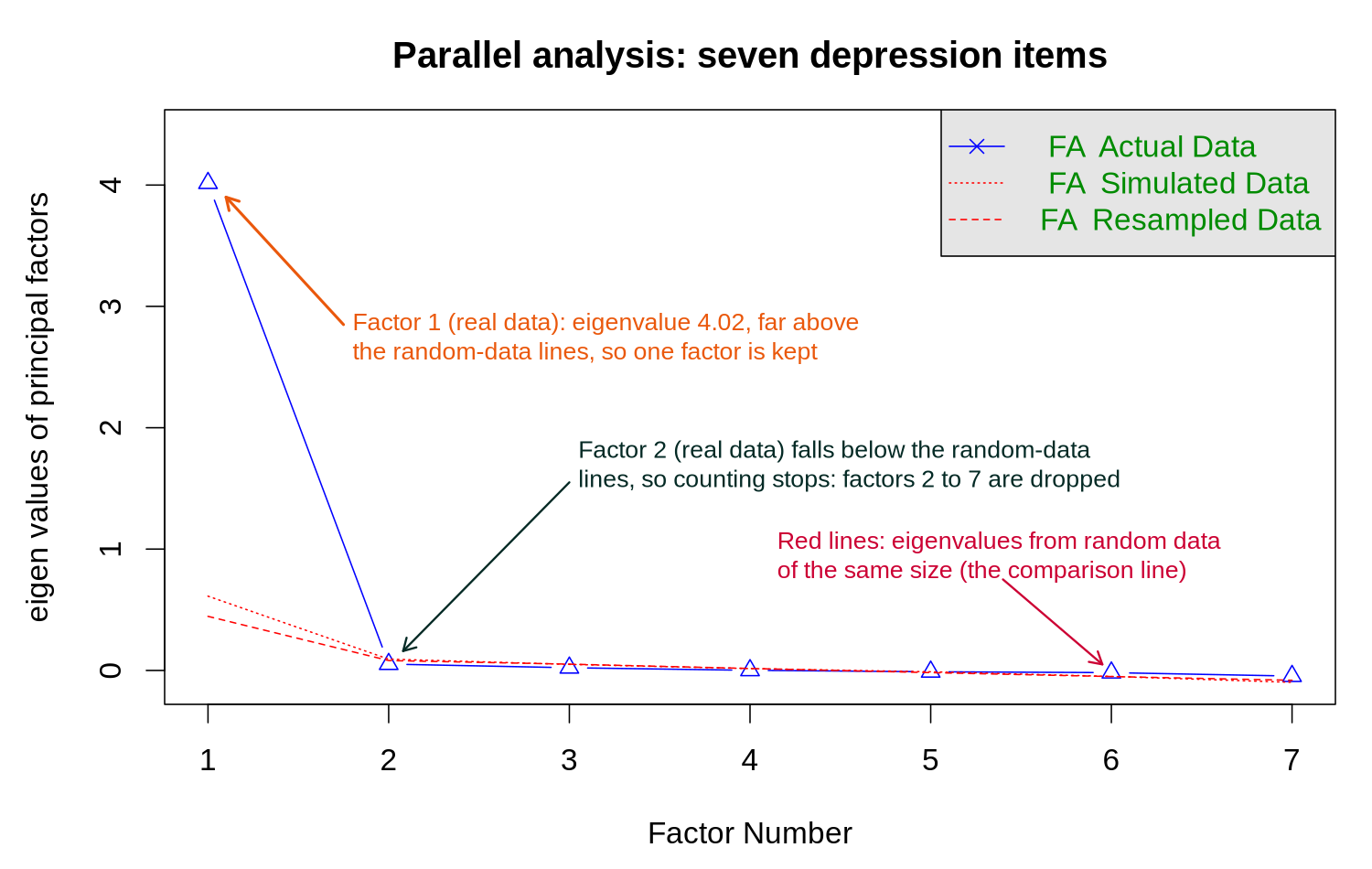
How to read this. An α of 0.904 indicates that the seven depression items measure essentially the same construct. The single factor explains 57.6% of the item variance and every loading is well above the 0.40 threshold (the lowest is 0.691, for dep7), so combining the items into dep_score is justified. Step 5 builds the score as the mean of the answered items multiplied by the number of items (a prorated sum), and only for people who answered at least six of the seven depression items (four of the five anxiety items). Using rowSums(dep_items, na.rm = TRUE) instead would count a skipped item as 0 and understate the scores of the 15 people who skipped dep4, by between 1.8 and 4.5 points (2.8 on average). The score is used as a continuous predictor in a later lesson and as a covariate in the logistic model for hypertension.
R Reflect on what you just ran
Use the questions below to interpret the output you produced. Look at your console / plot before answering.
1. What is the raw alpha for the depression items? For the anxiety items? Which scale (if either) clears the conventional 0.80 threshold for "good" internal consistency, and which item (look at the "Reliability if an item is dropped" table) contributes least to the depression scale?
2. From fa.parallel(dep_items), how many factors have eigenvalues above the parallel-analysis line? Does the one-factor solution from factanal() show all seven loadings >= 0.40?
fa.parallel() shows exactly one factor above the parallel-analysis line for the depression items (first eigenvalue 4.02 against about 0.5 for random data, a value that varies slightly from run to run; the second is 0.05) and prints "the number of factors = 1", supporting a unidimensional structure. The one-factor solution from factanal() has all seven loadings ≥ 0.40 (they run from 0.691 for dep7 to 0.795 for dep2, and the factor explains 57.6% of the item variance), confirming that all items track the same latent construct.3. In the two-factor combined solution, do the depression items load on a different factor than the anxiety items? Cite one specific loading from your output that supports your answer.
Normality Assessment
Assessing whether a variable follows a normal distribution informs the choice between parametric and non-parametric methods.
Q-Q (quantile-quantile) plots compare observed quantiles to theoretical normal quantiles. Points falling along the diagonal line suggest normality; systematic departures indicate non-normality. Histograms with a normal curve overlay also provide quick visual assessment.
In plain terms, a Q-Q plot sorts the data from smallest to largest and plots each value against the z-score that a standard normal distribution would place at the same position. These z-scores form the horizontal axis, labelled theoretical quantiles, which runs from about −3 to 3. If the data are normal, the points fall along a straight line. Points that curve away from the line at one end indicate skew, and points that bend away at both ends in an S shape indicate heavy tails, meaning more extreme values than a normal distribution would produce. In R, qqnorm(x) draws the points and qqline(x) adds the reference line.
The Shapiro-Wilk test is generally preferred for samples under 5,000. The Kolmogorov-Smirnov test (with Lilliefors correction) is an alternative. Both test the null hypothesis that data come from a normal distribution.
Because the null hypothesis is normality, a small p-value (below 0.05 by convention) is evidence of a departure from normality, and a large p-value means that no departure was detected. The p-value also depends on sample size: the same small departure gives a large p-value in a sample of 50 and a very small one in a sample of 50,000, because a test with many observations has the power to detect even trivial departures. R's shapiro.test() accepts between 3 and 5,000 values.
Caveat: With very large samples, these tests will reject normality even for trivial departures. Visual assessment should always accompany formal tests.
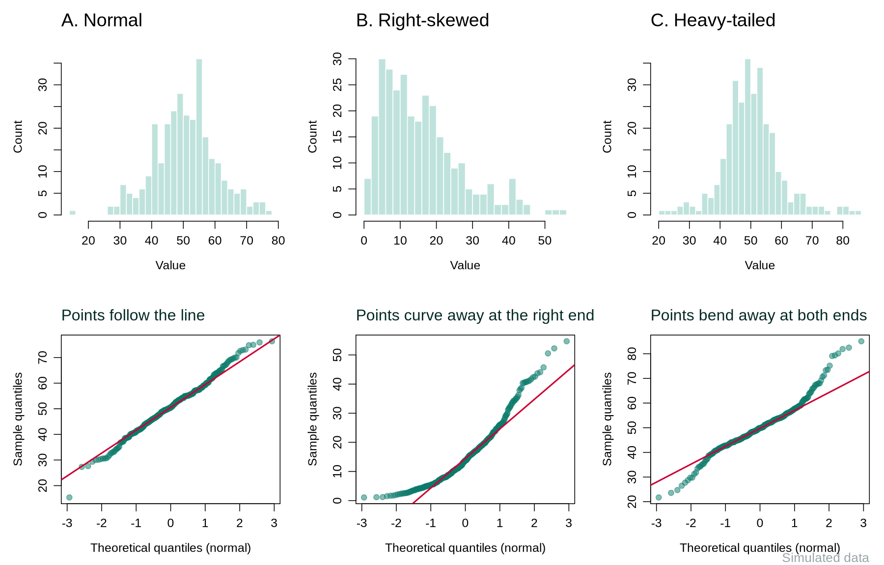
qqnorm(phaa$systolic_bp, main = "Systolic BP: normal Q-Q plot")
qqline(phaa$systolic_bp)          # the reference line
shapiro.test(phaa$systolic_bp)
shapiro.test(phaa$diastolic_bp)| Output | What it shows |
|---|---|
W | The test statistic, which is close to 1 when the data look normal. Both values (0.993 and 0.997) are very close to 1. |
| Systolic BP: p-value = 0.0005 | The small p-value means a departure from normality was detected. In the Q-Q plot the points follow the line closely except at the lower end, where the 18 lowest readings are all exactly 85 mmHg and form a short flat run. With 798 readings the test detects this small departure, while the skew of 0.05 shows that the distribution is close to symmetric. |
| Diastolic BP: p-value = 0.10 | No departure from normality was detected. |
From the Checks to a Decision
In practice the analyst combines the plot, the skew value and the purpose of the analysis. If the Q-Q plot is close to a straight line and |skew| is below about 1, the variable is summarised as mean (SD) and parametric methods are reasonable, even when a large sample makes the Shapiro-Wilk p-value small, as for systolic BP here. If the plot curves clearly or |skew| is above about 1, the variable is summarised as median (IQR), and the analyst either transforms it (as in an earlier section) or uses a rank-based method. Rank-based methods replace each value by its rank (1 for the smallest, 2 for the next, and so on), so a few extreme values cannot dominate the result. The table below pairs the common options.
| Question | Parametric option (assumes approximate normality) | Rank-based option (fewer assumptions) |
|---|---|---|
| Do two groups differ? | The t-test compares the two means: t.test(y ~ group). R uses the Welch version by default, which allows the two groups to have different spreads. | The Wilcoxon rank-sum test compares the ranks of the two groups: wilcox.test(y ~ group). |
| Do three or more groups differ? | One-way analysis of variance (ANOVA) compares the means: summary(aov(y ~ group)). | The Kruskal-Wallis test compares the ranks: kruskal.test(y ~ group). |
| Are two continuous variables associated? | Pearson correlation measures linear association: cor.test(x, y). | Spearman correlation is Pearson correlation calculated on the ranks: cor.test(x, y, method = "spearman"). |
Implications for Analysis Choice
If a variable is approximately normal, parametric tests (t-tests, ANOVA, Pearson correlation) are appropriate. For non-normal distributions, consider non-parametric alternatives (Wilcoxon rank-sum, Kruskal-Wallis, Spearman correlation) or data transformations. The Central Limit Theorem provides some protection for large samples, but descriptive summaries should still reflect the actual distribution.
Reflection
Consider how you would construct a “Table 1” for an epidemiologic study examining the relationship between physical activity and cardiovascular disease. What variables would you include, how would you summarize each, and what stratification would you use?
1. For a heavily right-skewed variable, which summary statistics should be reported?
2. A distribution has excess kurtosis greater than 0. What does this indicate?
3. What is the primary purpose of stratifying descriptive statistics by exposure group in epidemiologic research?
4. A Shapiro-Wilk test yields p < 0.001 with a sample of 50,000. Which interpretation is most appropriate?
● Complete the reflection and knowledge check to continue.
Final Assessment
Bringing It All Together
This lesson followed a single dataset from raw to descriptive. The section on data quality named the errors (collection, entry, storage, and analysis-stage problems) and unpacked the missing-data mechanisms (MCAR, MAR, MNAR) that determine which cleaning approaches are valid. The section on cleaning strategies turned that vocabulary into a workflow: systematic range, type, and consistency checks; outlier triage; principled missing-data handling; transformations and derived variables; and a documentation trail that a peer reviewer could follow. The section on descriptive analyses closed the loop with the layer that every paper opens with: central tendency, spread, shape, frequency tables, visualisations, scale checks, and a Table 1 that stratifies on the primary exposure or outcome.
Descriptive analysis is a core stage of any analysis. It is the layer where data problems surface, where assumptions get tested, and where readers calibrate how much trust to place in the inferential models that follow. From here we can move into the regression machinery of the rest of the course knowing that the dataset under it has been examined and understood.
Key Takeaways from this lesson
- Errors enter the data pipeline at every stage; cleaning is about locating them, not arbitrarily fixing values.
- The missing-data mechanism (MCAR, MAR, MNAR) determines which handling strategies remain valid; complete-case analysis is defensible when little is missing and MCAR is plausible, and multiple imputation under a stated MAR assumption is preferred otherwise.
- Outliers should be investigated, not deleted by reflex; document keep/exclude/transform decisions.
- Choose central tendency, spread, and shape statistics based on variable type and distributional shape.
- A well-built Table 1 stratified by exposure or outcome is often the most informative single output of an analysis.
- Cleaning and descriptive work must leave a documented trail; reproducibility is not optional.
Reflection
Reflecting on the entire lesson, describe a systematic workflow you would follow when receiving a new epidemiologic dataset, from initial data quality assessment through to producing a complete descriptive summary. What tools, checks, and documentation would you use at each step?
data/raw/) and never edit it. (2) Inventory: read the file and check its structure with dim(), str(), summary() and colSums(is.na()), comparing each variable with the codebook. (3) Variable-by-variable cleaning: convert missing-data codes to NA, list the IDs that break each hard limit with sum() and which() before setting them to NA, flag soft-limit values for checking, check categories with table() and IDs with duplicated(). (4) Missing data: count missing values per variable and complete cases, compare people with and without missing values, state the assumed mechanism, and choose complete-case analysis or multiple imputation accordingly. (5) Derivation: build analytic variables (age groups, BP categories, scale scores after checking alpha and dimensionality). (6) Descriptive summary: histograms, boxplots, summary() and psych::describe() for each variable, normality checks for the main continuous variables, and a Table 1 by exposure or outcome. (7) Documentation: one R script, always run from the raw file, with a comment for every decision; a cleaning log saved as a CSV file; the cleaned data saved under a new name; and an updated codebook that includes every derived variable and its formula. Documentation at every step: the decision log explains every NA, every recode, every dropped row.Final Knowledge Assessment
You must answer all 15 questions correctly (100%) and complete the final reflection to finish this lesson.
1. Which stage of the data pipeline is most susceptible to transcription errors?
2. In a dataset where missingness of income depends on the actual income value itself (high earners are less likely to report), the missing data mechanism is:
3. Which method for handling missing data correctly accounts for imputation uncertainty?
4. Using the IQR method, a value is classified as an outlier if it falls:
5. What is the primary limitation of listwise deletion?
6. For a normally distributed continuous variable, the conventional summary statistics to report are:
7. A variable measuring “number of emergency department visits in the past year” is best classified as:
8. Which visualization is most appropriate for comparing the distribution of a continuous variable across three treatment groups?
9. In a cross-tabulation of exposure and disease, the odds ratio is computed as:
10. Positive skewness indicates that:
11. What is the purpose of a Q-Q plot?
12. When applying a natural log transformation to a variable that contains zero values, the appropriate approach is to:
13. In a “Table 1” for an epidemiologic study, categorical variables are typically summarized as:
14. Which statement about the z-score method for outlier detection is correct?
15. An audit trail for data cleaning should include all of the following EXCEPT:
✦ Before submitting: pass every section knowledge check (100%) and complete every reflection.