Quasi-Experimental Designs II: Time Series, Discontinuities and Natural Experiments
Program Planning & Evaluation
Learning objectives for this lesson:
- Explain how an interrupted time series projects a counterfactual from the pre-intervention level and trend, and identify the threats to validity that the design leaves open.
- Interpret a segmented regression with level and slope changes, and explain how residual autocorrelation, Newey-West standard errors and a comparison series affect its conclusions.
- Judge whether a time series has enough time points and enough sensitivity for an evaluation question, considering seasonality, autocorrelation and the program's reach.
- Distinguish sharp from fuzzy regression discontinuity designs, calculate a fuzzy estimate with the Wald estimator, and apply checks for manipulation, covariate balance and bandwidth sensitivity.
- Summarize the Medical Research Council guidance on natural experiments and describe Canadian provincial policies that have been studied as natural experiments.
- State the assumptions of an instrumental variable analysis, calculate a Wald estimate from a binary instrument and interpret it as a local average treatment effect among compliers.
- Use Plan-Do-Study-Act cycles, run charts and statistical process control charts appropriately, and identify the reporting elements of SQUIRE 2.0.
- Compare quality improvement designs with the randomized and quasi-experimental designs of Lessons 6 to 8 by the question each answers and the assumption each relies on.
- Choose a design for a program evaluation and justify it in writing, naming its assumptions and how they will be checked.
This course was developed by Dr. Kiffer G. Card, Faculty of Health Sciences, Simon Fraser University, drawing on Rossi, P. H., Lipsey, M. W., & Henry, G. T. (2019). Evaluation: A Systematic Approach (8th ed.). SAGE; and Shadish, W. R., Cook, T. D., & Campbell, D. T. (2002). Experimental and Quasi-Experimental Designs for Generalized Causal Inference. Houghton Mifflin.
Interrupted Time Series
Adding a comparison series
Learning Objectives for this section
- Explain how an interrupted time series uses the pre-intervention level and trend to project a counterfactual, and name the threats to validity that the design leaves open.
- Specify a segmented regression model with a level change and a slope change, and interpret each coefficient.
- Describe how seasonality and autocorrelation affect estimates and standard errors, and how each is detected and handled.
- Judge whether a series has enough time points and enough sensitivity to detect the effect a program could plausibly produce.
- Interpret the results of a single and a controlled interrupted time series, including the residual checks and a plot of the counterfactual.
1.1 The Logic of an Interrupted Time Series
An interrupted time series measures an outcome at regular intervals before and after an intervention begins at a known point in time. The observations before the interruption establish the level of the outcome, its trend and its ordinary variation, and the design asks whether the series changed at the interruption by more than that pattern would predict. In the design notation of Shadish, Cook and Campbell (2002), a simple series with five observations on each side is written O1 O2 O3 O4 O5 X O6 O7 O8 O9 O10, where each O is a measurement and X marks the start of the program. Campbell and Stanley (1963) included this "time-series experiment" among their quasi-experimental designs and identified history as its main weakness, and it remains one of the most common designs for evaluating health policies and programs introduced to a whole population at once (Lopez Bernal et al., 2017).
Lesson 7 showed that a single pre-test and post-test cannot separate a program effect from a secular trend, maturation or regression to the mean. A long series addresses these threats directly. If emergency visits were already rising by about half a visit per 1,000 older adults each year, the counterfactual is the continuation of that rise, and comparing the post-program observations with the projected trend removes the part of the change that the trend explains. The pre-program points also show how much the series varies from month to month.
The design leaves other threats open. The most important is history: an event at about the same time as the program, such as a new provincial policy or an unusual respiratory virus season, can produce a change at the interruption. Instrumentation is a second threat, because a change in how the outcome is recorded, such as a new emergency department information system, can create a step in the series. Changes in the composition of the population can alter a rate without any change in individual risk, and regression to the mean reappears if a program was launched in response to an unusually high recent value.
The Cedar Valley Connector program is a fictional community connector (social prescribing) program run by the fictional Cedar Valley Health Authority in British Columbia. Primary care clinicians refer adults aged 65 and older who score 6 or higher on the three-item UCLA Loneliness Scale (scored 3 to 9), or whom they judge to be isolated, to a community connector who meets them up to six times over twelve weeks. The program's planners expect fewer emergency department visits, although Lesson 1 recorded this as an expectation that had not been tested. The health authority's analyst can extract monthly emergency department visits per 1,000 residents aged 65 and older for 72 months: 48 months before launch and 24 months after. Month 1 is a January. Wave one (the 12 clinics chosen for readiness, as Lesson 7 described) began at month 49, and wave two (the other 12 clinics) began at month 61. A fictional neighbouring region, Juniper Ridge, has no connector program and supplies a comparison series. All Cedar Valley and Juniper Ridge numbers in this lesson are illustrative and come from simulated data.
Background: regression on time
A linear regression with time as its only predictor, Yt = β0 + β1 × timet + et, fits a straight line through a series: β0 is the fitted value at time zero, β1 is the change in the outcome per month, and et is the residual, the distance of each month's observation from the line. Segmented regression adds two predictors that switch on at the launch. An indicator that equals 0 before the launch and 1 from the launch month onward lets the line jump at the launch, and its coefficient is the level change. A counter of months since the launch, which is 0 before it and 0, 1, 2 and so on from the launch month, lets the line bend, and its coefficient is the slope change, the difference between the post-launch and pre-launch slopes. Ordinary standard errors assume that the residuals are independent, whereas in a monthly series a month above the line tends to be followed by another month above it. This positive autocorrelation means that the series holds less independent information than its number of months suggests, so ordinary standard errors are too small, and Newey-West standard errors recompute them from the observed correlation between nearby residuals.
HSCI 410 Lesson 3 (Linear and Logistic Regression) covers linear regression more fully and is optional reading.
1.2 Segmented Regression
The standard analysis of an interrupted time series is segmented regression, which fits a separate straight line to the periods before and after the interruption and estimates how the level and the slope changed (Wagner et al., 2002). With one interruption, the model is:
Segmented regression model
Yt = β0 + β1 × timet + β2 × postt + β3 × time_aftert + et
Here timet counts months from the start of the series (1 to 72), postt equals 0 before the launch and 1 from the launch month onward, and time_aftert equals 0 before the launch and then 0, 1, 2 and so on from the launch month. β0 is the level at time zero, β1 is the pre-launch slope, β2 is the level change at the launch month relative to the projected trend, and β3 is the slope change. The post-launch slope is β1 + β3, and the estimated effect k months after the launch month is β2 + β3 × k.
The coding of time_after determines what β2 means. With time_after equal to 0 at the launch month, β2 is the difference between the fitted and projected values in that month; if time_after starts at 1, the level change refers to an earlier point and changes slightly while the slope change does not. The evaluation plan should state the coding. Because the effect at a later month combines two coefficients, its confidence interval needs both variances and their covariance, as the worked example in Section 1.6 shows.
Specifying the impact model in advance
Lopez Bernal and colleagues (2017) recommend that the evaluator state the expected shape of the effect, the impact model, before analyzing the data, because a shape chosen after looking at the series can fit random fluctuation. The impact model should follow from the program theory developed in Lesson 3.
An immediate, persistent step is expected when a policy changes conditions for everyone at once, such as a new fee or a ban. For Cedar Valley, a region-wide step at launch would be surprising, because only a few hundred older adults are referred in the first months, and it would prompt a search for co-occurring events.
A gradual divergence from the projected trend is expected when a program's reach accumulates over time. The Connector program enrols older adults continuously and adds the second wave of clinics at month 61, so its program theory predicts a slope change in emergency visits as the number of past participants grows.
Estimating both terms is the usual default, because a program can produce an early step, for example from changes in clinic practice, followed by a growing effect. The evaluator then reports the effect at specified months after launch.
Some effects begin after a delay, such as the twelve weeks a participant spends with a connector, and some fade. A lag is handled by excluding a transition period, and a temporary effect needs an additional segment; both choices should be fixed before the analysis.
1.3 Seasonality and Autocorrelation
Emergency department visits by older adults usually rise in winter with the respiratory virus season. If the program launches near a seasonal peak or trough, an unmodelled seasonal cycle can masquerade as a level change, and seasonal swings reduce precision. The model can include indicators for calendar month (eleven terms for monthly data) or Fourier terms, which are pairs of sine and cosine functions with a twelve-month period; one pair, sin(2π × month / 12) and cos(2π × month / 12), describes a smooth annual cycle with two parameters, which matters in short series. A second pair can be added if the seasonal shape is not a single smooth wave.
Autocorrelation means that observations close together in time resemble each other more than observations far apart. In monthly health data, a busy month tends to be followed by another busy month, so the residuals of a segmented regression are often positively correlated. Ordinary least squares still gives unbiased coefficients when the model is correctly specified, but with positive autocorrelation its standard errors are usually too small, so confidence intervals are too narrow. The evaluator checks by plotting the residuals against time, by examining the autocorrelation function (ACF), which shows the correlation between residuals one, two or more months apart, and by formal tests. The Durbin-Watson test (Durbin and Watson, 1950) examines first-order autocorrelation: its statistic is close to 2 when there is none and falls toward 0 as positive autocorrelation increases. The Breusch-Godfrey test examines several lags at once.
Newey-West standard errors (Newey and West, 1987) keep the ordinary least squares estimates and replace the standard errors with ones that remain valid under autocorrelation and unequal variance up to a chosen lag. Generalized least squares with first-order autoregressive errors, such as the Prais-Winsten estimator, models the autocorrelation directly, and autoregressive integrated moving average (ARIMA) models handle more complex dependence in long series. When the outcome is a count, a Poisson or negative binomial model with the logarithm of the population as an offset estimates a rate ratio (Lopez Bernal et al., 2017).
A plot of the raw series shows the trend, the seasonal pattern, outliers and data problems, such as a month with missing records that appears as a sudden drop.
Record the dates of events that could affect the outcome, such as a pandemic wave, a hospital closure or a change in coding rules. Real series covering 2020 to 2022 need explicit treatment of the COVID-19 pandemic, which disrupted emergency department use across Canada.
A rate per 1,000 residents depends on population estimates, which are often interpolated between censuses, and a change in the estimation method can create an artificial step.
1.4 How Many Time Points?
There is no single rule for the length of a series. The Cochrane Effective Practice and Organisation of Care group requires at least three points before and three after for inclusion as an interrupted time series in its reviews, which is a minimum for inclusion. For monthly data, twelve observations before and twelve after is often cited as a working minimum (Wagner et al., 2002), partly because a full year on each side helps separate seasonality from the effect. More pre-launch points sharpen the counterfactual trend, and more post-launch points allow a slope change to be detected and its persistence assessed.
Power depends on the number of points, the residual variability, the autocorrelation, the size and shape of the expected effect and the position of the interruption. Zhang, Wagner and Ross-Degnan (2011) showed how to estimate power by simulation: the evaluator generates many series with plausible features and an assumed effect, fits the planned model to each, and counts how often the effect is detected.
The level of aggregation also matters. An outcome measured for a whole region dilutes the effect of a program that reaches a small share of its population. Before relying on a population-level series, the evaluator should estimate the change the program could plausibly produce, given its reach, and compare it with the month-to-month variability of the series. The worked example in Section 1.6 ends with such a check.
1.5 Controlled Interrupted Time Series
A single series cannot rule out history, because any event that coincides with the launch changes the series in the same way as the program. A controlled interrupted time series adds a comparison series that should be exposed to the same co-occurring events but not to the program (Lopez Bernal et al., 2018). The key assumption is that, without the program, the difference between the two series would have continued along its pre-launch path. A controlled interrupted time series is closely related to the difference-in-differences designs of Lesson 7, with many periods and an explicitly modelled trend on each side of the interruption.
The analysis can stack both series and add a group indicator and its interactions with each term of the segmented model: Yt = β0 + β1time + β2post + β3time_after + β4group + β5group × time + β6group × post + β7group × time_after. The coefficients β6 and β7 estimate how much more the level and the slope changed in the program series than in the comparison series. An equivalent approach, used in the worked example in Section 1.6, fits the segmented model to the difference between the two series month by month, which removes shared seasonality and shared shocks.
1.6 Worked Example: An Interrupted Time Series for Cedar Valley
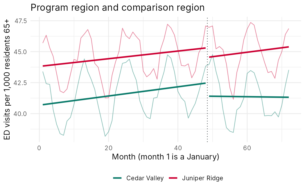
The worked example uses a simulated monthly series of emergency department visits per 1,000 residents aged 65 and older for Cedar Valley and Juniper Ridge over 72 months. The simulation includes a winter cycle, a gentle upward trend, first-order autocorrelation and a small drop in both regions in the launch month that stands in for a hypothetical province-wide change. Its rates, about 0.5 visits per resident per year, are set somewhat higher than the illustrative annual rates in Lessons 2 and 7 (about 0.4). The worked example concerns the changes in the series, and its results describe this teaching dataset only.
The naive comparison. Each region has 48 pre-launch and 24 post-launch months. The mean rate fell slightly in Cedar Valley, from 41.59 to 41.36 visits per 1,000, and rose in Juniper Ridge, from 44.57 to 44.98. This comparison ignores the upward trend under way before the launch.
The segmented regression. The model for Cedar Valley contains time, post and time_after, coded as in Section 1.2, and one pair of Fourier terms for the winter cycle, as described in Section 1.3. The table gives the main estimates with ordinary standard errors. The coefficients of the sine and cosine terms are 1.5316 and 1.9442.
| Term | Estimate | Standard error |
|---|---|---|
| Intercept | 40.6842 | 0.1527 |
| time (pre-launch slope per month) | 0.0370 | 0.0054 |
| post (level change at launch) | −1.0913 | 0.2617 |
| time_after (slope change per month) | −0.0408 | 0.0163 |
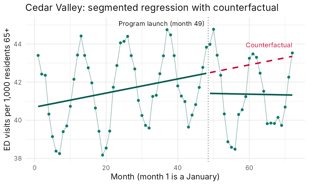
Before the launch, the rate rose by 0.0370 visits per 1,000 per month, about 0.44 per year. At the launch month the level fell by 1.0913 visits per 1,000 relative to the projected trend, and the slope changed by −0.0408 per month, so the post-launch slope was 0.0370 − 0.0408 = −0.0038, which is close to flat. The two Fourier terms capture the winter peak, and the model explains 92.8 percent of the variance (R2 = 0.928). These ordinary standard errors assume independent residuals, an assumption checked next.
Residual autocorrelation. The lag-one autocorrelation of the residuals is 0.369, above the approximate bound of 0.236, while the autocorrelations at lags 2 to 6 lie within it. The Durbin-Watson statistic is 1.2551 (p = 5.257e-05), well below 2, which confirms positive first-order autocorrelation.
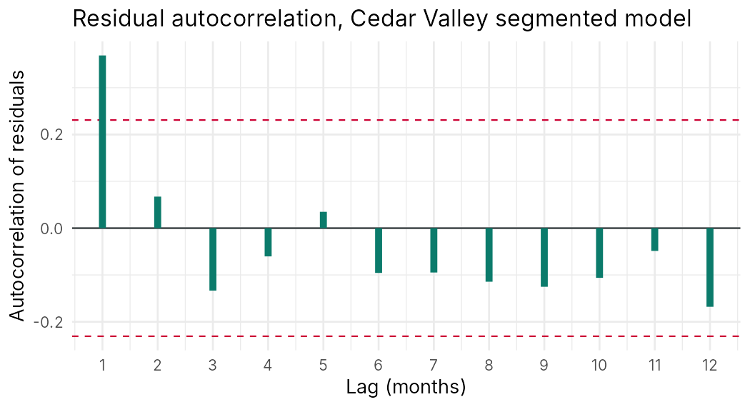
Newey-West standard errors and the effect at month 72. The standard errors were recomputed with a Newey-West estimator using three lags, and the effect was estimated for month 72, the 24th month of the program, when time_after equals 23.
| Coefficient | Ordinary standard error | Newey-West standard error | p (Newey-West) |
|---|---|---|---|
| Level change (post) | 0.2617 | 0.3575 | 0.0033 |
| Slope change (time_after) | 0.0163 | 0.0209 | 0.0555 |
Allowing for autocorrelation increases the standard error of the level change from 0.2617 to 0.3575 and that of the slope change from 0.0163 to 0.0209. The level change remains clearly different from zero (p = 0.0033), while the p-value for the slope change rises to 0.0555. The estimated effect in month 72 is −2.029 visits per 1,000 (95 percent confidence interval −2.755 to −1.303), against a counterfactual of 43.350, a relative reduction of 4.7 percent.
The fitted segments and the counterfactual. The figure shows the fitted lines with the Fourier terms set to zero, their average over a year, together with the counterfactual, which sets post and time_after to zero in the post-launch months.
A controlled interrupted time series. The same model was first fitted to Juniper Ridge, and a segmented regression was then fitted to the month-by-month difference between the regions, in which shared seasonality and shared shocks cancel.
Juniper Ridge, which has no program, also dropped at the launch month, by 0.7687 visits per 1,000 (p = 0.0075), with no change in slope (0.0051, p = 0.716). This pattern points to a co-occurring event that affected both regions, which in the simulation represents a hypothetical province-wide change. In the difference model, Cedar Valley's level change relative to Juniper Ridge is −0.3989 (p = 0.38185) and its slope change is −0.0426 per month (p = 0.08917). The controlled effect in month 72 is −1.378 visits per 1,000 (95 percent confidence interval −2.136 to −0.620), about a third smaller than the single-series estimate of −2.029. Most of the single-series level change was shared with the comparison region, and the remaining evidence for an effect rests on the divergence in slopes.
A plausibility check on the size of the effect
Suppose, for illustration, that about 5 percent of the region's residents aged 65 and older had attended the program by month 72. This is a generous assumption, because the attendance figures reported in this course imply a share closer to 3 percent of the region's 46,000 older adults, which would make the required effect per participant larger still. A region-wide reduction of 1.378 visits per 1,000 residents per month would then require a reduction of about 27.6 visits per 1,000 participants per month (1.378 / 0.05), or about 0.33 visits per participant per year. The counterfactual rate of 43.350 per 1,000 per month corresponds to about 0.52 visits per resident per year, so participants would have to avoid about 64 percent of the emergency visits an average older resident makes, which is difficult to believe for a twelve-week program. The simulated effect was set large so that the methods are easy to see. In a real evaluation, this arithmetic would mark the region-wide rate as an insensitive outcome, and the plan would add a series restricted to referred older adults using linked records.
Reflection
A health authority introduced a pharmacist-led medication review for adults aged 65 and older in month 37 of a 60-month monthly series of falls-related emergency department visits per 10,000 residents aged 65 and older. The analyst fitted a segmented regression in which time counts months from 1 to 60, post equals 1 from month 37 onward, and time_after equals 0 before month 37 and then 0, 1, 2 and so on from month 37. The estimates are a pre-intervention slope of 0.05 visits per month, a level change of −1.2 (ordinary standard error 0.40, Newey-West standard error 0.55) and a slope change of −0.08 per month (ordinary standard error 0.03, Newey-West standard error 0.04). The Durbin-Watson statistic is 1.31, and the projected counterfactual rate in month 60 is 32.0 per 10,000. In the month the review began, the province also changed the emergency department triage codes used to classify falls. (a) Calculate the estimated effect in month 60 and express it as a percentage of the counterfactual. (b) State which standard errors you would report and why. (c) Explain the threat that the coding change creates and propose one comparison series that would address it.
(a) Month 60 is the 24th month of the intervention, so time_after equals 23. The estimated effect is −1.2 + 23 × (−0.08) = −1.2 − 1.84 = −3.04 visits per 10,000. Against a counterfactual of 32.0, this is a reduction of 3.04 / 32.0 = 9.5 percent.
(b) A Durbin-Watson statistic of 1.31 is well below 2 and indicates positive first-order autocorrelation, so the ordinary standard errors are likely too small. I would report the Newey-West standard errors. With them, the level change is −1.2 / 0.55 = −2.18 standard errors from zero and the slope change is −0.08 / 0.04 = −2.0, so both are near conventional significance (two-sided p of about 0.03 and 0.05), and the evidence is weaker than the ordinary standard errors suggest. A confidence interval for the month-60 effect would also require the covariance of the two coefficients.
(c) The coding change is an instrumentation threat: if the new triage codes classify fewer visits as falls, the series would step down at month 37 with no change in actual falls, and the level change would be wrongly credited to the review. A good comparison series is falls-related emergency visits among residents aged 50 to 64 in the same province, who were not offered the review but were coded under the same new system. A drop of similar size in that series would point to the coding change.
Minimum 20 characters required.
Question 1: In a segmented regression in which time_after equals 0 before the launch and 0, 1, 2 and so on from the launch month, what does the coefficient on post estimate?
Question 2: A segmented regression of monthly data has a Durbin-Watson statistic of 1.26 and a lag-one residual autocorrelation of 0.37. What is the most likely consequence of reporting ordinary least squares standard errors?
Question 3: In the Cedar Valley worked example, the Juniper Ridge series dropped by 0.7687 visits per 1,000 at the launch month with no change in slope. What does this finding most directly suggest?
Question 4: Why is a region-wide emergency department rate a potentially insensitive outcome for the Cedar Valley Connector program?
Regression Discontinuity
A local effect for a local decision
Learning Objectives for this section
- Explain the logic of a regression discontinuity design and why units close to an eligibility threshold provide a credible comparison.
- Distinguish sharp from fuzzy regression discontinuity designs, and calculate a fuzzy estimate with the Wald estimator.
- Describe local linear estimation, bandwidth choice and the problems created by a running variable with few distinct values.
- Apply the standard checks for manipulation of the running variable, covariate balance and placebo thresholds.
- Interpret a regression discontinuity estimate as a local effect and judge its relevance to a program decision.
2.1 Assignment by a Threshold
Many health programs decide eligibility with a rule applied to a measured score: adults become eligible at a given age, patients receive a treatment when a laboratory value crosses a cut-off, families qualify for a subsidy below an income limit, and older adults are referred to a connector when a screening score reaches a set value. A regression discontinuity design uses such a rule to estimate the program's effect. The score that determines eligibility is called the running variable (also the forcing or assignment variable), and the cut-off is the threshold. People just below and just above the threshold are similar in everything except eligibility, so a jump in the outcome at the threshold, beyond what the smooth relationship between the score and the outcome would predict, estimates the effect of the program for people near the threshold.
Thistlethwaite and Campbell (1960) introduced the design to study the effect of merit awards given to students whose test scores exceeded a cut-off. In the notation of Shadish, Cook and Campbell (2002), the design is written as two rows, OA C X O and OA C O, where OA is the pre-assignment measure of the running variable, C indicates that assignment was made by cut-off, X is the program and O is the outcome. The formal condition for identification is continuity: the average outcome that people would have without the program must change smoothly with the running variable as it crosses the threshold (Hahn, Todd and Van der Klaauw, 2001). Lee (2008) showed that when people cannot precisely control their own score, assignment near the threshold behaves almost like a randomized experiment, which is why the design is often described as having a "local randomization" interpretation.
Eligibility thresholds are common in health programs, and evaluators have used them to answer questions that randomization could not. The cards below give examples, including two from Canadian provinces.
In the fictional Cedar Valley Connector program, clinicians at wave-one clinics screen older adults with the three-item UCLA Loneliness Scale and refer those who score 6 or higher, or whom they judge to be isolated, to a community connector. In the program's first twelve months, the 12 wave-one clinics screened 2,600 older adults, of whom 705 (27.1 percent) scored 6 or higher, and 616 were referred. With 24 further older adults referred on clinician judgement without a recorded screening score, the clinics made 640 referrals in the year, 312 of them in the first six months. The clinics repeat the three-item screen at a routine visit about six months later. The steering committee asks whether referral reduces loneliness for older adults at the margin of eligibility, and whether the threshold should be lowered to 5.
2.2 Sharp and Fuzzy Designs
In a sharp regression discontinuity design, the rule is followed exactly: everyone at or above the threshold receives the program and no one below it does, so the probability of receiving the program jumps from 0 to 1. The effect is estimated as the difference between the limit of the average outcome as the score approaches the threshold from above and the limit as it approaches from below. In a fuzzy design, the probability of receiving the program jumps at the threshold by less than 1, because some eligible people are not treated and some ineligible people are. Clinician discretion, patient refusal, waiting lists and exceptions all make designs fuzzy. The Cedar Valley rule is fuzzy by construction, because clinician judgement can bring a person with a score below 6 into the program, and some older adults who score 6 or higher are never referred.
In a fuzzy design, the jump in the outcome at the threshold is diluted, because only some of the people who cross the threshold change their program status. This jump is the reduced form, and it is the regression discontinuity analogue of an intention-to-treat effect. The jump in the probability of receiving the program is the first stage. Dividing the reduced form by the first stage gives the Wald estimator (Hahn, Todd and Van der Klaauw, 2001):
The fuzzy regression discontinuity (Wald) estimator
Effect at the threshold = (jump in the average outcome at the threshold) / (jump in the probability of receiving the program at the threshold)
For example, if the probability of referral jumps by 0.40 at a score of 6 and the average six-month loneliness score drops by 0.20 points, the estimated effect of referral is −0.20 / 0.40 = −0.50 points for the older adults whose referral depended on the threshold.
The fuzzy design is an instrumental variable analysis in which being above the threshold is the instrument, a connection that Section 3 develops. The estimate applies to compliers at the threshold: people who would be referred if their score were 6 and would not be referred if it were 5. Two further assumptions are needed. Crossing the threshold must affect the outcome only through receipt of the program (the exclusion restriction), and no one may be less likely to receive the program because their score crossed the threshold (monotonicity). Lesson 6 met the same logic when it divided an intention-to-treat effect by the difference in program uptake to obtain a complier average causal effect.
2.3 Estimation and Bandwidth
Because the design compares people near the threshold, the analysis concentrates on observations within a window, called the bandwidth, on either side of it. The standard estimator is local linear regression: a straight line is fitted to the outcome on each side of the threshold within the bandwidth, and the effect is the difference between the two fitted lines at the threshold (Imbens and Lemieux, 2008). Imbens and Lemieux suggested equal weights within the bandwidth (a rectangular kernel) for simplicity, and current software usually applies weights that decline with distance from the threshold (a triangular kernel). Centring the running variable at the threshold makes the coefficient on the threshold indicator equal to that difference. Covariates are unnecessary for identification, although adjusting for variables measured before assignment can improve precision.
The choice of bandwidth is a trade-off between bias and variance. A narrow bandwidth compares people who are very similar, which reduces bias from curvature in the relationship between score and outcome, but it uses fewer observations and gives a noisier estimate. A wide bandwidth adds observations but relies more heavily on the straight-line approximation. Imbens and Kalyanaraman (2012) derived a bandwidth that minimizes mean squared error, and Calonico, Cattaneo and Titiunik (2014) showed that confidence intervals built around such bandwidths need a bias correction to achieve their stated coverage. Their methods are implemented in the rdrobust package for R and Stata. Good practice reports the main estimate and shows how it changes across a range of bandwidths. Gelman and Imbens (2019) argued against fitting high-order polynomials to the whole range of the running variable, because such fits give noisy estimates that depend heavily on points far from the threshold.
The three-item UCLA scale creates a specific difficulty. The running variable takes only seven values (3 to 9), so there are no observations between 5 and 6, and the fitted line from below must be extrapolated one full point to reach the threshold. The bandwidth cannot shrink below one point, and the analysis rests on the assumption that the relationship between score and outcome is close to linear over the range used. Lee and Card (2008) and Kolesár and Rothe (2018) discuss inference when the running variable is discrete. In practice, the evaluator reports results for more than one window, as the worked example in Section 2.6 does, and is cautious about precise confidence intervals.
The plan should name the running variable and threshold, the estimator (local linear regression is the usual choice), the bandwidth rule and the alternative bandwidths to be reported, the kernel, any covariates, how standard errors account for clustering (for example, by clinic), and the outcomes and follow-up times.
When the running variable is calendar time and the threshold is a policy start date, the design resembles an interrupted time series. Analyses of this kind compare observations just before and just after the start date, and they face the time-series threats discussed in Section 1, such as autocorrelation and co-occurring events.
If other programs use the same threshold, the jump reflects all of them. Age 65, for example, triggers several benefits at once. In Cedar Valley, the evaluator should confirm that no other service uses a UCLA score of 6 to determine eligibility.
2.4 Checking the Design
The main threat to a regression discontinuity design is manipulation of the running variable. If people can control their score precisely, those who end up just above the threshold may differ from those just below. A clinician who wants to secure a referral might record a borderline score of 5 as 6, or an older adult who does not want a referral might understate loneliness. Such sorting usually leaves a trace in the distribution of the running variable: an excess of people just above the threshold (heaping) and a deficit just below. McCrary (2008) proposed a formal test for a discontinuity in the density of the running variable, and Cattaneo, Jansson and Ma (2020) developed a local polynomial density test implemented in the rddensity package. With a discrete score, the evaluator compares the frequencies at 5 and 6 with the smooth pattern across the other values.
A second check examines covariates fixed before assignment, such as age, sex, living alone and emergency visits in the previous year. If the design is valid, these should not jump at the threshold, and the same local regression used for the outcome is applied to each covariate. A third check uses placebo thresholds: the analysis is repeated at values where no rule applies (for example, a score of 4 or 8), where no jump should appear. Outcomes that the program cannot affect should also show no discontinuity. When heaping is found, a donut design that excludes observations at the threshold can test whether the result depends on the people who may have been sorted.
| Check | What it examines | A worrying result |
|---|---|---|
| Density of the running variable | Whether people sort themselves or are sorted around the threshold | Too many observations just above the threshold and too few just below |
| Covariate continuity | Whether people just above and below are similar before assignment | A jump in age, prior health care use or living arrangements |
| Placebo thresholds | Whether jumps appear where no rule applies | Jumps of similar size at values other than the real threshold |
| Bandwidth sensitivity | Whether the estimate depends on the window | Estimates that change sign or size substantially across reasonable bandwidths |
2.5 Interpreting a Local Effect
A regression discontinuity estimate describes the effect for people near the threshold, and in a fuzzy design only for compliers near the threshold. It does not describe the effect for older adults who score 9, who may be lonelier and may respond differently, or for those who would be referred by clinician judgement regardless of their score. This limitation matters less than it might appear when the decision concerns the threshold itself. The Cedar Valley steering committee's question, whether to lower the threshold from 6 to 5, concerns exactly the people at the margin, and a credible local effect speaks directly to it. A decision about whether to fund the program for all lonely older adults would need evidence from other designs as well, such as the comparison of wave-one and wave-two clinics in Lesson 7.
2.6 Worked Example: A Fuzzy Regression Discontinuity at the Referral Threshold
This short worked example uses a simulated dataset of the 2,600 older adults screened at the wave-one clinics in the program's first year. It shows the jump in the probability of referral at a score of 6, the jump in the six-month loneliness score, and the Wald estimator, each estimated with simple linear models. The data are simulated, and the results describe this teaching dataset only.
The running variable and the referral rule. The table gives, for each screening score, the number of older adults screened, the proportion referred and the mean six-month score.
| Screening score | Older adults | Proportion referred | Mean six-month score |
|---|---|---|---|
| 3 | 843 | 0.033 | 3.622 |
| 4 | 606 | 0.081 | 4.226 |
| 5 | 446 | 0.159 | 4.868 |
| 6 | 331 | 0.622 | 5.302 |
| 7 | 210 | 0.667 | 6.071 |
| 8 | 104 | 0.740 | 6.933 |
| 9 | 60 | 0.750 | 7.850 |
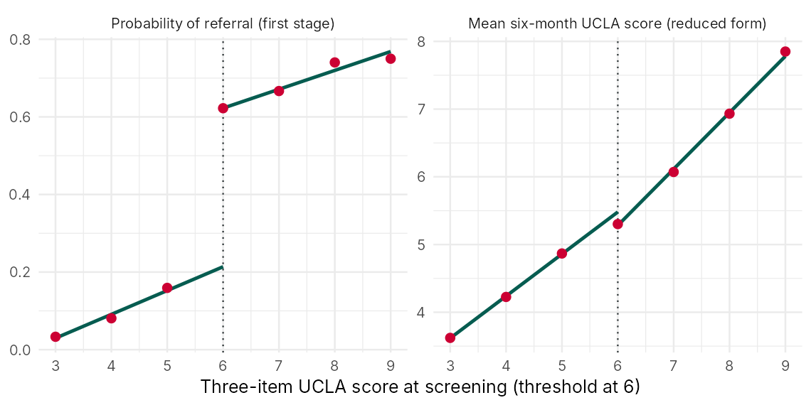
The frequencies decline smoothly from 843 at a score of 3 to 60 at 9, with 446 at 5 and 331 at 6 and no excess just above the threshold, so the distribution gives no sign of sorting. The proportion referred rises slowly below the threshold (0.033, 0.081, 0.159), reflecting clinician judgement, and then jumps to 0.622 at a score of 6. The mean six-month score rises with the screening score on both sides, as expected, with a smaller step between 5 and 6 (4.868 to 5.302) than between 6 and 7 (5.302 to 6.071).
First stage, reduced form and a covariate check. The score is centred at the threshold, and each model fits a separate line on each side over all scores from 3 to 9, so the estimated jump is the difference between the two lines at a score of 6. The first stage has a standard error of 0.0280 and the reduced form a standard error of 0.0837.
Crossing the threshold raises the probability of referral by 0.4089 (the first stage) and lowers the mean six-month score by 0.1985 points (the reduced form, p = 0.0178). Age, which cannot be affected by the referral rule, shows no clear jump (−0.5407 years, p = 0.3031).
The Wald estimate. The Wald estimate is −0.1985 / 0.4089 = −0.485 points on the three-item scale: among older adults whose referral depended on crossing the threshold, referral lowered the six-month score by about half a point. Restricting the analysis to scores 4 to 7 gives −0.539, a similar value. A percentile bootstrap interval based on 2,000 resamples of older adults runs from −0.927 to −0.047, which is wide because the first stage divides the reduced form by 0.4089, and a fuller analysis would resample clinics to respect clustering.
The two naive comparisons show why the design matters. Referred older adults had a mean six-month score 1.217 points higher than those not referred, because referral selects lonelier people. Among referred older adults, the mean score fell from 6.286 at screening to 5.547 six months later, a drop of 0.739 points that includes regression to the mean, since people selected for high scores tend to score lower when measured again. The regression discontinuity estimate avoids both biases, at the cost of describing only the margin of eligibility.
Reflection
A provincial home-support program offers subsidized weekly help to adults aged 65 and older whose frailty index, a score from 0 to 1 recorded by a home-care assessor, is 0.25 or higher. Assessors may approve people below 0.25 in exceptional circumstances, and some eligible people decline the subsidy. In a regression discontinuity analysis using local linear regression with a bandwidth of 0.05, the estimated probability of receiving the subsidy is 0.10 just below the threshold and 0.70 just above it, and the estimated mean number of hospital admissions in the following year is 0.42 just below and 0.36 just above. A histogram shows 1,840 assessments with scores from 0.230 to 0.249 and 2,410 with scores from 0.250 to 0.269, whereas the counts in neighbouring bins on both sides change by less than 5 percent from one bin to the next. (a) State whether the design is sharp or fuzzy and calculate the Wald estimate. (b) Explain to whom the estimate applies. (c) Interpret the histogram and describe two further checks you would run.
(a) The design is fuzzy, because the probability of receiving the subsidy jumps from 0.10 to 0.70 at the threshold, a jump of 0.60, rather than from 0 to 1. The jump in admissions is 0.36 − 0.42 = −0.06. The Wald estimate is −0.06 / 0.60 = −0.10 admissions per person in the following year.
(b) The estimate applies to compliers near a frailty index of 0.25: older adults who receive the subsidy because their score reaches the threshold and would not receive it otherwise. It does not describe the effect for very frail adults far above the threshold, for people approved by exception regardless of score, or for people who decline.
(c) The histogram shows 2,410 assessments just above the threshold and 1,840 just below, about 31 percent more above (2,410 / 1,840 = 1.31), whereas neighbouring bins differ by less than 5 percent. This heaping suggests that some assessors nudge borderline scores up to 0.25 to secure the subsidy. The people pushed over the threshold may be needier or have stronger advocates, so the comparison at the threshold is no longer clean. I would run a formal density test (for example, the McCrary test or rddensity) and check whether age, prior admissions and living alone are continuous at the threshold. I would also estimate a donut model that excludes scores from 0.24 to 0.26 and examine whether heaping is concentrated among particular assessors.
Minimum 20 characters required.
Question 1: What distinguishes a fuzzy regression discontinuity design from a sharp one?
Question 2: In the simulated Cedar Valley data, the probability of referral jumps by 0.4089 at a score of 6, and the mean six-month score drops by 0.1985 points. What is the Wald estimate of the effect of referral?
Question 3: A histogram of screening scores shows 446 older adults at a score of 5 and 680 at a score of 6, while the counts at other values decline smoothly. What does this pattern most likely indicate?
Question 4: The Cedar Valley steering committee asks whether lowering the referral threshold from 6 to 5 is justified. Why is a regression discontinuity estimate well suited to this question?
Natural Experiments and Instrumental Variables
Learning Objectives for this section
- Define a natural experiment and summarize the Medical Research Council guidance on using natural experiments to evaluate population health interventions.
- Describe Canadian provincial policies that have been studied as natural experiments, and identify the design and the main threat in each.
- State the assumptions of an instrumental variable analysis (relevance, independence, the exclusion restriction and monotonicity) and draw them on a causal diagram.
- Calculate a Wald estimate from a binary instrument and interpret it as a local average treatment effect among compliers.
- Assess a proposed instrument for a health program and identify the evidence that would strengthen or weaken it.
3.1 What Makes an Experiment Natural
Craig and colleagues (2012), writing the Medical Research Council's guidance on natural experiments, define them as events or interventions that are not under the control of researchers but that divide a population into exposed and unexposed groups whose outcomes can be compared. The term describes how exposure was assigned. The analytical methods are the same ones used in quasi-experimental evaluation: interrupted time series, difference-in-differences, regression discontinuity, synthetic control, matching and instrumental variables. What distinguishes a strong natural experiment is an assignment process that is unrelated, or plausibly unrelated, to the outcome. Dunning (2012) describes the ideal as assignment that is "as if random", and he argues that the credibility of a natural experiment rests mainly on the evidence that this condition holds.
The classic example is John Snow's study of cholera in London in 1854. Two water companies supplied houses on the same streets, and one of them, the Lambeth Company, had moved its intake upstream to a cleaner part of the Thames, while the Southwark and Vauxhall Company still drew water from a stretch contaminated by sewage. Households had generally not chosen their supplier, so the companies' customers were similar in most respects, and Snow (1855) could compare cholera deaths between them. The assignment was set by commercial decisions made years earlier, which is the feature evaluators look for.
The Medical Research Council guidance makes several points that apply directly to program evaluation. Natural experimental studies are most informative when the intervention is expected to have an effect large enough to detect, when good data on exposure and outcomes are available for large populations, and when the process that determines exposure is understood well enough to support a credible comparison. The guidance encourages evaluators to examine the assignment process carefully, to choose comparison groups and analyses that reduce bias from selective exposure, and to test assumptions with more than one method (Craig et al., 2012). A later review summarized the range of methods and their contributions to public health research (Craig et al., 2017), and the updated framework for complex interventions treats natural experimental evaluation as one route to evaluating interventions that researchers do not control (Skivington et al., 2021).
For the Cedar Valley Connector program, the distinction between a planned evaluation and a natural experiment is a matter of degree. The health authority planned the program, but the evaluation team did not control which clinics went first; Lesson 7 established that the 12 wave-one clinics were chosen for readiness. The region-wide emergency department series in Section 1 and the referral threshold in Section 2 are features of the program that the evaluation uses opportunistically, which is the attitude a natural experimental study takes.
3.2 Natural Experiments in Canadian Provinces
Canada's provinces make health and social policy separately and at different times, which creates many natural experiments. The examples below show how evaluators have used provincial differences and the threats that accompany each design.
Saskatchewan introduced public hospital insurance in 1947 and public medical care insurance in 1962, and the other provinces followed under federal cost-sharing legislation over the following years. Hanratty (1996) used the staggered introduction of national health insurance across provinces to estimate its effects on infant health. The design is a difference-in-differences comparison across provinces and years, and its main threat is that provinces adopting insurance earlier may have differed in other trends affecting infant health.
In 1997, Quebec began introducing low-fee child care, while other provinces did not. Baker, Gruber and Milligan (2008) compared families in Quebec with families in the rest of Canada before and after the policy, and reported increases in mothers' employment together with less favourable measures on some child and family outcomes. The design is difference-in-differences, and its main threat is other Quebec-specific changes over the same period.
British Columbia and Saskatchewan set minimum prices for alcoholic beverages and adjusted them at known dates. Stockwell and colleagues (2012) used time-series analyses of these changes and associated increases in minimum prices with reductions in alcohol consumption. The design is an interrupted time series with variation in the size and timing of price changes, and its main threats are co-occurring changes in alcohol policy and in cross-border purchasing.
From 1974 to 1979, the Mincome experiment offered a guaranteed annual income to residents of Dauphin, Manitoba. Decades later, Forget (2011) linked administrative health records to compare Dauphin residents with matched residents of comparison communities and reported fewer hospitalizations during the experiment. The original program was planned as a social experiment, but the health analysis was a natural experimental study, and its main threat is that Dauphin differed from its comparison communities in ways that matching did not capture.
Each of these studies depends on administrative data that cover whole populations over long periods. In British Columbia, Population Data BC provides researchers with access to linked health and social data under data access agreements, which makes provincial policy changes and program rollouts open to similar analysis. Section 2 described one more provincial example, the minimum legal drinking age, which Callaghan and colleagues (2013) studied with a regression discontinuity design.
3.3 The Logic of Instrumental Variables
Notation: in this section Z denotes the instrument and D denotes receipt of the program, which corresponds to the exposure X in the causal diagrams used across the course series. Elsewhere in the series, Z denotes a collider.
The designs in Lesson 7 and in Sections 1 and 2 of this lesson deal with confounding by comparing groups or periods that should be similar. An instrumental variable analysis takes a different route. It looks for a variable, the instrument, that changes the probability of receiving the program but has no other connection to the outcome. Variation in the program that is driven by the instrument is free of the confounding that affects voluntary participation, so the association between the instrument and the outcome, scaled by the association between the instrument and the program, estimates the program's effect.
Three core conditions define an instrument (Hernán and Robins, 2006). Relevance requires that the instrument be associated with receipt of the program. Independence, also called exchangeability, requires that the instrument share no common causes with the outcome, as it would if it were randomly assigned. The exclusion restriction requires that the instrument affect the outcome only through the program. Only relevance can be checked directly in the data; the other two rest on knowledge of how the instrument arose, supported by indirect checks. A fourth condition is needed to say whose effect is being estimated, and it is described below.
The Wald estimator for a binary instrument
Effect = (mean outcome when Z = 1 − mean outcome when Z = 0) / (proportion receiving the program when Z = 1 − proportion receiving the program when Z = 0)
The numerator is the effect of the instrument on the outcome (the reduced form), and the denominator is the effect of the instrument on program receipt (the first stage). With covariates or a continuous instrument, the same logic is implemented as two-stage least squares: the first stage regresses program receipt on the instrument and covariates, and the second stage regresses the outcome on the predicted receipt. Standard errors must come from software that accounts for both stages.
Compliers and the local average treatment effect
Imbens and Angrist (1994) and Angrist, Imbens and Rubin (1996) showed what an instrumental variable estimate means when program effects differ between people. With a binary instrument and a binary program, each person belongs to one of four groups, defined by how their program receipt would respond to the instrument. Under the fourth condition, monotonicity, which states that there are no defiers, the Wald estimator equals the average effect among compliers. This quantity is the local average treatment effect. It is the effect for the people whose participation the instrument actually changes, and it may differ from the average effect in the whole population.
Weak instruments create two problems. When the first stage is small, the denominator of the Wald estimator is close to zero, so the estimate becomes very imprecise, and in finite samples it is biased toward the confounded ordinary regression estimate. A small violation of the exclusion restriction is also magnified, because any direct effect of the instrument on the outcome is divided by a small number. A first-stage F statistic below about 10 is a common warning sign (Staiger and Stock, 1997). Hernán and Robins (2006) concluded that instrumental variable methods can be valuable but that their key assumptions are unverifiable, and that an instrumental variable estimate can be more biased than a conventional estimate when the assumptions are even slightly violated.
3.4 Instruments in Health Services Evaluation
Instruments in health services research usually come from features of the care system that steer people toward or away from a treatment for reasons unrelated to their own prognosis. The table summarizes common types and the assumption most likely to fail in each.
| Instrument | Example | Assumption most at risk |
|---|---|---|
| Random assignment with incomplete uptake | Randomization to a program arm, used in Lesson 6 to estimate a complier average causal effect | Exclusion, if assignment changes behaviour apart from uptake |
| Distance to a facility | Differential distance to hospitals offering cardiac catheterization (McClellan, McNeil and Newhouse, 1994) | Independence, because people who live far from facilities differ in income, rurality and health |
| Provider preference | A physician's prescribing preference for one drug over another (Brookhart et al., 2006) | Independence and exclusion, if preferred providers also differ in other aspects of care |
| Threshold rules | Being above an eligibility score in a fuzzy regression discontinuity design (Section 2) | Exclusion, if the threshold also triggers other services |
| Genetic variants | Mendelian randomization, in which inherited variants act as instruments for an exposure (Davey Smith and Ebrahim, 2003) | Exclusion, if a variant affects the outcome through other pathways |
3.5 Worked Example: Connector Capacity as an Instrument
In the second year of the fictional Cedar Valley Connector program, after the wave-two clinics joined, connectors' caseloads were sometimes full. When a referral arrived and no slot was open, the older adult was placed on a waiting list, and many never started. Whether a slot was open depended on when earlier participants completed their twelve weeks, which the evaluator argues is unrelated to the characteristics of the person being referred. Of 1,240 older adults referred in year two, 860 were referred when a slot was open and 380 when caseloads were full. The figures in this example are illustrative.
Among those referred when a slot was open, 80 percent started connector meetings within four weeks, compared with 35 percent of those referred when caseloads were full. The mean six-month three-item UCLA score was 5.6 in the first group and 5.9 in the second. The Wald estimate is (5.6 − 5.9) / (0.80 − 0.35) = −0.30 / 0.45 = −0.67 points. Under the instrumental variable assumptions, starting connector meetings promptly lowered the six-month score by about two thirds of a point among compliers, the older adults who started only because a slot was open.
The evaluator then examines each assumption. Relevance is strong, because the instrument changes the proportion starting by 45 percentage points. Independence is threatened if caseloads fill at particular times or places that also affect loneliness: caseloads may be fuller in winter, when loneliness and illness are more common, or at clinics serving more isolated neighbourhoods. The analysis should therefore compare referrals within the same clinic and season and check whether baseline scores, age and living arrangements are balanced between referrals made when slots were open and when caseloads were full. The exclusion restriction is threatened if waiting-list status affects loneliness through other paths, for example if waitlisted older adults received a welcome call and a list of community groups, or if clinicians referred them to another service. Monotonicity is plausible, because an open slot should never make an older adult less likely to start.
This estimate answers a different question from the regression discontinuity estimate in Section 2. The fuzzy regression discontinuity estimates the effect of referral for older adults at the margin of eligibility, whereas the capacity instrument estimates the effect of starting promptly among older adults who were already referred. The two complier groups differ, and the estimates need not agree. Reporting both, with their assumptions, gives decision-makers a fuller picture than either alone.
3.6 Judging a Natural Experiment
Because the evaluator does not control assignment in a natural experiment, the strength of the evidence depends on how well alternative explanations have been examined. The questions below organize that assessment. Lesson 2 Section 3.5 places this kind of design within the MRC framework for developing and evaluating complex interventions, whose evaluation phase includes natural experimental designs for interventions that cannot be randomized.
The evaluator should document who decided which people, places or periods were exposed, on what basis and when. Assignment by readiness, need or political priority is more likely to be related to outcomes than assignment by timing, capacity or administrative accident.
The comparison group or period should be exposed to the same co-occurring events as the exposed group. Pre-period trends, covariate balance and the density of the running variable provide evidence on comparability.
Negative control outcomes, which the intervention should not affect, and negative control exposures, which should not affect the outcome, can reveal confounding (Lipsitch, Tchetgen Tchetgen and Cohen, 2010). For Cedar Valley, emergency visits for fractures could serve as a negative control outcome for the connector program.
Triangulation compares results from approaches with different sources of bias (Lawlor, Tilling and Davey Smith, 2016). If a controlled interrupted time series, a difference-in-differences comparison of clinics and a regression discontinuity estimate point in the same direction, a common bias is less likely to explain all three.
Natural experimental studies usually rely on linked administrative data, which require data access agreements, privacy review and, where the work is research, ethics review under TCPS 2. Indigenous data in British Columbia also require attention to First Nations data governance, as Lesson 4 discussed.
A colleague proposes using the straight-line distance from each older adult's home to the nearest wave-one clinic as an instrument for program participation, with emergency department visits in the following year as the outcome. Write a short paragraph assessing relevance, independence, the exclusion restriction and monotonicity for this instrument, and name one check that could weaken or strengthen the case for it.
Reflection
An evaluator wants to estimate the effect of attending a community connector program on emergency department visits among adults aged 65 and older in a health region with towns and rural areas. Attendance is voluntary, and attenders differ from non-attenders in health and motivation. The evaluator proposes living within 5 km of a connector office as an instrument. In linked records, 34 percent of older adults living within 5 km attended, compared with 18 percent of those living farther away, and mean emergency department visits in the following year were 0.48 per person within 5 km and 0.52 farther away. The first-stage F statistic is 45. Most residents living farther than 5 km live in rural communities, and the region's two emergency departments are in its two largest towns, where the connector offices are also located. The four instrumental variable conditions are relevance (the instrument is associated with attendance), independence (the instrument shares no causes with the outcome), the exclusion restriction (the instrument affects the outcome only through attendance) and monotonicity (no one attends less because they live closer). (a) Calculate the Wald estimate. (b) Assess each of the four conditions for this instrument. (c) Propose two changes that would make the analysis more credible, and state whom the estimate would describe.
(a) The Wald estimate is (0.48 − 0.52) / (0.34 − 0.18) = −0.04 / 0.16 = −0.25 emergency visits per person per year among compliers.
(b) Relevance is satisfied: attendance differs by 16 percentage points and the first-stage F of 45 is well above the usual warning level of 10. Independence is doubtful, because people within 5 km live mainly in towns and differ from rural residents in age, income, health and access to services. The exclusion restriction is also doubtful, because living near a connector office means living near an emergency department, and proximity to an emergency department affects its use directly. Monotonicity is plausible, because living closer should not make anyone less likely to attend, although a few people might avoid a program where neighbours could see them.
(c) First, I would adjust for rurality and for distance to the nearest emergency department, or compare older adults within the same community type, so that the instrument varies among people with similar access to emergency care. Second, I would test the instrument against a negative control outcome, such as emergency visits for fractures, which attending a connector program should not change; an association would signal a violation. The estimate would describe compliers: older adults who attend because they live close and would not attend if they lived farther away, who may be less mobile or lack transportation.
Minimum 20 characters required.
Question 1: According to the Medical Research Council guidance (Craig et al., 2012), what defines a natural experiment?
Question 2: Which instrumental variable assumption can be checked directly in the data?
Question 3: In the Cedar Valley capacity example, 80 percent of older adults referred when a slot was open started meetings within four weeks, compared with 35 percent when caseloads were full, and mean six-month scores were 5.6 and 5.9. What does the Wald estimate of −0.67 describe?
Question 4: Distance to a facility is often proposed as an instrument. Which assumption is it most likely to violate, and why?
Quality Improvement Designs
Learning Objectives for this section
- Describe the Model for Improvement and the Plan-Do-Study-Act cycle, and identify the features that make a series of cycles informative.
- Construct and interpret a run chart using the four run chart rules.
- Distinguish common-cause from special-cause variation, choose an appropriate statistical process control chart, and calculate control limits for a p-chart.
- Identify the reporting elements of SQUIRE 2.0.
- Compare quality improvement designs with the evaluation designs of Lessons 6 to 8, and write a design justification that names its assumptions and the checks for them.
4.1 Quality Improvement and Evaluation
Quality improvement has been defined as systematic, data-guided activities designed to bring about immediate, positive change in the delivery of health care in particular settings (Lynn et al., 2007). Its purpose is local and practical: a team wants its own process to work better, soon. Evaluation, as Lesson 1 defined it, determines the merit, worth or significance of a program, and research seeks knowledge that generalizes beyond the setting. The three overlap in methods, and many programs need all of them. TCPS 2 Article 2.5, discussed in Lesson 1, recognizes that quality improvement and program evaluation activities do not require research ethics board review unless they are conducted for research purposes, although they still raise ethical questions that teams must address.
Programs such as the Cedar Valley Connector program use quality improvement designs to improve their own delivery, and an evaluator needs to understand what such data can show. The designs share the logic of Section 1, because they track a measure over time and look for change after a deliberate intervention, although their standards of evidence differ, as Section 4.6 explains.
4.2 The Model for Improvement and Plan-Do-Study-Act Cycles
The Model for Improvement (Langley et al., 2009) asks three questions: what are we trying to accomplish, how will we know that a change is an improvement, and what change can we make that will result in improvement. The answers become an aim, a set of measures and a set of change ideas. Change ideas are then tested in Plan-Do-Study-Act (PDSA) cycles. The cycle descends from Walter Shewhart's work on industrial quality in the 1920s and 1930s and was developed by W. Edwards Deming, who preferred "Study" to "Check" to emphasize learning from the data. In the Plan stage the team states the change, a prediction and the data it will collect; in Do it carries out the test on a small scale; in Study it compares the results with the prediction; and in Act it decides whether to adopt, adapt or abandon the change.
The Model for Improvement uses three kinds of measures. Outcome measures track the aim, process measures track whether the changes are being carried out, and balancing measures watch for unintended effects elsewhere in the system, such as staff overtime or longer waits for other services.
PDSA cycles are simple to describe and difficult to do well. Taylor and colleagues (2014) reviewed published applications in health care and found that few reports showed the method's key features: a sequence of linked cycles, an explicit prediction for each test, small-scale testing before wider implementation, and the use of data collected over time. Reed and Card (2016) argued that the apparent simplicity of the method hides the skill, resources and organizational support it requires, and that cycles are often used as single projects with little connection to a theory of change. An evaluator reviewing a program's improvement work therefore looks for documented predictions, linked cycles and time-series data, which together distinguish genuine learning from a record of activity.
The fictional Cedar Valley Connector program's coordinator notices that many referred older adults wait more than two weeks for a first meeting, and that some lose interest while they wait. The improvement aim is to raise the percentage of referred older adults who have a first connector meeting within 14 days from about 54 percent to 70 percent within six months. The outcome measure is the weekly percentage of new referrals with a first meeting within 14 days, the process measure is the percentage of new referrals telephoned within two business days, and the balancing measure is connector overtime hours. In the first PDSA cycle, one connector at one clinic telephones every new referral within two business days for two weeks, predicting that 8 of 10 will be reached. Six of nine are reached, and several older adults say they would prefer a text message first. In the second cycle, two connectors offer a text message before the call. Later cycles extend the change to all wave-one clinics from week 11.
4.3 Run Charts
A run chart plots a measure over time in the order the data were collected, with the median as a centre line and the timing of changes annotated on the chart. It is the basic tool for judging whether a process has changed, because it distinguishes patterns that are unlikely to arise by chance from the ordinary ups and downs of a stable process. Perla, Provost and Murray (2011) describe four rules for detecting non-random patterns. A shift is six or more consecutive points all above or all below the median, with points that fall on the median neither breaking nor adding to the run. A trend is five or more consecutive points all going up or all going down. Too few or too many runs, judged against a published table for the number of points, indicate non-random clustering or oscillation. An astronomical data point is a value that is obviously different from all others and that people familiar with the process would recognize as unusual. When a change is tested after a stable baseline, the median is often calculated from the baseline points and extended across the chart, so that new points are judged against the earlier centre.
In the illustrative data, the weekly percentages in the ten baseline weeks were 52, 58, 49, 55, 61, 50, 57, 53, 48 and 56, with a median of 54. After the change was spread from week 11, the percentages were 60, 63, 59, 66, 68, 64, 70, 67, 72 and 69. All ten post-change points lie above the baseline median, which meets the shift rule. No five consecutive points rise or fall, so the trend rule is not met, and no point is astronomical. The shift is a non-random signal that coincides with the change, and the team would reasonably conclude that the process improved. The run chart cannot show, by itself, that the change caused the improvement. A new coordinator, a seasonal fall in referrals or a change in how meetings were recorded could produce the same signal, which is the history threat of Section 1 in a new setting.
4.4 Statistical Process Control Charts
Shewhart (1931) distinguished two kinds of variation. Common-cause variation is the ordinary variation built into a stable process, arising from many small sources that cannot be separated. Special-cause variation comes from specific, identifiable sources that are not part of the usual process. A process that shows only common-cause variation is said to be in statistical control, and its future performance is predictable within limits. A statistical process control chart, or control chart, plots the measure over time with a centre line (usually the mean) and upper and lower control limits, conventionally set three standard deviations from the centre line, with the standard deviation calculated from the distribution that suits the data (Benneyan, Lloyd and Plsek, 2003; Mohammed, Worthington and Woodall, 2008).
Common rule sets for detecting special-cause variation include a single point outside the control limits, eight consecutive points on one side of the centre line, six consecutive points increasing or decreasing, and two of three consecutive points beyond two standard deviations on the same side. Teams should agree on one set of rules in advance, because applying many rules increases false signals. The choice of chart depends on the type of data.
| Chart | Type of data | Cedar Valley example |
|---|---|---|
| p-chart | Proportions with varying subgroup sizes | Monthly proportion of referrals with a first meeting within 14 days |
| u-chart | Rates per unit of exposure with varying denominators | Monthly emergency visits per 1,000 residents aged 65 and older |
| c-chart | Counts with a constant area of opportunity | Weekly number of new referrals at one clinic |
| Individuals chart (XmR) | One continuous value per period, with limits from moving ranges | Monthly median days from referral to first meeting |
Control limits for a p-chart
Centre line = p̄, the overall proportion in the baseline period. Limits for subgroup i = p̄ ± 3 × √(p̄ × (1 − p̄) / ni), where ni is the number of referrals in that subgroup.
With p̄ = 0.54 and a month with 52 referrals, the standard deviation is √(0.54 × 0.46 / 52) = 0.0691, so the limits are 0.54 ± 0.207, or 0.333 to 0.747. A month in which 75 percent of 52 referrals had a first meeting within 14 days would lie above the upper limit and signal special-cause variation, whereas a month at 70 percent would lie within the limits and would need a run of points to signal a change. Months with fewer referrals have wider limits.
Control charts and interrupted time series use the same kind of data for different purposes: a control chart flags signals quickly for managers to investigate, whereas an interrupted time series estimates the size of an effect against a modelled counterfactual. Both are affected by the issues raised in Section 1. Standard control limits assume independent observations, so positive autocorrelation produces more false signals, and a strong seasonal pattern can create apparent special causes in winter. A u-chart of Cedar Valley's monthly emergency visit rate, for example, would flag winter peaks as special causes unless the seasonal pattern were modelled first.
4.5 Reporting with SQUIRE 2.0
The Standards for QUality Improvement Reporting Excellence, SQUIRE 2.0 (Ogrinc et al., 2016), provide an 18-item guideline for reporting systematic efforts to improve the quality, safety and value of health care. The items follow the structure of a scientific report: title and abstract; an introduction covering the problem, available knowledge, rationale and specific aims; methods covering context, the intervention or interventions, the study of the intervention, measures, analysis and ethical considerations; results; a discussion with a summary, interpretation, limitations and conclusions; and funding.
Four items deserve particular attention from evaluators.
Authors state the informal or formal frameworks, models or theories used to explain the problem and the expected effect of the intervention, which links improvement work to the program theory of Lesson 3.
Authors describe the elements of the setting considered important at the outset, such as staffing, leadership support and existing services, so that readers can judge where the results might transfer.
SQUIRE separates the intervention from the approach chosen to assess whether the observed outcomes were due to it. This is where the team names its design, whether a run chart, a control chart, an interrupted time series or a controlled comparison.
Authors report their outcome, process and balancing measures and the methods used to draw inferences, such as the run chart rules applied. A Cedar Valley report on first meetings would also list the co-occurring changes the team considered.
4.6 Quality Improvement Designs and the Evaluation Designs of Lessons 6 to 8
Lessons 6 to 8 have introduced a set of designs that differ in the question they answer, the assumption they rely on and the data they need. The table compares them, using the Cedar Valley program as a common reference.
| Design | Question answered | Key assumption | Cedar Valley use |
|---|---|---|---|
| Cluster or stepped-wedge randomized trial (Lesson 6) | Effect of offering the program, averaged over clinics | Randomization was carried out and maintained | Hypothetical randomized order of clinic waves |
| Difference-in-differences (Lesson 7) | Effect in program clinics over a period | Parallel trends without the program | Wave-one compared with wave-two clinics in year one |
| Propensity score methods (Lesson 7) | Effect for participants compared with similar non-participants | No unmeasured confounding | Referred older adults matched to similar older adults at wave-two clinics |
| Synthetic control (Lesson 7) | Effect for one treated unit | A weighted combination of donors reproduces the pre-period | Region-wide rates compared with a weighted set of other regions |
| Interrupted time series (Lesson 8) | Change in level and slope after launch | The pre-launch trend would have continued; a comparison series shares co-occurring events | Monthly emergency visit rates with Juniper Ridge |
| Regression discontinuity (Lesson 8) | Effect at the eligibility threshold | Continuity at the threshold and no manipulation | The UCLA score of 6 referral rule |
| Instrumental variable (Lesson 8) | Effect among compliers | Relevance, independence, exclusion and monotonicity | Connector capacity at the time of referral |
| Run chart or control chart with PDSA cycles (Lesson 8) | Whether a local process changed after a tested change | A stable baseline and no co-occurring change | First meetings within 14 days |
Quality improvement designs place speed and local learning ahead of causal certainty. A run chart with a shift after a tested change is persuasive to the team that made the change, and it is often enough for a local decision, but it leaves history and instrumentation threats largely unaddressed. Improvement teams can strengthen their designs with the methods of this lesson: by annotating co-occurring events, by spreading a change across sites at staggered times so that each site's start serves as a replication (a logic close to the stepped-wedge design of Lesson 6), by adding a comparison site or a balancing measure, and by analyzing a long series with segmented regression. Evaluators, in turn, can use a program's improvement data as evidence of implementation and as process measures within a larger design.
4.7 Choosing and Justifying a Design
No design is best in general. The choice follows from the evaluation question and the decision it informs (Lesson 4), from the way the program was assigned to people or places, from the data that exist or can be collected, from the assumptions that are plausible in the setting, and from ethical and practical constraints. A design justification sets out this reasoning so that readers can judge it. A strong justification states the evaluation question and the causal contrast it requires, describes how the program was or will be assigned, names the chosen design and the alternatives considered with reasons for rejecting them, states the design's assumptions in plain language, specifies in advance the checks for each assumption, explains what the evaluator will conclude if a check fails, and identifies complementary designs or data that address the main remaining threats.
4.8 Worked Example: A Design Justification for Cedar Valley
The following excerpt shows the core of a design justification for the fictional Cedar Valley Connector program, written for the steering committee.
Excerpt: Cedar Valley design justification
The evaluation addresses three questions agreed with the steering committee: whether the program reduces loneliness among referred older adults, whether it reduces emergency department visits among older adults in the region, and whether lowering the referral threshold from a UCLA score of 6 to 5 is justified. Because the health authority chose the 12 wave-one clinics for their readiness, the clinics were not randomized, and comparisons between waves must address selection.
For loneliness, the primary design is a difference-in-differences comparison of the change between screening and follow-up among older adults screened at wave-one and wave-two clinics during the program's first year, combined with the matching on baseline characteristics developed in Lesson 7. Its key assumption is that, without the program, loneliness and screening patterns would have followed parallel trends in the two groups of clinics. Because loneliness screening began only at launch, pre-launch trends in loneliness cannot be observed, so we will examine trends in emergency and primary care visits among screened older adults for the 24 months before launch, from linked records, as an indirect check, and present an event-study plot for those outcomes.
For emergency department visits, the design is a controlled interrupted time series using 48 months before and 24 months after launch, with Juniper Ridge as the comparison region and emergency visits for fractures as a negative control outcome. Its assumptions are that the difference between the regions would have continued along its pre-launch path and that co-occurring events affected both regions. Because the program reaches a small share of older adults, we will report a plausibility check on the size of any region-wide effect and analyze visits among referred older adults through linked records.
For the threshold question, a fuzzy regression discontinuity at a score of 6 will estimate the effect of referral for older adults at the margin of eligibility. We will check the distribution of scores at 5 and 6, the continuity of age and prior emergency visits, placebo thresholds and results in two windows, and we will interpret the estimate cautiously because the score has only seven values. Process improvement data on first meetings within 14 days will be tracked on a p-chart and reported as implementation evidence.
| Assumption | Planned check | If the check fails |
|---|---|---|
| Parallel trends between wave-one and wave-two clinics | Pre-launch trends and an event-study plot | Report the difference-in-differences estimate as descriptive and give more weight to the other designs |
| Juniper Ridge shares co-occurring events | Pre-launch trend in the difference series, a list of regional events, and the negative control outcome | Seek a second comparison series, such as residents aged 50 to 64 |
| No manipulation of screening scores | Frequencies at scores 5 and 6, and clinician-level patterns | Use a donut analysis that excludes scores of 6, or drop the threshold analysis |
| Effect size plausible given reach | Dilution arithmetic using participant counts | Treat a region-wide effect as unexplained and investigate co-interventions |
What a design justification contains
A design justification states the evaluation questions the design must answer and the causal contrast each requires, describes how the program was or will be assigned, names the chosen design (randomized, quasi-experimental, natural experimental, a quality improvement design, or a combination), and explains why at least one alternative was rejected. It lists each key assumption in plain language with the check that will be run for it, states what the evaluator will conclude if a check fails, and summarizes the assumptions and checks in a short table, as the Cedar Valley excerpt above does.
A sound justification lets the design follow from the evaluation questions, the assignment process and the available data, and it matches each assumption to a specific, feasible check planned in advance. It addresses the main threats to validity, including history and selection, explains how complementary data or designs reduce them, and, where relevant, addresses the number of time points, the bandwidth or the strength of an instrument. It is written clearly enough for a steering committee to act on.
Reflection
A clinic team tested a change in which connectors telephone each referred older adult within two business days. The team recorded the weekly percentage of referrals reached within two business days for eight weeks before the change (41, 47, 44, 39, 50, 45, 42 and 48) and for eight weeks after it began in week 9 (52, 49, 55, 47, 58, 56, 60 and 57). The run chart rules are as follows: a shift is six or more consecutive points all above or all below the median; a trend is five or more consecutive points all increasing or all decreasing; too few or too many runs indicate a non-random pattern; and an astronomical point is an obviously unusual value. SQUIRE 2.0 is an 18-item guideline for reporting quality improvement work, with items that include the rationale, the context, the intervention, the study of the intervention, measures, analysis, ethical considerations and limitations. (a) Calculate the baseline median and apply the shift and trend rules, extending the baseline median across all 16 weeks. (b) State what the team can and cannot conclude. (c) Name two elements that a SQUIRE 2.0 report of this work should contain and explain why each matters here.
(a) The sorted baseline values are 39, 41, 42, 44, 45, 47, 48 and 50, so the median is (44 + 45) / 2 = 44.5. Week 8 (48) and all eight post-change weeks (52, 49, 55, 47, 58, 56, 60 and 57) lie above 44.5, giving nine consecutive points above the median, which meets the shift rule. No five consecutive points rise or fall, because the post-change values alternate between rises and falls, so the trend rule is not met, and no value is astronomical.
(b) The team can conclude that the process changed in a non-random way at about the time of the change. It cannot conclude from the run chart alone that the telephone change caused the improvement. The run begins in week 8, one week before the change, which suggests checking whether staff started early or whether another event occurred, such as new staff or a drop in referrals. Annotating co-occurring events, tracking a balancing measure such as connector overtime, and replicating the change at a second clinic would strengthen the conclusion.
(c) The report should describe the study of the intervention, naming the run chart rules and the baseline median used, because readers need to know how the team judged improvement. It should also describe the context, including staffing and referral volumes, because the change may depend on connector capacity and may not transfer to busier clinics.
Minimum 20 characters required.
Question 1: On a run chart with a baseline median of 54 percent, which pattern meets the shift rule described by Perla, Provost and Murray (2011)?
Question 2: For a p-chart with a centre line of 0.54 and a month with 52 referrals, the control limits are 0.333 to 0.747. A month at 0.70 is observed. What is the appropriate interpretation?
Question 3: What does SQUIRE 2.0 mean by the study of the intervention?
Question 4: Which statement best compares a run chart used in PDSA work with a controlled interrupted time series?
Final Assessment
Bringing It All Together
This lesson completed the course's sequence on designs for causal claims about programs. Section 1 showed how an interrupted time series uses a long run of observations to project what would have happened without a program, how segmented regression estimates level and slope changes, why seasonality and autocorrelation must be handled, and how a comparison series addresses co-occurring events. The worked example applied these ideas to Cedar Valley's simulated emergency department series and showed that a shared drop in a neighbouring region reduced the estimated effect by about a third.
Section 2 turned to eligibility thresholds and explained how a regression discontinuity design compares people just above and just below a cut-off, why the Cedar Valley referral rule produces a fuzzy design, and how the Wald estimator recovers a local effect for compliers. Section 3 placed these designs within the wider idea of natural experiments, using the Medical Research Council guidance and Canadian provincial examples, and set out the assumptions of instrumental variable analysis. Section 4 described quality improvement designs, from Plan-Do-Study-Act cycles to run charts and control charts, and compared them with every design in Lessons 6 to 8 before showing how to write a design justification.
Key Takeaways from this lesson
- An interrupted time series uses the pre-intervention level and trend to project a counterfactual, which controls for secular trends and maturation but leaves history, instrumentation and changes in population composition as threats.
- Segmented regression estimates a level change and a slope change, and the effect at a given month after launch combines both coefficients, so its confidence interval requires their covariance.
- The expected shape of an effect should be specified in advance from the program theory, because a shape chosen after examining the data can fit random fluctuation.
- Seasonality can be modelled with calendar-month indicators or Fourier terms, and positive autocorrelation makes ordinary standard errors too small, which Newey-West standard errors or autoregressive models correct.
- A controlled interrupted time series adds a comparison series that shares co-occurring events, and its key assumption is that the difference between the series would have continued along its pre-launch path.
- A region-wide outcome can dilute the effect of a program that reaches few people, so evaluators should check whether an estimated effect is plausible given the program's reach.
- A regression discontinuity design estimates the effect of a program at an eligibility threshold, and in a fuzzy design the Wald estimator divides the jump in the outcome by the jump in the probability of receiving the program.
- Regression discontinuity analyses need checks for manipulation of the running variable, covariate continuity, placebo thresholds and sensitivity to bandwidth, and discrete running variables require extra caution.
- An instrumental variable must be relevant, independent of the outcome's causes and related to the outcome only through the program, and under monotonicity it estimates a local average treatment effect among compliers.
- Run charts and control charts support rapid local learning in quality improvement, but they leave history threats largely unaddressed unless they are combined with comparisons, replication or segmented regression.
Core Concepts Reviewed
Section 1: interrupted time series, segmented regression, level and slope changes, impact models, seasonality and Fourier terms, autocorrelation, the Durbin-Watson test, Newey-West standard errors, the number of time points, dilution and the controlled interrupted time series.
Section 2: the running variable and threshold, continuity, sharp and fuzzy designs, the first stage, the reduced form, the Wald estimator, local linear regression, bandwidth choice, discrete running variables, manipulation and density tests, covariate and placebo checks, and the local interpretation of effects.
Section 3: natural experiments and the Medical Research Council guidance, as-if random assignment, Canadian provincial examples, instrumental variable assumptions, two-stage least squares, compliers and the local average treatment effect, weak instruments and falsification tests.
Section 4: the Model for Improvement, Plan-Do-Study-Act cycles, outcome, process and balancing measures, run chart rules, common-cause and special-cause variation, control charts and p-chart limits, SQUIRE 2.0, and the comparison and justification of evaluation designs.
The final reflection asks you to choose and justify a design for a new program, drawing on all four sections of the lesson.
Reflection
A provincial health ministry introduces free public transit passes for adults aged 65 and older with annual incomes below $30,000 in one health region on 1 April, and plans to extend the program to other regions in two years if it is effective. Monthly emergency department and primary care visit rates are available for every region for the five years before the launch, income is recorded for everyone in tax-linked administrative data, and uptake of the pass is recorded for each eligible person. Uptake is voluntary, and about half of eligible older adults collect a pass. The ministry asks whether the passes reduce health care use among older adults. In about 250 words, choose a design or a combination of designs, justify the choice by reference to how the passes were assigned and the data available, state the key assumption of each design in plain language, and specify one check for each assumption.
The passes were assigned by region and launch date, and within the launch region by an income threshold, and uptake is voluntary. These features support two complementary designs.
The first is a controlled interrupted time series of monthly emergency and primary care visit rates among older adults with incomes below $30,000, with 60 months before launch, using the same income group in neighbouring regions as the comparison series. Its key assumption is that, without the passes, the difference between the launch region and the comparison regions would have continued along its pre-launch path, which requires that co-occurring events affect both. I would check the pre-launch trend in the difference series, record provincial and regional events around April, and examine a negative control outcome, such as visits among older adults with incomes well above the threshold in the launch region.
The second is a fuzzy regression discontinuity at the $30,000 income threshold within the launch region, with pass uptake as the treatment. Its key assumptions are that health care use would change smoothly with income at the threshold and that people cannot precisely manipulate reported income. I would check the density of incomes just below and above $30,000, test the continuity of age and prior visits at the threshold, and report estimates across several bandwidths. Because uptake is about half, the estimate would describe compliers near the threshold. Together, the two designs address history and selection with different assumptions, and agreement between them would strengthen the ministry's decision.
Minimum 30 characters required.
Final Knowledge Assessment
Question 1: An evaluator has 60 monthly observations of a rate before a program launch and 18 after, and the program theory predicts an effect that builds as enrolment grows. Which impact model should the analysis plan specify?
Question 2: How do Newey-West standard errors differ from ordinary least squares standard errors in a segmented regression?
Question 3: In the Section 1 worked example, the single-series effect in month 72 was −2.029 visits per 1,000 and the controlled effect was −1.378. Which conclusion is best supported?
Question 4: Which design from Lesson 7 is most closely related to a controlled interrupted time series?
Question 5: A subsidy makes adults eligible at age 65. Which threat is specific to using this threshold in a regression discontinuity design?
Question 6: Why is the confidence interval for a fuzzy regression discontinuity estimate wider than that for the reduced-form jump on which it is based?
Question 7: A fuzzy regression discontinuity design is a special case of which method?
Question 8: Referred older adults in the simulated data had six-month scores 1.217 points higher than those not referred, while the regression discontinuity estimate was −0.485. What explains the difference?
Question 9: Which kind of evidence most strengthens the claim that assignment in a natural experiment was as if random?
Question 10: Under monotonicity, whose effect does an instrumental variable estimate describe?
Question 11: An instrumental variable analysis has a first-stage F statistic of 4. Which problem does this most strongly suggest?
Question 12: Which Canadian study used a regression discontinuity design at a provincial legal threshold?
Question 13: In a Plan-Do-Study-Act cycle, what is the purpose of stating a prediction in the Plan stage?
Question 14: A u-chart of monthly emergency visits per 1,000 older adults flags every January as special-cause variation. What is the most likely explanation?
Question 15: A design justification states that a controlled interrupted time series assumes that the comparison region is similar. How could this statement be improved?
Glossary: Key Terms, People & Frameworks
📚 Reference page, available throughout the lesson
This glossary defines the terms, tools and people introduced in Lesson 8, grouped by the lesson's main themes.