Exploratory Data Analysis and Visualization
Exploratory Data Analysis For Epidemiology
Learning objectives for this lesson:
- Explain the purpose of exploratory data analysis and why summary statistics alone can mislead, using Anscombe's quartet as the illustration.
- Choose an appropriate display for one variable, for two variables and for many variables, given the variable types involved.
- Produce histograms, bar charts, boxplots and scatterplots in base R, and arrange several base R plots in one window.
- Build the same plots in ggplot2 by mapping variables to aesthetics and adding geoms, scales, labels and themes.
- Use
facet_wrap()andfacet_grid()to compare a display across groups. - Produce a correlation heatmap, a scatterplot with marginal histograms, and a combined multi-panel figure.
- Read plots for data problems such as skew, outliers, heaping and impossible values, and write a figure caption that states what the figure shows.
This course was developed by Dr. Kiffer G. Card, Faculty of Health Sciences, Simon Fraser University based on Dohoo, I. R., Martin, S. W., & Stryhn, H. (2012). Methods in Epidemiologic Research. VER Inc.
Glossary: Key Terms, People & Concepts
📚 Reference page, available throughout the lesson
This glossary collects the key concepts, methods and people in this lesson. It can be used as a reference while working through the material or as a review before assessments. Typing in the search box filters the entries.
anscombe.
hist() in base R and geom_histogram() in ggplot2.
barplot(table(x)), and in ggplot2 with geom_bar() or geom_col().
pairs().
alpha in ggplot2 or rgb(..., alpha) in base R.
aes(), links a variable to a visual property such as horizontal position, colour or fill. A value given outside aes() is set for every mark.
geom_histogram(), geom_boxplot(), geom_point() or geom_tile(). Each geom is a layer.
facet_wrap() uses one variable, and facet_grid() places one variable in rows and another in columns.
theme_minimal().
geom_smooth(method = "loess").
cor().
ggExtra::ggMarginal() adds them to a ggplot2 scatterplot.
+ or | places plots side by side and / stacks them.
ggsave() writes a ggplot2 plot to a file of a chosen width and height. Resolution, in dots per inch (dpi), is usually 300 for print.
x[x == 20] <- NA. na.omit() keeps only rows with no missing values (a complete-case file).
Look Before You Model
The plots tell four different stories
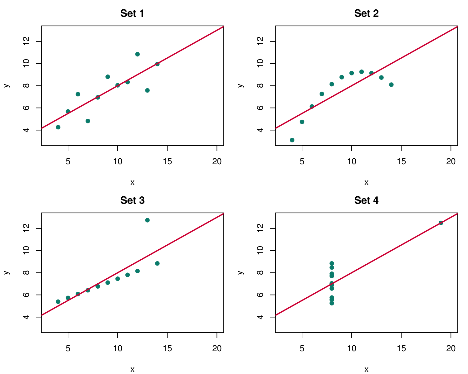
anscombe.Four displays that conceal the data
Introduction and Overview
Lessons 4 and 5 fitted regression models to outcomes of many kinds. Each of those models rested on assumptions about the shape of the data: a straight-line relationship, residuals with an even spread, counts that are not more variable than the model allows, or observations that are independent. This lesson returns to the step that should come before any model is fitted, which is looking carefully at the data. Exploratory data analysis uses plots and simple summaries to find the shape of each variable, unusual or impossible values, and the relationships between variables. It tells the analyst whether the planned model suits the data, and it often suggests questions that the model should answer.
Learning Objectives
- Explain the purpose of exploratory data analysis and how it differs from confirmatory analysis.
- Use Anscombe's quartet to explain why summary statistics alone can mislead.
- Choose an appropriate display for one variable, for two variables and for many variables, given the variable types involved.
- Recognize four common poor displays and describe what each one conceals.
- Compute summary statistics and draw a set of four plots in R for Anscombe's quartet.
Box 6.1 introduces the running case for the lesson, a one-page visual briefing on social connection that an analyst prepares for a regional working group on loneliness. Each section of the lesson returns to this briefing, so the box sets out the group's three questions and the survey data from which the plots are drawn.
A regional health authority has formed a working group on loneliness. Before it commissions any statistical modelling, the group has asked an analyst for a one-page visual briefing on social connection, drawn from the 2021 wave of the Canadian Social Connection Survey (CSCS). The group has three questions: how lonely people in the survey are, whether loneliness differs by age and gender, and how loneliness goes together with social support and mental health. The 2021 wave has 4,045 respondents, one row per person, and 3,083 of them answered every question used in the briefing. Each section of this lesson adds plots to the briefing, and Section 4 assembles them into a single multi-panel figure with a caption. Section 2 describes how the survey recruited its respondents and what its sample can support.
The rest of this section explains what exploratory data analysis is, shows with Anscombe's quartet why summary statistics alone can mislead, matches displays to the questions they answer, and examines four common poor displays.
What Exploratory Data Analysis Is
The statistician John Tukey set out this kind of work in his book Exploratory Data Analysis (Tukey, 1977). He distinguished two activities. Confirmatory analysis tests a question that was set before the data were examined, and it reports estimates, confidence intervals and p-values. Exploratory analysis asks what the data look like, using plots and simple summaries, and it is open to finding things that nobody planned to look for. Tukey compared exploration to detective work: the analyst gathers clues about the data before deciding which formal test or model to apply.
Exploration serves three purposes in an epidemiological analysis. It checks data quality, by revealing values that are impossible, implausible or suspiciously common. It describes distributions, which decides whether a mean or a median is the better summary and whether a variable needs to be transformed or grouped. It shows relationships, including whether they are straight or curved and whether they differ between groups, which decides how variables should enter a model. Lesson 2 introduced numeric summaries, data cleaning and the basic plots for one and two variables (histograms, boxplots, bar charts and scatterplots). This lesson develops those plots into an exploratory workflow and adds displays for many variables.
Table 6.1 sets out five questions that the analyst asks during exploration, what a plot can show in answer to each, and how the answer changes the later analysis.
Table 6.1. Questions asked during exploration, what a plot can show, and what the answer changes in the analysis.
| Question the analyst asks | What the plot can show | What it changes in the analysis |
|---|---|---|
| What shape does each variable have? | Symmetry or skew, one peak or two, a floor or ceiling | The choice between a mean and a median; transformation or grouping |
| Are there unusual or impossible values? | Outliers, values outside the possible range, spikes at a maximum | Checking the codebook; recoding values to missing; a sensitivity analysis |
| Do answers pile up on particular values? | Heaping on round numbers or on the end of a scale | Caution in interpreting small differences; grouping the variable |
| How do two variables go together? | Direction, form (straight or curved) and strength | How each variable enters a model; whether a curve is needed |
| Does a pattern differ between groups? | Different shapes or slopes in different panels | Whether an interaction or a stratified analysis is needed |
Each question in Table 6.1 is answered by looking at a plot. The next part shows, with four small datasets, why summary statistics cannot take the place of a plot.
Anscombe's Quartet: Why Summary Statistics Can Mislead
In 1973 the statistician Francis Anscombe published four small datasets to argue that graphs are an essential part of statistical analysis and that a computer should produce graphs as well as calculations (Anscombe, 1973). Each dataset has eleven pairs of values, labelled x and y, and the four datasets are supplied with R as a data frame called anscombe. Their summary statistics are almost identical, as Table 6.2 shows.
Table 6.2. Summary statistics for the four datasets in Anscombe's quartet (Anscombe, 1973).
| Statistic | Set 1 | Set 2 | Set 3 | Set 4 |
|---|---|---|---|---|
| Mean of x | 9.0 | 9.0 | 9.0 | 9.0 |
| Mean of y | 7.5 | 7.5 | 7.5 | 7.5 |
| Standard deviation of x | 3.32 | 3.32 | 3.32 | 3.32 |
| Standard deviation of y | 2.03 | 2.03 | 2.03 | 2.03 |
| Correlation of x and y | 0.816 | 0.816 | 0.816 | 0.817 |
| Fitted line | y = 3.00 + 0.500x | y = 3.00 + 0.500x | y = 3.00 + 0.500x | y = 3.00 + 0.500x |
A report that gave only these numbers would describe the four datasets as the same. The plots show that they are very different. Figure 6.1 draws each of the four sets as a scatterplot with its fitted line.
anscombe data frame in R.The accordion below takes the four panels of Figure 6.1 in turn and states, for each set, what the plot shows and whether the fitted line is a fair summary.
The points scatter evenly around a straight line. A correlation of 0.82 and a fitted slope of 0.5 are fair summaries of these data, and the assumptions of linear regression from Lesson 3, Section 2 (reviewed in Lesson 4, Section 1) look reasonable.
The points follow a smooth arch with almost no scatter. The relationship is strong, but it is curved, so a straight line misdescribes it: the line overestimates y at both ends and underestimates it in the middle. A model with a squared term for x would fit these data almost exactly.
Ten points lie almost exactly on a line, and one point lies far above it. That single point pulls the fitted line upward and lowers the correlation from nearly 1 to 0.82. The analyst would check whether the point is a recording error before deciding how to handle it.
Ten of the eleven points share the same value of x (8), so within those points there is no relationship to estimate. The one point at x = 19 creates the whole correlation and decides the slope of the line on its own. In the terms used in Lesson 3, the point has high leverage and a large Cook's distance: it lies so far from the others along the x axis that the fitted line must pass through it.
The same lesson has been repeated with more recent examples. Starting from a dataset drawn in the outline of a dinosaur by Alberto Cairo, Matejka and Fitzmaurice (2017) generated the "Datasaurus Dozen", a set of further datasets that form stars, circles and lines, each with the same means, standard deviations and correlation as the dinosaur to two decimal places. The point is the same as Anscombe's: a summary statistic describes one feature of the data, and only a plot shows whether that feature is the one that matters.
Activity 6.1 reproduces Table 6.2 and Figure 6.1 in R from the anscombe data frame, and its first question asks what an analyst who saw only the summary statistics would conclude.
This activity uses the anscombe data frame, which is supplied with R, so no file needs to be loaded. The first block prints the data and computes the mean and standard deviation of each column. The second computes the four correlations and two fitted lines. The third draws the four scatterplots in one window.
anscombe                          # four small datasets that come with R
round(colMeans(anscombe), 2)      # the mean of each column
round(sapply(anscombe, sd), 2) # the standard deviation of each columnThe data frame has eleven rows and eight columns: x1 and y1 form set 1, x2 and y2 form set 2, and so on. colMeans() gives the mean of every column, and sapply(anscombe, sd) applies the standard deviation function sd() to every column. Every x column has a mean of 9.0 and a standard deviation of 3.32, and every y column has a mean of 7.5 and a standard deviation of 2.03.
round(cor(anscombe$x1, anscombe$y1), 3)   # correlation in set 1
round(cor(anscombe$x2, anscombe$y2), 3)   # set 2
round(cor(anscombe$x3, anscombe$y3), 3)   # set 3
round(cor(anscombe$x4, anscombe$y4), 3)   # set 4
coef(lm(y1 ~ x1, data = anscombe))        # intercept and slope of the line, set 1
coef(lm(y4 ~ x4, data = anscombe)) # the same for set 4The four correlations are 0.816, 0.816, 0.816 and 0.817. lm(y1 ~ x1, data = anscombe) fits a straight line, and coef() prints its intercept and slope: 3.00 and 0.500 for set 1, and 3.00 and 0.500 for set 4.
par(mfrow = c(2, 2))    # four plots in one window: two rows, two columns
plot(anscombe$x1, anscombe$y1, main = "Set 1", xlab = "x", ylab = "y")
plot(anscombe$x2, anscombe$y2, main = "Set 2", xlab = "x", ylab = "y")
plot(anscombe$x3, anscombe$y3, main = "Set 3", xlab = "x", ylab = "y")
plot(anscombe$x4, anscombe$y4, main = "Set 4", xlab = "x", ylab = "y")
par(mfrow = c(1, 1))    # back to one plot per window
These lines print nothing to the console. They draw four scatterplots in the Plots pane, arranged in two rows and two columns by par(mfrow = c(2, 2)). Your plots should match Figure 6.1, without the red lines. Section 2 explains par(mfrow = ...) in more detail.
R Reflect on what you just ran
Use the questions below to interpret the output you produced. Look at your console output and plots before answering.
1. Using the console output, list the statistics that the four sets share. Then state, in one sentence, what an analyst who saw only those statistics would conclude.
2. Describe each of your four plots in one sentence. For which set or sets is the fitted line y = 3.00 + 0.500x a fair summary?
3. The working group asks why the briefing should contain plots when a table of means and correlations would be shorter. Use this activity to write a two-sentence answer.
Anscombe's quartet shows that almost identical summary statistics can describe very different data, so the analyst needs a plot that suits each question. The next part sets out how the number and the type of the variables point to a display.
Matching the Display to the Question
Choosing a display begins with two questions about the request: how many variables it involves, and what type each variable is. The variable types are those from Lesson 2. A numeric variable records an amount and is continuous (any value in a range, such as age) or discrete (whole numbers, such as the number of people in a household). A categorical variable places each person into a group and is binary, ordinal (ordered groups, such as self-rated mental health from poor to excellent) or nominal (unordered groups, such as province). Scale scores such as the loneliness score, which takes the whole-number values 3 to 9, are numeric for plotting purposes, although their small number of distinct values affects how they look, as later sections show.
Box 6.2 recalls the guide to the basic plots from Lesson 2 and poses a retrieval question about comparing loneliness across age groups.
Box 6.2: Recall: Lesson 2, Section 3 (Visualization Techniques)
Lesson 2, Section 3 matched the basic plots to the question and the variable type. A histogram shows the distribution of one numeric variable, a bar chart shows the frequencies of a categorical variable, boxplots compare a numeric variable across groups, and a scatterplot shows the relationship between two numeric variables. This section extends that guide to pairs of categorical variables and to many variables at once.
Retrieval question. Which display would you draw to see whether loneliness scores differ between four age groups, and why?
Figure 6.2 extends that guide into a decision tree, which starts from the number of variables in the question and then branches on their types.
A histogram divides the range of a numeric variable into intervals (bins) and draws a bar for the number of people in each one, so the bars touch and their order follows the number line. A bar chart draws one bar for each category of a categorical variable, with gaps between the bars, and the categories can be placed in any sensible order, such as the order of an ordinal scale or from most to least common. Students often confuse the two because both use bars. The test is the variable on the horizontal axis: a histogram has a numeric axis, and a bar chart has categories.
For two variables, the display follows the pair of types. A scatterplot places one point per person for two numeric variables. Boxplots side by side compare a numeric variable across the groups of a categorical variable, and adding the individual points shows how many people are in each group and how their values are spread. For two categorical variables, a bar chart of percentages (for example, the percentage of each gender in each mental health category) compares the groups fairly when the groups differ in size. For many variables, a scatterplot matrix or a correlation heatmap gives an overview of every pair, and facets repeat one display for each group in a grid of small panels, an idea that Tufte (1983) called small multiples.
Interactive 6.1 applies the decision tree in Figure 6.2 to six requests from the working group. Each request is answered by choosing a display, and the feedback under the options explains why each choice suits the request or fails it.
📊 Interactive 6.1: Try it: choose a display for the briefing
Each request below comes from the working group. Choose the display you would draw first. Feedback appears under the options, and nothing is scored.
1. How are loneliness scores (a numeric score from 3 to 9) distributed across the 3,083 people in the briefing file?
2. How many people rated their mental health as poor, fair, good, very good or excellent?
3. Does loneliness (numeric) differ between the four age groups (categorical)?
4. Is higher social support (a numeric score from 1 to 7) associated with lower loneliness?
5. Do women, men and non-binary respondents differ in how they rate their mental health (both categorical)?
6. Which of six numeric briefing variables (loneliness, support, depression, anxiety, life satisfaction and age) go together?
Choosing the right type of display is the first step. A display of the right type can still mislead when it is drawn poorly, and the next part examines four common examples.
A Gallery of Poor Displays
Research on graphical perception has found that people judge positions along a common scale more accurately than lengths, angles or areas (Cleveland & McGill, 1984). A good display therefore encodes the comparison that matters as a position or a length on a shared axis, and it shows the data themselves wherever possible. The four displays below break these principles in ways that are common in reports and presentations. Each tab shows the poor version beside a better one, drawn from the briefing file.
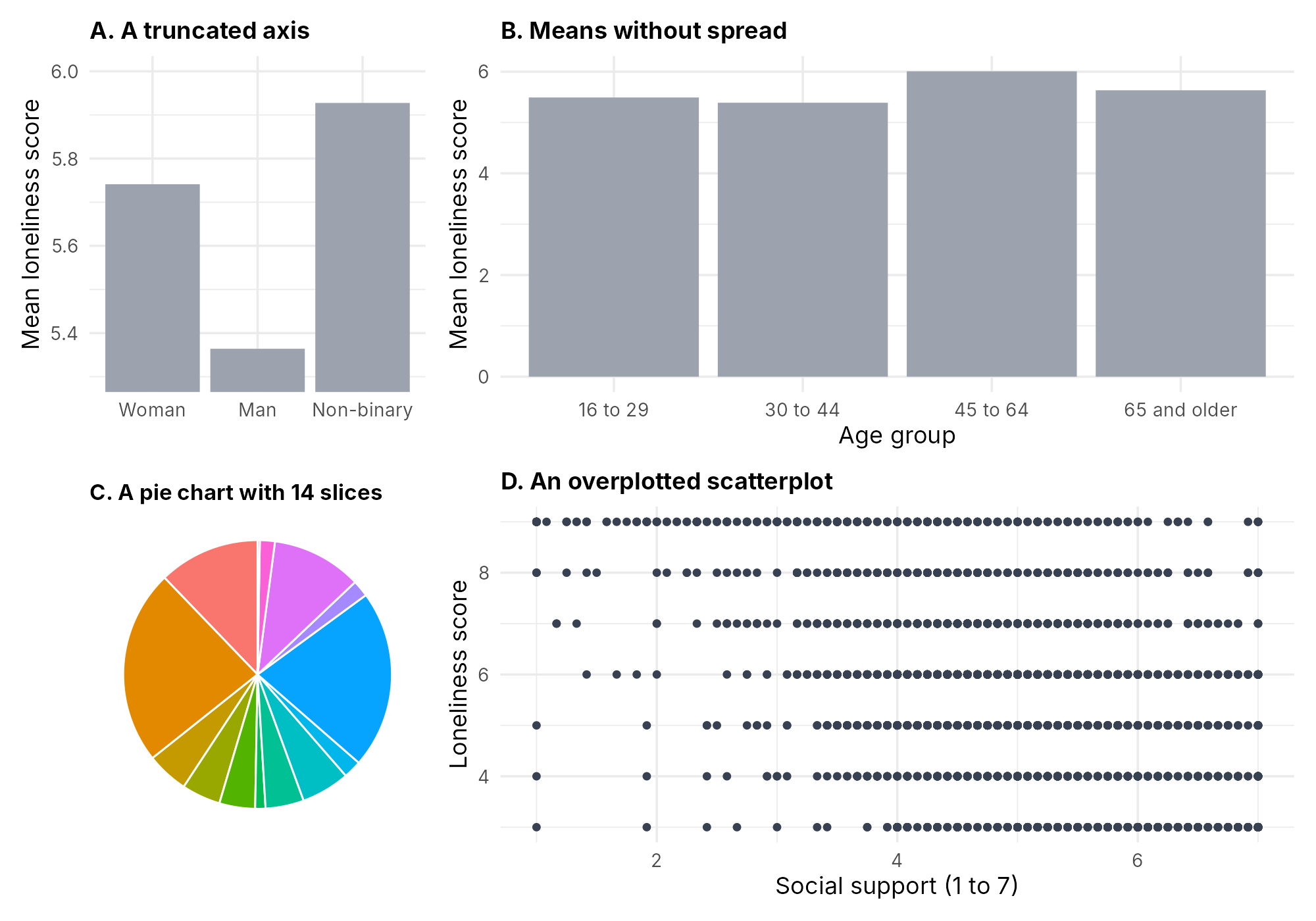
The four tabs hold Figure 6.3 (a truncated axis), Figure 6.4 (means without spread), Figure 6.5 (a pie chart with many slices) and Figure 6.6 (overplotting), and the text under each figure states what the poor version conceals.
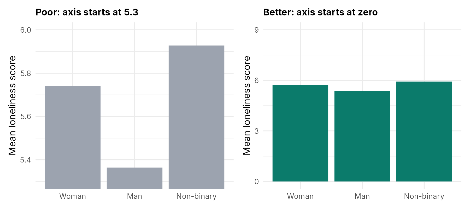
What it conceals. A bar encodes a value by its length, so a bar chart whose axis starts above zero misrepresents every comparison. On the left, the bar for men looks about one tenth of the height of the bar for non-binary respondents, although the means are 5.36 and 5.93, a ratio of about nine to ten. The right panel starts the axis at zero, so the lengths are proportional to the values. A related distortion is the dual axis, in which two series share a plot with two different vertical scales; the apparent crossing points and relative heights depend entirely on how the two scales were chosen, and two separate panels are usually clearer.
Note on axis ranges. The zero rule applies to bars. A dot or line display may use an axis that covers the possible range of the scale (3 to 9 for this loneliness score), provided the range is labelled.
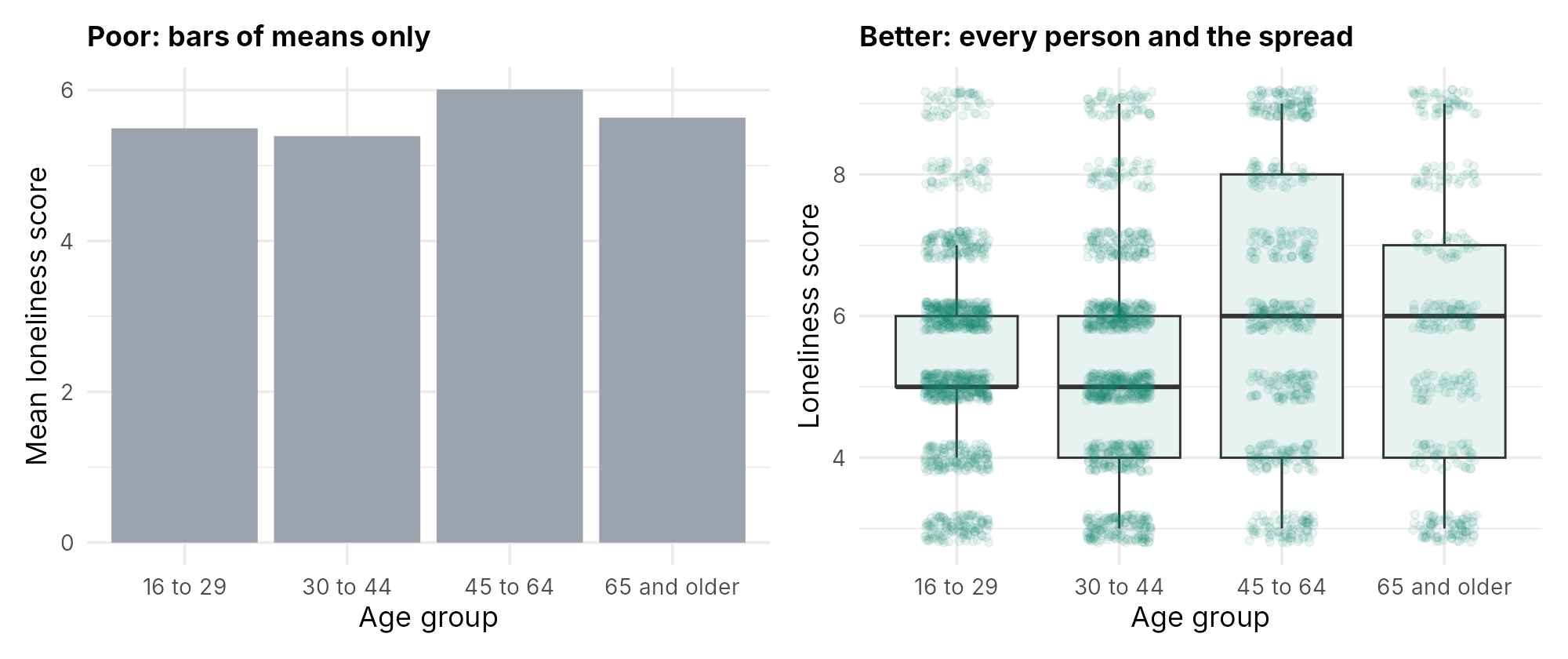
What it conceals. The bars show four means between 5.39 and 6.01 and nothing else. They hide the spread within each group (scores from 3 to 9 in every group), the shape of each distribution, and the number of people in each group, which ranges from 366 people aged 65 and older to 1,079 people aged 16 to 29. Weissgerber and colleagues (2015) reviewed 703 research articles in leading physiology journals, found that bar graphs were the most common way of presenting continuous data (85.6% of the articles included at least one), and recommended displays that show the distribution of the data, particularly dot plots of the individual values when samples are small. The right panel shows that the differences between age groups are small compared with the variation within each group.
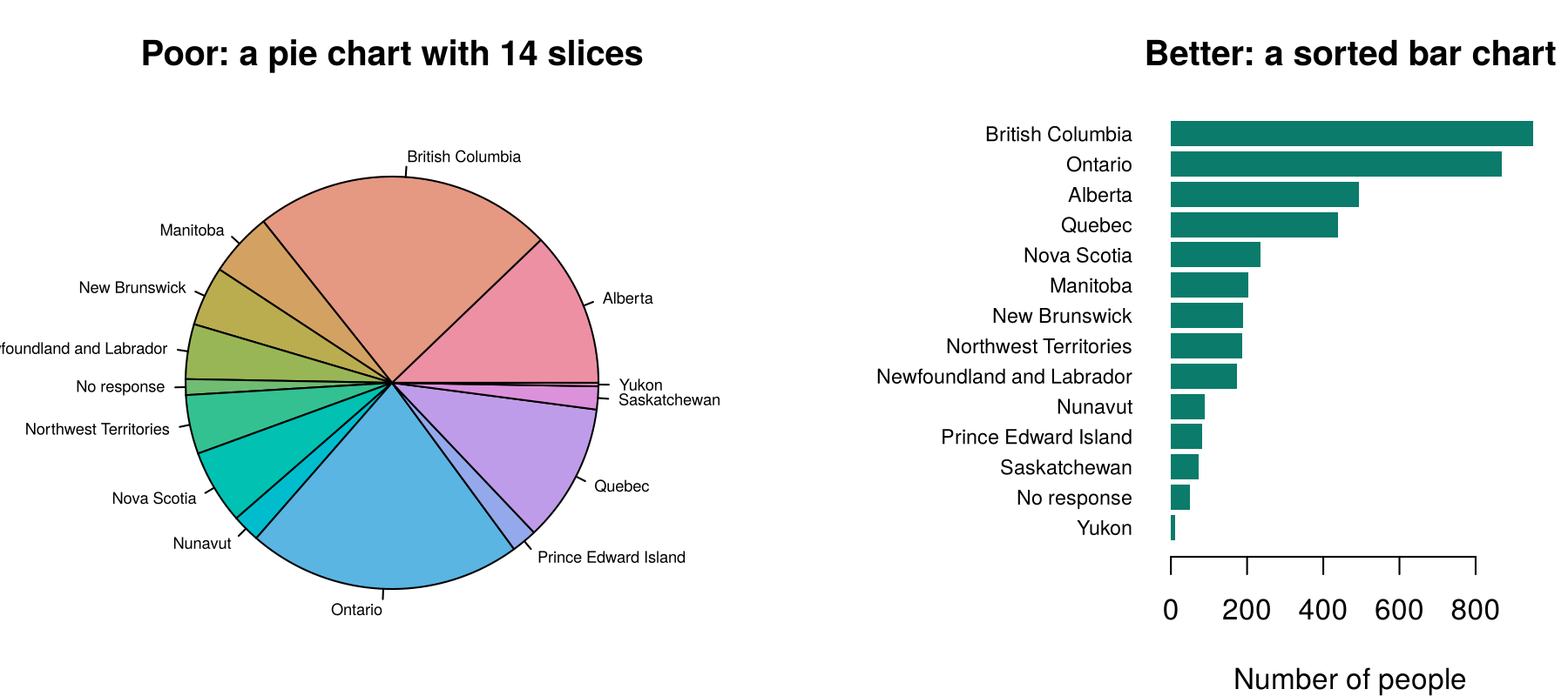
What it conceals. A pie chart asks the reader to compare angles and areas, which people judge less accurately than positions along a common scale. With fourteen slices, several of them thin, it is hard to tell whether Manitoba or New Brunswick has more respondents, or to read the smaller territories at all. The sorted bar chart places every category on a common scale, so the order and the size of the differences are clear. A pie chart can be acceptable for two or three categories that make up a whole; for more categories, a bar chart is clearer.
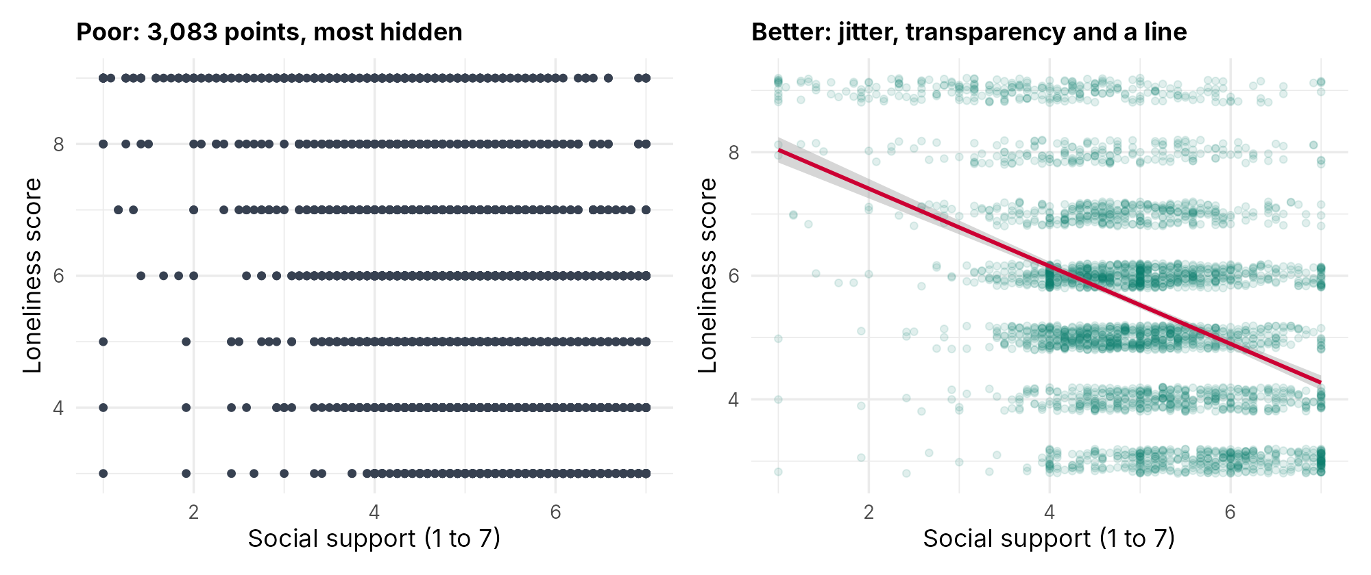
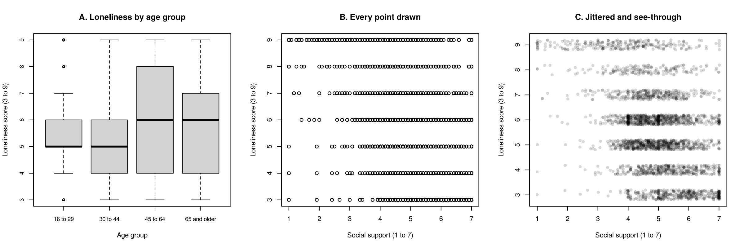
What it conceals. The loneliness score takes only seven values, so 3,083 points fall on seven horizontal lines and lie on top of one another. The left panel cannot show where most people are, and a row with five people looks the same as a row with five hundred. The right panel adds a small random vertical shift to each point (jitter) and draws the points with transparency, so dense areas look darker. The fitted line makes the downward trend easy to see: people with more social support tend to report less loneliness.
Several of these displays compare groups, such as genders or age groups. Box 6.3 sets out when groups are better shown by colour within one panel and when they are better shown in separate panels.
Box 6.3: Colour or facets?
When a display must show groups, the analyst can give each group its own colour within one panel, or draw one panel per group (facets). Colour works well for two or three groups whose values overlap little, and it lets the reader compare the groups directly. Facets work better when there are more groups, when the points overlap heavily, or when the groups differ greatly in size, because each group gets its own space on a shared scale. Section 3 draws both versions in ggplot2.
This section has explained why the analyst looks at the data before fitting a model, how the question and the variable types point to a display, and what four common poor displays conceal. The knowledge check and the reflection that follow review these ideas, and Section 2 draws the displays for the briefing file in base R.
1. What is the main purpose of exploratory data analysis?
2. The four datasets in Anscombe's quartet have nearly identical means, standard deviations, correlations and fitted lines. What does the quartet demonstrate?
3. A researcher wants to show the distribution of age, measured in years, among survey respondents. Which display is the natural first choice?
4. Which feature distinguishes a histogram from a bar chart?
5. A bar chart of mean scores in four groups starts its vertical axis at 5.3. What is the main problem?
✎ Reflection
Exploratory data analysis looks at the data before modelling. This section described four features that plots reveal in a single variable (its shape, unusual or impossible values, heaping on particular values, and missing values) and showed, with Anscombe's quartet, that four datasets with identical means, standard deviations, correlations and fitted lines can follow completely different patterns. It also listed displays for different questions: a histogram for one numeric variable, a bar chart for one categorical variable, a scatterplot for two numeric variables, boxplots with points for a numeric variable across groups, and a bar chart of percentages for two categorical variables. Suppose a colleague has fitted a linear regression of weekly hours of physical activity (a numeric variable) on age group (four categories) in a community survey, and plans to report the model without any plots. Name two plots you would ask the colleague to draw first, explain what each plot could reveal, and describe how one possible finding would change the analysis.
Quick Looks in Base R
A histogram and a bar chart
A spike at the largest value
Boxplots and a scatterplot
Introduction and Overview
Section 1 explained why the analyst looks before modelling and how the question and the variable types point to a display. This section draws those displays for the survey data with base R, the plotting functions that are part of R itself. Base R plots need no extra packages and usually one line of code, which makes them the analyst's quick diagnostic tool: they are drawn, read and set aside, and only the useful ones are later rebuilt as polished figures (Section 3). The section also prepares the briefing file that every later plot uses, and it uses a quick plot to find a data problem that the cleaning lesson left behind.
Learning Objectives
- Prepare an analysis file in base R with bracket recoding and
na.omit(). - Draw a histogram, a bar chart, side-by-side boxplots, a scatterplot and a scatterplot matrix in base R, with titles and axis labels.
- Read a histogram for shape, unusual and impossible values, and heaping.
- Use jitter and transparency to show data that share a small number of values.
- Arrange several base R plots in one window with
par(mfrow = ...)and save a plot to a file withpng().
The section begins with the labelling arguments that every base R plot accepts. It then prepares the briefing file, reads plots of one variable and of two variables, and ends with layouts of several plots and plots saved to files.
Base R as the Analyst's Quick Diagnostic Tool
Base R draws a quick diagnostic plot with one line of code. Every plotting function accepts the same labelling arguments: main for the title, xlab and ylab for the axis labels. Every plot in the briefing should carry these labels from the start, because a plot without labels is easily misread, even by the person who drew it.
Box 6.4 recalls the four standard plotting functions from the Lesson 2 activity and names the briefing variables to which this section applies them.
Box 6.4: Recall: Lesson 2, Section 3 (R Activity: descriptives and standard plots)
The R activity in Lesson 2, Section 3 drew four standard plots with base R: hist(x) for a histogram of one numeric variable, barplot(table(x)) for a bar chart of one categorical variable, boxplot(y ~ group, data = ...) for boxplots of a numeric variable across groups, and plot(x, y) for a scatterplot of two numeric variables. This section applies the same four functions to the briefing file: the loneliness score, self-rated mental health, loneliness by age group, and loneliness against social support.
Retrieval question. Why is barplot() given table(x) and not the raw variable?
barplot() draws one bar for each number it is given, so it needs counts. table(x) counts the people in each category, and barplot() then draws one bar per count.This section adds three tools that Lessons 1 and 2 did not use. The function pairs(data) draws a scatterplot matrix, one small scatterplot for every pair of several numeric variables, such as loneliness, support, depression and age. The setting par(mfrow = ...) places several plots in one window, and png() sends plots to a file; both are described at the end of this section.
Before any of these functions can be applied, the survey data must be prepared as a single analysis file, which the next part describes.
Preparing the Briefing File
All the plots in this lesson use one analysis file, called brief. The code that builds it follows the pattern of the course's data cleaning and regression walkthroughs. It loads the CSCS file from the course's GitHub repository, keeps the 2021 wave (which gives one row per person), and gives short names to six variables. It then uses bracket recoding, in which a condition inside square brackets selects the rows to change, to set the answer "Presented but no response" to missing (NA) for gender and self-rated mental health, and to build four age groups from age in years. The function factor() with a levels argument fixes the order in which categories appear in tables and plots. Finally, na.omit() keeps the people who have no missing value on any of the nine briefing variables.
Table 6.3 lists the nine briefing variables, the survey measure behind each one, its possible values and the way it is treated for plotting.
Table 6.3. The nine variables in the briefing file.
| Short name | Measure in the survey | Values | Type for plotting |
|---|---|---|---|
loneliness | Three-item UCLA Loneliness Scale (Hughes et al., 2004) | 3 to 9, higher is lonelier | Numeric (seven whole values) |
support | Multidimensional Scale of Perceived Social Support, mean of 12 items (Zimet et al., 1988) | 1 to 7, higher is more support | Numeric |
depression | Patient Health Questionnaire-2 (Kroenke et al., 2003) | 0 to 6, higher is more symptoms | Numeric (seven whole values) |
anxiety | Generalized Anxiety Disorder-2 (Kroenke et al., 2007) | 0 to 6, higher is more symptoms | Numeric (seven whole values) |
life_sat | Life satisfaction, a single item | 1 to 10, higher is more satisfied | Numeric (ten whole values) |
age | Age in years | 16 to 100 | Numeric |
age_group | Four groups built from age | 16 to 29, 30 to 44, 45 to 64, 65 and older | Categorical (ordinal) |
gender | Gender | Woman, Man, Non-binary | Categorical (nominal) |
mental_health | Self-rated mental health | Poor, Fair, Good, Very good, Excellent | Categorical (ordinal) |
Two cautions apply to every result drawn from this file. Box 6.5 describes how the CSCS recruited its respondents and what its sample can support, and Box 6.6 describes the people whom the complete-case file leaves out.
Box 6.5: Background: What the CSCS sample can support
The Canadian Social Connection Survey (CSCS) is a national online survey of social connection, loneliness and health among people living in Canada. Respondents to the 2021 wave completed an anonymous online questionnaire between April and June 2021. They were recruited online and were not drawn at random from a sampling frame, so the chance that any person in Canada took part is unknown, and the public file contains no survey weights that could correct for this. Two consequences follow for the briefing. Percentages and means describe these respondents and should not be read as the prevalence of loneliness in the Canadian population, because people who answer an online survey about social connection may differ from those who do not. Associations between variables within the sample, such as the link between social support and loneliness, are the more useful product, although they also assume that taking part did not depend jointly on both variables. For optional reading, HSCI 207 Lesson 11, Section 2 makes the same point for CSCS respondents aged 65 and older.
Box 6.6: Who is left out?
The 2021 wave has 4,045 respondents and the briefing file has 3,083, so na.omit() removed 962 people (24%) who skipped at least one of the nine questions. Using a single complete-case file means that every panel of the briefing describes the same people, which makes the panels comparable. The cost is that the briefing describes only people who answered every question, and Lesson 2 described how such people can differ from those who skipped questions. The briefing should state the number of people included and the reason others were excluded.
Activity 6.2 carries out these steps in R. It loads the survey, builds the briefing file, draws a histogram of the loneliness score and a bar chart of self-rated mental health, and summarizes the household size variable that a later part of this section examines.
This activity loads the survey, prepares the briefing file, draws a histogram and a bar chart, and checks the household size variable. The data are read directly from the course's GitHub repository, so an internet connection is needed the first time the code runs. The second block of code is the data preparation that every later activity in this lesson starts from.
github_url <- "https://raw.githubusercontent.com/jorgeandr3s/heal/main/cscs/public_data/CSCS2025_full_cleaned_deidentified_data_and_metadata.RData"
load(url(github_url))
data <- data[data$SURVEY_collection_year == 2021, ]   # the 2021 wave: one row per person
nrow(data) # how many people?The file adds three objects to the environment, and the one called data holds the survey responses. The square brackets keep the rows from the 2021 wave and every column. The 2021 wave holds 4,045 people.
# Short names for the briefing variables
data$loneliness <- data$LONELY_ucla_loneliness_scale_score   # 3 to 9, higher = lonelier
data$support    <- data$PSYCH_zimet_multidimensional_social_support_scale_score   # 1 to 7
data$depression <- data$WELLNESS_phq_score                   # 0 to 6, higher = more symptoms
data$anxiety    <- data$WELLNESS_gad_score                   # 0 to 6, higher = more symptoms
data$life_sat   <- data$WELLNESS_life_satisfaction_num       # 1 to 10, higher = more satisfied
data$age        <- data$DEMO_age                             # years

# Gender: the answer "Presented but no response" becomes missing (NA)
data$gender <- as.character(data$DEMO_gender)
data$gender[data$gender == "Presented but no response"] <- NA
data$gender <- factor(data$gender, levels = c("Woman", "Man", "Non-binary"))

# Self-rated mental health, in order from Poor to Excellent
data$mental_health <- as.character(data$WELLNESS_self_rated_mental_health)
data$mental_health[data$mental_health == "Presented but no response"] <- NA
data$mental_health <- factor(data$mental_health,
  levels = c("Poor", "Fair", "Good", "Very good", "Excellent"))

# Four age groups
data$age_group[data$age < 30] <- "16 to 29"
data$age_group[data$age >= 30 & data$age < 45] <- "30 to 44"
data$age_group[data$age >= 45 & data$age < 65] <- "45 to 64"
data$age_group[data$age >= 65] <- "65 and older"
data$age_group <- factor(data$age_group,
  levels = c("16 to 29", "30 to 44", "45 to 64", "65 and older"))

# The briefing file: the briefing variables for people with no missing values
brief <- na.omit(data[, c("loneliness", "support", "depression", "anxiety",
                          "life_sat", "age", "age_group", "gender", "mental_health")])
nrow(brief) # people in the briefing fileEach bracket recode changes only the rows that meet the condition inside the brackets. The first age-group line, for example, writes "16 to 29" into age_group for every person whose age is below 30. na.omit() then keeps the 3,083 people with no missing value on the nine briefing variables.
summary(brief$loneliness)              # a numeric summary first
hist(brief$loneliness,
     breaks = seq(2.5, 9.5, by = 1),       # one bar for each score from 3 to 9
     main = "Loneliness (UCLA 3-item scale)",
xlab = "Loneliness score (3 to 9)", ylab = "Number of people")The scores run from 3 to 9, the median is 5 and the mean is 5.57. The histogram appears in the Plots pane, with one bar for each whole score.
table(brief$mental_health)             # the counts that the bars will show
barplot(table(brief$mental_health),
        main = "Self-rated mental health",
xlab = "Rating", ylab = "Number of people")The table gives the counts that the bars show, in the order set by factor(). Very good (1,024) is the most common rating and Poor (230) the least common.
summary(data$GEO_housing_household_size)   # people each respondent lives with
hist(data$GEO_housing_household_size,
     breaks = seq(-0.5, 20.5, by = 1),             # one bar for each value from 0 to 20
     main = "Household size",
     xlab = "Number of people the respondent lives with", ylab = "Number of people")
sum(data$GEO_housing_household_size == 20, na.rm = TRUE) # how many at the top value?The summary uses the full 2021 wave, in which 618 people did not answer the household questions. The maximum is 20, and sum(... == 20, na.rm = TRUE) counts the people at that value: 116. The argument na.rm = TRUE tells sum() to skip missing values, which would otherwise make the result NA.
R Reflect on what you just ran
Use the questions below to interpret the output you produced. Look at your console output and plots before answering.
1. Describe the shape of the loneliness histogram in two or three sentences, using the console output and the plot. Which score is most common, and what happens at the top of the scale?
2. From the table of self-rated mental health, what percentage of the briefing file rated their mental health as poor or fair? Show the calculation.
3. The histogram of household size has a spike of 116 people at 20, its largest value. Explain why this spike is a problem, and write the bracket recode that would create a new variable household with the value 20 set to missing.
data$household <- data$GEO_housing_household_size followed by data$household[data$household == 20] <- NA. The decision and the number of people affected (116) should be reported in the methods.With the briefing file in place, the next part turns to plots of one variable.
Looking at One Variable
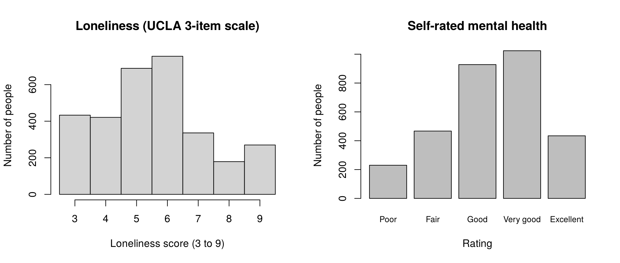
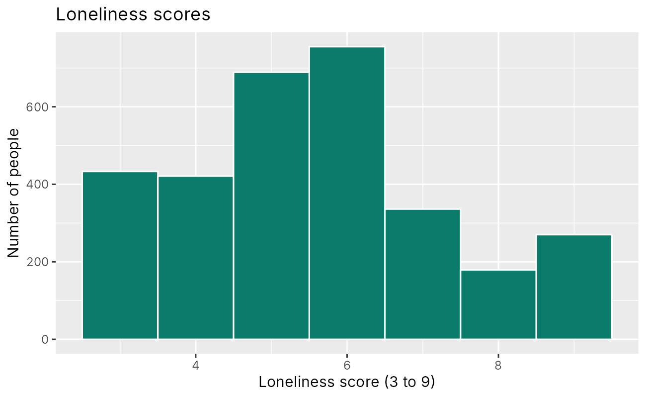
The first look at any variable is a plot of its distribution. Figure 6.7 shows the histogram of the loneliness score and the bar chart of self-rated mental health drawn in Activity 6.2, and the two paragraphs that follow read each plot in turn.
Reading the histogram. The argument breaks = seq(2.5, 9.5, by = 1) sets the edges of the bins at 2.5, 3.5, 4.5 and so on, so each bar holds exactly one whole score. Without it, R chooses its own bins, which can merge two scores into one bar or leave empty gaps, and the picture of a variable with only seven values can change a good deal. The loneliness histogram rises from 433 people at the lowest score of 3 to a peak of 755 at a score of 6, and then falls to 179 at a score of 8. The bar at 9, with 270 people (8.8%), is taller than the bar at 8. A rise at the top of a scale is called a ceiling pile-up: a group of people chose the most extreme answer to all three items, and the scale cannot record anything lonelier. The mean (5.57) is a little above the median (5), which reflects the longer upper tail.
Reading the bar chart. The bars follow the order set by factor(), from Poor to Excellent. Very good is the most common rating (1,024 people, 33.2%), followed by Good (928). Together, Poor (230) and Fair (467) make up 697 people, or 22.6% of the briefing file. If the levels had not been set, R would have placed the categories in alphabetical order (Excellent, Fair, Good, Poor, Very good), which hides the shape of an ordinal scale.
Box 6.7 gathers the questions behind these two readings into a checklist that applies to any plot of one variable.
Box 6.7: A checklist for one-variable plots
For each variable, the analyst asks whether the distribution is symmetric or skewed, whether it has one peak or more, whether values pile up at the lowest or highest possible value (a floor or a ceiling), whether answers heap on round numbers, whether any value lies outside the possible range, and how many values are missing. Each answer is recorded in the analysis notes, because each one can change a later decision about summaries, recoding or models.
The checklist asks about values outside the possible range and about answers that pile up on particular values. The next part applies it to a variable whose numeric summary looked unremarkable.
Finding a Problem That Cleaning Left Behind
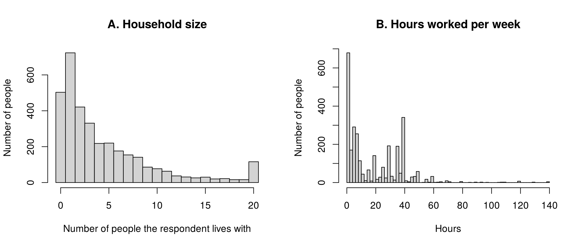
The household size variable, GEO_housing_household_size, records the number of people each respondent lives with, not counting the respondent, so 0 means living alone (503 people). The course's cleaning walkthrough used it to build a living-alone indicator, and its summary in Activity 6.2 looks unremarkable: a median of 3, a mean of 4.46 and a maximum of 20. The histogram tells a different story. Panel A of Figure 6.8 shows that histogram, and panel B shows a second variable from the 2021 wave, the hours worked per week.
In panel A, the bars fall smoothly from one other person toward larger households, and then a bar of 116 people appears at exactly 20, the largest value in the data. The real distribution of household sizes does not rise again at its maximum, so the spike signals that something about the value 20 differs from the other values. Tracing the variable back to the survey explains it. Household size is the sum of eight questions that ask how many partners, children, grandchildren, parents, in-laws, siblings, roommates and other people the respondent lives with, and totals above 20 were recorded as 20. For 105 of the 116 people at 20, the eight answers added up to more than 20, and one total reached 180. Some of these answers are implausible, such as five grandchildren, five in-laws and seven siblings in one household, and they may reflect careless or mistaken responses. The summary statistics did not reveal this problem, and the histogram made it obvious.
The analyst's response has three steps. The first is to check the codebook and the source questions, which is how the meaning of 20 was established. The second is to decide how the variable will be used. Used as a count, the value 20 cannot be trusted and can be set to missing with a bracket recode (Activity 6.2, question 3). Used as a grouped variable, such as living alone versus living with others, or 0, 1, 2 to 4 and 5 or more, the problem is absorbed by the top category and matters much less. The third step is to report the decision in the methods section, with the number of people affected, and, where the decision could change a result, to repeat the analysis both ways as a sensitivity analysis.
Panel B shows two further problems that the same plot can reveal. Answers to the question on hours worked per week heap on round numbers: 340 of the 2,978 people who answered reported exactly 40 hours, compared with one person at 39 and one at 41, and smaller peaks appear at 20, 30 and 35. Heaping of this kind, which Lesson 2 called digit preference, usually reflects rounding and standard working weeks, and it means that small differences in reported hours carry little information. The long right tail reaches 140 hours, and 13 people reported more than 112 hours a week, which would mean working more than 16 hours a day, every day. These values are implausible and would be checked and, in most analyses, set to missing.
Household size and working hours show that a histogram can reveal problems that summary statistics hide. Activity 6.3 draws boxplots and scatterplots of two variables and a scatterplot matrix, and it saves a two-panel figure to a file.
This activity starts from the briefing file made in Activity 6.2. If you are starting a new R session, run the loading and preparation code from Activity 6.2 first (it is also at the top of the answer key). The code draws boxplots, two scatterplots and a scatterplot matrix, and then saves a two-panel figure to a file.
boxplot(loneliness ~ age_group, data = brief,
        main = "Loneliness by age group",
        xlab = "Age group", ylab = "Loneliness score (3 to 9)")
tapply(brief$loneliness, brief$age_group, median) # the thick line in each boxThe formula loneliness ~ age_group draws one box for each age group. tapply() applies median() to the loneliness scores within each group and returns the values of the thick lines: 5, 5, 6 and 6.
plot(brief$support, brief$loneliness,              # every person as one point
     xlab = "Social support (1 to 7)", ylab = "Loneliness score (3 to 9)")
set.seed(2021)                                       # the same jitter every time
plot(jitter(brief$support), jitter(brief$loneliness),   # nudge each point a little
     pch = 16, col = rgb(0, 0, 0, 0.15),             # small grey see-through dots
     xlab = "Social support (1 to 7)", ylab = "Loneliness score (3 to 9)")
These lines draw two scatterplots and print nothing. The first shows seven solid stripes. The second uses jitter(), small filled dots (pch = 16) and a see-through grey (rgb(0, 0, 0, 0.15), where the last number is the opacity), so the dense areas look darker. set.seed(2021) makes the random jitter the same each time.
pairs(brief[, c("loneliness", "support", "depression", "age")],
      pch = 16, col = rgb(0, 0, 0, 0.1))   # every pair of variables in one grid
The scatterplot matrix has one panel for every pair of the four variables, with the variable names on the diagonal.
png("briefing_base_r.png", width = 1600, height = 800, res = 200)   # open a file
par(mfrow = c(1, 2))                       # one row, two plots
hist(brief$loneliness, breaks = seq(2.5, 9.5, by = 1),
     main = "A. Loneliness", xlab = "Loneliness score", ylab = "Number of people")
boxplot(loneliness ~ age_group, data = brief,
        main = "B. Loneliness by age group", xlab = "Age group", ylab = "Loneliness score")
par(mfrow = c(1, 1))
dev.off() # close the file, which saves itNothing appears in the Plots pane, because png() sent both plots to the file briefing_base_r.png in the working directory (getwd() shows where that is). The message after dev.off() names the graphics device R returned to. It may read null device 1 or RStudioGD 2, depending on whether other plots are open, and it can be ignored.
R Reflect on what you just ran
Use the questions below to interpret the output you produced. Look at your console output and plots before answering.
1. Using the boxplots and the medians printed by tapply(), compare loneliness across the four age groups. Mention the medians and the width of the boxes.
2. Compare the two scatterplots of social support and loneliness. What does the jittered, transparent version show that the first version hides?
3. After running the last block of code, no new plot appears in the Plots pane. Explain why, and say how you would find the saved file.
png() opened an image file, so the histogram and the boxplots were drawn into briefing_base_r.png and not on screen. dev.off() closed the file, which saved it. The file is in the working directory, which getwd() prints and which the Files pane in RStudio shows; opening it there displays the two-panel figure.The next part turns from single variables to pairs of variables.
Looking at Two Variables
A plot of two variables shows how the variables go together. Figure 6.9 shows the boxplots of loneliness by age group and the two scatterplots of loneliness against social support from Activity 6.3, and the paragraphs below read each panel.
Boxplots. A boxplot summarizes a numeric variable with five numbers. The thick line is the median. The box runs from the lower to the upper quartile, so it holds the middle half of the people, and its length is the interquartile range (IQR). The whiskers extend to the most extreme values that lie within 1.5 times the IQR of the box, and any value beyond the whiskers is drawn as a separate point. Table 6.4 gives the numbers behind panel A.
Table 6.4. The numbers behind the boxplots in panel A of Figure 6.9: the number of people, the whiskers, the quartiles and the median in each age group.
| Age group | People | Lower whisker | Lower quartile | Median | Upper quartile | Upper whisker |
|---|---|---|---|---|---|---|
| 16 to 29 | 1,079 | 4 | 5 | 5 | 6 | 7 |
| 30 to 44 | 1,060 | 3 | 4 | 5 | 6 | 9 |
| 45 to 64 | 578 | 3 | 4 | 6 | 8 | 9 |
| 65 and older | 366 | 3 | 4 | 6 | 7 | 9 |
The two older groups have a median of 6 and the two younger groups a median of 5, and the box for people aged 45 to 64 is the widest, so loneliness varies most in that group. The box for people aged 16 to 29 is narrow, because most of them scored 5 or 6. Its whiskers therefore stop at 4 and 7, and the scores 3, 8 and 9 in this group are drawn as separate points (212 people in all). These points are flagged by the 1.5 × IQR rule, and they are ordinary answers on the scale. With a variable that takes only a few whole values, the points beyond the whiskers say more about the narrowness of the box than about unusual people.
Scatterplots and overplotting. Panel B draws one solid point for each of the 3,083 people. Because the loneliness score takes only seven values, the points fall on seven horizontal lines and cover one another, a problem called overplotting, and the plot cannot show where most people are. Panel C applies two remedies. The function jitter() adds a small random amount to each value so that points sharing a value spread out a little, and col = rgb(0, 0, 0, 0.15) draws each point in black at 15% opacity, so that areas where many points overlap look darker. The function set.seed() fixes the random numbers, so the jittered plot is the same each time the code runs. Jitter changes only the picture: the data used in any calculation are unchanged. Panel C shows that most people have support scores between 4 and 6 and loneliness scores of 5 or 6, and that people with more support tend to report less loneliness.
The scatterplot matrix. The function pairs() draws a small scatterplot for every pair of the chosen variables, with the variable names on the diagonal. Each panel is a quick look at one pair, and the panel above the diagonal shows the same pair as the panel below it with the axes swapped. With 3,083 people and scores that take few values, the panels are crowded, so the matrix is best used to spot strong patterns or unexpected shapes, after which a single scatterplot or a correlation heatmap (Section 4) gives a clearer view.
Figure 6.10 shows the scatterplot matrix that Activity 6.3 draws for loneliness, support, depression and age.
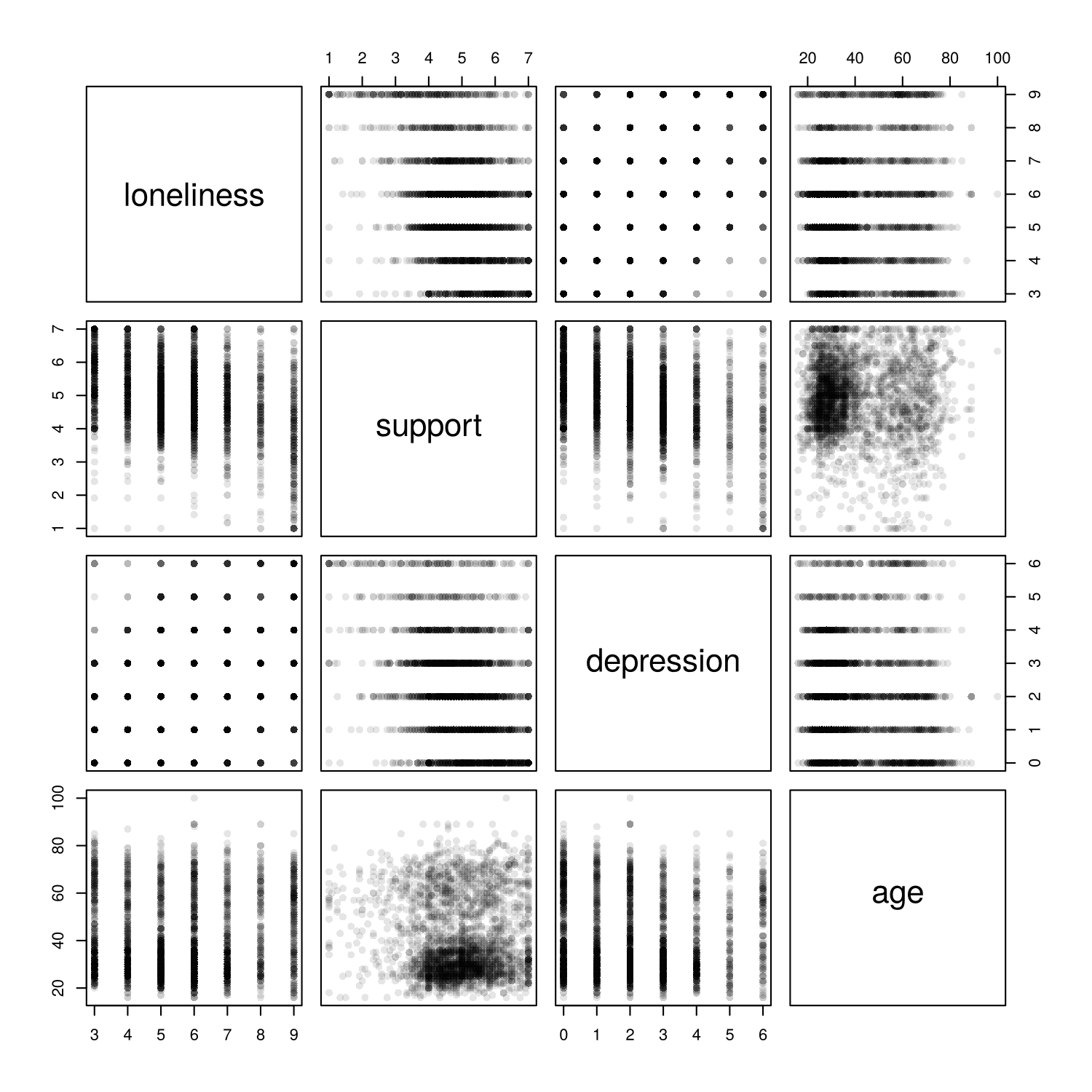
pairs() for four briefing variables (n = 3,083). Each off-diagonal panel is a scatterplot of the two variables named in its row and column.Boxplots, scatterplots and the scatterplot matrix complete the base R displays that this section draws. The last part of this section shows how to arrange several plots in one window and how to keep them in a file.
Several Plots in One Window, and Saving Plots
The setting par(mfrow = c(rows, columns)) divides the plotting window into a grid, and each new plot fills the next cell, row by row. par(mfrow = c(1, 2)) places two plots side by side, and par(mfrow = c(2, 2)), used in the Anscombe activity, places four in a square. The setting stays in force until it is changed, so the code resets it with par(mfrow = c(1, 1)) afterwards.
Plots in the RStudio Plots pane disappear when the session ends. To keep a plot, the analyst sends it to a file. The function png("name.png", width = 1600, height = 800, res = 200) opens an image file 1,600 pixels wide and 800 pixels high, at a resolution of 200 pixels per inch, which prints at 8 by 4 inches. Every plot drawn afterwards goes into the file and does not appear on screen. The function dev.off() closes the file, which saves it in the working directory. The functions pdf() and jpeg() work in the same way for other formats, and the Export button in the Plots pane saves a plot by hand. Saving with code is better practice, because the code records exactly how the figure was made and remakes it in one step if the data change.
The card below links to a narrated R walkthrough of the base R plots in this section and the ggplot2 plots in Section 3.
Narrated R walkthrough: Data Visualization in Base R and ggplot2
The walkthrough runs the code from this section and the next one line at a time, draws each plot as the line runs, and explains every argument. It is a good place to start if the activities feel fast.
Open the walkthroughThis section has prepared the briefing file and used base R to read one variable, to find a data problem that cleaning left behind, to show two variables together and to save a figure. The knowledge check and the reflection that follow review these steps, and Section 3 rebuilds the most useful plots as polished figures with ggplot2.
1. Which base R code draws a bar chart of the number of people in each category of self-rated mental health?
table() counts the people in each category, and barplot() draws one bar per count. hist() needs a numeric variable.2. A histogram of household size falls smoothly from small to large households and then shows a tall bar at the largest value, 20. What is the most likely explanation?
3. In a base R boxplot, what does the thick line inside each box show?
4. A scatterplot of two survey scores shows only a few solid horizontal stripes because most points sit on top of each other. Which change would help most?
5. What does par(mfrow = c(1, 2)) do in base R?
mfrow divides the plotting window into a grid of rows and columns, here one row and two columns, which the next plots fill in turn. Saving to a file uses png() and dev.off().✎ Reflection
This section used base R to take quick looks at the data and showed how a histogram can reveal problems that numeric summaries hide. Two examples came from the 2021 Canadian Social Connection Survey. Household size (the number of people a respondent lives with) had a median of 3, a mean of 4.46 and a maximum of 20, and its histogram showed a spike of 116 people at exactly 20, because totals above 20 had been recorded as 20 and many of those totals came from implausible answers. Hours worked per week showed heaping: 340 of 2,978 people reported exactly 40 hours, compared with one person each at 39 and 41, and 13 people reported more than 112 hours a week. Suppose an analysis plans to use hours worked per week as a numeric predictor of loneliness. Describe the plot you would draw first, the two problems it would reveal, and how you would handle each problem, including what you would report in the methods section.
hist(data$WORK_hours_per_week, breaks = seq(0, 140, by = 2)), because it is a single numeric variable and narrow bins show heaping that wide bins would hide. The first problem it would reveal is implausible values: 13 people reported more than 112 hours a week, which would mean more than 16 hours of work every day. I would check these against the codebook and, unless there were a clear explanation, set them to missing with a bracket recode such as data$hours[data$hours > 112] <- NA. The second problem is heaping, with 340 people at exactly 40 hours and smaller peaks at 20, 30 and 35. Heaping cannot be corrected, but it means that small differences in hours carry little information, so I would consider grouping the variable (for example, none, 1 to 34, 35 to 44 and 45 or more hours) or at least interpreting its coefficient per ten hours. In the methods I would state that 13 values above 112 hours were set to missing, give the number of people included in the analysis, and note that reported hours heap on round numbers, and I would repeat the main model with and without the recoded values as a sensitivity analysis.The Grammar of Graphics with ggplot2
Data, a mapping, a geom and labels
| Line of code | Part of the grammar |
|---|---|
ggplot(brief, aes(x = loneliness)) + | Data and the aesthetic mapping |
geom_histogram(binwidth = 1, fill = "#0B7B6B", colour = "white") + | The geom, with fixed (set) colours |
labs(title = "...", x = "...", y = "...") | Labels |
geom_bar() counts; geom_col() draws values
A boxplot with every person shown
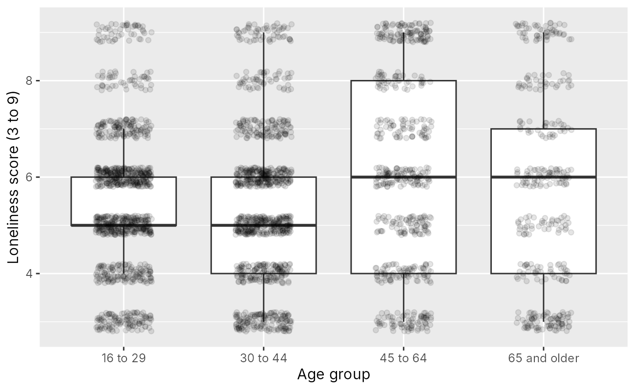
geom_boxplot() and geom_jitter() (n = 3,083).Loneliness across age, with a loess curve
Small multiples with facet_grid()
A colour-blind-safe palette
theme_minimal().Introduction and Overview
Base R plots are quick to draw, and Section 2 used them to check the data. A figure for the working group's briefing, or for a manuscript, needs more care: consistent labels, readable colours, panels that share a scale, and a file of the right size and resolution. The ggplot2 package (Wickham, 2016) is the most widely used tool in R for such figures. It belongs to the tidyverse, a family of packages that Lesson 1 loaded when setting up R. The walkthroughs and this lesson keep data preparation in base R, exactly as in Section 2, and ggplot2 is the tidyverse package that this lesson uses for figures.
Learning Objectives
- Describe the layered grammar of graphics in terms of data, aesthetics, geoms, scales, facets and themes.
- Build a histogram, a bar chart, a boxplot with jittered points, and a scatterplot with a smoother in ggplot2.
- Distinguish
geom_bar(), which counts rows, fromgeom_col(), which draws supplied values. - Compare a display across groups with
facet_wrap()andfacet_grid(), and choose between colour and facets. - Apply a colour-blind-safe palette and a theme, and save a figure with
ggsave().
The section first describes the grammar on which ggplot2 is built. It then draws displays of one variable, of a numeric variable across groups and of two numeric variables, compares groups with facets and with colour, and ends with saving a figure to a file.
The Layered Grammar of Graphics
Leland Wilkinson described a grammar of graphics in which every statistical graphic is assembled from a small set of independent parts, in the way that a sentence is assembled from parts of speech (Wilkinson, 2005). Hadley Wickham adapted the idea into a layered grammar, in which a plot is built by adding layers one at a time, and implemented it as ggplot2 (Wickham, 2010). The practical benefit is that one template covers almost every display: once the parts are familiar, a histogram, a boxplot and a faceted scatterplot differ only in a line or two of code.
Figure 6.11 lists the six parts of a ggplot2 plot, each with an example taken from the briefing.
The six flip cards below repeat the parts in Figure 6.11 and serve as a reference for the code in the activities of this section.
Click each card for a short description of the part and the code that controls it.
Equation 6.1 shows how the parts are joined into a single block of code.
Every ggplot2 plot follows the same template. The function ggplot() receives the data and the aesthetic mappings, and each further part is added with a plus sign at the end of the line before it:
geom_...() +
labs(title = ..., x = ..., y = ...) +
theme_...()Eq 6.1
The accordion below describes three errors that beginners meet first when they use the template in Equation 6.1, with the remedy for each.
The package is not loaded. The message could not find function "ggplot" means that library(ggplot2) has not been run in this session. The package is installed once with install.packages("ggplot2"), and loaded with library(ggplot2) in every new session.
The plus sign starts a line. R reads each line as a complete command when it can. If a line ends without a plus sign, R draws the plot so far and then treats the next line, starting with +, as a separate command, which gives an error. The plus sign therefore goes at the end of a line, never at the start of the next.
A fixed colour is put inside aes(). Writing aes(colour = "blue") maps the word "blue" as if it were a variable, so the points are drawn in a default colour with a legend that says "blue". A fixed colour belongs outside aes(), as in geom_point(colour = "blue").
With the template in hand, the following parts apply it to the displays drawn in base R in Section 2, beginning with one variable.
One Variable in ggplot2
The histogram in Activity 6.4 maps loneliness to x and adds geom_histogram(binwidth = 1), which gives one bar per whole score, as breaks did in base R. The fill colour and the white bar outlines are set outside aes(), so they apply to every bar. Figure 6.12 carries the same information as the base R histogram in Section 2 (Figure 6.7), with labels that can be reused in the briefing.
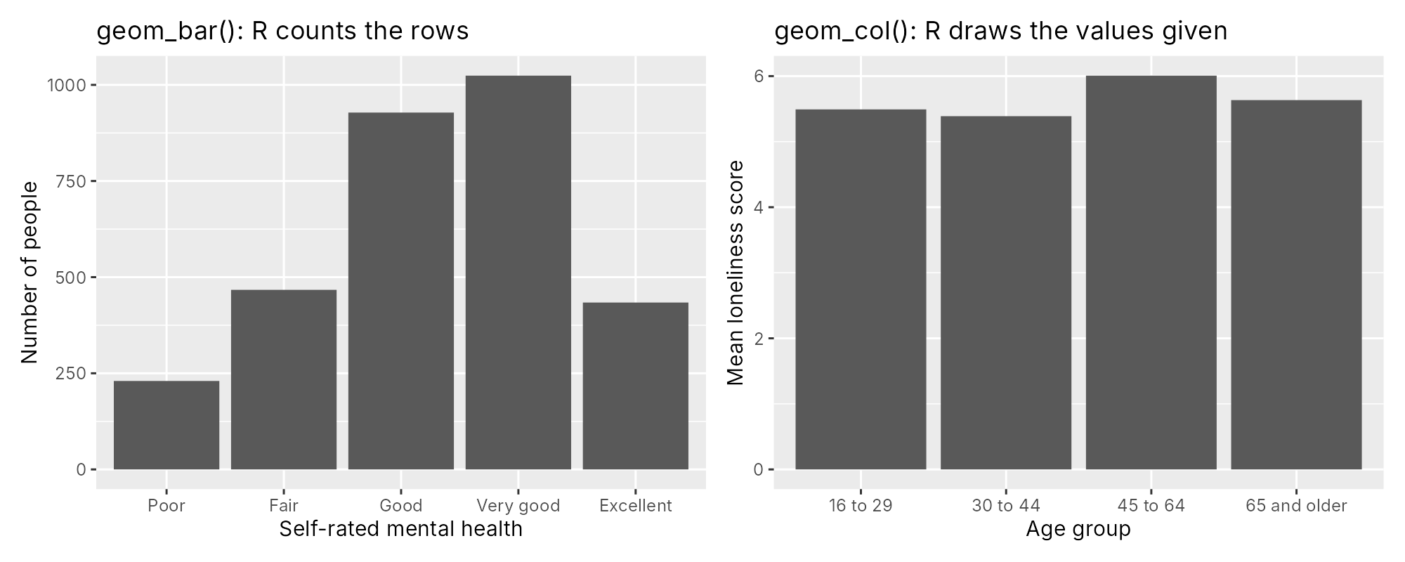
geom_histogram(binwidth = 1) (n = 3,083).Two geoms draw bars, and they are easily confused. geom_bar() counts the rows in each category, so it needs only an x aesthetic, such as mental_health. geom_col() draws bars whose heights are supplied in the data, so it needs both x and y. To draw mean loneliness by age group, the means are first computed with the base R function aggregate(), which returns a small data frame with one row per age group, and geom_col() then draws those values. Figure 6.13 draws one chart with each geom.
geom_bar() counts the rows in each category of self-rated mental health. Right: geom_col() draws the four group means computed by aggregate(). The titles were added for this figure.The right-hand panel is the "means without spread" display from Section 1, and it is shown here to illustrate geom_col(). For the briefing, loneliness by age group is better shown with boxplots and the individual points.
Activity 6.4 draws the plots in Figure 6.12 and Figure 6.13 and a boxplot with jittered points.
This activity starts from the briefing file made in Activity 6.2 of Section 2. If you are starting a new R session, run the loading and preparation code from that activity first (it is also at the top of the answer key). The first line installs ggplot2 and is needed only once on each computer, so it is written as a comment; remove the # to run it.
# install.packages("ggplot2")   # run once, if not yet installed
library(ggplot2)
ggplot(brief, aes(x = loneliness)) +          # data and the aesthetic mapping
  geom_histogram(binwidth = 1,                # the geom: one bar per score
                 fill = "#0B7B6B", colour = "white") +
  labs(title = "Loneliness scores",           # labels
       x = "Loneliness score (3 to 9)", y = "Number of people")
This block prints nothing to the console and draws a histogram in the Plots pane. If R reports could not find function "ggplot", run library(ggplot2) again.
ggplot(brief, aes(x = mental_health)) +
  geom_bar() +                                # geom_bar() counts the rows in each category
  labs(x = "Self-rated mental health", y = "Number of people")
geom_bar() counts the people in each category of mental_health, in the order set by factor() in Section 2.
means <- aggregate(loneliness ~ age_group, data = brief, FUN = mean)
means                                         # one row per age group
ggplot(means, aes(x = age_group, y = loneliness)) +
  geom_col() +                                # geom_col() draws the values it is given
labs(x = "Age group", y = "Mean loneliness score")aggregate() applies mean() to the loneliness scores within each age group and returns a data frame with one row per group. geom_col() then draws the four values in the loneliness column.
set.seed(2021)                                # the same jitter every time
ggplot(brief, aes(x = age_group, y = loneliness)) +
  geom_boxplot(outlier.shape = NA) +          # the box summarizes each group
  geom_jitter(width = 0.2, height = 0.2, alpha = 0.1) +   # every person as a faint dot
  labs(x = "Age group", y = "Loneliness score (3 to 9)")
The boxplot and the jittered points share the same axes. set.seed(2021) makes the jitter the same every time the code runs.
R Reflect on what you just ran
Use the questions below to interpret the output you produced. Look at your console output and plots before answering.
1. In the histogram code, identify the data, the aesthetic mapping, the geom and the labels. Which setting in geom_histogram() is set to a fixed value, and how would the plot change if it were mapped inside aes() instead?
brief; the aesthetic mapping is aes(x = loneliness); the geom is geom_histogram(binwidth = 1, ...); and the labels come from labs(). The fill ("#0B7B6B") and the outline colour ("white") are set to fixed values outside aes(), so every bar is teal with a white outline. If fill = "#0B7B6B" were written inside aes(), ggplot2 would treat the text as a variable with one value, draw the bars in its default colour (a pinkish red) and add a legend labelled with the text.2. Using the table printed by aggregate(), report the mean loneliness score in each age group to two decimal places. Why does this table need geom_col() and not geom_bar()?
loneliness column. geom_col() draws supplied values, while geom_bar() counts rows, so with only x mapped it would give every age group a bar of height 1, because each group appears in one row of the table.3. Compare the boxplot with jittered points to the bar chart of means. Name two things the boxplot display shows that the bars do not.
The last plot in Activity 6.4 combines a boxplot with the individual points, a display that the next part examines more closely.
A Numeric Variable Across Groups
A boxplot with jittered points uses two geoms on the same axes. geom_boxplot(outlier.shape = NA) draws the median, the quartiles and the whiskers for each age group and suppresses the separate outlier points, because geom_jitter(width = 0.2, height = 0.2, alpha = 0.1) already draws every person. The width and height arguments set how far each point may be nudged sideways and up or down, and alpha sets the opacity, from 0 (invisible) to 1 (solid). Figure 6.14 shows the result for the four age groups.
The combined display shows three things that bars of means would hide. The medians differ by one point (5 in the two younger groups and 6 in the two older groups). Every group includes people across the whole range of the scale, from 3 to 9. And the groups differ in size, from 1,079 people aged 16 to 29 to 366 aged 65 and older, which the density of the points makes visible.
Boxplots compare a numeric variable across the groups of a categorical one. When both variables are numeric, the display is a scatterplot, which the next part extends with a smoother.
Two Numeric Variables and a Smoother
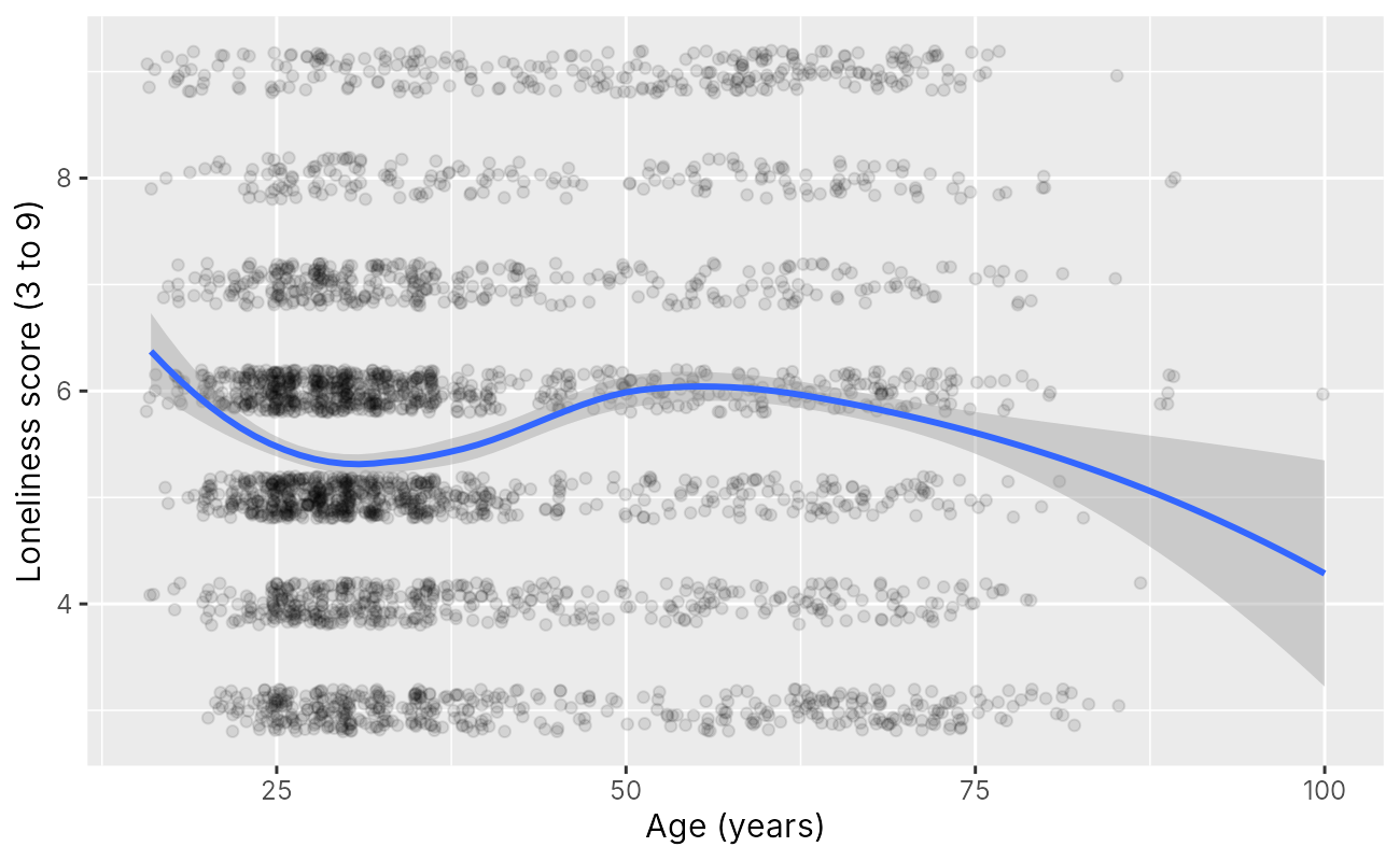
A scatterplot maps two numeric variables to x and y. Because the loneliness score takes only seven values, the points are jittered vertically (height = 0.2) and drawn with transparency. The layer geom_smooth() adds a curve that summarizes the average of y across the values of x, with a grey 95% confidence band. With method = "loess", the curve is a loess smoother (locally estimated scatterplot smoothing), which fits many small weighted regressions along the axis and joins them, so it can bend. With method = "lm", the curve is a straight least-squares line. When it draws the curve, ggplot2 prints the message `geom_smooth()` using formula = 'y ~ x', which only reports the formula it used and is not an error. Figure 6.15 adds a loess smoother to a scatterplot of loneliness against age.
The curve tells a story that a straight line would miss. Predicted loneliness is highest among the youngest respondents (about 6.4 at age 16), falls to about 5.3 around age 30, rises to about 6.0 between ages 50 and 60, and declines after 70 (about 5.4 at age 80). The band is narrow where most people are (ages 20 to 40) and widens at both ends, where the curve rests on few people: 48 respondents are under 20 and 29 are 80 or older. The ends of a smoother deserve the least trust, and a single respondent aged 100 sits at the far right. A smoother is a description of the data. It suggests that age might enter a later model as a curve or in groups, and it gives no reason, by itself, for the pattern.
The smoother summarizes one relationship across the whole briefing file. The next part asks whether a pattern differs between groups by drawing one panel for each group.
Comparing Across Groups with Facets
Facets draw the same plot in one panel per group. facet_wrap(~ age_group) takes one categorical variable and wraps its panels into a grid, which suits a single grouping variable with several levels. All panels share the same axes by default, so heights and positions can be compared across panels. Figure 6.16 applies facet_wrap() to the histogram of loneliness, with one panel for each age group.
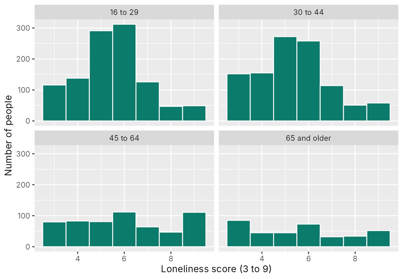
facet_wrap(~ age_group) (n = 3,083). The panels share both axes.The shared vertical axis shows both the shape and the size of each group. The two younger groups, with more than 1,000 people each, have tall bars at 5 and 6. The two older groups have shorter, flatter histograms with more people at both ends of the scale, and they hold most of the ceiling pile-up seen in Section 2: in the 45 to 64 group, 111 people (19.2%) scored 9, as many as scored 6 (112), and in the 65 and older group the most common score is 3, the lowest possible (85 people, 23.2%). The older groups are therefore more divided, with more people at the least lonely and the most lonely ends of the scale. If the groups' shapes matter more than their sizes, facet_wrap(~ age_group, scales = "free_y") gives each panel its own vertical axis, at the cost of making heights incomparable across panels.
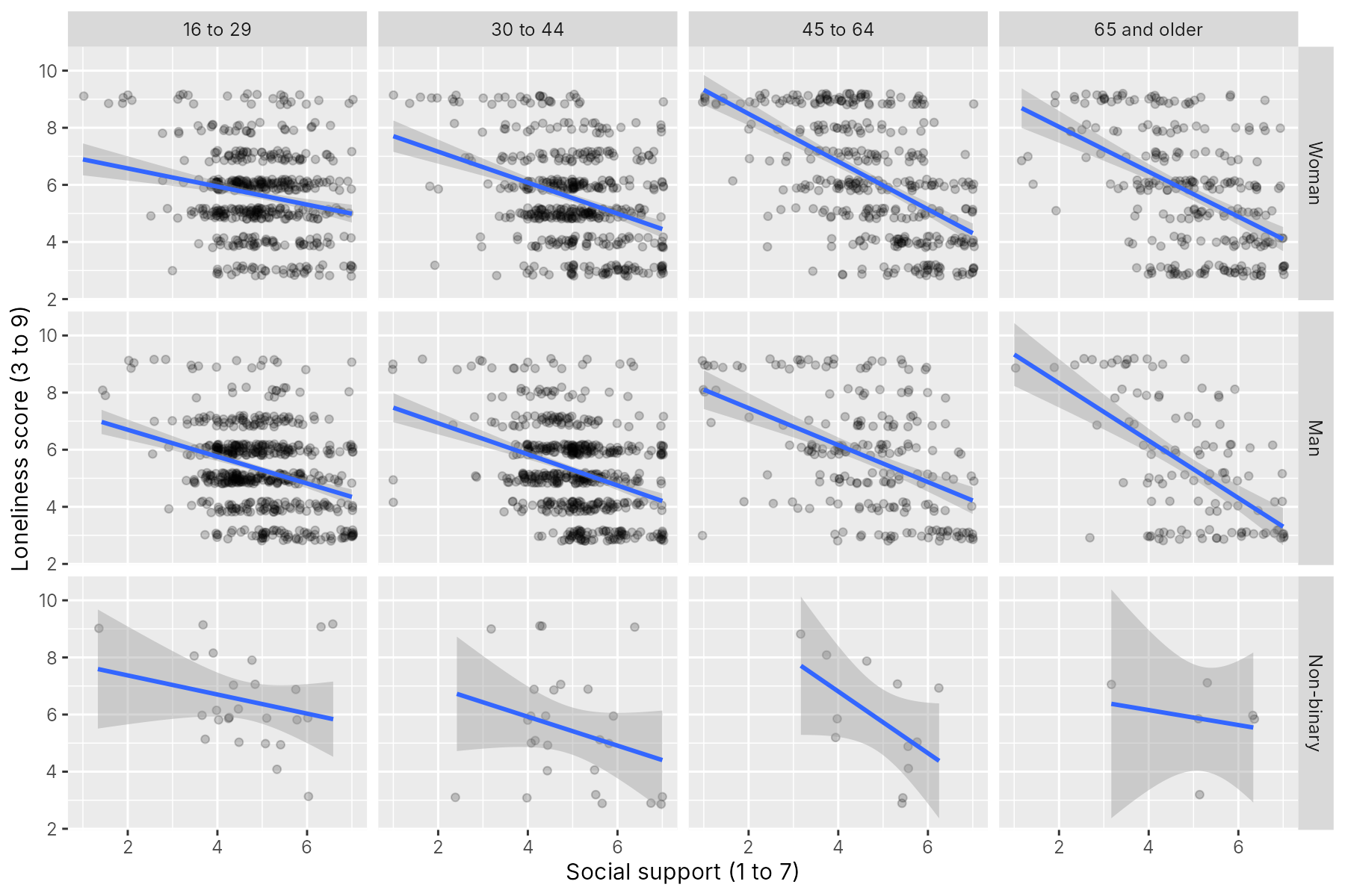
facet_grid(gender ~ age_group) takes two variables, the first for the rows and the second for the columns, and draws one panel for every combination. Figure 6.17 shows social support against loneliness, with a straight line in each panel.
The lines slope downward in all twelve panels, so higher support goes with lower loneliness in every combination of gender and age group. The lines look steeper in the two older age groups: within the age groups as a whole, the slopes are about −0.40 and −0.54 points of loneliness per point of support in the two younger groups and about −0.76 and −0.84 in the two older groups. The table of counts printed in Activity 6.5 is the necessary companion to the grid. The non-binary panels hold between 6 and 26 people, so their lines and bands are very uncertain, and any difference they appear to show would need a much larger sample to assess. An exploratory figure should show small groups, and the text should say how small they are.
Table 6.5 gives these counts, the number of people behind each panel of Figure 6.17.
Table 6.5. Number of people in each panel of Figure 6.17, by gender and age group.
| Gender | 16 to 29 | 30 to 44 | 45 to 64 | 65 and older |
|---|---|---|---|---|
| Woman | 490 | 477 | 362 | 251 |
| Man | 564 | 557 | 204 | 109 |
| Non-binary | 25 | 26 | 12 | 6 |
Facets give each group its own panel. Groups can also share one panel and be told apart by colour, and the next part turns to colour, palettes and themes.
Colour, Palettes and Themes
Mapping a variable to colour (for points and lines) or fill (for bars and boxes) shows groups within one panel. Colour and facets suit different situations. Colour lets the reader compare groups directly on the same axes, and it works well for two or three groups. Facets give each group its own panel, and they work better when there are many groups, when points overlap heavily, or when one group is much smaller than the others and would be hidden. The two can also be combined, with colour for one grouping variable and facets for another.
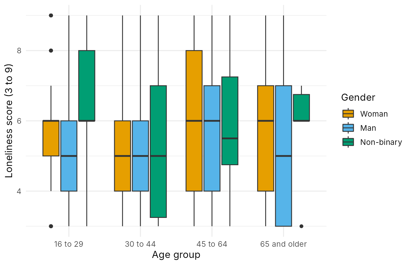
The colours themselves need care. About 8% of men and 0.5% of women of northern European ancestry have some form of red-green colour-vision deficiency, so a palette that relies on telling red from green fails a sizeable part of any audience. The Okabe-Ito palette (Okabe & Ito, 2008) is a set of eight colours chosen to remain distinguishable for people with the common forms of colour-vision deficiency. Its first three colours after black, orange (#E69F00), sky blue (#56B4E9) and bluish green (#009E73), are used below with scale_fill_manual(). The viridis palettes, available in ggplot2 as scale_fill_viridis_d() for categories, are another safe choice, and they also remain readable when printed in greyscale. Figure 6.18 maps fill to gender in boxplots of loneliness by age group, with the three Okabe-Ito colours and a minimal theme.
theme_minimal(base_size = 12) (n = 3,083).The theme controls the appearance of everything except the data. The default theme, theme_grey(), uses a grey panel with white grid lines. theme_minimal() removes the grey panel, theme_bw() adds a black border, and theme_classic() keeps only the axis lines. The argument base_size sets the size of all text in points, and 11 or 12 suits most journal figures. Labels are set with labs(), which also names the legend through the aesthetic it describes, as in fill = "Gender".
Once a figure has its colours, theme and labels, it is saved to a file at the size at which it will be printed or shown, which the next part describes.
Saving a Figure with ggsave()
The function ggsave() writes a ggplot2 plot to a file. Its first argument is the file name, and the extension sets the format: .png for most uses, .pdf or .svg for figures that must stay sharp at any size, and .tiff when a journal asks for it. The second argument is the plot object, here p, and without it ggsave() saves the last plot shown. The arguments width and height are in inches by default, and dpi sets the resolution, with 300 dots per inch the usual requirement for print. A figure of 7 by 4.5 inches at 300 dpi is 2,100 by 1,350 pixels. Text size is relative to the physical size of the figure, so a plot saved at a large width with a small base_size will have text that is too small when the figure is shrunk to fit a page.
Activity 6.5 draws the plots in Figure 6.15, Figure 6.16, Figure 6.17 and Figure 6.18, prints the counts in Table 6.5, and saves the last plot with ggsave().
This activity continues from Activity 6.4, with ggplot2 loaded and the briefing file in memory. It draws a scatterplot with a loess smoother, two faceted plots and a boxplot coloured by gender, and saves the last plot to a file.
set.seed(2021)
ggplot(brief, aes(x = age, y = loneliness)) +
  geom_jitter(height = 0.2, alpha = 0.1) +
  geom_smooth(method = "loess") +             # a smooth curve through the average score
labs(x = "Age (years)", y = "Loneliness score (3 to 9)")The message reports the formula that geom_smooth() used, a curve of y on x, and is not an error. The blue curve is the loess smoother and the grey band is its 95% confidence band.
ggplot(brief, aes(x = loneliness)) +
  geom_histogram(binwidth = 1, fill = "#0B7B6B", colour = "white") +
  facet_wrap(~ age_group) +                   # one panel for each age group
  labs(x = "Loneliness score (3 to 9)", y = "Number of people")
facet_wrap(~ age_group) draws one histogram per age group, with shared axes.
set.seed(2021)
ggplot(brief, aes(x = support, y = loneliness)) +
  geom_jitter(height = 0.2, alpha = 0.2) +
  geom_smooth(method = "lm") +                # a straight line in each panel
  facet_grid(gender ~ age_group) +            # rows: gender; columns: age group
labs(x = "Social support (1 to 7)", y = "Loneliness score (3 to 9)")The grid has three rows (gender) and four columns (age group), and method = "lm" draws a straight line in each panel.
table(brief$gender, brief$age_group) # people in each panelThe table gives the number of people behind each panel of the grid. Six non-binary respondents are aged 65 and older.
p <- ggplot(brief, aes(x = age_group, y = loneliness, fill = gender)) +
  geom_boxplot() +
  scale_fill_manual(values = c("#E69F00", "#56B4E9", "#009E73")) +  # Okabe-Ito colours
  labs(x = "Age group", y = "Loneliness score (3 to 9)", fill = "Gender") +
  theme_minimal(base_size = 12)               # a plain theme with larger text
p                                             # show the plot
ggsave("loneliness_age_gender.png", p, width = 7, height = 4.5, dpi = 300)
Storing the plot as p lets the same object be shown on screen and saved. ggsave() writes loneliness_age_gender.png, 7 by 4.5 inches at 300 dots per inch (2,100 by 1,350 pixels), to the working directory, and prints nothing.
R Reflect on what you just ran
Use the questions below to interpret the output you produced. Look at your console output and plots before answering.
1. Describe the shape of the loess curve of loneliness across age in two or three sentences. Why should the ends of the curve be trusted least?
2. Using the faceted grid and the table of counts, compare the lines in the panels for women and men with the panels for non-binary respondents. What should the briefing say about the non-binary panels?
3. Explain why the code uses scale_fill_manual(values = c("#E69F00", "#56B4E9", "#009E73")), and state what the width, height and dpi arguments of ggsave() control.
ggsave(), width and height set the physical size of the figure in inches (7 by 4.5), and dpi sets the resolution in dots per inch (300, the usual print standard), so the saved file is 2,100 by 1,350 pixels.The card below links again to the narrated walkthrough introduced in Section 2.
Narrated R walkthrough: Data Visualization in Base R and ggplot2
The walkthrough builds the ggplot2 plots in this section layer by layer, so that the effect of each line of code can be seen before the next is added.
Open the walkthroughThis section has described the grammar on which ggplot2 is built and used it to draw the briefing plots for one variable, for a numeric variable across groups and for two numeric variables, to compare groups with facets and colour, and to save a figure. The knowledge check and the reflection that follow review these steps, and Section 4 adds displays for many variables and combines the briefing plots into one figure.
1. In the layered grammar of graphics, what is an aesthetic mapping?
aes(), connects a variable to a visual property such as x, y, colour or fill. The marks are geoms, and fonts and backgrounds belong to the theme.2. A data frame has one row per age group and a column of mean scores. Which geom draws one bar per group with the height of its mean?
geom_col() draws bars whose heights are supplied in the data. geom_bar() counts rows, so it would give every group in this table a bar of height 1.3. Why is outlier.shape = NA used in geom_boxplot() when geom_jitter() is added?
4. A plot must compare a score across 12 regions, and the points overlap heavily. Which approach is usually clearer?
5. Which ggsave() call saves the plot p as a 7 by 4.5 inch PNG file at a resolution suitable for print?
width and height are in inches, and 300 dots per inch is the usual print standard.✎ Reflection
This section introduced ggplot2 and the layered grammar of graphics, in which a plot is built from data, aesthetic mappings (variables linked to visual properties inside aes()), geoms (marks such as boxes, points and lines), scales, facets (one panel per group) and a theme. It also described two ways to show groups: mapping a variable to colour or fill within one panel, which suits two or three groups compared directly, and facets, which suit many groups, heavily overlapping points or very unequal group sizes. Colours should come from a palette that people with colour-vision deficiency can read, such as the Okabe-Ito palette. A colleague's draft figure shows depressive symptom scores (0 to 6) against age for respondents in five regions, all in one panel, with each region in a different colour from a red-to-green palette and about 3,000 overlapping solid points. Describe three changes you would make to the figure, write the ggplot2 code for your improved version (assume a data frame d with the variables age, depression and region), and explain what each change improves.
facet_wrap(~ region), because five overlapping colours in one panel with 3,000 points make it impossible to see any one region, while facets on shared axes keep the regions comparable. Second, I would deal with overplotting: depression takes only seven whole values, so I would use geom_jitter(height = 0.2, alpha = 0.15) so that dense areas appear darker and individual values are visible, and add geom_smooth(method = "loess") to summarize the average score across age in each panel. Third, with region now shown by the panels, colour is no longer needed for region, which removes the red-to-green palette that readers with red-green colour-vision deficiency cannot read; if colour were still needed, I would use the Okabe-Ito colours. I would also add clear labels and a plain theme. The code would be:ggplot(d, aes(x = age, y = depression)) +
geom_jitter(height = 0.2, alpha = 0.15) +
geom_smooth(method = "loess") +
facet_wrap(~ region) +
labs(x = "Age (years)", y = "Depressive symptoms, PHQ-2 (0 to 6)") +
theme_minimal()Finally, I would print a table of the number of people in each region beside the figure, so that a panel with few people is not over-interpreted.
Many Variables and Combined Figures
A correlation matrix drawn as colours
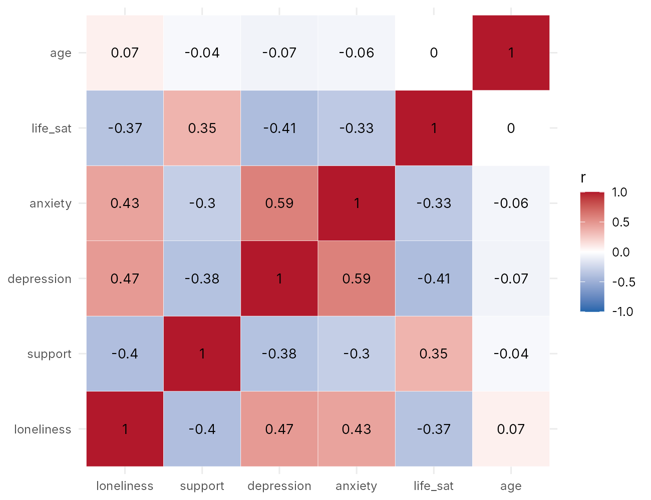
A relationship and two distributions in one display
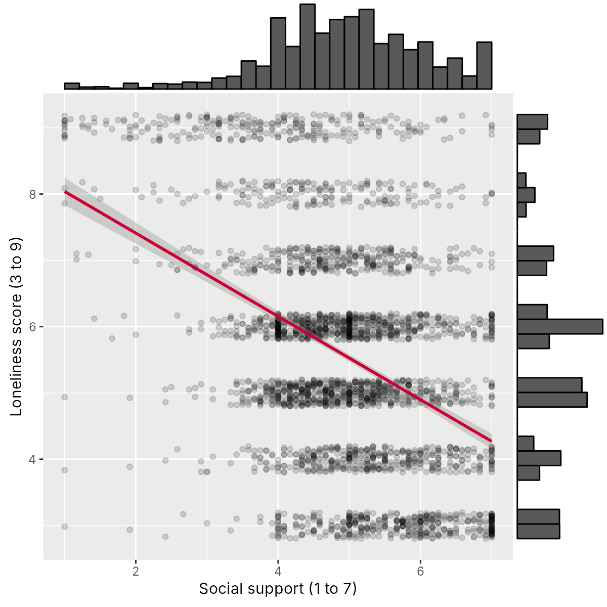
ggMarginal(p_scatter, type = "histogram").The briefing as one figure
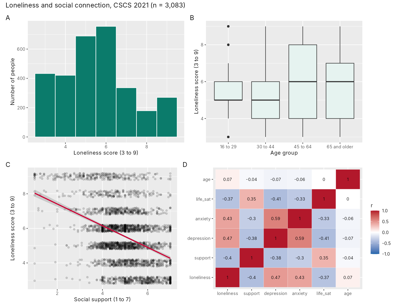
(p_hist + p_box) / (p_scatter + p_heat) + plot_annotation(tag_levels = "A")Introduction and Overview
The working group's third question asks how loneliness goes together with social support and mental health, which involves several variables at once. One scatterplot per pair would answer it slowly, because six variables have fifteen pairs. This section shows how to summarize many pairs in one display with a correlation matrix and a heatmap, and it explains the limits of that summary. It then adds marginal histograms to a scatterplot, combines the briefing plots into one multi-panel figure, and sets out the conventions of a publication figure and its caption. The finished figure is the kind of exploratory figure that a research paper based on survey data often includes.
Learning Objectives
- Compute a correlation matrix with
cor()and display it as a heatmap in ggplot2. - Explain why a correlation heatmap shows association and cannot identify causes, curved relationships or the shape of the data.
- Build a scatterplot with marginal histograms using
ggExtra::ggMarginal(). - Combine several ggplot2 plots into one labelled figure with the patchwork package and save it with
ggsave(). - Apply the conventions of a publication figure and write a caption that states what the figure shows.
The section begins with the correlation matrix, the numeric summary from which the heatmap is drawn.
Looking at Many Variables at Once
The Pearson correlation coefficient, written r, measures how closely two numeric variables follow a straight line. It ranges from −1 (all points on a line sloping downward) through 0 (no straight-line relationship) to +1 (all points on a line sloping upward). Its sign gives the direction and its size gives the strength. Cohen (1988) suggested that values of about 0.1, 0.3 and 0.5 be called small, medium and large in the behavioural sciences, and these labels are a rough guide only, since what counts as a strong association depends on the field and the question.
The function cor(), given a data frame of numeric columns, returns a correlation matrix with one row and one column per variable. Each cell holds the correlation between its row variable and its column variable. The diagonal holds the correlation of each variable with itself, which is always 1, and the matrix is symmetric, so the values above the diagonal repeat those below it. Six variables give 36 cells and 15 distinct correlations.
Table 6.6 gives the correlation matrix for the six numeric briefing variables.
Table 6.6. Pearson correlations among the six numeric variables in the briefing file (n = 3,083).
| loneliness | support | depression | anxiety | life_sat | age | |
|---|---|---|---|---|---|---|
| loneliness | 1.00 | −0.40 | 0.47 | 0.43 | −0.37 | 0.07 |
| support | −0.40 | 1.00 | −0.38 | −0.30 | 0.35 | −0.04 |
| depression | 0.47 | −0.38 | 1.00 | 0.59 | −0.41 | −0.07 |
| anxiety | 0.43 | −0.30 | 0.59 | 1.00 | −0.33 | −0.06 |
| life_sat | −0.37 | 0.35 | −0.41 | −0.33 | 1.00 | 0.00 |
| age | 0.07 | −0.04 | −0.07 | −0.06 | 0.00 | 1.00 |
In the briefing file, loneliness has moderate positive correlations with depressive symptoms (0.47) and anxiety symptoms (0.43), and moderate negative correlations with social support (−0.40) and life satisfaction (−0.37). Its correlation with age is close to zero (0.07). The strongest correlation in the matrix is between depressive and anxiety symptoms (0.59), two measures that often move together.
Two practical points apply to cor(). First, it returns NA for any pair with a missing value unless told how to handle them, for example with use = "complete.obs". The briefing file has no missing values, so this does not arise here. Second, Pearson's r assumes numeric variables and is sensitive to outliers and to skew. For ordinal scores or skewed variables, Spearman's rank correlation, computed with cor(..., method = "spearman"), uses the ranks of the values and is less affected by extreme values. For loneliness and social support, Spearman's correlation is −0.36, close to the Pearson value of −0.40.
Activity 6.6 computes Table 6.6 with cor(), reshapes it into one row per pair of variables, and draws a heatmap of the correlations.
This activity starts from the briefing file with ggplot2 loaded. If you are starting a new R session, run the loading and preparation code from Section 2 and library(ggplot2) first (both are at the top of the answer key).
vars <- c("loneliness", "support", "depression", "anxiety", "life_sat", "age")
cor_mat <- round(cor(brief[, vars]), 2)     # Pearson correlations, rounded
cor_matbrief[, vars] keeps the six numeric columns named in vars, cor() computes every pairwise Pearson correlation, and round(..., 2) keeps two decimal places. The diagonal is 1.00 and the matrix is symmetric.
cor_long <- as.data.frame(as.table(cor_mat))   # one row for each pair
names(cor_long) <- c("var1", "var2", "r")
head(cor_long)The long data frame has 36 rows, one for each cell of the matrix. head() prints the first six, which are the correlations of each variable with loneliness.
ggplot(cor_long, aes(x = var1, y = var2, fill = r)) +
  geom_tile(colour = "white") +                     # one coloured square per pair
  geom_text(aes(label = r), size = 3.5) +           # print the value on each square
  scale_fill_gradient2(low = "#2166AC", mid = "white", high = "#B2182B",
                       limits = c(-1, 1)) +         # blue negative, red positive
  labs(x = NULL, y = NULL, fill = "r") +
  theme_minimal()
This block draws the heatmap and prints nothing. scale_fill_gradient2() sets a diverging scale with white at zero, and limits = c(-1, 1) fixes the ends of the scale at the possible range of r.
R Reflect on what you just ran
Use the questions below to interpret the output you produced. Look at your console output and plots before answering.
1. Which variable has the strongest correlation with loneliness, and what is its value? Describe this correlation in one sentence using the words direction and strength.
2. The correlation between age and loneliness is 0.07. A member of the working group concludes that age is unrelated to loneliness. Using what you saw in Section 3, explain why this conclusion is too strong.
3. Another member reads the heatmap and says that it shows social support reduces loneliness. Write a two-sentence reply that the analyst could give.
The heatmap at the end of Activity 6.6 displays the same matrix in colour, and the next part explains how it is built and how it is read.
Correlation Heatmaps
A matrix of 36 numbers is slow to read. A correlation heatmap draws each cell as a coloured square, so that the pattern can be seen at a glance. Drawing it in ggplot2 takes two steps. The matrix is first turned into a long data frame with one row per pair: as.table() treats the matrix as a table, and as.data.frame() turns that table into three columns, here renamed var1, var2 and r. Then geom_tile() draws one square per row, with var1 mapped to x, var2 to y and r to fill, and geom_text() prints the value on each square. Figure 6.19 shows the heatmap for the six briefing variables.
The colour scale is a diverging scale, set with scale_fill_gradient2(): blue for negative values, white at zero and red for positive values, with limits = c(-1, 1) so that the colours keep the same meaning in any heatmap. A diverging scale suits correlations because zero is a meaningful midpoint. Blue and red remain distinguishable for people with red-green colour-vision deficiency, which a red-to-green scale would not.
The heatmap shows a clear structure. Loneliness, depression and anxiety form a block of positive correlations, and each of the three is negatively correlated with social support and life satisfaction, which are positively correlated with each other (0.35). Age is close to white in every square. For the briefing, this panel gives the working group an overview of the third question in one picture.
The overview has limits, which the following subsection sets out.
What a Heatmap Shows and What It Cannot
A correlation heatmap shows the strength and direction of straight-line association between each pair of variables. Three common readings go beyond what it shows.
The accordion below explains each of these readings and why the heatmap cannot support it.
The correlation of 0.47 between loneliness and depressive symptoms is consistent with several causal stories. Loneliness might increase depressive symptoms. Depression might lead people to withdraw from others and feel lonelier, which is reverse causation. Other factors, such as poor physical health, bereavement or low income, might increase both, which is confounding by a common cause. All three stories, and combinations of them, would produce the same square on the heatmap. The CSCS 2021 data were collected at one time point, so the order of events cannot be established from them. Separating these explanations requires study design, causal diagrams of the kind drawn in earlier courses, and models that adjust for confounders, and even then a cross-sectional survey supports causal claims only weakly. A heatmap is therefore a map of where to look, and the briefing should describe it as showing which measures go together.
Pearson's r measures how well a straight line describes the data. The correlation between age and loneliness is 0.07, yet the loess curve in Section 3 showed a clear pattern: loneliness dips around age 30, rises into the fifties and falls after 70. Rises and falls in different parts of the age range cancel out in a single straight-line summary. A near-white square means only that no straight line fits well, and a scatterplot is needed to see whether a curve does.
Anscombe's quartet in Section 1 showed four datasets with the same correlation of 0.82 and completely different shapes, including a curve, an outlier and a relationship created by a single point. A heatmap reduces each pair to one number, so it hides outliers, clusters, floors and ceilings, and it says nothing about how many people contributed. Strong or surprising squares should be followed up with a scatterplot of that pair.
A heatmap therefore points to the pairs of variables that deserve a closer look. The next part shows one way to take that closer look: a scatterplot of one pair with the distribution of each variable along its margins.
Scatterplots with Marginal Histograms
A scatterplot shows how two variables go together, and a histogram shows how one variable is distributed. A scatterplot with marginal histograms shows both at once: the scatterplot sits in the middle, with a histogram of the horizontal variable along the top and a histogram of the vertical variable along the right side. The function ggMarginal() from the ggExtra package adds the margins to a finished ggplot2 scatterplot. Its argument type can be "histogram", "density" or "boxplot". Figure 6.20 shows loneliness against social support with a histogram of each variable along its margin.
The marginal histogram of social support shows a distribution skewed to the left: most people have scores between 4 and 6, and a long, thin tail runs toward low support. It also shows spikes at whole-number scores. In the briefing file, 170 people have a score of exactly 5, 136 exactly 4 and 117 exactly 7. The support score is the mean of twelve items, so a whole-number score is what a person who gives the same answer to every item receives, and a score of 7 requires the highest answer on all twelve. Such answers can reflect genuine views or a respondent moving quickly through the questions (sometimes called straight-lining), and the plot is a reason to look more closely before analyzing the score. The marginal histogram of loneliness shows the seven separate values of that score.
The object that ggMarginal() returns is a finished drawing, and it is not a ggplot2 object, so further layers cannot be added to it and patchwork cannot place it in a grid without extra steps. It can be saved with ggsave(). The combined briefing figure (Figure 6.21) therefore uses the scatterplot without its margins.
The marginal histograms reveal spikes in the support score at whole-number values. The next part places the scatterplot beside three other briefing plots in a single figure made with patchwork.
Combining Panels with patchwork
A multi-panel figure lets a reader see several related displays together, with consistent styling and one caption. The patchwork package combines ggplot2 plots with arithmetic-like operators. A plus sign (+) or a vertical bar (|) places plots side by side, a forward slash (/) stacks them, and parentheses group them. The expression (p_hist + p_box) / (p_scatter + p_heat) therefore gives two plots in the top row and two in the bottom row. The function plot_annotation() adds a title, a subtitle or a caption to the whole figure, and its argument tag_levels = "A" labels the panels A, B, C and D in reading order, which the caption can then refer to. The function plot_layout() controls the number of columns, the relative widths and heights of panels, and whether legends are collected in one place. Figure 6.21 shows the draft briefing figure that this expression produces from the histogram, the boxplots, the scatterplot and the heatmap.
The figure is saved with ggsave("briefing_figure.png", figure, width = 11, height = 8.5, dpi = 300). A four-panel figure needs a larger size than a single plot, so that each panel keeps legible text, and 11 by 8.5 inches suits a full page turned sideways or a slide. When the figure is placed in a narrower space, such as one column of a journal, it is better to save it at that width and adjust the text size with base_size than to shrink a large image.
Activity 6.7 draws the scatterplot with marginal histograms in Figure 6.20, and then assembles and saves the four-panel briefing figure in Figure 6.21.
This activity continues from Activity 6.6, with the briefing file, ggplot2 and the cor_long data frame in memory. It installs and loads two more packages (installation is needed once per computer), draws a scatterplot with marginal histograms, and assembles and saves the four-panel briefing figure.
# install.packages(c("ggExtra", "patchwork"))   # run once, if not yet installed
library(ggExtra)     # ggMarginal() adds histograms to the margins of a plot
library(patchwork)   # + and / combine ggplot2 plots into one figure
set.seed(2021)
p_scatter <- ggplot(brief, aes(x = support, y = loneliness)) +
  geom_jitter(height = 0.2, width = 0, alpha = 0.15) +
  geom_smooth(method = "lm", colour = "#CC0033") +
  labs(x = "Social support (1 to 7)", y = "Loneliness score (3 to 9)")
ggMarginal(p_scatter, type = "histogram") # a histogram on each axisThe message appears twice because ggMarginal() builds the scatterplot twice while it adds the margins; it is not an error. The plot shows the scatterplot with a histogram of support along the top and a histogram of loneliness along the right side.
p_hist <- ggplot(brief, aes(x = loneliness)) +
  geom_histogram(binwidth = 1, fill = "#0B7B6B", colour = "white") +
  labs(x = "Loneliness score (3 to 9)", y = "Number of people")
p_box <- ggplot(brief, aes(x = age_group, y = loneliness)) +
  geom_boxplot(fill = "#E6F3F0") +
  labs(x = "Age group", y = "Loneliness score (3 to 9)")
p_heat <- ggplot(cor_long, aes(x = var1, y = var2, fill = r)) +
  geom_tile(colour = "white") +
  geom_text(aes(label = r), size = 3) +
  scale_fill_gradient2(low = "#2166AC", mid = "white", high = "#B2182B",
                       limits = c(-1, 1)) +
  labs(x = NULL, y = NULL, fill = "r")
These lines store three more plots without drawing them. Each is a complete ggplot2 object that patchwork can arrange.
figure <- (p_hist + p_box) / (p_scatter + p_heat) +   # + side by side, / stacked
  plot_annotation(tag_levels = "A",                     # label the panels A to D
    title = "Loneliness and social connection, CSCS 2021 (n = 3,083)")
figure
ggsave("briefing_figure.png", figure, width = 11, height = 8.5, dpi = 300)Typing figure draws the combined figure, and ggsave() draws it again to save it, so the message from the scatterplot panel appears twice. The file briefing_figure.png is 11 by 8.5 inches at 300 dots per inch.
R Reflect on what you just ran
Use the questions below to interpret the output you produced. Look at your console output and plots before answering.
1. Describe the marginal histogram of social support in two sentences. What do the spikes at whole-number scores suggest, and why might they matter?
2. Explain in words how the expression (p_hist + p_box) / (p_scatter + p_heat) arranges the four plots, and what plot_annotation(tag_levels = "A") adds.
p_hist + p_box is the top row and p_scatter + p_heat is the bottom row. The forward slash stacks the first group above the second, giving a two-by-two grid with the histogram top left, the boxplot top right, the scatterplot bottom left and the heatmap bottom right. plot_annotation(tag_levels = "A") labels the panels A, B, C and D in reading order and adds the overall title, so the caption can refer to each panel by its letter.3. List two changes that would bring the draft figure closer to the conventions of a publication figure, and write the code for one of them.
life_sat, which should be replaced by plain labels, and a plain theme would remove the grey backgrounds. For the theme, the combined figure can be given one theme for every panel with figure & theme_minimal(), where & applies the theme to all panels. For the labels, the names can be recoded before the heatmap is drawn, for example levels(cor_long$var1)[levels(cor_long$var1) == "life_sat"] <- "Life satisfaction" and the same for var2. The legend title could also read "Pearson r" with labs(fill = "Pearson r").The draft figure still shows R variable names in panel D. The next part sets out the conventions that a publication figure follows.
Conventions of a Publication Figure
An exploratory figure in a manuscript has a different audience from the analyst's quick looks. Readers see it once, often without the text nearby, and they should be able to understand it without access to the code. Tufte (1983) argued that a graphic should spend its ink on the data and remove decoration that carries no information, which he called chartjunk. Table 6.7 lists the conventions most journals expect and checks the draft briefing figure against them.
Table 6.7. Conventions of a publication figure, checked against the draft briefing figure (Figure 6.21).
| Convention | What it means | Draft briefing figure |
|---|---|---|
| Axis labels in words, with units or ranges | "Loneliness score (3 to 9)" in place of loneliness | Met in panels A to C |
| Plain labels for variables | "Life satisfaction" in place of life_sat | Not yet met in panel D, which shows R names |
| Panel letters | A, B, C and D, referred to in the caption | Met with tag_levels = "A" |
| Legends that name their scale | The fill legend in panel D is labelled r | Met, though "Pearson r" would be clearer |
| Readable colours | Colour-blind-safe palettes that also work in greyscale | Met (teal, a red line, a blue-white-red scale) |
| Legible text at printed size | Text of about 8 points or more when printed | Met at 11 by 8.5 inches |
| Resolution | About 300 dots per inch for print | Met with dpi = 300 |
| Sample size | The number of people shown, in the title or caption | Met in the title (n = 3,083) |
| No chartjunk | No three-dimensional effects, shadows or decoration | Met; a plain theme would lighten it further |
A figure that meets the conventions in Table 6.7 still needs a caption, which the next part describes.
Writing a Figure Caption
A caption makes a figure stand on its own. Most journals place the caption below the figure, beginning with the figure number and a short title, followed by sentences that tell the reader what is shown. A good caption states what the figure displays and for whom: the data source and year, the number of people included and the reason others were excluded, the measures and their ranges, and the meaning of every panel and mark, such as what the boxes, whiskers, lines and bands represent and whether points were jittered. The caption describes the figure; the interpretation, such as which differences matter, belongs in the results text that refers to it.
Worked Example 6.1 applies these rules to the briefing. It lists the changes made to the draft in Figure 6.21, gives the full caption of the finished figure, and shows the three sentences of text that accompany the figure in the briefing.
The analyst replaces the R names in panel D with plain labels (loneliness, social support, depression, anxiety, life satisfaction and age), applies theme_minimal() to all four panels, and saves the figure at 11 by 8.5 inches and 300 dpi. The caption reads as follows.
Figure 1. Loneliness and social connection among respondents to the 2021 wave of the Canadian Social Connection Survey (n = 3,083 respondents with complete data on all variables shown; 962 of 4,045 respondents were excluded for missing data). (A) Distribution of scores on the three-item UCLA Loneliness Scale (range 3 to 9; higher scores indicate more loneliness). (B) Loneliness score by age group; boxes show the median and interquartile range, whiskers extend to the most extreme values within 1.5 times the interquartile range, and points show values beyond the whiskers. (C) Loneliness score against perceived social support (Multidimensional Scale of Perceived Social Support, range 1 to 7); points are jittered vertically by up to 0.2 and drawn with transparency, and the line is a least-squares line with its 95% confidence band. (D) Pearson correlations among loneliness, social support, depressive symptoms (PHQ-2, 0 to 6), anxiety symptoms (GAD-2, 0 to 6), life satisfaction (1 to 10) and age.
In the one-page briefing, three sentences of text accompany the figure. Loneliness scores were spread across the whole scale, with the most common scores at 5 and 6 and a group of respondents at the maximum score. Median loneliness was one point higher among respondents aged 45 and older than among younger respondents, although scores varied widely within every age group. Loneliness was moderately correlated with lower social support, more depressive and anxiety symptoms and lower life satisfaction; these are associations in a survey collected at one time and do not show which factors cause which.
The caption and the three sentences of text complete the briefing. The last part of this section places a figure of this kind within the results of a research paper.
From Analysis to Manuscript
An exploratory figure is one part of the results of a research paper. STROBE, the reporting guideline for cohort, case-control and cross-sectional studies (von Elm et al., 2007), lists what the results section should report. Item 13 asks for the number of people at each stage of the study and the reasons they were not included, which the caption of the briefing figure gives (3,083 of 4,045 respondents, with 962 excluded for missing data). Item 14 asks for the characteristics of the participants and the number with missing data for each variable, usually in a Table 1, and item 15 asks for summaries of the outcome, such as the distribution in panel A. Item 16 asks for the main results: unadjusted and adjusted estimates with their confidence intervals, and a statement of which confounders were adjusted for and why. These estimates are usually set out in a results table with one column for the crude estimates and one for the adjusted estimates, as Lesson 4, Section 1 showed for a logistic model.
The figure and the tables then support the rest of the paper. The abstract reports the main estimate with its confidence interval in one or two sentences. The discussion interprets the results, compares them with earlier studies and states the limitations; for the CSCS, these include the cross-sectional design, which limits causal claims, and the online recruitment, which limits generalization to the Canadian population. For optional reading, HSCI 207 Lesson 12 (Writing Up Research) treats results tables, the discussion and limitations in more detail.
This section has summarized many variables with a correlation matrix and a heatmap, set out the limits of that summary, added marginal histograms to a scatterplot, combined the briefing plots into one figure, and described the conventions of a publication figure and its caption. The knowledge check and the reflection that follow review these ideas, and the final page of the lesson gathers the key takeaways, a closing reflection and the final assessment.
1. A correlation matrix of five variables is printed with cor(). How many distinct correlations between different variables does it contain?
2. In a correlation heatmap, the square for loneliness and depressive symptoms shows r = 0.47. Which statement is supported by the heatmap alone?
3. The Pearson correlation between age and loneliness is 0.07, but a loess curve shows loneliness falling and rising across age. What explains this?
4. Which patchwork expression places plot a above plot b?
5. Which of the following belongs in a figure caption for an exploratory figure?
✎ Reflection
This section combined several displays into one figure and set out the conventions of a publication figure. A caption should state what the figure shows, the data source and year, the number of people included and why others were excluded, the measures and their ranges, and what each panel and mark means (for example, what boxes, whiskers, lines and confidence bands represent and whether points were jittered), and it should leave interpretation to the results text. Suppose a two-panel figure from a community survey of 1,850 adults (2,200 were surveyed, and 350 were excluded for missing data) shows, in panel A, a histogram of sleep duration in hours per night and, in panel B, boxplots of a perceived stress score (range 0 to 40, higher is more stress) for three groups of sleep duration (under 6 hours, 6 to 8 hours, more than 8 hours), with the individual points jittered horizontally. Write a complete caption for this figure, then write one sentence for the results text that interprets panel B without making a causal claim, assuming that the median stress score was 22 in the shortest-sleep group and 16 in the other two groups.
Results sentence. Respondents who reported sleeping under 6 hours per night had a higher median perceived stress score (22) than those who slept 6 to 8 hours or more than 8 hours (16 in both groups), although scores overlapped considerably across the three groups (Figure 2B).
The caption describes what is shown and how to read it, and the results sentence states the association without saying that short sleep causes stress, since the data cannot establish the direction of the relationship.
Lesson 6: Final Assessment
Bringing It All Together
This lesson followed one request from start to finish: a one-page visual briefing on social connection for a regional loneliness working group, drawn from the 2021 wave of the Canadian Social Connection Survey. Section 1 set out why the analyst looks before modelling. Anscombe's quartet showed four datasets with the same means, standard deviations, correlation and fitted line but completely different patterns, and a decision guide matched the display to the number and types of the variables in a question. A gallery of poor displays showed what a truncated axis, a bar chart of means, a crowded pie chart and an overplotted scatterplot conceal.
Section 2 prepared the briefing file in base R (3,083 people with complete data on nine variables) and used quick base R plots to check it. A histogram revealed a spike of 116 people at the top value of household size, where larger totals had been recorded as 20, and heaping at 40 hours in reported hours of work, problems that the numeric summaries did not show. Section 3 rebuilt the plots with ggplot2, using the layered grammar of data, aesthetics, geoms, scales, facets and themes. A loess smoother showed that loneliness dips around age 30 and rises to a second high point in the fifties, facets compared the relationship between social support and loneliness across gender and age groups, and the Okabe-Ito palette kept the colours readable. Section 4 summarized many variables with a correlation heatmap, explained why a heatmap shows association and cannot show cause, curves or shape, added marginal histograms to a scatterplot, and combined four panels into one figure with a caption.
The same habits apply to every analysis in the rest of the course: each variable is plotted before it is summarized, each relationship is plotted before it is modelled, and each figure carries labels and a caption that let it stand on its own. The next lesson, Measurement and Psychometrics, takes up a question that this lesson left open: whether the scale scores plotted here, such as the loneliness and social support scores, measure what they are meant to measure, and how reliably they do so.
Key Takeaways from this lesson
- Exploratory analysis looks at the data before modelling, because very different data can share the same summary statistics.
- The display follows from the question and the variable types: a histogram or bar chart for one variable, a scatterplot or boxplots for two, and a heatmap, scatterplot matrix or facets for many.
- A bar chart's axis starts at zero, distributions are shown alongside or in place of means, pie charts are kept to a few categories, and overplotting is reduced with jitter and transparency.
- Base R draws quick diagnostic plots with
hist(),barplot(),boxplot(),plot()andpairs(), arranges them withpar(mfrow = ...), and saves them withpng()anddev.off(). - Histograms reveal skew, ceilings, heaping, spikes at a top-coded value and impossible values, and each finding is checked against the codebook, handled and reported.
- A ggplot2 plot is built from data, aesthetic mappings and geoms, with scales, facets and a theme added as layers, and it is saved at a chosen size and resolution with
ggsave(). - Groups are shown with colour for a few groups compared directly, or with facets for many groups, overlapping points or unequal group sizes, using a colour-blind-safe palette.
- A correlation heatmap summarizes straight-line association among many variables, and it cannot identify causes, detect curved relationships or show the shape of the data.
- patchwork combines panels into one labelled figure, and a caption states what the figure shows, the data source, the number of people and the meaning of every mark.
The final assessment covers all four sections. All 15 questions must be answered correctly (100%), and the final reflection completed, to finish the lesson.
Reflection
A research question asks whether daily time spent on social media is associated with loneliness among CSCS 2021 respondents. In the data, social media time per day is recorded in six ordered categories (from "Less than 10 minutes per day" to "More than 3 hours per day"); 18 respondents chose "Presented but no response" and 597 have no answer. Loneliness is the three-item UCLA score (whole numbers from 3 to 9, higher is lonelier), and the analyst also has age group (four categories) and gender (woman, man, non-binary; only about 2% of respondents are non-binary). This lesson recommended plotting each variable before summarizing it (a histogram for a numeric variable, a bar chart for a categorical one), checking for skew, ceilings, heaping, spikes at a top value and impossible values, choosing displays by variable type (boxplots with jittered points for a numeric variable across groups, facets or colour to compare groups, a correlation heatmap for many numeric variables), and finishing with a multi-panel figure made with ggplot2 and patchwork, saved with ggsave() and described by a caption that states the data source, the number of people and the meaning of every mark. Describe the exploratory figure you would build for this question: name each panel, the display and the main ggplot2 functions it uses, and what it is meant to show. Then state two data checks you would make before drawing it, and list the elements your caption would include.
geom_histogram(binwidth = 1), so that each whole score has its own bar and any pile-up at the ceiling of 9 is visible. Panel B would be a bar chart of social media time with geom_bar(), with the six categories kept in their natural order by setting the factor levels in base R first, to show how respondents are spread across the categories. Panel C, the main panel, would show loneliness across the six social media categories with geom_boxplot(outlier.shape = NA) and geom_jitter(width = 0.2, height = 0.2, alpha = 0.1), so that the medians, the spread and the number of people in each category are all visible, and I would add facet_wrap(~ age_group) to see whether the pattern differs by age. I would report gender in a table and leave it out of the facets, because the non-binary panels would hold very few people. I would combine the panels with patchwork as (p_a + p_b) / p_c + plot_annotation(tag_levels = "A"), apply theme_minimal(), and save with ggsave(..., width = 10, height = 8, dpi = 300). Before drawing, I would run table() on social media time, set the 18 "Presented but no response" answers to missing with a bracket recode, and confirm that the six categories appear in their natural order; I would also check that loneliness lies only between 3 and 9 and count how many people na.omit() removes, since 597 people already lack a social media answer. The caption would give the survey and year (CSCS 2021), the number of respondents included and the number excluded for missing data, the measures and their ranges (UCLA 3-item loneliness score, 3 to 9; social media time in six categories), what the boxes, whiskers and jittered points show, and what each panel letter and facet represents.Minimum 20 characters required.
Final Knowledge Assessment
1. Which activity is an example of exploratory analysis?
2. In one of Anscombe's datasets, ten points share the same x value and one point lies far to the right. The correlation is 0.82. What does this dataset show?
3. A briefing must compare the distribution of life satisfaction (scored 1 to 10) across four income groups. Which display suits this best?
4. A plot must show whether the percentage of respondents in each self-rated mental health category differs between three provinces of very different sizes. Which display suits this best?
5. A histogram of a symptom score that runs from 0 to 6 shows a taller bar at 6 than at 5. What is the most likely description of this pattern?
6. Reported cigarettes smoked per day pile up at 10, 20 and 40, with few answers at 9, 11, 19 or 21. What is this pattern called?
7. Which base R code draws boxplots of loneliness for each gender in the data frame brief?
loneliness ~ gender asks boxplot() for one box of loneliness per gender. barplot(table(...)) counts people in each gender, and hist() does not take a grouping formula.8. When jitter() or geom_jitter() is used in a scatterplot, what changes?
9. In ggplot(brief, aes(x = support, y = loneliness, colour = gender)) + geom_point(alpha = 0.3), which property is set to a fixed value for every point?
alpha = 0.3 is given outside aes(), so every point has the same transparency. Position and colour are inside aes(), so they are mapped to variables and change from point to point.10. A data frame has one row per survey respondent and a column for self-rated mental health. Which geom draws a bar chart of the number of respondents in each category?
geom_bar() counts the rows in each category. geom_col() needs the bar heights to be supplied in a column, so it suits a table of computed values.11. What does facet_grid(gender ~ age_group) produce?
facet_grid(rows ~ columns), the variable before the tilde defines the rows and the one after it defines the columns, giving one panel per combination.12. Why would an analyst choose the Okabe-Ito palette for a figure that shows three groups?
13. In the briefing file, the Pearson correlation between social support and loneliness is −0.40. Which statement is the best interpretation?
14. Which patchwork expression places plots a and b side by side in a top row, with plot c below them across the full width?
a and b side by side, the parentheses group them as one row, and the forward slash stacks c beneath that row.15. Which sentence belongs in the caption of an exploratory figure?
✦ Before submitting: pass every section knowledge check (100%) and complete every reflection.