Quasi-Experimental Designs I: Comparison Groups, Difference-in-Differences and Matching
Program Planning & Evaluation
Learning objectives for this lesson:
- Explain the counterfactual problem for a program evaluation and show how selection bias enters a comparison of program and comparison groups.
- Identify the Shadish, Cook and Campbell threats to internal validity in a program evaluation and write evaluation designs in design notation.
- Estimate the part of a pre-post change that regression to the mean could produce under stated assumptions.
- Estimate a two-group, two-period difference-in-differences by hand and by regression, and interpret a clinic and quarter fixed-effects model with clinic-clustered standard errors.
- Assess the parallel trends assumption with an event-study plot and explain the problems of staggered adoption for two-way fixed effects models.
- Interpret propensity score estimates and a matched comparison, assess balance with standardized mean differences, and explain the limits of matching when confounders are unmeasured.
- Explain the synthetic control method for a single treated unit and compare the designs in this lesson by their assumptions and data requirements.
- Identify a candidate comparison group for a program and describe the threats to validity it leaves open.
Notation used in this lesson:
- T indicates receipt of the program (T = 1 for participants, T = 0 for comparisons). In the causal diagrams used across the course series, the program is the exposure, written X.
- X in the propensity score e(X) is the set of measured pre-program covariates. In the series diagrams these covariates are the confounders, written C.
- P and C label the program group and the comparison group in the selection bias decomposition and the difference-in-differences formulas, so C here is a group label and does not mean a confounder.
- In the Campbell design notation of Section 1.5, X marks delivery of the program, O an observation and NR nonrandom assignment.
This course was developed by Dr. Kiffer G. Card, Faculty of Health Sciences, Simon Fraser University, drawing on Rossi, P. H., Lipsey, M. W., & Henry, G. T. (2019). Evaluation: A Systematic Approach (8th ed.). SAGE; and Shadish, W. R., Cook, T. D., & Campbell, D. T. (2002). Experimental and Quasi-Experimental Designs for Generalized Causal Inference. Houghton Mifflin.
The Counterfactual Problem and Threats to Validity
Learning Objectives for this section
- State the counterfactual problem for a program evaluation in potential outcomes terms, and show how selection bias enters a comparison of program and comparison groups.
- Distinguish the four validity types in the Shadish, Cook and Campbell typology and explain why quasi-experimental designs are judged first on internal validity.
- Identify history, maturation, selection, regression to the mean, instrumentation, testing and attrition in a program evaluation, and estimate the part of a pre-post change that regression to the mean could produce.
- Read and write design notation for one-group, nonequivalent comparison group and switching replications designs, and state which threats each design leaves open.
1.1 A First Wave Chosen for Readiness
The running example is the fictional Cedar Valley Connector program, which runs through this course. The fictional Cedar Valley Health Authority in British Columbia supports primary care clinicians to refer adults aged 65 and older who screen as socially isolated or lonely to a community connector. The connector meets each person up to six times over twelve weeks, co-develops a plan, and links the person to community groups, volunteer roles, transportation help and services. The program launched in 12 of the region's 24 primary care clinics, and the other 12 clinics are scheduled to join in a second wave a year later. All Cedar Valley figures in this lesson are illustrative.
Lesson 6 imagined a version of this rollout in which the health authority had randomized clinics to the two waves. This lesson treats the first wave as it was actually chosen. The health authority selected the 12 first-wave clinics for their readiness: their managers volunteered, they had a room the connector could use, and their electronic medical records could produce a list of older patients who had screened as lonely. Those are sensible operational reasons to start somewhere, and each of them could also be related to the outcomes the program hopes to change. The 12 second-wave clinics, which continue usual care during the program's first year, are the obvious comparison group, but they were not chosen to be comparable.
The first report to the steering committee illustrates the problem. In the first six months, 312 older adults were referred, 241 attended a first meeting, and 188 had both a baseline and a follow-up loneliness measurement on the three-item UCLA Loneliness Scale, which is scored from 3 to 9 with higher scores indicating greater loneliness. The mean score among those 188 people fell from 7.1 to 6.3. A committee member asks whether the 0.8-point fall shows that the program works. This section gives the vocabulary for answering that question, and Sections 2 to 4 give the designs that answer it better than a pre-post comparison can.
1.2 The Counterfactual Problem Restated
Lesson 6 introduced the potential outcomes framework associated with Rubin (1974). Each older adult has a loneliness score Y(1) that they would have at six months if they took part in the program and a score Y(0) that they would have if they did not. Holland (1986) called the impossibility of observing both for the same person the fundamental problem of causal inference. For a program that people choose or are chosen to join, the quantity of most interest is usually the average treatment effect on the treated (ATT), which is the mean of Y(1) − Y(0) among the people who actually received the program. The first term is observed for participants. The second term, the outcome participants would have had without the program, is the counterfactual, and every design in this lesson is a strategy for estimating it from data that can be observed.
The selection bias decomposition
Let P denote program participants and C a comparison group. A simple comparison of mean outcomes can be written as
E[Y(1) | P] − E[Y(0) | C] = ATT + { E[Y(0) | P] − E[Y(0) | C] }
The term in braces is selection bias: the difference that would have existed between the groups if neither had received the program. A comparison estimates the ATT only when this term is zero, which is the condition called exchangeability. Random allocation makes the term zero in expectation. Without random allocation, the evaluator must argue that the term is zero, small, or removable by design and analysis.
Background: two meanings of selection bias
The bracketed term, the difference in untreated outcomes between the program and comparison groups, is what epidemiology calls confounding, or a lack of exchangeability, the sense used in HSCI 230 Lesson 11, Section 1 (Confounding and Statistical Inference), and HSCI 341 Lesson 7, Section 3 (Designing Against Bias: Validity and Confounding in Study Protocols). Epidemiology reserves the term selection bias for bias that arises when entry into or retention in a study depends jointly on the exposure and the outcome, or on their causes; on a causal diagram it results from conditioning on a common effect (HSCI 341 Lesson 7, Section 1). Program evaluation and econometrics texts use selection bias for the bracketed term, and this lesson follows that usage, so readers of the epidemiological literature should translate it as confounding. Section 3 returns to the same problem under that name.
Shadish, Cook and Campbell (2002) define a quasi-experiment as a study that shares the purpose and structure of a randomized experiment, with a manipulable cause that occurs before the outcome is measured, but in which units are not assigned to conditions at random. The designs differ in where they find a stand-in for the missing counterfactual. A one-group pre-post design uses the participants' own earlier scores. A posttest-only comparison uses another group's level at the same time. Difference-in-differences uses another group's change over the same period. Matching and weighting use other people who resemble participants on measured characteristics. A synthetic control uses a weighted combination of untreated units that tracks the treated unit before the program. Each stand-in is valid under a different assumption, and the evaluator's task is to choose the stand-in whose assumption is most credible for the program at hand and then to probe that assumption with data.
1.3 The Validity Typology
The vocabulary of threats to validity comes from a line of work that began with Campbell (1957) and Campbell and Stanley (1963), was extended by Cook and Campbell (1979), and was consolidated in Shadish, Cook and Campbell (2002). Their typology distinguishes four kinds of validity, each concerned with a different inference that an evaluation makes.
| Validity type | The inference it concerns | A Cedar Valley example |
|---|---|---|
| Statistical conclusion validity | Whether the program and the outcome covary, and how strongly. | Standard errors that ignore clustering by clinic would overstate the precision of the estimated change in emergency department visits. |
| Internal validity | Whether the observed covariation reflects a causal effect of the program. | The first-wave clinics may have had falling emergency visit rates before the program began. |
| Construct validity | Whether the program, outcomes, people and settings are correctly labelled. | If connectors mostly provide transportation help, the estimated effect describes a transport program more than a connector program. |
| External validity | Whether the effect holds across other people, settings, outcomes and times. | An effect found in clinics chosen for readiness may be smaller in the less prepared second-wave clinics. |
The name construct validity also has a narrower use in measurement, where it refers to evidence that an instrument's scores relate to other measures and predictions as theory expects, such as convergent and discriminant validity; HSCI 410 Lesson 7, Section 3 (Measurement and Psychometrics), teaches that sense. The broad aim in measurement is that an instrument measures the construct it is meant to measure. The Shadish, Cook and Campbell sense extends that aim from a single instrument to the whole study, asking whether the program, outcomes, people and settings are correctly labelled.
Shadish, Cook and Campbell give internal validity priority when the question is causal, because an estimate of an effect that may not exist cannot be generalized. The priority is a judgement about sequence; it does not make the other types unimportant. For a health authority deciding whether to extend the program to every clinic, external validity matters a great deal, and the readiness criterion that threatens internal validity also limits generalization. Lesson 9 returns to this tension when it discusses the transfer of programs from early adopters to later sites.
1.4 Threats to Internal Validity
A threat to internal validity is a specific reason why the inference that a program caused an observed change might be wrong. Shadish, Cook and Campbell (2002) list nine: ambiguous temporal precedence, selection, history, maturation, regression, attrition, testing, instrumentation, and the additive and interactive effects of these threats. Ambiguous temporal precedence is rarely the main concern in program evaluation, because the program's start date is usually known, although it can arise when people join a program because their outcome has already begun to change. The cards below describe the seven threats that most often decide the credibility of a program evaluation, each with a Cedar Valley example. Click a card to open it.
The threats also combine. Shadish, Cook and Campbell stress the interactions of selection with the other threats, because they are the threats that survive the addition of a comparison group. A selection-maturation interaction occurs when the program and comparison groups would have changed at different rates without the program, for example if first-wave clinics serve neighbourhoods where emergency department use is falling faster. A selection-history interaction occurs when an event affects one group and not the other, such as an urgent care centre that opens near several first-wave clinics. A selection-instrumentation interaction occurs when measurement differs between groups, and a selection-regression interaction occurs when one group was selected on more extreme scores than the other. Section 2 shows that the key assumption of difference-in-differences is, in effect, the assumption that these interactions are absent.
Regression to the mean in the Cedar Valley pre-post result
Regression to the mean was first described by Galton (1886) in his studies of the heights of parents and children, and Barnett, van der Pols and Dobson (2005) give a clear account of its consequences for health research. Any measure with less than perfect reliability contains a component of chance, and people selected for extreme scores are disproportionately those whose chance component was extreme on the day they were measured. On remeasurement, the chance component is drawn afresh and the group's mean moves back toward the population mean.
The expected follow-up mean under regression to the mean alone
If the population mean is μ, the correlation between two measurements is r, and a group selected on its first measurement has mean x̄, then with no true change the expected mean at the second measurement is
expected follow-up mean = μ + r × (x̄ − μ)
The expected fall from regression to the mean alone is (1 − r) × (x̄ − μ).
Here r is the test-retest reliability of the instrument, which published reliability studies usually report as an intraclass correlation coefficient, and the value used for the three-item UCLA Loneliness Scale should be taken from such a study. HSCI 410 Lesson 7, Section 2 (Measurement and Psychometrics), explains test-retest reliability and is optional reading.
Suppose, as illustrative assumptions, that the mean UCLA score among all older adults in the region is 4.6, that the correlation between two administrations of the scale a few months apart is 0.70, and that the baseline score used in the analysis is the screening score on which people were referred. The expected follow-up mean among the 188 participants, with no program effect at all, would be 4.6 + 0.70 × (7.1 − 4.6) = 4.6 + 1.75 = 6.35. The observed follow-up mean was 6.3. Under these assumptions, regression to the mean could account for 0.75 of the observed 0.8-point fall. The table shows how the answer depends on the reliability of the measure.
| Test-retest correlation (r) | Expected follow-up mean with no effect | Fall expected from regression to the mean | Remainder of the observed 0.8-point fall |
|---|---|---|---|
| 0.60 | 6.10 | 1.00 | −0.20 |
| 0.70 | 6.35 | 0.75 | 0.05 |
| 0.80 | 6.60 | 0.50 | 0.30 |
| 0.90 | 6.85 | 0.25 | 0.55 |
The calculation does not show that the program had no effect, and it does not show that the program had an effect. It shows that the pre-post change cannot distinguish the two explanations without information that the one-group design does not contain. Three design responses reduce the problem. The evaluator can take a second baseline measurement at the first connector meeting and use it as the pretest, so that the selection measurement and the pretest are separate. The evaluator can select a comparison group by the same rule, for example older adults in second-wave clinics who scored 6 or higher at screening, so that both groups regress by similar amounts. The evaluator can also analyze follow-up scores with adjustment for baseline scores, which removes the part of the change predicted by the baseline score when the groups were selected in the same way.
1.5 Design Notation
Campbell and Stanley (1963) introduced a compact notation for research designs, and Shadish, Cook and Campbell (2002) use an updated version of it. Each row represents a group and time runs from left to right. X denotes the program, O denotes an observation (a measurement of the outcome), and subscripts number the observations in time order. R at the start of a row indicates random assignment and NR indicates nonrandom assignment. Writing a design in this notation forces the evaluator to state exactly what is observed, when, and for whom, and it makes the threats that each design leaves open easier to see.
The design O1 X O2 compares participants with themselves. It controls for stable characteristics of the participants, but every change between O1 and O2 is attributed to the program, so history, maturation, regression to the mean, testing and instrumentation all remain plausible explanations. The Cedar Valley six-month report (7.1 to 6.3) has this design. It is useful for monitoring and for checking that outcomes move in the expected direction, and it is weak evidence of effect.
Comparing first-wave and second-wave clinics at a single time after launch removes history and maturation to the extent that they affect both groups equally, but the comparison has no pretest, so a difference between the groups cannot be separated from differences that existed before the program. Section 2 shows that this design overstates the Cedar Valley effect on emergency visits by more than double, because first-wave clinics already had lower rates before launch.
Adding a pretest to both groups allows the evaluator to compare changes, which is the logic of difference-in-differences. Stable differences between the groups are removed. What remains open are the selection interactions: a different rate of maturation, a local event affecting one group, a measurement change in one group, or different amounts of regression to the mean. Adding several pretests (O1 to O8) lets the evaluator check whether the groups were changing at the same rate before the program, which is the basis of the event-study plot in Section 2.
In a switching replications design the comparison group receives the program later, so the program effect can be estimated twice, at two different times and in two different groups. A history event is unlikely to coincide with both starts. The Cedar Valley rollout has this structure, because the second wave starts a year after the first. With quarterly administrative data, the design can be written with many observations: NR O1 … O8 X O9 … O12 O13 … for the first wave and NR O1 … O8 O9 … O12 X O13 … for the second. Section 2 explains why the analysis of the second replication needs care.
Which design addresses which threat
The table summarizes the threats that each design rules out by its structure, assuming that the comparison group is measured with the same instrument, over the same period, by the same procedures. The entries describe plausibility; a threat marked as addressed can still operate if those assumptions fail.
| Threat | One-group pre-post | Posttest-only comparison | Comparison with pretest and posttest | Comparison with many pretests |
|---|---|---|---|---|
| History | Open | Addressed if shared | Addressed if shared | Addressed if shared |
| Maturation | Open | Addressed if equal | Addressed if equal | Equal rates can be checked |
| Selection | Not applicable | Open | Stable differences removed | Stable differences removed |
| Regression to the mean | Open | Open | Addressed if selected alike | Pre-launch dips can be seen |
| Testing and instrumentation | Open | Addressed if identical | Addressed if identical | Addressed if identical |
| Attrition | Open | Open | Open | Open |
Attrition remains open in every design because it arises after assignment. It is handled by keeping follow-up rates high, by comparing the baseline characteristics of those lost and those retained, and by analyses such as multiple imputation or inverse probability of censoring weights under stated assumptions. Administrative outcomes such as emergency department visits are less affected by attrition than survey outcomes, because they are recorded for everyone who remains enrolled at a clinic, which is one reason the Section 2 worked example uses them.
A clinic newsletter reports: "Among older adults who completed the Connector program, loneliness scores fell from 7.1 to 6.3. The program works." Using the threats in this section, write three sentences that explain to the steering committee why this claim is premature, and name one change to the evaluation design that would address each threat you raise. Then open the model answer below.
The fall from 7.1 to 6.3 comes from a one-group pre-post design, so it cannot separate the program's effect from regression to the mean, maturation and attrition. Because people were referred when they scored 6 or higher, their later scores would drift toward the population mean even without the program, and under plausible reliability assumptions this could account for most of the 0.8-point fall; a second baseline measurement at the first meeting and a comparison group selected by the same rule would address this. Loneliness often eases with time after life events, so a comparison group observed over the same months is needed to estimate how much change would have occurred anyway. Finally, 53 of the 241 people who attended a first meeting have no follow-up score, so the 188 who remained may be those who were doing better; reporting baseline scores for completers and non-completers, and improving follow-up, would show how much this matters.
Carry forward
Every design in this lesson replaces the missing counterfactual with something observable, and each replacement comes with an assumption. Section 2 adds a comparison group with many pretests to the Cedar Valley evaluation, which removes stable differences between clinics and leaves the evaluator to defend one assumption: that the two groups of clinics would have changed in parallel without the program.
Reflection
A health authority launched a falls-prevention exercise program for adults aged 65 and older in four community centres whose managers volunteered to host it. Older adults were recruited when they reported two or more falls in the previous year. Among the 180 people enrolled, 140 completed six-month follow-up. Their mean number of falls was 1.6 in the six months before enrolment and 0.9 in the six months after. The program report concludes that the program cut falls by almost half. Use the following threats to internal validity: history (other events during the follow-up period), maturation (natural change over time), selection (pre-existing differences between people who join and others), regression to the mean (people chosen for extreme values tend to be closer to average when measured again), instrumentation (changes in how the outcome is measured) and attrition (loss to follow-up related to the outcome). Choose three threats that could explain part of the change, explain how each could operate in this program, and propose one design change that would address each.
Regression to the mean is the most likely explanation for part of the fall. People were recruited because they had fallen at least twice in the past year, and falls vary from year to year, so a group selected for a bad year would be expected to fall less in the next period even without the program. Recruiting a comparison group by the same rule, for example older adults with two or more falls at centres that will host the program later, would let the evaluator estimate how much of the change occurs without the program.
Attrition could also inflate the result. Forty of the 180 enrolled people (22 percent) have no follow-up, and people who fell, were injured or moved into care may be overrepresented among them. Using administrative records of fall-related emergency visits for everyone enrolled would reduce this problem, and comparing the baseline falls of those lost and retained would show its likely direction.
Instrumentation is a third concern. Falls before enrolment were recalled over a year and falls after enrolment were probably recorded by program staff over six months, so the two measures differ in period and method. Measuring falls the same way before and after, ideally with monthly falls calendars started before the program begins, would remove this difference. An alternative strong answer could discuss history, such as a winter with less ice in the follow-up period, addressed by the same comparison group.
Minimum 20 characters required.
Question 1: In the decomposition E[Y(1) | P] − E[Y(0) | C] = ATT + { E[Y(0) | P] − E[Y(0) | C] }, what does the term in braces represent?
Question 2: Older adults were referred to a program with a mean baseline loneliness score of 7.1. Assume the regional mean is 4.6 and the test-retest correlation of the scale is 0.80. With no program effect, what follow-up mean would regression to the mean predict?
Question 3: Which of the following is an example of a selection-history interaction in the Cedar Valley evaluation?
Question 4: Which line of design notation describes a switching replications design?
Comparison Group Designs and Difference-in-Differences
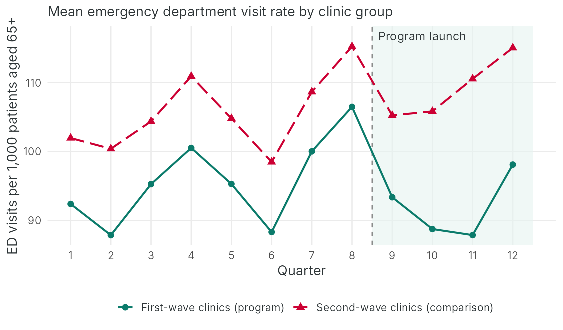
Group means by quarter
The gap, quarter by quarter
Learning Objectives for this section
- Explain why a posttest-only comparison and a one-group pre-post comparison give biased estimates of the Cedar Valley program's effect, and compute both from group means.
- Compute a two-group, two-period difference-in-differences estimate by hand and by regression, and state the parallel trends assumption on which it rests.
- Fit a clinic and quarter fixed-effects model with clinic-clustered standard errors and explain why clustering changes the standard error.
- Construct and interpret an event-study plot, including what pre-launch coefficients can and cannot show about parallel trends.
- Explain why two-way fixed effects estimates can mislead under staggered adoption and name estimators designed for staggered rollouts.
2.1 From Comparison Groups to Difference-in-Differences
Section 1 described the Cedar Valley rollout as a switching replications design with nonrandom assignment. During the program's first year, the 12 first-wave clinics deliver the program and the 12 second-wave clinics do not. The health authority's administrative records give the number of emergency department visits made each quarter by the patients aged 65 and older enrolled at each clinic, so the evaluator can compute a visit rate per 1,000 enrolled older patients for every clinic in every quarter, both before and after launch. This section uses that clinic-by-quarter panel to estimate the program's effect on emergency department use.
Two simple comparisons are available, and each carries a known bias. A posttest-only comparison of first-wave and second-wave clinics after launch estimates the program effect plus the difference that already existed between the groups. A one-group pre-post comparison of first-wave clinics before and after launch estimates the program effect plus whatever change would have occurred anyway, from secular trends, seasonal patterns, maturation and history. Difference-in-differences (DiD) combines the two. It takes the change in the program group and subtracts the change in the comparison group over the same period, so that a stable difference between the groups and a change shared by both groups are both removed.
The two-group, two-period difference-in-differences estimator
DiD = (ȲP, post − ȲP, pre) − (ȲC, post − ȲC, pre)
Here Ȳ is a group mean, P the program group and C the comparison group. The comparison group's change stands in for the change the program group would have experienced without the program.
The logic is old. John Snow's comparison of cholera deaths among households supplied by two London water companies in the 1850s is often cited as an early example. In economics, Card and Krueger (1994) compared employment in fast-food restaurants in New Jersey, which raised its minimum wage, with restaurants in neighbouring eastern Pennsylvania, which did not, before and after the increase. In public health, Wing, Simon and Bello-Gomez (2018) review the design's use for evaluating policies and programs and set out practices for doing it well.
2.2 The Parallel Trends Assumption
DiD replaces the assumption of exchangeable levels with an assumption about changes. The parallel trends assumption states that, in the absence of the program, the average outcome in the program group would have changed by the same amount as the average outcome in the comparison group. In potential outcomes notation, E[Y(0)post − Y(0)pre | P] = E[Y(0)post − Y(0)pre | C]. The assumption allows the groups to differ in level, which is why DiD suits Cedar Valley, where clinics chosen for readiness had lower emergency visit rates before launch. It does not allow the groups to be on different paths. In the language of Section 1, it assumes away selection-maturation, selection-history, selection-instrumentation and selection-regression interactions.
Four further conditions are usually stated alongside it. No anticipation requires that the program not change outcomes before it starts, as it might if first-wave staff began contacting isolated patients while preparing for launch. Stable composition requires that the population measured in each group not change because of the program, as it would if older adults moved to first-wave clinics to see a connector. No spillover would fail if second-wave patients joined community groups that connectors had strengthened. Finally, parallel trends in rates and parallel trends in the logarithm of rates are different assumptions, and at most one can hold when the groups start at different levels, so the scale should be chosen on substantive grounds before the results are seen.
The assumption fails in a characteristic way when people or units enter a program because of a recent change in their outcome. Ashenfelter (1978) observed that the earnings of people entering job training programs dipped in the year before entry, so that their later recovery would look like a program effect in a pre-post or DiD comparison. A health analogue is a clinic chosen for a program after a bad year, or an older adult referred after an unusual run of emergency visits. Several pretest periods are the best protection, because they show whether the groups were moving together before the program and whether a dip preceded entry.
2.3 Worked Example: Difference-in-Differences for the Cedar Valley Clinics
The simulated dataset contains one row for each of the 24 clinics in each of 12 quarters (288 clinic-quarters). The program launches at the start of quarter 9 in the 12 first-wave clinics (wave1 = 1). The second-wave clinics (wave1 = 0) start a year later, after the data end, so they provide a comparison for quarters 9 to 12. The outcome ed_rate is emergency department visits per 1,000 enrolled patients aged 65 and older per quarter. The variable event_time counts quarters relative to launch, from −8 to 3. The data are simulated, so the results describe this teaching dataset only.
Group means by quarter. The panel is balanced, with 96 pre-launch and 48 post-launch clinic-quarters in each group. The graphical check of parallel trends plots the mean rate in each group in each quarter.
Before launch, first-wave clinics have lower rates in every quarter, with gaps between −8.63 and −12.53 visits per 1,000, and the gap in quarter 8, the last quarter before launch, is −8.75. Both series rise and fall together, peaking in quarters 4 and 8, which are the winter quarters in this dataset. The gap does not drift in one direction over the eight pre-launch quarters, which is what parallel trends predicts. After launch the gap widens to −11.88, −17.08, −22.66 and −16.93 in quarters 9 to 12.
The two-by-two estimate by hand. The table gives the four group means, in emergency department visits per 1,000 enrolled patients aged 65 and older per quarter, and the change in each group.
| Clinics | Before launch | After launch | Change |
|---|---|---|---|
| First wave | 95.768 | 92.023 | −3.745 |
| Second wave | 105.595 | 109.158 | 3.564 |
First-wave clinics fell by 3.745 visits per 1,000 per quarter after launch, while second-wave clinics rose by 3.564, so the DiD estimate is −3.745 − 3.564 = −7.308. The posttest-only comparison of the two groups after launch (−17.135) more than doubles this, because it includes the pre-existing gap of about 9.8 visits. The pre-post comparison within first-wave clinics (−3.745) understates it, because it ignores the rise in rates that the comparison clinics show over the same period. The simulated effect is deliberately large so that the methods are easy to see. Spread over the roughly 500 older adults who attend a first meeting in the first year, a fall of 7.3 visits per 1,000 enrolled older patients per quarter would mean more than one avoided visit per participant each year, far more than the 0.12 visits that Lesson 10 assumes in its economic evaluation, so a real evaluation would check an estimate of this size against the program’s reach.
Background: how a product term reproduces four group means
The regression below contains two indicators, wave1 (1 for first-wave clinics) and post (1 for quarters after launch), and their product, wave1 × post, which equals 1 only for first-wave clinics after launch. Substituting the four combinations of 0 and 1 shows what each coefficient means. For second-wave clinics before launch every indicator is 0, so the prediction is β0. For second-wave clinics after launch it is β0 + β2, for first-wave clinics before launch β0 + β1, and for first-wave clinics after launch β0 + β1 + β2 + β3. With four coefficients and four groups, the model reproduces the four means exactly. The first-wave change is β2 + β3 and the second-wave change is β2, so their difference, the DiD estimate, is β3, the coefficient on the product term. A product term is how a regression represents statistical interaction: it allows the change over time to differ between the two waves.
HSCI 410 Lesson 3, Section 4 (Linear and Logistic Regression), covers interaction terms more fully and is optional reading.
The same estimate by regression. The regression Y = β0 + β1 wave1 + β2 post + β3 (wave1 × post) reproduces the four means, and β3 is the DiD estimate. Standard errors are clustered by clinic, and the t tests use 23 degrees of freedom (the number of clinics minus one). The intercept (105.5948) is the comparison group's pre-launch mean, the wave1 coefficient (−9.8271) is the pre-launch difference between the groups, the post coefficient (3.5635) is the comparison group's change, and the interaction (−7.3083) is the DiD estimate computed by hand. Its clustered standard error is 3.1503, giving t = −2.3199 and p = 0.0296.
Clinic and quarter fixed effects. The two-way fixed effects (TWFE) model replaces the group indicator with a separate intercept for each clinic and the period indicator with a separate intercept for each quarter. Its program indicator equals 1 for first-wave clinics after launch. The table compares conventional and clinic-clustered standard errors for the program effect.
| Type of standard error | Estimate | Standard error | t | p |
|---|---|---|---|---|
| Conventional | −7.3083 | 2.1087 | −3.4658 | 0.0006 |
| Clustered by clinic (23 degrees of freedom) | −7.3083 | 3.3444 | −2.1853 | 0.0393 |
In a balanced panel with a single launch date, the TWFE estimate equals the DiD of group means (−7.3083). The standard errors differ. The conventional standard error (2.1087) treats the 288 clinic-quarters as independent, whereas a clinic's rate in one quarter is correlated with its rate in neighbouring quarters. The clustered standard error (3.3444) allows any pattern of correlation within a clinic and is about 1.59 times larger. The 95 percent confidence interval based on the clustered standard error runs from −14.227 to −0.39 visits per 1,000 per quarter.
Recall: clustered standard errors (Lesson 6, Section 2.5)
Lesson 6, Section 2.5 (Randomized Designs for Health Services Interventions), analyzed a simulated cluster trial in which every older adult in a clinic shared the same allocation. A clustered sandwich standard error, which allows residuals to be correlated within clinics, was 0.1313, close to the mixed-model value of 0.136 and far larger than the naive 0.084, because the information about the program came from comparisons among 24 clinics, a far smaller number than the 960 people enrolled. The same logic applies to the clinic panel here, in which each clinic contributes twelve correlated quarters.
Question: Why does clustering by clinic widen the confidence interval for the Cedar Valley difference-in-differences estimate?
A clinic's emergency visit rate in one quarter is correlated with its rate in other quarters, so the 288 clinic-quarters carry less independent information than their number suggests. The clustered standard error reflects the 24 clinics that did or did not receive the program, so it is larger than the conventional one (3.34 against 2.11), and the 95 percent confidence interval widens accordingly.
Bertrand, Duflo and Mullainathan (2004) showed that ignoring serial correlation in DiD studies with many periods produces standard errors that are far too small and tests that reject a true null hypothesis much more often than the nominal 5 percent. Clustering by the unit at which the program is assigned, here the clinic, is the standard response. Clustered standard errors rely on the number of clusters being reasonably large, and with 24 clinics the worked example uses a t distribution with 23 degrees of freedom as a small-sample correction; Cameron and Miller (2015) describe further options, such as the wild cluster bootstrap, for studies with fewer clusters. The clustered standard error from the fixed-effects model (3.3444) is slightly larger than the one from the two-by-two regression (3.1503) only because the usual small-sample adjustment multiplies the variance by (n − 1)/(n − k), and k is 36 in the fixed-effects model and 4 in the two-by-two model.
2.4 Event-Study Plots
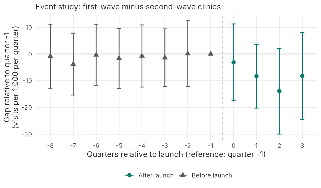
The two-by-two estimate averages over all pre-launch and all post-launch quarters. An event study estimates a separate coefficient for each quarter relative to launch, so that the evaluator can see whether the groups moved together before launch and how the effect develops afterwards. The model is
Yct = αc + λt + Σk ≠ −1 βk × Dc × 1[t − 9 = k] + εct
Here αc are clinic fixed effects, λt are quarter fixed effects, Dc = 1 for first-wave clinics, and 1[t − 9 = k] equals 1 in the quarter k quarters from launch. The quarter just before launch (k = −1) is the reference, so each βk is the change in the gap between the groups relative to that quarter. Coefficients with k < 0 are called leads and coefficients with k ≥ 0 are called lags.
The event-study model was fitted to the Cedar Valley panel with one indicator for each lead and lag except event time −1, clinic and quarter fixed effects, and clinic-clustered standard errors with 23 degrees of freedom. A joint test checks whether the seven leads all equal zero.
The seven leads lie between −3.77 and 0.12, with standard errors between 5.22 and 5.96, and the joint test gives F = 0.135 on 7 and 23 degrees of freedom (p = 0.994), so the pre-launch data show no sign of diverging trends. The lags are −3.13, −8.32, −13.91 and −8.18, a pattern consistent with an effect that builds as connectors' caseloads grow. Each lag is imprecise on its own, and every 95 percent interval includes zero. In a balanced panel with one launch date, each coefficient equals the raw gap in that quarter minus the gap in quarter 8: for event time 1 (quarter 10), −17.08 − (−8.75) = −8.33, which matches −8.32 up to rounding. The two-by-two estimate is the mean of the four lags minus the mean of the eight pre-launch coefficients, (−8.385) − (−1.076) = −7.309, which matches the two-by-two estimate in Section 2.3 up to rounding.
Flat leads are reassuring, and they are weaker evidence than they appear. The parallel trends assumption concerns the post-launch period, in which the counterfactual trend is unobservable, and pre-launch agreement shows only that the groups moved together when neither had the program. Pre-trend tests also have low power when, as here, each lead has a standard error of about 5.5; a real divergence of a few visits per quarter could easily pass the test. Roth (2022) showed that reporting results only when a pre-trend test passes can make the bias of the selected estimates worse. Rambachan and Roth (2023) propose a sensitivity analysis that asks how large a post-launch violation of parallel trends, relative to the largest pre-launch deviation, would be needed to overturn the conclusion. For Cedar Valley, the evaluator would also check the plausible sources of divergence directly, by asking whether urgent care services, clinic staffing or record systems changed differently in the two groups of clinics during the study period.
2.5 Staggered Adoption and Two-Way Fixed Effects
The clean comparison in the worked example lasts only one year. When the second wave launches in quarter 13, every clinic is receiving the program and the rollout becomes a case of staggered adoption, in which units start at different times. A common approach has been to fit the TWFE model from Section 2.3 to the full period, with the program indicator switched on for each clinic from its own launch date. A body of econometric work, most of it published since 2020, has shown that this estimate can be misleading when program effects change over time or differ between adoption groups (Goodman-Bacon, 2021; de Chaisemartin and D'Haultfœuille, 2020; Callaway and Sant'Anna, 2021; Sun and Abraham, 2021; Roth et al., 2023).
Goodman-Bacon (2021) showed that the TWFE estimate under staggered adoption is a weighted average of every two-group, two-period comparison in the data. Some comparisons use not-yet-treated units as controls, which is legitimate under parallel trends. Others use already-treated units as controls for later adopters. When the earlier group's effect is still growing, its change during the later group's launch includes its own growing effect, and subtracting that change biases the comparison. The worked example below shows this with a noiseless version of the full Cedar Valley rollout.
Wave 1 starts in quarter 9 and wave 2 in quarter 13. Both waves share the same underlying trend, so parallel trends hold exactly, and the program lowers the rate by 1 visit per 1,000 for each quarter of exposure. The panel runs for 16 quarters and contains no random noise. The true average effect is compared with the TWFE estimate and with the two underlying two-by-two comparisons: wave 1 against not-yet-treated wave 2 over quarters 1 to 12, and wave 2 against already-treated wave 1 over quarters 9 to 16.
The true average effect over all treated clinic-quarters is −3.833, but the TWFE estimate is −1.167. The comparison of wave 1 with not-yet-treated wave 2 (−2.500) correctly recovers wave 1's average effect over its first four quarters. The comparison of wave 2 with already-treated wave 1 gives +1.500, a harmful-looking estimate, because wave 1's effect deepens from an average of −2.5 to −6.5 while wave 2 starts, and that deepening is subtracted. The TWFE estimate is exactly the weighted average of the two comparisons with weights of 2/3 and 1/3. If the effect were constant, the forbidden comparison would be harmless and TWFE would recover it.
Several estimators avoid the problem by building each comparison only from units that are not yet treated or never treated, and then averaging the resulting estimates with weights the analyst chooses. The accordion summarizes the main approaches, each of which is available in standard statistical software.
The Goodman-Bacon decomposition lists every two-by-two comparison that contributes to a TWFE estimate, with its weight, so the analyst can see how much of the estimate rests on comparisons with already-treated units. De Chaisemartin and D'Haultfœuille show that some group-period effects can even receive negative weights, so that a program with positive effects everywhere could produce a negative TWFE estimate.
This approach estimates a separate effect for each adoption group in each period, using never-treated or not-yet-treated units as the comparison, and then aggregates the group-time effects into an overall effect or an event-study profile. It makes the choice of comparison explicit and allows covariates to be used in the parallel trends assumption.
Sun and Abraham showed that conventional event-study coefficients can be contaminated by effects from other relative periods when effects differ between adoption groups, and they proposed an estimator that interacts relative-time indicators with adoption-group indicators.
The imputation approach fits unit and period fixed effects to untreated observations only, predicts the untreated outcome for each treated observation, and averages the differences between observed and predicted outcomes.
Once the second wave launches, no clinic remains untreated, so effects in the second year can be estimated only by comparing the second wave with already-treated first-wave clinics or by extrapolating trends. The evaluation should report the first-year effect with second-wave clinics as the comparison, as in the worked examples in Sections 2.3 and 2.4, estimate the second wave's early effects using the same quarters-from-launch approach, and avoid a single TWFE estimate pooled over both years.
The health authority also tracks primary care visits per 1,000 enrolled patients aged 65 and older per quarter. First-wave clinics averaged 1,180 before launch and 1,256 after launch. Second-wave clinics averaged 1,214 and 1,238 over the same quarters. Compute the DiD estimate, state the assumption it requires, and suggest one explanation for the result other than a change in patients' need for care.
The change in first-wave clinics is 1,256 − 1,180 = 76, and the change in second-wave clinics is 1,238 − 1,214 = 24, so the DiD estimate is 76 − 24 = 52 additional primary care visits per 1,000 older patients per quarter. The estimate assumes that, without the program, primary care visits in first-wave clinics would have risen by the same 24 visits as in second-wave clinics. Connectors may link people to care they had been missing, which the logic model might treat as a desired short-term outcome. An instrumentation explanation is also possible: if visits arranged by connectors are recorded as primary care visits in first-wave clinics, part of the increase reflects recording rather than additional care.
Carry forward
Difference-in-differences uses repeated measurements of the same clinics to remove stable differences between groups. Many evaluation questions are about individuals, for whom a long series of pre-program outcomes is rarely available. Section 3 turns to propensity scores, which construct a comparison group of individuals who resemble participants on measured characteristics.
Reflection
An evaluation compares 12 program clinics with 12 comparison clinics. The mean emergency department visit rate per 1,000 older patients per quarter in the program clinics was 95.8 before launch and 92.0 after launch. In the comparison clinics it was 105.6 before and 109.2 after. An event-study analysis with eight pre-launch quarters shows pre-launch coefficients between −3.8 and 0.1, each with a standard error of about 5.5, and a joint test that all pre-launch coefficients equal zero gives p = 0.99. A colleague writes: "The pre-trends test passed, so parallel trends is confirmed and our estimate is unbiased." Compute the difference-in-differences estimate from the four means, then write a response to the colleague that explains what the event-study evidence does and does not show and proposes two specific further checks.
The program clinics changed by 92.0 − 95.8 = −3.8 visits and the comparison clinics by 109.2 − 105.6 = 3.6 visits, so the difference-in-differences estimate is −3.8 − 3.6 = −7.4 visits per 1,000 older patients per quarter. (With unrounded means the estimate is −7.3.)
The event study is reassuring but it does not confirm the assumption. Parallel trends concerns what would have happened after launch without the program, which is never observed. The pre-launch coefficients show only that the two groups moved together before launch. With standard errors of about 5.5 for each coefficient, the test has little power, so a real divergence of several visits per quarter could easily have passed it. Roth (2022) also showed that reporting results only when such a test passes can make bias in the reported estimates worse.
I would propose two further checks. First, a sensitivity analysis in the style of Rambachan and Roth (2023), reporting how large a post-launch departure from parallel trends, relative to the largest pre-launch deviation, would be needed to make the confidence interval include zero. Second, a negative control population, such as patients aged 50 to 64 at the same clinics, who are not eligible for the program; a similar estimated effect among them would point to a clinic-level change, such as a new urgent care service, rather than to the program. A log of local service and staffing changes in both groups of clinics would also help.
Minimum 20 characters required.
Question 1: First-wave clinics averaged 95.768 emergency visits per 1,000 older patients per quarter before launch and 92.023 after. Second-wave clinics averaged 105.595 and 109.158. What is the difference-in-differences estimate?
Question 2: In the fixed-effects model, the clinic-clustered standard error (3.3444) is larger than the conventional one (2.1087). Why?
Question 3: An event study shows seven pre-launch coefficients between −3.77 and 0.12, each with a standard error near 5.5, and a joint test with p = 0.994. Which interpretation is best supported?
Question 4: In the toy staggered rollout, the true average effect was −3.833 but the two-way fixed effects estimate was −1.167. What caused the difference?
Propensity Scores
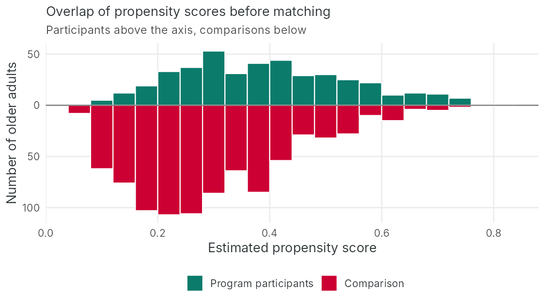
Estimating scores and checking overlap
Standardized mean differences
Learning Objectives for this section
- Explain how confounding arises when program participants are compared with non-participants, and define the propensity score and the assumptions that justify its use.
- Estimate propensity scores with logistic regression and assess the overlap of the program and comparison groups.
- Match participants to comparisons by nearest-neighbour matching with a caliper, and explain how matching defines and can change the estimand.
- Assess covariate balance with standardized mean differences and variance ratios, and construct inverse probability weights for the average effect in the whole population and among participants.
- Explain why balance on measured covariates leaves bias from unmeasured confounders untouched, and describe sensitivity analyses and design features that address it.
3.1 The Individual-Level Question
Section 2 estimated the program's effect on a clinic-level outcome, emergency department visits, using a long series of administrative data. The steering committee of the fictional Cedar Valley Connector program also wants to know whether the program reduces loneliness among the older adults who take part. Loneliness is measured with the three-item UCLA Loneliness Scale (3 to 9, higher scores indicating greater loneliness) at enrolment and six months later, so there is one pre-program measurement per person. A comparison group is available because second-wave clinics screened their older patients for loneliness during the program's first year with the same instrument and followed up a sample of them six months later. The natural comparison is between program participants in first-wave clinics and screened older adults in second-wave clinics.
The two groups differ by design. Participants were referred by clinicians, usually because they scored 6 or higher at screening, and then chose to attend. They are therefore likely to be lonelier at baseline, more likely to live alone, and perhaps more motivated to change their circumstances than the comparison group. Each of these characteristics can also affect loneliness six months later.
Recall: confounding and backdoor paths (Lesson 6, Section 1.1)
Lesson 6, Section 1.1 (Randomized Designs for Health Services Interventions), defined a confounder as a common cause of receiving the program and of the outcome, or a proxy for one, that is not on the causal pathway, and called the non-causal path it opens a backdoor path. When clinicians refer the patients who are loneliest, baseline loneliness causes both referral and six-month loneliness, which is confounding by indication, as the diagram shows. Conditioning on a measured confounder through stratification, regression, matching or weighting blocks its backdoor path, while a confounder that was never recorded, such as a person's readiness to engage, leaves its path open whatever analysis is chosen. The confounding described here is the same lack of exchangeability that Section 1 called selection bias in the potential outcomes decomposition.
Question: Matching on baseline loneliness can remove the confounding by indication in the diagram. Why can it not remove confounding by readiness to engage?
Baseline loneliness was measured, so conditioning on it blocks the backdoor path from referral through baseline loneliness to six-month loneliness. Readiness to engage was never recorded, so no analysis can condition on it, and its backdoor path stays open.
3.2 The Propensity Score
The propensity score is the probability of receiving the program given a person's measured pre-program characteristics, e(X) = Pr(T = 1 | X). Rosenbaum and Rubin (1983) showed that it is a balancing score: among people with the same propensity score, the distribution of the measured covariates X is the same in the program and comparison groups. If assignment to the program is unconfounded given X, it is also unconfounded given e(X). The result reduces the problem of comparing people who are alike on many covariates to the problem of comparing people who are alike on one number, which can then be used for matching, weighting, stratification or regression adjustment. In the notation of this lesson, T = 1 indicates receipt of the program and X is the set of measured pre-program covariates.
Background: logistic regression and predicted probabilities
Program receipt is binary, so its probability must stay between 0 and 1, and a straight line in the covariates would not respect those limits. Logistic regression solves this by modelling the log odds of receipt, log[p / (1 − p)], as a linear function of the covariates: log odds = b0 + b1x1 + … + bkxk. Each coefficient is the change in the log odds for a one-unit change in its covariate with the others held fixed, and exponentiating it gives an odds ratio; in the worked example below, each additional point of baseline loneliness multiplies the odds of being a participant by 1.550. Once the model is fitted, any person's covariate values give a predicted log odds, which converts back to a probability as p = 1 / (1 + e−log odds). A predicted log odds of −0.5, for example, corresponds to a probability of 1 / (1 + e0.5) = 0.38. That predicted probability of receiving the program, given the person's measured pre-program covariates, is the estimated propensity score e(X). The model serves prediction here, so the test of the model is whether the resulting scores balance the covariates, which Section 3.5 checks.
HSCI 410 Lesson 3, Section 3 (Linear and Logistic Regression), introduces logistic regression more fully and is optional reading.
The propensity score does not remove the need for assumptions. It moves them into a form that the evaluator can state and partly check. The cards below set out the assumptions on which a propensity score analysis rests.
Propensity score methods target a specific estimand. The average treatment effect (ATE) is the average effect in the whole population of participants and comparisons. The average treatment effect on the treated (ATT) is the average effect among the people who actually received the program, and it is usually the estimand of interest for an existing program, because it describes what the program did for the people it served. Matching each participant to one or more comparisons, as below, targets the ATT.
The choice of covariates is a design decision that should be made before the outcomes are examined. Covariates should be measured before the program began, so that the program cannot have affected them; the number of connector meetings or six-month social participation should never enter a propensity model. Brookhart and colleagues (2006) showed in simulations that including variables related to the outcome improves precision without increasing bias, whereas variables related only to receipt of the program increased variance without reducing bias; later work showed that such variables can also amplify bias from unmeasured confounding (Myers et al., 2011). The pre-program measurement of the outcome, here the baseline UCLA score, is usually the most important single covariate, because it captures many unmeasured influences on later scores and because matching on it means that both groups regress toward the mean by similar amounts.
3.3 Worked Example: Propensity Score Matching for Cedar Valley Participants
The simulated dataset contains 1,300 older adults: 423 who enrolled in the program at first-wave clinics during the first year and completed the six-month measurement (program = 1) and 877 who completed loneliness screening at second-wave clinics (program = 0). Covariates measured at enrolment or screening are age, sex (female), living alone, the baseline UCLA score (ucla_base), the number of chronic conditions (chronic) and emergency department visits in the prior year (ed_prior). The outcome is the UCLA score six months later (ucla_6m). The data are simulated, so the results describe this teaching dataset only.
The groups. The table gives the mean of each covariate and of the six-month outcome in each group.
| Variable | Comparisons (n = 877) | Participants (n = 423) |
|---|---|---|
| Age (years) | 76.029 | 75.452 |
| Female (proportion) | 0.592 | 0.603 |
| Lives alone (proportion) | 0.351 | 0.518 |
| Baseline UCLA score | 5.497 | 6.345 |
| Chronic conditions | 2.152 | 2.310 |
| Emergency department visits in the prior year | 0.491 | 0.539 |
| Six-month UCLA score | 5.696 | 5.657 |
Participants were lonelier at baseline (6.345 against 5.497) and more often lived alone (0.518 against 0.351). Their six-month mean (5.657) is almost the same as the comparison group's (5.696), so the unadjusted difference is −0.0383 (standard error 0.0823, p = 0.6414) and suggests no effect. Adjusting for the six covariates by ordinary regression changes the estimate to −0.6983 (standard error 0.0612), because participants started out lonelier and would have been expected to remain lonelier without the program.
The propensity score. A logistic regression of program receipt on the six covariates estimates each person's propensity score. Each additional point on the baseline UCLA score multiplies the odds of being a participant by 1.550 (z = 9.088), living alone multiplies them by 1.775 (z = 4.455), and each additional year of age multiplies them by 0.979 (z = −2.289). The odds ratios for sex, chronic conditions and prior emergency department visits lie between 0.901 and 1.113, with smaller z statistics. Propensity scores range from 0.065 to 0.780 among comparisons and from 0.083 to 0.802 among participants, with means of 0.293 and 0.393. The groups overlap over most of the range, but comparisons become sparse above about 0.65, which is where matching will struggle.
3.4 Matching
Nearest-neighbour matching pairs each participant with the comparison whose propensity score is closest. In the greedy form used here, participants are matched one at a time, each comparison can be used only once (matching without replacement), and each participant receives one match (1:1 matching). A caliper sets the largest acceptable distance between matched scores, and participants with no comparison within the caliper are left unmatched. Austin (2011) recommended a caliper of 0.2 standard deviations of the logit of the propensity score, based on simulations showing that it removes most of the bias that matching can remove while keeping most participants.
Each participant was matched to one comparison by greedy nearest-neighbour matching without replacement. The propensity score came from the same logistic model, distance was measured on the logit of the score, and the caliper of 0.2 standard deviations of the logit is 0.1474. Matching produced 410 pairs, left 13 participants unmatched, and left 467 comparisons unused. All 13 unmatched participants had propensity scores of 0.659 or higher, so they are the people most likely to take part, for whom few similar comparisons exist.
Dropping unmatched participants changes the estimand. The matched analysis estimates the average effect among the 410 matched participants, who exclude the participants with the highest propensity to enrol. Here the change is small, because 97 percent of participants were matched, but the report should state it and describe the people who were dropped. When many participants fall outside the caliper, the evaluator faces a choice between a less biased estimate for a subgroup and a more biased estimate for everyone, and the choice should be made explicitly.
Matching with replacement lets a comparison serve as the match for several participants. It usually produces closer matches and less bias, especially when good comparisons are scarce, but it increases variance and requires weights in the analysis to reflect how often each comparison was used.
Matching each participant to k comparisons (k:1 matching) uses more of the comparison pool and reduces variance, at the cost of poorer second and third matches. The gain in precision diminishes as k grows while the bias from poorer matches increases (Austin, 2010).
Greedy matching depends on the order in which participants are matched. Optimal matching minimizes the total distance across all pairs, and full matching places every person in a matched set with at least one participant and one comparison, using all the data with weights.
Exact matching on a few critical variables (for example, sex or a baseline score band) can be combined with propensity score matching on the rest. Coarsened exact matching (Iacus, King and Porro, 2012) groups each covariate into bands and matches exactly on the bands, which gives the analyst direct control over balance.
3.5 Balance Diagnostics
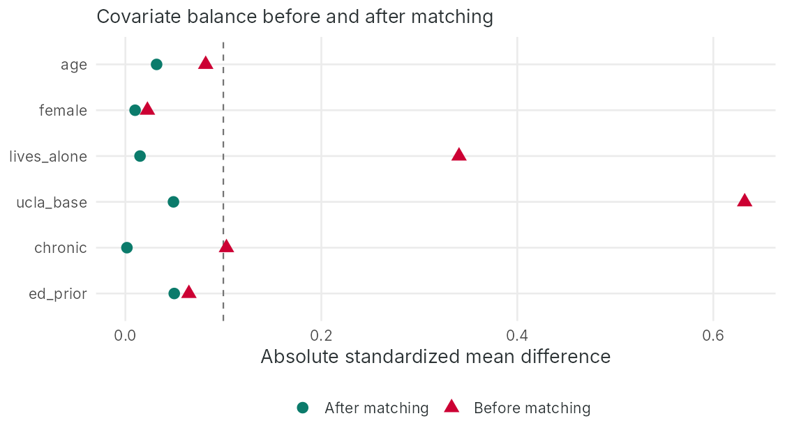
Because the purpose of a propensity score is to balance covariates, the main diagnostic is the balance achieved. The standard measure is the standardized mean difference (SMD), which expresses the difference in a covariate's mean between groups in standard deviation units and so does not depend on sample size (Austin, 2009).
Standardized mean differences
For a continuous covariate: SMD = (x̄P − x̄C) / √[(sP2 + sC2) / 2]
For a binary covariate with proportions pP and pC: SMD = (pP − pC) / √[(pP(1 − pP) + pC(1 − pC)) / 2]
A common rule of thumb treats an absolute SMD below 0.1 as negligible imbalance. The variance ratio (the participants' variance divided by the comparisons' variance) should be close to 1, and Rubin (2001) suggested that values outside 0.5 to 2 indicate a problem.
The table gives each covariate's SMD before and after matching, using the pooled standard deviation of the unmatched sample in both cases so that the change reflects only the change in means, and the variance ratio after matching. The figure shows the same SMDs as a balance plot.
| Covariate | SMD before matching | SMD after matching | Variance ratio after matching |
|---|---|---|---|
| Age | −0.082 | 0.032 | 1.077 |
| Female | 0.023 | −0.010 | 1.004 |
| Lives alone | 0.341 | 0.015 | 1.000 |
| Baseline UCLA score | 0.632 | 0.049 | 1.094 |
| Chronic conditions | 0.103 | 0.002 | 0.988 |
| Emergency department visits in the prior year | 0.065 | −0.050 | 0.836 |
Before matching, the baseline UCLA score (0.632) and living alone (0.341) were badly imbalanced and the number of chronic conditions (0.103) was just above the threshold. After matching, every absolute SMD is 0.050 or smaller, and the variance ratios range from 0.836 to 1.094. On the measured covariates, the matched groups resemble each other as closely as two randomized groups of this size typically would.
Two practices make balance checking honest. Balance should be assessed with SMDs and plots, without significance tests, because a p-value for a difference in means falls or rises with the sample size, and matching changes the sample size (Imai, King and Stuart, 2008). The design should also be finalized before the outcome is examined. Rubin (2001) argued that the matching stage of an observational study corresponds to the design stage of a trial: the analyst may revise the propensity model, add interactions or change the caliper until balance is acceptable, but should do so without seeing outcomes, so that the choice of specification cannot be steered by the result.
3.6 Estimating the Effect
The effect is the difference in mean six-month scores in the matched sample. Standard errors are clustered on the matched pair, because members of a pair are similar. A second model adds the covariates to remove residual imbalance.
In the matched sample, participants' six-month scores are 0.6756 points lower than those of their matched comparisons (standard error 0.0710), with a 95 percent confidence interval from −0.815 to −0.536. Adding the covariates gives −0.7239 with a slightly smaller standard error (0.0678).
3.7 Inverse Probability Weighting
Inverse probability weighting (IPW) uses the propensity score to reweight the sample instead of discarding unmatched people. Each person is weighted by the inverse of the probability of the group they are actually in, which creates a pseudo-population in which the covariates are unrelated to program receipt. The weights depend on the estimand.
Inverse probability weights
For the ATE: participants receive weight 1 / e(X) and comparisons receive weight 1 / [1 − e(X)].
For the ATT: participants receive weight 1 and comparisons receive weight e(X) / [1 − e(X)], which reweights the comparison group to resemble the participants.
Weights become large when a propensity score approaches 0 or 1, and a few large weights make the estimate unstable. Under ATE weighting, the Cedar Valley participant with the lowest score (0.083) would receive a weight of 1 / 0.083 = 12.05, standing in for twelve people. Stabilized weights, which multiply each weight by the marginal probability of the group, and truncation of extreme weights at chosen percentiles are common responses (Cole and Hernán, 2008; Austin and Stuart, 2015). Weighted balance should be checked with SMDs, exactly as for matching.
With ATT weights, the largest comparison weight is 3.55, which belongs to the comparison with the highest propensity score (0.780 / 0.220 = 3.55). Weighting reduces the effective size of the comparison group from 877 to 530.90. The IPW estimate (−0.7084, with a sandwich standard error of 0.0923) is close to the matched estimate. The sandwich standard error ignores the uncertainty in the estimated propensity scores; for ATT weights this can make it either too large or too small, so a bootstrap that re-estimates the propensity model in each resample is a safer choice for a final report.
Matching, weighting and regression adjustment can be combined. Augmented inverse probability weighting fits both a propensity model and an outcome model and gives a consistent estimate if either model is correctly specified, which offers some protection against misspecification of one of them (Hernán and Robins, 2020). Regression adjustment within a matched sample, as in the second model of the worked example in Section 3.6, follows the same logic.
The same weights extend to programs whose receipt changes over time. When participation can start, stop or intensify across several periods, and a covariate that affects later participation and the outcome is itself affected by earlier participation, ordinary regression adjustment fails: adjusting for that covariate blocks part of the program's effect and can open other non-causal paths, while leaving it out leaves confounding. Weights computed at each time point from the covariate and program history up to that point, and multiplied across time points, create a pseudo-population in which program receipt at each time is unrelated to past covariates, and a model fitted in that pseudo-population is a marginal structural model. HSCI 230 Lesson 11, Section 1 (Confounding and Statistical Inference), introduces time-varying confounding at undergraduate level, and Hernán and Robins (2020) give a full treatment of marginal structural models.
3.8 The Limits of Matching
All the adjusted estimates in the worked examples lie between −0.6756 and −0.7239, they agree closely, and the matched groups are balanced on every measured covariate. They are nevertheless biased. The simulation that generated the data included an unrecorded trait, readiness to engage, that made people more likely to enrol and also lowered their later loneliness. The true average effect among participants in the simulated data is about −0.42, so the matched estimate of −0.6756 overstates the benefit by about 0.26 points, and its 95 percent confidence interval excludes the true value. No balance diagnostic could have revealed this, because balance can be checked only on covariates that were measured.
What balance can and cannot show
Good balance shows that the comparison is fair with respect to the measured covariates. It says nothing about unmeasured ones, and agreement among matching, weighting and regression shows only that the methods handle the measured covariates similarly. King and Nielsen (2019) add a further caution: aggressive pruning with propensity score matching can increase imbalance and model dependence, so matching on the covariates themselves, or weighting, may be preferable in some settings.
Several strategies reduce the risk or quantify it. The first is design: measure the likely reasons for selection, such as motivation, social support and clinician judgement, at baseline in both groups. Within-study comparisons, in which a randomized experiment and a nonrandomized study of the same intervention are compared, suggest that adjusted estimates come closest to the experimental benchmark when the covariates are rich, well measured and related to the selection process (Shadish, Clark and Steiner, 2008), and a reanalysis of the same study found that pretest measures and measures of why people chose a condition removed most of the bias (Steiner et al., 2010). The second is to combine matching with difference-in-differences when pre-program outcomes are available, so that stable unmeasured differences are also removed. The third is a negative control outcome, an outcome the program cannot plausibly affect but that shares the suspected confounding (Lipsitch, Tchetgen Tchetgen and Cohen, 2010); an apparent "effect" on it signals residual confounding. The fourth is sensitivity analysis. Rosenbaum (2002) developed bounds that show how strongly an unmeasured confounder would need to affect assignment to change a conclusion, and VanderWeele and Ding (2017) proposed the E-value, the minimum strength of association, on the risk ratio scale, that an unmeasured confounder would need with both the program and the outcome to explain away an estimate.
In a different matched sample, the mean age is 76.8 years among participants (standard deviation 6.2) and 75.9 years among comparisons (standard deviation 5.8). Compute the SMD for age, decide whether the imbalance is acceptable, and say what you would do next.
The pooled standard deviation is √[(6.22 + 5.82) / 2] = √[(38.44 + 33.64) / 2] = √36.04 = 6.003, so the SMD is (76.8 − 75.9) / 6.003 = 0.15. This exceeds the 0.1 threshold, so age remains imbalanced. Because age affects both enrolment and loneliness, the next step is to revise the design before looking at outcomes, for example by adding age squared or an interaction with living alone to the propensity model, narrowing the caliper, or matching exactly within age bands, and then to recheck balance on all covariates.
Carry forward
Difference-in-differences needs many comparable units observed over time, and propensity scores need rich individual covariates and the assumption of no unmeasured confounding. Section 4 introduces a design for a different situation, a single treated unit such as a whole region or province, and then compares all the designs in this lesson so that an evaluator can choose a comparison group for a given evaluation.
Reflection
An evaluation compares 423 older adults who enrolled in a community connector program with 877 older adults screened at comparison clinics. A propensity score (the estimated probability of enrolling given measured baseline characteristics) was estimated from age, sex, living alone, baseline loneliness score, chronic conditions and prior emergency visits. Participants were matched one-to-one to comparisons, with a caliper (a maximum allowed distance between matched scores). Thirteen participants, all with propensity scores of 0.659 or higher, had no match, leaving 410 pairs. Before matching, the standardized mean differences (differences in means divided by a pooled standard deviation) were 0.63 for baseline loneliness and 0.34 for living alone; after matching every one was below 0.05. In the matched sample, six-month loneliness (scored 3 to 9) was 0.68 points lower among participants (95 percent confidence interval −0.82 to −0.54). Program staff remark that participants are "the motivated ones." Write a paragraph for the steering committee that states what this estimate refers to, what the balance results show, what remains uncertain, and one sensitivity analysis or design change you would recommend.
The estimate refers to the average effect among the 410 participants who could be matched, which excludes the 13 participants who were most likely to enrol and for whom no similar comparison existed; because 97 percent of participants were matched, it is close to the average effect among all participants, but the report should say who was excluded. The balance results show that matching removed the large baseline differences in loneliness and living alone, so on the six measured characteristics the matched groups are as similar as randomized groups of this size would usually be. Balance says nothing about characteristics that were not measured. If participants are more motivated, and motivation also lowers later loneliness, the 0.68-point difference overstates the program effect, and the confidence interval reflects only sampling error, not this bias. I would recommend reporting an E-value, which states how strongly an unmeasured confounder would need to be associated with both enrolment and loneliness to explain away the estimate, and adding a short readiness or motivation measure to the baseline questionnaire for future participants and comparisons so that it can be included in the matching. Comparing the result with the clinic-level difference-in-differences results, which rest on different assumptions, would also help the committee judge it.
Minimum 20 characters required.
Question 1: In the propensity score model, the odds ratio for the baseline UCLA score was 1.550. What does this mean?
Question 2: Caliper matching left 13 of 423 participants unmatched, all with propensity scores of 0.659 or higher. What is the main consequence?
Question 3: Using inverse probability weights for the average effect among participants (ATT), what weight does a comparison person with a propensity score of 0.75 receive?
Question 4: After matching, every standardized mean difference was below 0.05 and four adjusted estimates agreed (−0.68 to −0.72), yet the simulation's true effect was about −0.42. What explains the gap?
Synthetic Control and Design Choice
Learning Objectives for this section
- Explain when the synthetic control method is the appropriate design and how its donor weights are chosen.
- Compute the values and pre-period fit of a synthetic control from donor data and weights, and interpret placebo-based inference.
- Compare the designs in this lesson by the comparison each one constructs, its identifying assumption, its data requirements and the threats it leaves open.
- Choose a candidate comparison group for a program and describe the threats to validity that it leaves open.
4.1 Evaluating a Single Treated Unit
Many health policies and programs apply to a whole jurisdiction at once. A province changes a drug coverage rule, a city introduces free transit for older residents, or a health authority adopts a program in every clinic. The evaluation then has one treated unit, and the comparison must come from other jurisdictions. Difference-in-differences with a single treated unit is possible, but it depends heavily on which comparison units the evaluator chooses, and with one treated unit the usual standard errors are unreliable.
The synthetic control method was developed by Abadie and Gardeazabal (2003), who studied the economic costs of conflict in the Basque Country, and by Abadie, Diamond and Hainmueller (2010), who estimated the effect of California's 1988 tobacco control program (Proposition 99) on cigarette sales by comparing California with a weighted combination of other states. Instead of choosing one comparison unit or averaging all of them equally, the method builds a synthetic control: a weighted average of untreated units from a donor pool, with weights chosen so that the weighted average reproduces the treated unit's outcomes and characteristics before the intervention. After the intervention, the synthetic control's trajectory estimates what would have happened to the treated unit without it.
The synthetic control estimator
With a treated unit 1 and donor units j = 2 to J + 1, choose weights wj ≥ 0 with Σ wj = 1 so that the weighted donors match unit 1 as closely as possible on pre-intervention outcomes and predictors. The estimated effect in each post-intervention period t is
effectt = Y1t − Σ wj Yjt
The quality of the pre-intervention match is summarized by the root mean squared prediction error (RMSPE), the square root of the mean squared gap between the treated unit and its synthetic control before the intervention.
The restriction to non-negative weights that sum to one has two consequences. The synthetic control is an interpolation among real units, so it cannot extrapolate beyond the range of the donors, and the weights are transparent: the evaluator can report exactly which units contribute and how much. Abadie (2021) sets out the conditions under which the method is credible. The treated unit should be closely matched over a long pre-intervention period, the donor pool should exclude units that adopted similar interventions or suffered large idiosyncratic shocks, the intervention should not have been anticipated, and the intervention should not spill over to donor units.
4.2 A Worked Example: Cedar Valley as a Whole
Suppose that, once both waves are running, the fictional Cedar Valley Health Authority wants to know whether emergency department use among all residents aged 65 and older in the region has changed. The whole region is now the treated unit. The evaluator assembles annual emergency department visit rates per 1,000 residents aged 65 and older for Cedar Valley and for 14 other health service areas that have no comparable program and that use the same visit definitions. The year in which the first wave launched is the start of the intervention, so year 1 includes only first-wave clinics and year 2 includes both waves. The optimization assigns weights of 0.50 to Area A, 0.30 to Area B, 0.20 to Area C, and zero to the other 11 areas. All values are illustrative.
| Year | Cedar Valley | Area A | Area B | Area C | Synthetic | Gap |
|---|---|---|---|---|---|---|
| −6 | 401 | 380 | 432 | 401 | 399.8 | 1.2 |
| −5 | 404 | 386 | 436 | 405 | 404.8 | −0.8 |
| −4 | 411 | 391 | 441 | 412 | 410.2 | 0.8 |
| −3 | 414 | 397 | 447 | 416 | 415.8 | −1.8 |
| −2 | 421 | 402 | 450 | 421 | 420.2 | 0.8 |
| −1 | 426 | 408 | 456 | 427 | 426.2 | −0.2 |
| 1 | 425 | 413 | 461 | 431 | 431.0 | −6.0 |
| 2 | 428 | 419 | 466 | 437 | 436.7 | −8.7 |
Each synthetic value is the weighted sum of the donors. For year −6 it is 0.50 × 380 + 0.30 × 432 + 0.20 × 401 = 190.0 + 129.6 + 80.2 = 399.8. No single donor tracks Cedar Valley: Area A is consistently lower and Area B consistently higher, but their weighted combination with Area C stays within 1.8 visits of Cedar Valley in every pre-intervention year. The pre-intervention RMSPE is √[(1.22 + 0.82 + 0.82 + 1.82 + 0.82 + 0.22) / 6] = √(6.64 / 6) = 1.05 visits. After the program starts, Cedar Valley falls below its synthetic control by 6.0 visits in year 1 and 8.7 visits in year 2, and the post-intervention RMSPE is √[(6.02 + 8.72) / 2] = 7.47, about 7.1 times the pre-intervention value.
Inference with placebo tests
With one treated unit, conventional standard errors do not apply. Abadie, Diamond and Hainmueller (2010) proposed placebo tests instead. In an in-space placebo test, the method is applied to each donor area in turn as if it had been treated, using the remaining areas as its donor pool, and the ratio of post-intervention to pre-intervention RMSPE is computed for every area. If Cedar Valley's ratio of 7.1 were the largest among the 15 areas, the probability of observing a ratio that large by chance assignment of the program to an area would be 1/15 = 0.067, which is the smallest p-value this donor pool can produce. If Cedar Valley ranked second, the p-value would be 2/15 = 0.13. An in-time placebo moves the start date back, for example to year −3, and checks that no gap opens at the false date. A leave-one-out analysis drops each donor with a positive weight in turn and checks whether the estimate depends on a single area.
The example also shows a substantive limit. Only a small fraction of the region's older residents take part in the program in any year, so a region-wide gap of 8.7 visits per 1,000 implies a large effect per participant. Before attributing the gap to the program, the evaluator should check whether the program's reach could plausibly produce it and look for other region-wide changes in the post-intervention years, such as a change in emergency department triage or a new urgent care service. A synthetic control controls for influences that the donors share; it cannot rule out an event that affected Cedar Valley alone.
Extensions
Several extensions address the method's limits. The augmented synthetic control method (Ben-Michael, Feller and Rothstein, 2021) corrects the estimate with an outcome model when the pre-intervention fit is imperfect. Synthetic difference-in-differences (Arkhangelsky et al., 2021) combines unit weights of the synthetic control kind with time weights and fixed effects, which makes the estimator less sensitive to level differences. The generalized synthetic control method (Xu, 2017) handles several treated units with different start dates. Bouttell and colleagues (2018) describe the use of synthetic control methods for population-level health interventions. When a single treated unit has a long series but no credible donors, the interrupted time series designs of Lesson 8 compare the unit with its own pre-intervention trend.
4.3 Comparing the Designs
The designs in this lesson differ in the comparison they construct, the assumption that makes the comparison valid, and the data they need. The table sets them side by side. No design removes every threat, and the evaluator's task is to choose the design whose assumption is most defensible for the program and then to collect the evidence that tests that assumption.
| Design | Stand-in for the counterfactual | Key assumption | Data required | Main threats left open |
|---|---|---|---|---|
| One-group pre-post | Participants' own pretest | No change would have occurred without the program | One pretest and one posttest | History, maturation, regression to the mean, testing, instrumentation |
| Posttest-only comparison | Comparison group's posttest | Groups would have had equal outcomes | One posttest in each group | Selection and all its interactions |
| Two-period difference-in-differences | Comparison group's change | Parallel trends | Pretest and posttest in each group | Selection interactions, including differential trends |
| Multi-period difference-in-differences and event study | Comparison group's change, period by period | Parallel trends, partly checkable before launch | Several pre- and post-periods for many units | Post-launch divergence, anticipation, problems from staggered timing |
| Propensity score matching or weighting | Comparisons with similar measured covariates | No unmeasured confounding, and overlap | Rich individual pre-program covariates | Unmeasured confounding |
| Matching combined with difference-in-differences | Change in matched comparisons | Parallel trends after matching | Covariates and pre- and post-program outcomes | Time-varying unmeasured confounding |
| Synthetic control | Weighted combination of donor units | Pre-intervention fit implies post-intervention fit | Long aggregate series for the unit and many donors | Events specific to the treated unit, poor fit, spillover to donors |
The choice usually follows from the data that exist or can be collected. The tabs set out the common situations.
When the program is delivered in some clinics, schools or communities and administrative outcomes are available for all of them over several periods before and after launch, a multi-period difference-in-differences with an event-study plot is usually the strongest option. If units start at different times, the estimators of Section 2.5 should replace a pooled two-way fixed effects model.
When the question concerns individual participants and the evaluation can measure the outcome and the main reasons for selection before the program, propensity score matching or weighting on those measures is reasonable. The analysis should include a balance table, a sensitivity analysis for unmeasured confounding, and, where possible, a negative control outcome.
When a whole province, region or city adopts the program and comparable aggregate data exist for other jurisdictions over a long period, a synthetic control is appropriate. Without credible donors, an interrupted time series (Lesson 8) is the alternative.
When eligibility depends on a score threshold, such as a UCLA score of 6 or higher, a regression discontinuity design may be possible (Lesson 8). When the timing or location of the program can still be randomized, the designs of Lesson 6 should be considered first.
Designs can also be combined. In Cedar Valley, a clinic-level difference-in-differences for emergency department visits, an individual-level matched comparison for loneliness, and a region-wide synthetic control make different assumptions and are vulnerable to different biases. Lawlor, Tilling and Davey Smith (2016) describe this strategy as triangulation: when approaches with different sources of bias point in the same direction, confidence in the conclusion increases, and when they disagree, the disagreement shows where further work is needed.
4.4 Choosing a Comparison Group
Whichever design is chosen, its credibility depends on the comparison group. A good comparison group meets the same eligibility rules as the program group, is measured with the same instrument, mode, timing and data system, is observed over the same calendar period, does not receive the program or a similar one, has similar outcome levels and trends before the program, contains enough units for inference, and has data that the evaluation can legally and practically obtain. Lesson 5 covered data sharing agreements, which often determine whether a comparison group that looks ideal on paper is available in practice.
Comparison groups usually come from one of five sources. Later-wave or waitlisted sites, like the Cedar Valley second wave, share the program's selection process to some degree and are often the best available option, although their window as a comparison closes when they start. Similar sites in neighbouring regions avoid contamination but may differ in health system context. Eligible non-participants at the same sites share the setting but differ in motivation, which is strong self-selection. Historical cohorts at the same sites remove selection between places but are exposed to every history and instrumentation threat between the two periods. Synthetic comparisons built from many units are suited to aggregate outcomes. For each candidate, the evaluator should ask which of the Section 1 threats it leaves open and what evidence could show whether those threats operated.
4.5 Worked Example: The Cedar Valley Comparison Group Memo
Evaluation questions. Did the program reduce emergency department visits among older patients of first-wave clinics during its first year, and did it reduce loneliness among participants at six months?
Candidate comparison group. For emergency department visits, the 12 second-wave clinics during the four quarters before they launch. For loneliness, older adults screened at second-wave clinics during the same year who scored 6 or higher, measured at screening and six months later by the same research staff who measure participants. Participants and comparisons will be matched on age, sex, living alone, baseline UCLA score, chronic conditions and prior emergency visits, and on a short measure of readiness for change added to the baseline questionnaire.
Why this group. Second-wave clinics belong to the same health authority, serve the same kind of population, and are eligible for the same program. Emergency department visits come from the same hospital records for both groups. Eight quarters of pre-launch data show a stable gap of about 9.8 visits per 1,000 per quarter with no sign of diverging trends.
The design in notation. NR O1 … O8 X O9 … O12 for first-wave clinics and NR O1 … O8 O9 … O12 X for second-wave clinics, with the second X marking the start of the replication in year two.
| Threat left open | How it could operate in Cedar Valley | What the plan does about it |
|---|---|---|
| Selection-maturation | Clinics chosen for readiness may have been on a different path after launch, for example because of growing practice teams. | Event-study plot, sensitivity analysis for departures from parallel trends, and a staffing record for each clinic. |
| Selection-history | An urgent care centre opening near several first-wave clinics would lower their visits. | A log of local service changes and a negative control population: patients aged 50 to 64 at the same clinics, who are ineligible for the program. |
| Anticipation and contamination | Second-wave clinicians preparing for launch may begin linking patients to community groups, and some patients may move to first-wave clinics. | Record preparation activities and clinic transfers, and define clinic membership at baseline. |
| Instrumentation | Participants might report lower loneliness to connectors they know. | Research staff, never connectors, collect six-month scores in both groups. |
| Unmeasured confounding | Participants may be more motivated than matched comparisons. | A baseline readiness measure, an E-value for the loneliness estimate, and comparison with the clinic-level results. |
| Attrition | Follow-up may be lower and more selective in the comparison group. | Track follow-up rates by group and compare the baseline characteristics of those lost and retained. |
| External validity | Effects in ready clinics may be larger than in the second wave. | Estimate the second wave's early effects in year two and compare them with the first wave's. |
The memo closes by stating which threats remain after these steps. The comparison window is only four quarters, so long-term effects cannot be estimated against an untreated group, and an unmeasured difference in motivation between participants and comparisons can be bounded but not eliminated. These limits carry forward into the Cedar Valley design justification in Lesson 8.
What a comparison group memo contains
A comparison group memo defines a candidate comparison group precisely (who or what, where, when and from which data source), explains why it is the best available option, writes the resulting design in design notation, and presents a table of the threats to internal validity that it leaves open, how each could operate in the program, and what the evaluation plan will do about it.
A sound memo defines the group precisely enough that another evaluator could assemble it, and it justifies the choice with evidence or reasoning about eligibility, measurement, timing, exposure and pre-program similarity. It names threats in the Shadish, Cook and Campbell terms and describes them specifically for the program, links each mitigation step to data the evaluation will collect, and states which threats remain open after mitigation.
Reflection
A city introduces free public transit for all residents aged 65 and older. An evaluator wants to know whether it reduced emergency department visits among older residents. Annual emergency visit rates per 1,000 residents aged 65 and older, defined the same way, are available for the city and for 20 other cities for ten years before the policy and two years after it; three of those cities introduced their own seniors' transit discounts during the period. Consider three designs. Difference-in-differences compares the city's change with the average change in comparison cities and assumes parallel trends. A synthetic control builds a weighted average of untreated cities (weights non-negative and summing to one) that matches the city's outcomes before the policy, and uses placebo tests that apply the method to each untreated city. A one-group pre-post design compares the city before and after. Choose a design, explain how you would build the comparison (including which cities to include in the comparison pool), describe how you would judge the quality of the comparison and the statistical evidence, and name the most serious remaining threat.
A synthetic control is the best fit. There is one treated city, a long ten-year series before the policy, and a pool of potential comparison cities with the same outcome definition. A simple difference-in-differences against the average of all 20 cities would depend on whether that average happened to follow the city's path, while the synthetic control chooses weights so that the comparison reproduces the city's pre-policy series. The one-group pre-post design would attribute any secular change to the policy.
I would exclude the three cities that introduced their own transit discounts, because they received a similar intervention, leaving 17 donors. I would choose weights to match the ten pre-policy years and predictors such as the age structure and baseline health service use, and judge the comparison by the pre-policy root mean squared prediction error and by plotting the two series. For inference, I would apply the method to each of the 17 donors as a placebo and compare the ratio of post-policy to pre-policy prediction error; with 17 donors the smallest possible p-value is 1/18, about 0.056. I would also run an in-time placebo with a false start date and a leave-one-out analysis.
The most serious remaining threat is history specific to the city, such as a change in hospital triage or a new urgent care service in the same years, which the donors would not share. I would document local health service changes during the post-policy years.
Minimum 20 characters required.
Question 1: Which statement correctly describes the weights in a synthetic control?
Question 2: Donor regions A, B and C have outcomes of 410, 450 and 420 in a given year, with synthetic control weights of 0.5, 0.3 and 0.2. What is the synthetic control value?
Question 3: An in-space placebo test uses 14 donor areas, and the treated region has the largest ratio of post-intervention to pre-intervention RMSPE among all 15 areas. What is the permutation p-value?
Question 4: Which source of comparison group is most exposed to history and instrumentation threats?
Final Assessment
Bringing It All Together
This lesson began with the counterfactual problem. Every causal claim about a program compares what happened to participants with what would have happened to them without the program, and the second quantity is never observed. A comparison group stands in for it, and the selection bias decomposition shows that the stand-in works only when the groups would have had the same untreated outcomes. Shadish, Cook and Campbell's threats to internal validity, written down with design notation, give the evaluator a systematic way to ask what else could explain an observed change.
The designs in the lesson each replace exchangeability with a different assumption. Difference-in-differences assumes parallel trends and allows stable differences in level, and the Cedar Valley clinic panel showed how it differs from posttest-only and pre-post comparisons, how clustering changes its standard error, and how an event study displays the evidence before and after launch. Propensity score matching and weighting assume no unmeasured confounding, and the Cedar Valley participant data showed that excellent balance on measured covariates can coexist with substantial bias from a trait that was never recorded. The synthetic control method assumes that a weighted combination of donors that tracks a single treated unit before an intervention would have continued to track it afterwards.
Choosing among these designs depends on the data available and on which assumption is most defensible for the program, and combining designs with different weaknesses strengthens the conclusions that can be drawn. The Cedar Valley memo in Section 4.5 shows this choice made for one program, naming a comparison group and the threats it leaves open.
Key Takeaways from this lesson
- A comparison of program and comparison groups equals the average effect on participants plus selection bias, and every quasi-experimental design is a strategy for making the selection bias term small or removing it.
- The Shadish, Cook and Campbell threats to internal validity (history, maturation, selection, regression to the mean, instrumentation, testing and attrition) and their interactions with selection provide a checklist for judging any causal claim.
- Regression to the mean can produce most of a pre-post improvement when participants are selected for extreme scores, and a comparison group selected by the same rule addresses it.
- Difference-in-differences removes stable differences between groups and changes shared by both groups, and it rests on the assumption that the groups would have followed parallel trends without the program.
- Standard errors for difference-in-differences should be clustered by the unit of assignment, because outcomes within a unit are correlated over time.
- Event-study plots show whether groups moved together before launch and how an effect develops afterwards, but flat pre-launch coefficients cannot prove parallel trends after launch.
- Under staggered adoption, a single two-way fixed effects model can be badly biased when effects change over time, and estimators that use only not-yet-treated or never-treated comparisons avoid the problem.
- Propensity scores balance measured covariates and make the estimand explicit, and their validity depends on the untestable assumption of no unmeasured confounding.
- Balance diagnostics, agreement among methods and narrow confidence intervals cannot reveal bias from unmeasured confounders, which calls for design measures, negative controls and sensitivity analyses.
- The synthetic control method builds a weighted comparison for a single treated unit from donors that match its pre-intervention path, and it relies on placebo tests for inference.
Core Concepts Reviewed
Section 1: the counterfactual, selection bias, the validity typology, threats to internal validity and their interactions with selection, regression to the mean, and design notation.
Section 2: posttest-only and pre-post comparisons, difference-in-differences, parallel trends, clustered standard errors, event-study plots and the problems of staggered adoption for two-way fixed effects.
Section 3: confounding, the propensity score and its assumptions, nearest-neighbour matching with a caliper, standardized mean differences, inverse probability weighting and the limits of matching.
Section 4: the synthetic control method, donor pools, placebo tests, a comparison of designs by their assumptions and data, and the choice of a comparison group.
The final reflection asks you to design a comparison-group evaluation for a staggered rollout that combines the methods of this lesson.
Reflection
A regional health authority will roll out a home-visiting program for new parents across 30 public health units in three waves of 10 units, one year apart. The authority will choose the order based on staffing readiness. Two outcomes matter: emergency department visits by infants, available quarterly from administrative records for three years before the first wave and throughout the rollout, and parental depression scores, measured by survey at enrolment and six months later for participants and for a sample of eligible parents in units that have not yet started. Propose an evaluation design that uses methods from this lesson. For each outcome, describe the comparison, the key assumption, one diagnostic you would report, and the threat you consider most serious. Explain how you would avoid the problem that arises when a single two-way fixed effects model (unit and period fixed effects with one program indicator) is fitted to a staggered rollout in which effects grow over time.
For infant emergency visits I would use a multi-period difference-in-differences in which units that have not yet started serve as the comparison. Wave 1 is compared with waves 2 and 3 during year one, and wave 2 with wave 3 during year two. The key assumption is parallel trends: without the program, visit rates in early and later units would have changed in parallel. I would report an event-study plot with twelve pre-launch quarters for each wave, with clustered standard errors by public health unit. The most serious threat is a selection-maturation interaction, because units chosen for staffing readiness may also be improving in other ways. To avoid the two-way fixed effects problem, I would estimate group-time effects using only not-yet-treated units as controls (Callaway and Sant'Anna, 2021) and never use already-treated units as comparisons, since a growing effect in earlier waves would otherwise be subtracted from later ones.
For parental depression I would compare participants with eligible parents surveyed in units that have not yet started, matched on propensity scores estimated from baseline depression, parity, age, income support and social support, and check balance with standardized mean differences below 0.1. The key assumption is no unmeasured confounding, and the main threat is that parents who accept home visits differ in motivation or need. I would report an E-value and, because both groups have baseline scores, also estimate a matched difference-in-differences that removes stable unmeasured differences.
Minimum 30 characters required.
Final Knowledge Assessment
Question 1: A program report shows that participants' loneliness scores fell after enrolment. Which design change best addresses regression to the mean?
Question 2: Program sites had a mean outcome of 50 before and 44 after launch. Comparison sites had 58 before and 55 after. What is the difference-in-differences estimate?
Question 3: Which statement is the parallel trends assumption?
Question 4: In a staggered rollout analyzed with a single two-way fixed effects model, what is a "forbidden" comparison?
Question 5: In a balanced clinic-by-quarter panel with one launch date and quarter −1 as the reference, what does an event-study coefficient for event time 2 equal?
Question 6: Why did the Cedar Valley worked example base its clustered tests on a t distribution with 23 degrees of freedom?
Question 7: What is a propensity score?
Question 8: Which variable should be left out of the propensity score model for the Cedar Valley loneliness analysis?
Question 9: Which observation most clearly signals a problem with positivity?
Question 10: Before matching, 52 percent of participants and 35 percent of comparisons lived alone. What is the standardized mean difference, to two decimal places?
Question 11: Why should balance after matching be judged with standardized mean differences instead of significance tests?
Question 12: What does an E-value report?
Question 13: In which situation is the synthetic control method most appropriate?
Question 14: Which combination of methods removes stable unmeasured differences between matched individuals?
Question 15: Suppose the Cedar Valley event study had shown perfectly flat pre-launch coefficients with very narrow confidence intervals. Which threat would still remain open?
Glossary: Key Terms, People & Frameworks
📚 Reference page, available throughout the lesson
Terms, methods and people introduced in this lesson on comparison groups, difference-in-differences, propensity scores and synthetic control.